6 Data-Viz Tips from the Media’s Election Visualizations
This post is featured as part of Election Month.
Elections are exciting times for the data visualization and data journalism field. The innovations in each election cycle set the trend for the future of the field. These innovations apply to all kinds of analytics, whether you’re doing data journalism, internal business analytics, or schoolwork.
I looked at several of the leading organizations to find some great tricks we can all use.
1. If People Want to Know Just One Number, Show Them That Single Number
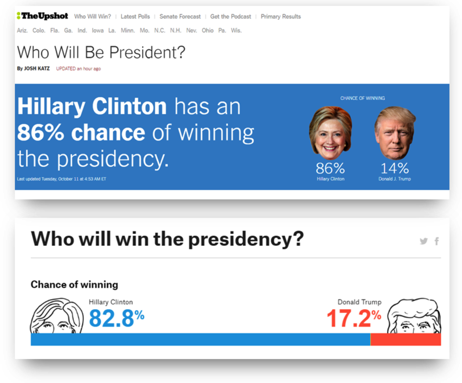
Sources: The Upshot, FiveThirtyEight
When people look at a poll tracker, there’s one key piece of information they want to know: who’s most likely to win. That is paramount, and every fact beyond that is contextual background detail. While you and I might love the intricacy and detail of a chart, sometimes we should pare things down and just show the important numbers. The examples above are from The Upshot and FiveThirtyEight.
2. Focus on the Interesting Data. Put the Boring Data in the Background
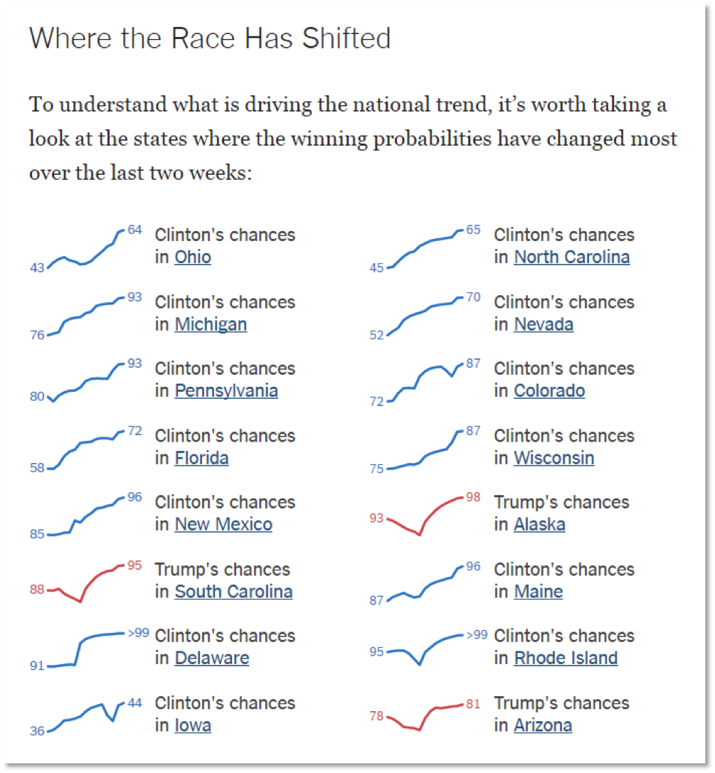
There are 50 states voting, but many of them don’t see a change in polling over time. The media have learnt to focus on just the interesting states. In most cases, they focus on the swing states.
Source: Wall Street Journal
This example from the Wall Street Journal looks at states where there is change in the polling. If the polls aren’t changing over time, then they’re not worth highlighting. You can click on each state in the small-multiples chart above to see much more detail. This approach leads the audience to the most interesting data, and that’s the goal.
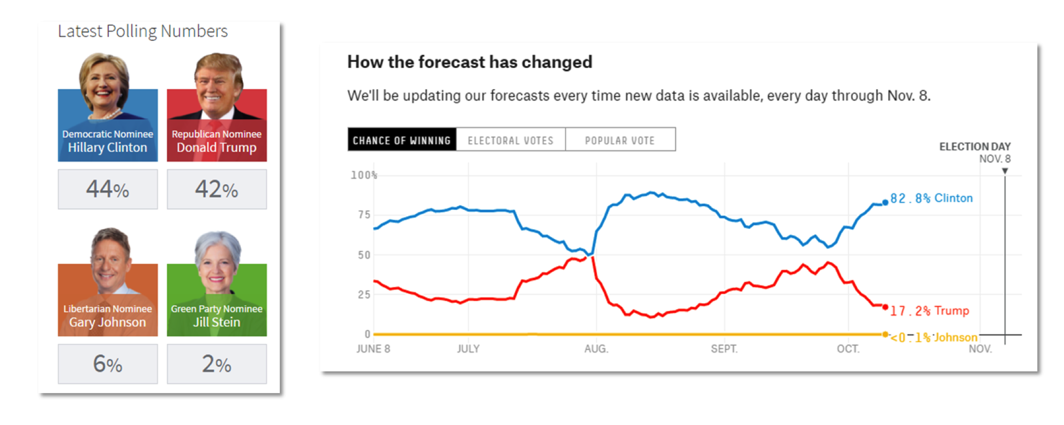
One challenge organizations face is deciding which candidates to represent. FiveThirtyEight and Fox News are showing data about all presidential candidates, as you can see below.
Sources: Fox News, Wall Street Journal
The Fox News approach (left) is the most inclusive, as Gary Johnson and Jill Stein have the same prominence as Donald Trump and Hillary Clinton in most charts.
FiveThirtyEight (right) is showing Johnson on the tracker, too. Does the flatlining yellow line really add anything? Well, it’s complete, and is showing all the tracking data for all the candidates. Those who choose not to show Johnson/Stein are arguably hiding valuable information from the electorate. Leaving aside the political impact of inclusion/exclusion, it does show that all of us need to choose which data to show when visualizing data.
3. Don’t Use a Map Just Because You Have Geographical Data
The actual location of each state doesn’t affect whether Donald Trump or Hillary Clinton will win: It’s what happens to each state’s electoral college votes, and whether there are enough cumulatively to get one candidate or another into the White House. If that’s the case, is a map the best way to show the data?
A map of the lower 48 is a poor way of showing how close the race is (or isn’t). Many large states have a small population, or few electoral college votes. They dominate maps. Compare Montana’s size and electoral college votes to Florida and New Jersey below.

There are two ways to solve this problem.
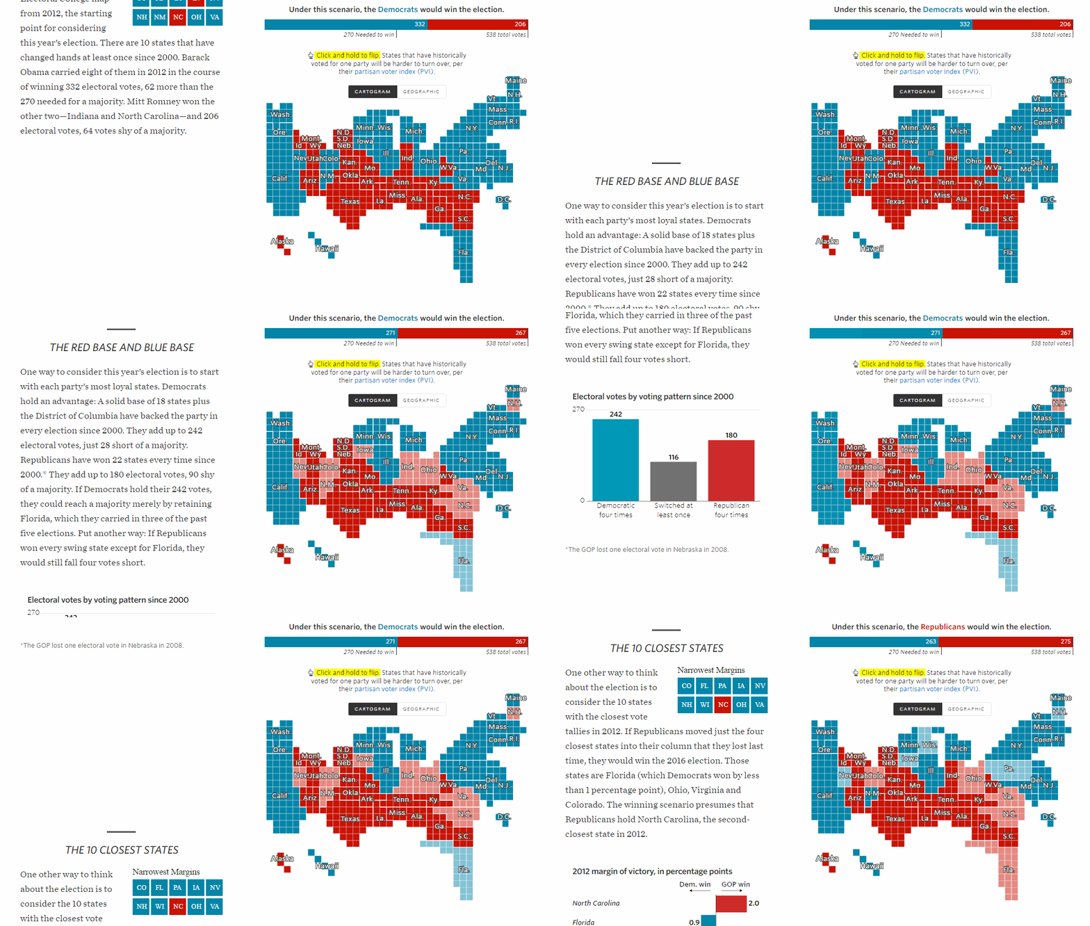
First of all, don’t bother showing maps. The Wall Street Journal’s polling home page doesn’t have any maps; you have to click deeper into the page to find them. We all know where Ohio, Florida and the other swing states are, so we don’t need the map. Just show us the data!
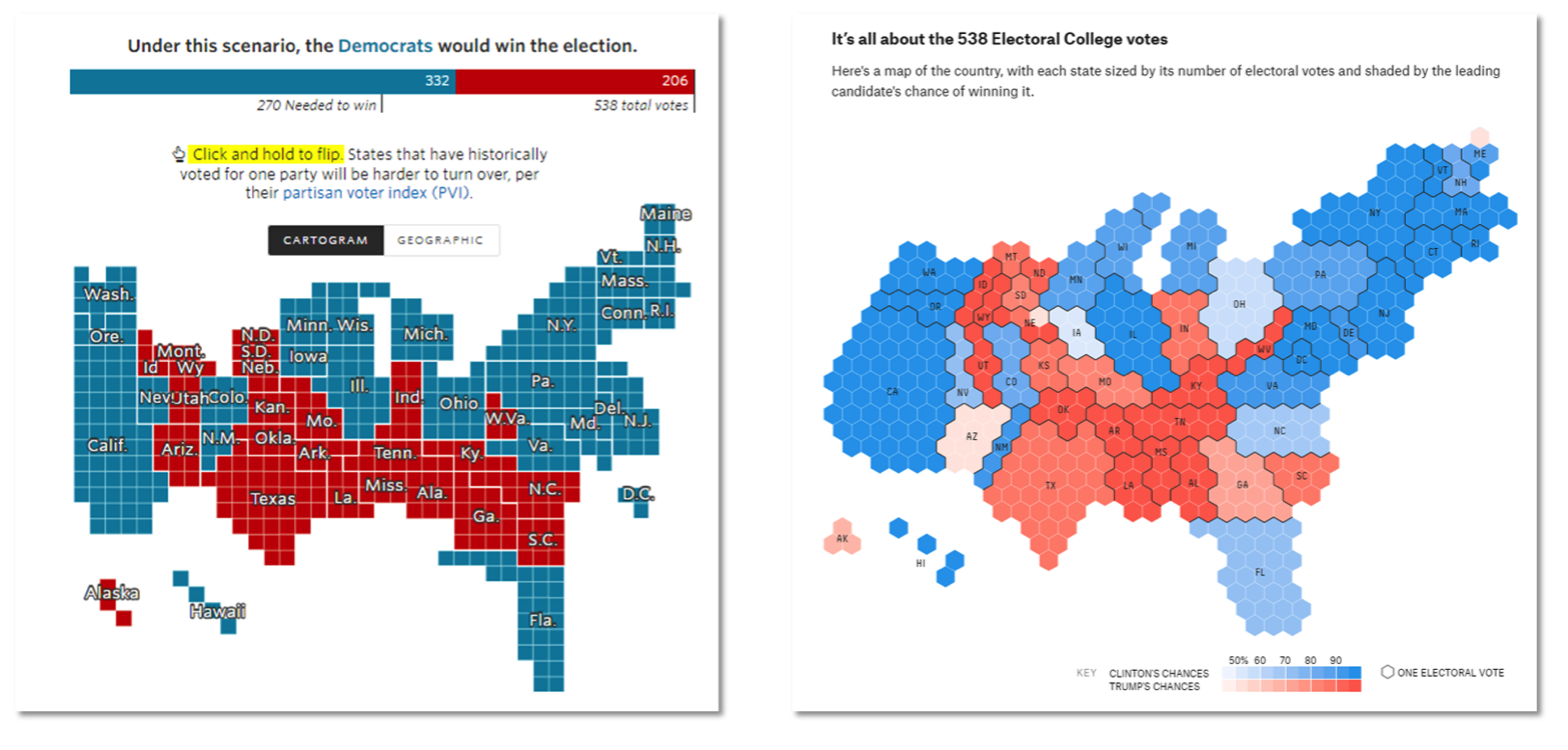
A second option is to show cartograms. These are maps which are sized according to the metric, not the geographic area. They do a great job at showing data accurately, but there is a price to be paid: the map no longer represents reality. Cartograms do represent a good compromise.
Sources: Wall Street Journal, FiveThirtyEight
The diagram above shows the WSJ (left) and FiveThirtyEight (right) cartograms. One thing to note: There’s not a standard cartogram, so you have to relearn the distribution of the states in each one. The WSJ uses squares, and FiveThirtyEight uses hexagrams.
4. Aggregate and Disaggregate
Source: Wall Street Journal
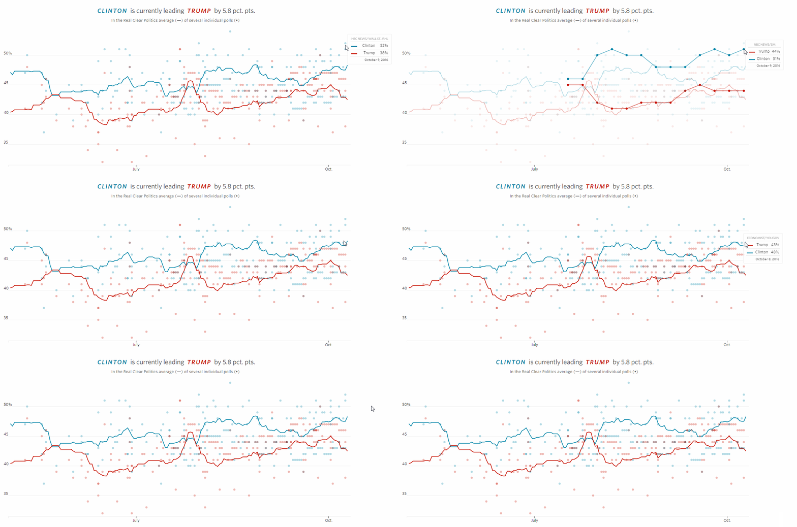
The US election polls have been volatile this year (much more so than in the UK’s General Election last year). FiveThirtyEight and WSJ have model which aggregate data into a poll-of-polls tracker. When you aggregate data, you get an overview but lose the detail of the individual polls. The WSJ has a particularly nice solution where it shows all the individual poll points as dots. If you hover over the dots, the individual polls are highlighted over time.
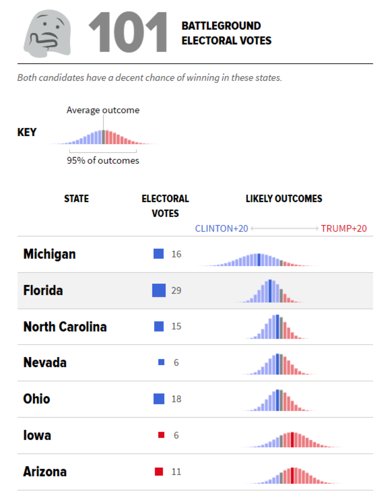
The Huffington Post is making great use of histograms. Instead of showing just the central predicted number, you can see how confident that prediction is. For example, Michigan and Florida have very different levels of certainty:
Source: The Huffington Post
5. Design Vizzes for the Way People Use Them
Source: Wall Street Journal
There are very few visualizations on the election sites that rely on interactivity. Where there is interactivity, it isn’t vital to the understanding of the visualization. A lot of interactivity is triggered by scrolling.
Why are people moving away from interactivity? Put simply: People don’t click things. Martin Stabe of FT.com explained the reasons for this recently and how it impacts his organization.
Also, all the election tracking sites are optimized to work on mobile. Anyone doing data visualization, even in business environments, should be producing mobile-enabled work.
6. Innovate!
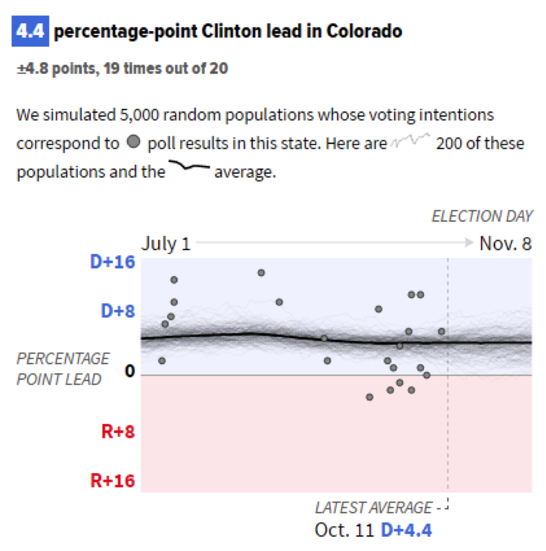
The Huffington Post has a really nice innovation on its state detail trackers. Look at the paragraph above the chart. That paragraph is actually a legend. Traditionally, we’d make a legend using as few words as possible, which makes the interpretation by the reader harder.
Source: The Huffington Post
Another nice innovation is from the WSJ, which is putting time on the y-axis. This is a relatively new trend in data visualization (see also XKCD and Information Is Beautiful). It’s something we will see more of as we consume more information on cell phones or tablets. Because we are so used to scrolling vertically on phones, it makes sense to translate the scrolling action into the passage of time.
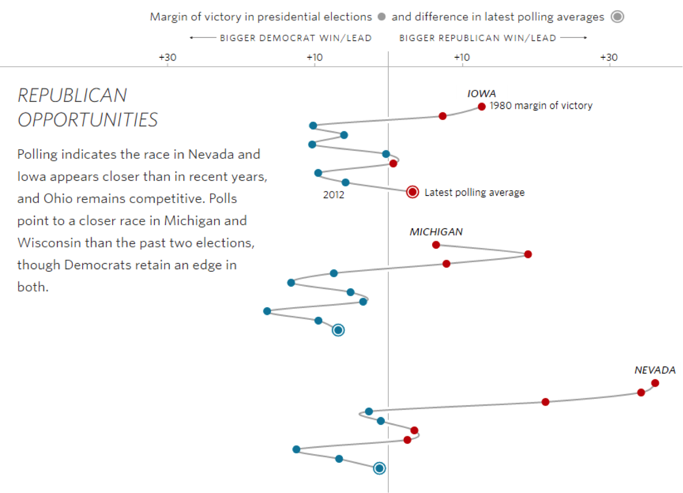
Source: Wall Street Journal
Innovation is important in data visualization as we seek new methods that are both engaging and accurate.
I hope you’ve enjoyed this summary of the great stuff going on in the election trackers. Are there any other tips you’ve learnt? Share them below.
Head over to our training page for all of our election-themed tutorials. And tweet us your viz @tableaupublic using the hashtag #ElectionViz!


