Iron Viz 2025: Where Data Took Flight


For the past 15 years, the Iron Viz competition has captivated Tableau Conference attendees and viewers worldwide. The ultimate data viz off where data viz experts face each other in a 20-minute dashboard creation challenge. Let’s relive the energy and highlights of the 2025 Iron Viz show.

Hosts Archana Ganeshalingam and Andy Cotgreave kick off the Iron Viz 2025 Championship.
Senior Data Evangelist Andy Cotgreave and Solution Engineering Program Manager Archana Ganeshalingam ignited the energy at Iron Viz, introducing the amazing finalists for this year's competition: Ryan Soares, Kathryn McCrindle, and Bo McCready. Each finalists is supported and guided by Tableau sous-vizzer chosen for their data visualization expertise—Brianna Fritz supporting Ryan Soares, Morag Deans on Kathryn McCrindle’s team, and Clara Wu supporting Bo McCready.
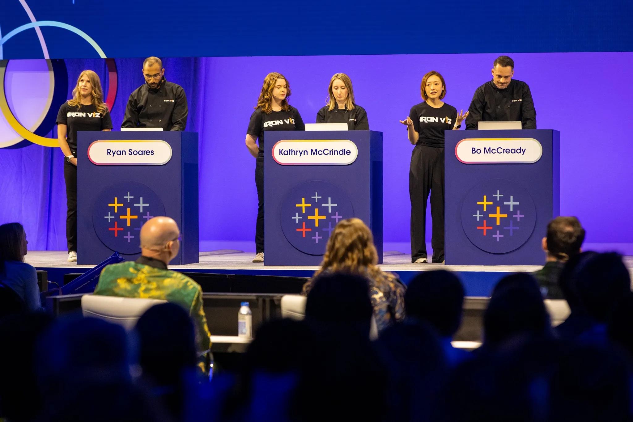
Finalists and sous-vizzers during the Iron Viz show. Left to right: Brianna Fritz, Ryan Soares, Morag Deans, Kathryn McCrindle, Clara Wu, and Bo McCready.
This year, the finalists created their unparalleled data vizzes on stage using the Federal Aviation Administration (FAA) national Wildlife Strike Database—which collects reports on wildlife strikes on aircrafts across the US for aviation safety and minimizing harm to wildlife.
After 20 minutes of dashboard building, each contestant had three minutes to present their viz to a live audience and this year’s distinguished judges: 2024 Iron Viz champion Chris Westlake, founding board member and Executive Director of the Data Visualisation Society Amanda Makulec, and 2nd time judge and Principal Solution Engineer at Tableau, Mark Bradbourne. The finalists must impress the panel of judges who judge the vizzes based on three key criteria: design, analysis, and storytelling.

2025 Iron Viz Judges (left to right) Chris Westlake, Amanda Makulec, and Mark Bradbourne.
The data visualizations created on stage
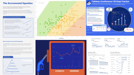
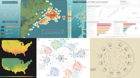
The 2025 Iron Viz finalist dashboards are truly exceptional. Discover the highlights and distinctive features that made each one of them stand out. From a bird’s perspective to a human one, all three visualizations offered a singular and unique narrative. Now onto viz exploration.
A Flight Less Travelled by Ryan Soares
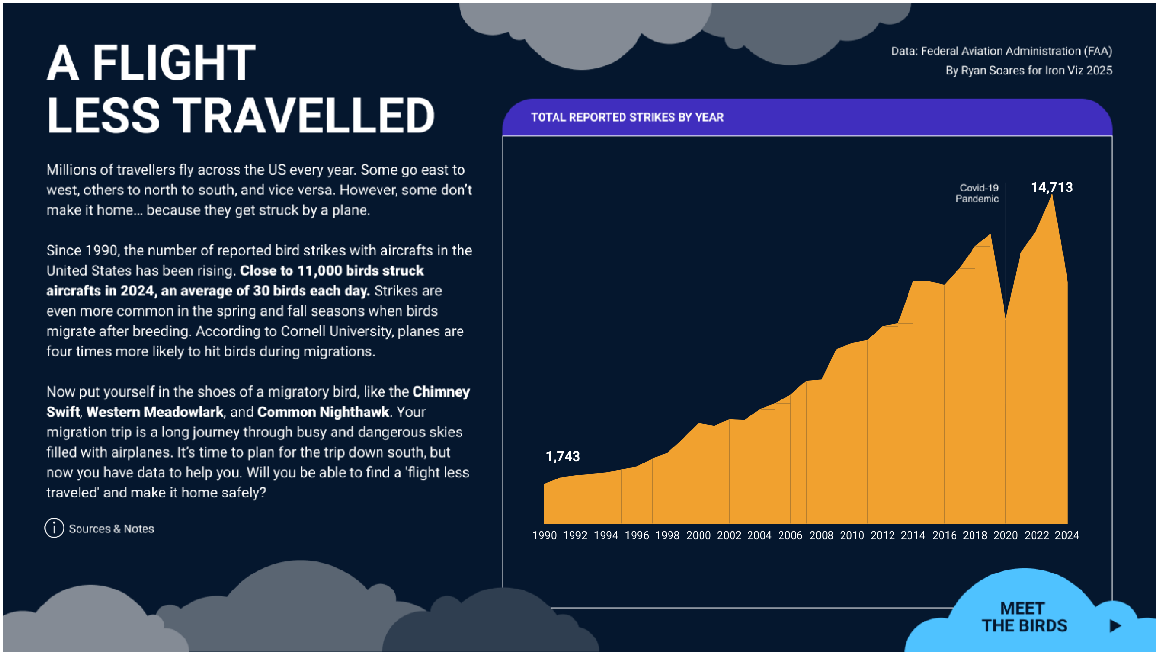
Ryan combined technical prowess with a unique perspective and a focused narrative. Through a creative use of parameters, calculations, and actions, he crafted a viz that truly took flight. His visualization allows users to step into the shoes of a migratory bird and plan their own migration trip from start to end. Through this visual journey, you can feel the weight of the danger a bird faces when migrating, empowering us to understand the vital need for safe flight. Ryan’s visualization not only informs—it inspires action, urging us to protect the skies these birds call home.
Wildlife Strikes by Kathryn McCrindle

Kathryn brought innovation to the forefront by revealing trends in wildlife strikes over time—highlighting which parts of the plane are most often hit (and how badly) and the species most commonly involved. She uses bold visuals, animations and a custom Damage Cockpit built with multi-sliced donut charts, allowing us to see clearly see the concerning risks of aircraft-bird collision. But how are we managing that risk? Kathryn takes it one step further with her Danger Zone map, which features a searchlight that offers an innovative way to uncover whether an airport’s surrounding environment can influence overall strike risk. Kathryn’s data driven approach and tasteful design made for a visualization full with insights worth exploring.
Two Eras of Safety by Bo McCready
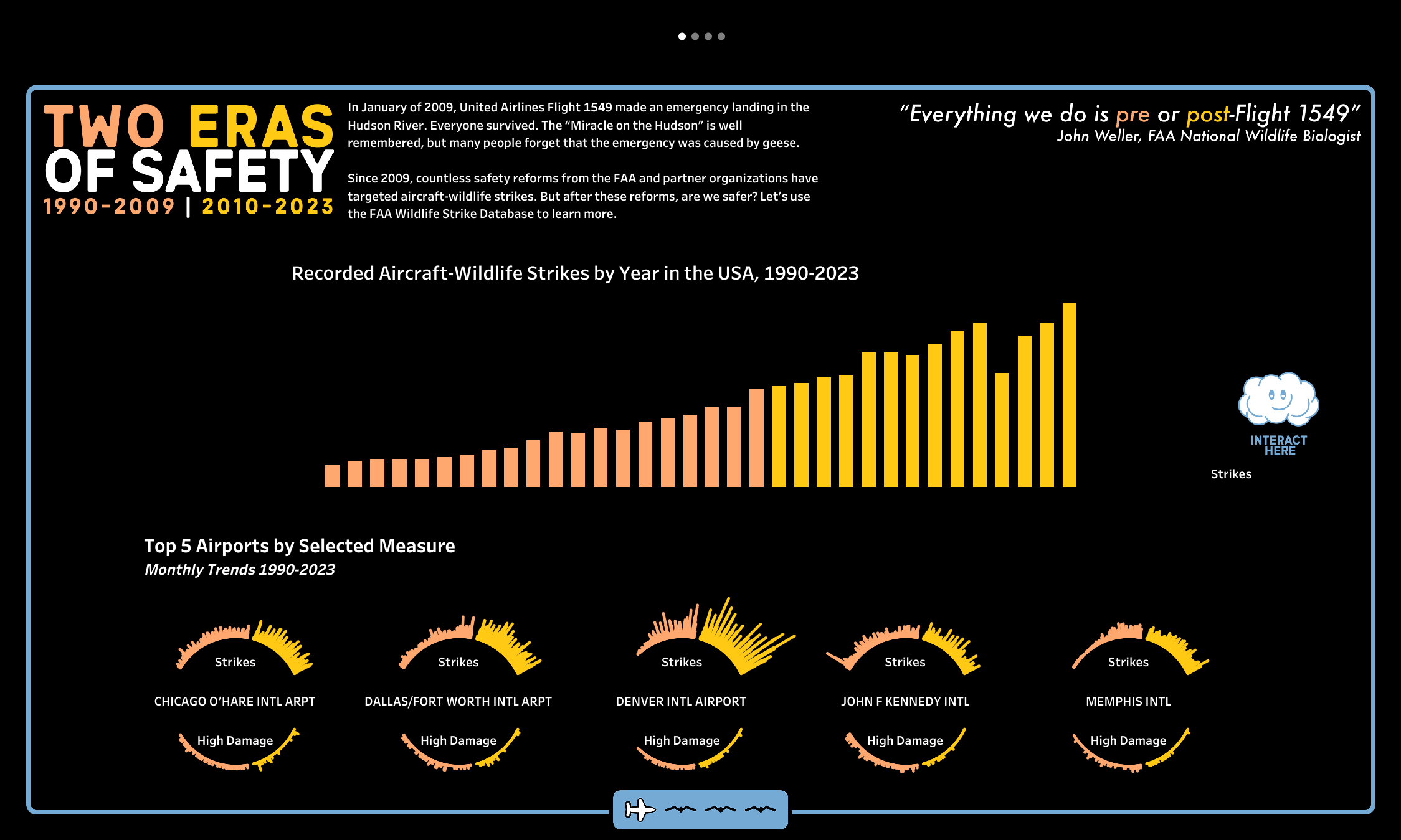
Bo championed the power of his signature design style, inspired by the influential Kelly Martin, a Tableau Visionary and former Iron Viz finalist who passed away from cancer in 2019. Using parameters and a striking marginal histogram, Bo’s viz cut through the complexity of the data to deliver a clear and impactful message. His work showcased the primary incidents causing damage to aircraft, revealing whether the FAA’s current mitigation strategies have been proven to be effective. His visualization proved to be a powerful testament to the fact that even with intricate datasets, simplicity can be the most effective way to communicate vital information and highlight the positive impact of ongoing efforts to create safer skies for both humans and wildlife.
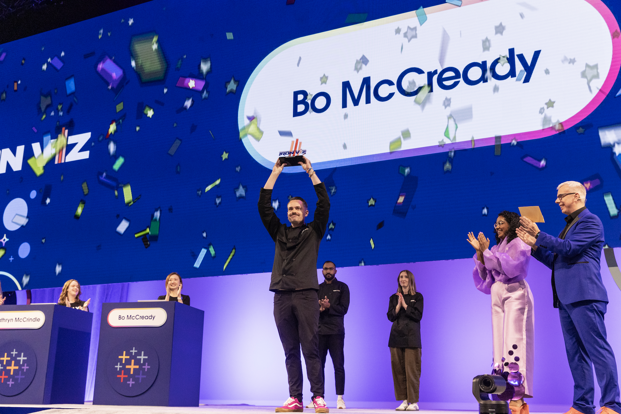
And the 2025 Iron Viz Champion is…Bo McCready!
The 2025 Iron Viz competition concluded with a display of exceptional data storytelling from all three finalists, each presenting a captivating and distinct approach. It was the simplicity, storytelling, and design from Bo’s Two Eras of Safety viz that made him this year's champion. Congratulations to Bo McCready and his chosen charity, Girls Who Code!
Curious who the Iron Viz Fan Favorite winner is? This winner is chosen by the Community worldwide and awarded during the Vizzies Awards. And the winner is…Ryan Soares!
It’s not an easy feat to get to the Iron Viz finals and these three data stars did amazing, impacting many across the world. Feeling inspired after this breathtaking show, creativity, data skills, and everything behind it? Tableau Public is the place where these authors share their work. With over 5 million global profiles and 11 million vizzes available to explore, there’s something for everyone and for any topic.
Watch the 2025 Iron Viz competition on Salesforce+ and stay tuned for next year's competition! Win or learn, you cannot lose by participating in Iron Viz. Congratulations to everyone who participated in the 2025 Qualifiers, and special congratulations to Ryan, Kathryn, and Bo on a viz-tastic showdown!
Related Stories
DataFam Roundup June 2026

Tableau Ambassador Nominations and Applications are Open
 June 10, 2026