Stepping through Charted Territory: Creating Interactive Step-by-Step Dashboards Tours


This is work co-authored by Naimul Hoque, a Salesforce Summer 2024 intern at Tableau, and Assistant Professor at University of Iowa, and Tableau Research member Nicole Sultanum. This work was presented at the EuroVis 2025 conference. You can find the full paper and demo video on Tableau Research.
Back in 2023, I attended my first Tableau Conference, where I had a chance to showcase DataTales—an early “GenAI for data stories” proof-of-concept for data-driven communication—to various Tableau customers. At that event, we heard different accounts of the same underlying issue: everyone is overwhelmed with dashboard-based communication. Be it countless phone calls to onboard confused dashboard users, or having to resort to extremely templated reporting for weekly shareouts, many felt the limited bandwidth they had for dashboard communication wasn't enough to make justice to the depth and nuance of their message.
Inspired by this challenge, we sought to find ways for GenAI to help dashboard users get the additional context they needed, and for dashboard authors to package and deliver it more easily. Together with Naimul Hoque, we found clarity by first understanding current practices and challenges around dashboard guidance. From additional conversations with Tableau customers, we learned that:
- Embedded dashboard guidance (as opposed to external documentation that forces you to leave the dashboard) is the gold standard. Within that, transparent overlays—like in these brilliant examples from the Tableau Community Emily de Padua, Kevin Wee, and Brittany Rosenau—are a #DataFam favorite published on Tableau Pubic, and a great example of on-demand guidance. However, they are largely static, they obstruct dashboard interaction, and they must be remade when something in the dashboard layout changes.
- While dashboard guidance goes beyond just explaining what a dashboard can do, we found most communication intents fit nicely into a small set of categories, of which I highlight three: (a) Interaction Guidance, which explains how a user may interact with the dashboard and what interactive features are available; (b) Dashboard Semantics & Encoding, which explains how users should read and interpret visualizations; and (c) Data Facts/Insights, which explains highlights in the data, such as outliers and trends.
- Dashboard guidance often comes as a one-size-fits-all solution, but not necessarily for user needs. Users come from different backgrounds, vary in analytical goals, and showcase various levels of visual literacy, so it follows that the extent of guidance that they need would also differ. But given the onerous nature of guidance authoring, dashboard guides are rarely deep or diverse.
If only I had a Dash(board)Guide…
Based on these findings, we found that there was a need to reduce authoring barriers for guidance, while still packaging this guidance in effective ways. To help address this problem, we borrowed inspiration from the highest quality guidance there is, which is having an expert take you by the hand: that is, the exact thing Tableau creators wish they had the bandwidth to do, and dashboard users wish they had more access to. This led to the creation of DashGuide.
In a nutshell, DashGuide helps dashboard authors create dashboard tours: that is, interactive, step-by-step guidance directly embedded into dashboards and leveraging existing dashboard interactivity from filters and data highlights. From a dashboard user's perspective, the experience looks like this:

Fig 1. A dashboard tour, created with DashGuide, that walks dashboard users through the dashboard following an authored step by step trajectory. As users step through the tour, the dashboard updates to highlight relevant marks.
“Oh, but isn't it really hard to build something like this in Tableau?” Yes! Not just the tooling for interactive step-by-step actions, but also the linking between guidance steps and relevant dashboard actions, plus the drafting of the content itself. But DashGuide naturally bridges that gap, by capturing the experience the dashboard author would have if walking someone through the dashboard by demonstration. More specifically, it follows a similar strategy to screen capture guide generators, which record interaction workflows and create step-by-step guides with screenshots.
Creating a dashboard tour with DashGuide is pretty straightforward. After specifying what kind of tour they are looking for (based on the three communication intents that emerged from our research) , tour “guides” can record their interactions on a dashboard of choice by interacting with elements of interest, which maps each interactive action to a step in the tour. After the recording is finished, generative AI fills in the blanks and a first version of the tour is ready. In mere minutes!
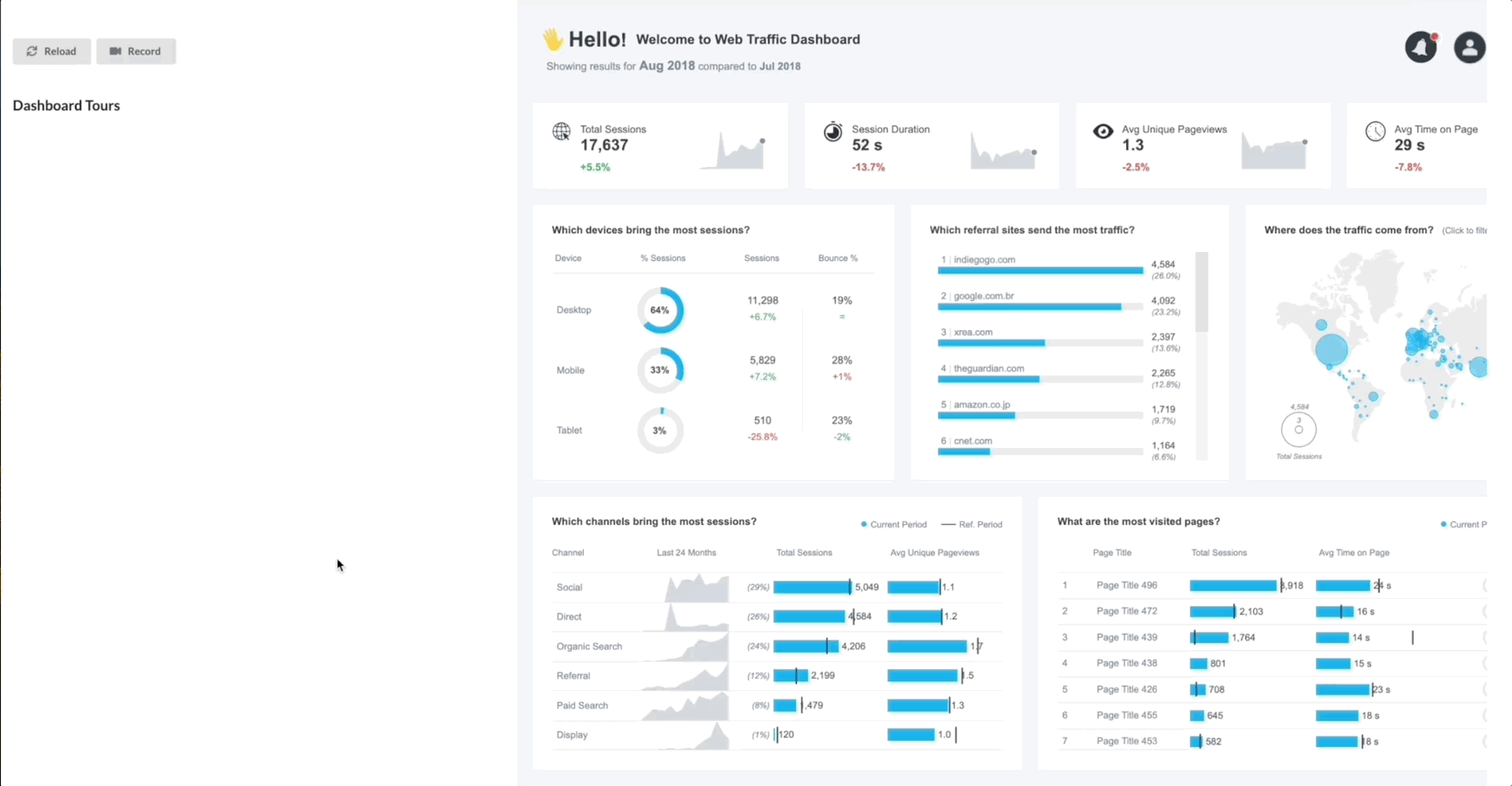
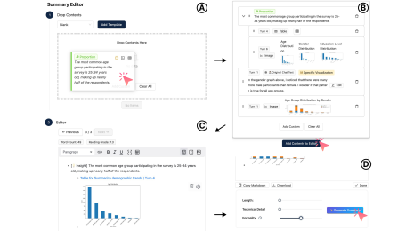
Fig 2. Workflow of a dashboard “tour guide” using DashGuide. In summary: hit record, specify communication intent, play with the dashboard in the intended order, pause recording… and voilá.
And if a few more minutes can be spared, tour guides can continue refining their tours by recording additional steps, tweaking content, or re-generating tour content following their own custom criteria. And because dashboard tours are so quick and easy to create, tour guides can actually afford the time to create not one but multiple tours for the same dashboard if they so wish, each tailored to different dashboard user audiences and needs.
Tour Guides Unite
We invited Tableau Visionaries and Ambassadors to try out DashGuide, and received overwhelmingly positive feedback. They found the guide-by-demonstration approach intuitive (e.g., “it makes sense to do the action I think the user will take”) and efficient (e.g., “Guidance is the last mile of dashboarding, the quicker I can make it the better”), and the content authoring features helpful to overcome blank screen paralysis (e.g., “I would probably spend a lot of time writing up and thinking about and I don’t feel I’d have to make a lot of changes”).
DashGuide was also recently shared at the Tableau Visionary Summit during Tableau Conference 2025. The Tableau Visionaries once again responded positively, especially to the idea of customizing AI-generated content without relying on external tools. There’s clear potential here to improve user onboarding, accessibility, and overall dashboard adoption.
Looking ahead, there is interest from the Tableau community in how DashGuide might evolve—for example, adapting to live data updates, expanding compatibility across Tableau platforms, or offering different guide types tailored to varying user needs.
For more details, check out the full research paper and demo video on DashGuide.
Related Stories

Which Model Speaks Your Data Language? A User-Centered Approach to Evaluating LLMs for Conversational Visual Analytics
 April 14, 2026
Rethinking How Data Workers Revisit Analytical Conversations and Communicate Insights
 April 10, 2026
Visualize, Narrate, Repeat: Closing the Loop on Data Storytelling
 June 2, 2025