How visual analytics helps audit and risk professionals shorten time to insight


Editor's Note: Visual Risk IQ is a long-standing Tableau Partner that specializes in helping finance and internal audit professionals see and understand their data. The firm has completed hundreds of successful data analytics projects for clients in all industries and their innovative approach to on-the-job training and mentoring helps shorten the time to insight.
Background: Data analytics is not “new”
Data analytics within the finance, risk and internal audit worlds are far from new. Spreadsheets became pervasive in finance and audit more than 30 years ago and traditional scripting languages and report writers are equally “of age” in the business world. Despite these advances in technology, most internal audit programs still begin with key steps that say “select a sample of transactions.”
Professional standards have mandated for more than 10 years that internal auditors consider the use of data analytics during planning, yet we find in practice that sampling is the predominant testing method for many internal audit teams. Even when entire populations of data are evaluated, they are tested as often with spreadsheets as they are with more robust tools. Spreadsheet use can create potential blind spots for auditors, particularly around data integrity.
In this blog, we'll share with you how to improve query design and create time savings by automating recurring risk and audit steps and solving for blind spots spreadsheet use can cause. We begin by describing the skills that effective audit teams need to execute on these process changes. Read on to learn why it's necessary to incorporate data analytics—at the minimum, data-driven alerts—instead of only sampling or spreadsheet analysis into your audit and risk functions.
In our experience, a repeatable process for audit and risk-focused analytics requires changes in approach that incorporate connecting business questions with an understanding of underlying data sources. At Visual Risk IQ, we developed a QuickStart process brings business and data-focused professionals together to connect their business questions to data sources.

What skills are needed for data analytics?
The single biggest key to success is ensuring that finance and audit domain expertise is supported by team members who have equally strong knowledge in data acquisition and data preparation. It definitely takes both of these skills for success with self-service data analytics. Having completed over 200 successful, data-driven internal audit projects across a variety of industries, we Visual Risk IQ continually see that this combination of skills is required.
Borrowing from the Association of Professional Research Analysts, who have developed a Body of Knowledge specific for data analytics in the fund-raising world, we have found that similar areas of expertise are needed for successful data analytics for finance and audit professionals:
- Project management
- Data acquisition and manipulation
- Statistical techniques
- Visual reporting techniques
- Communication
- Finance and audit domain expertise
- Change management and strategic thinking
All of the above skills are rarely if ever found in the same individual, hence we believe that finance and audit-focused data analytics should definitely be considered a team sport instead of an individual one. And that supplementing audit or finance skills with data-specific and visual reporting schools is an especially powerful idea.
In our experience, the visual reporting techniques are often the least developed skills from this Body of Knowledge in the finance and internal audit community. Finance professionals are very quick to run confirmatory queries to identify issues; for example, confirming if any invoices have been dated prior to a purchase order date. But instead of first exploring the number of days between invoices and purchase orders to understand the average or a minimum or maximum number of days, a confirmatory table that says “list all if Date A is prior to Date B” is too often considered an ultimate answer. Perhaps finance and audit professionals are better with confirmatory queries because scripting languages and traditional report writers are better tools for developing confirmatory queries than they are for developing exploratory queries.
Exploratory queries lead to data discovery and aligns better with the future of self-service, data analytics. Special IT or programming skills are no longer needed because modern tools like Tableau make exploring and analyzing populations of data easier. It only takes a few clicks to rank or sort transactions from largest to smallest or oldest to newest. And together with a few filters, an interactive dashboard can be created for exploration and finding greater insights than ever possible with spreadsheets or scripting languages.
For more on visual reporting techniques including matching your chart type to your business question, we recommend Stephen Few’s Show me the Numbers book and blog. One of the most important techniques for visual reporting done with Tableau are dashboard actions and “viz within a viz” where a high-level exploratory chart (e.g., time series or part-to-whole) can be used to select or filter a Ranking chart specific to a category or date range. This allows the person who is asking and answering an initial question to solve their next question without additional programming.
Other auditing tools and their limitations
While spreadsheets can be versatile and most auditors and analysts are highly experienced with them, we find that spreadsheet use creates potential blind spots for those seeking a full picture of their data, particularly around data integrity. The risks of spreadsheet formula errors and even accidental updates to data while scrolling in, sorting, or filtering a file is too great to make spreadsheets a trustworthy choice for most internal audit use. You may miss outliers and patterns from exploring entire data populations with ordinary exception queries or working with limited data sets in spreadsheets. Beyond using a more robust analytics platform that supports querying all of your data, your team needs to be staffed appropriately to manage evolving risk and audit functions.
Even for organizations that occasionally use scripting languages in their internal audit work, it is common for the tools to be used only once or twice and then atrophy with staffing changes. Perceptions and even realities regarding the high costs of ad hoc analyses cause these scripting tools to become “shelfware” at many organizations. We advocate that data analytics and particularly exploratory, visual analytics should be a more regular and repeatable process within internal audit planning, fieldwork, and reporting.
Great examples of visualizations for better auditing
Our favorite visual reporting applications allow for exploratory querying, which leads to data discovery, supporting a self-service, data analytics model. Examples we like for finance and audit professionals include travel and entertainment testing or Procurement Cards, since error rates are often high due to after-the-fact approval for this sort of spending.
This dashboard for Oklahoma P-card data can quickly show outliers indicating duplicate or out-of-policy expenses. This visualization is one of our favorite exploratory queries.

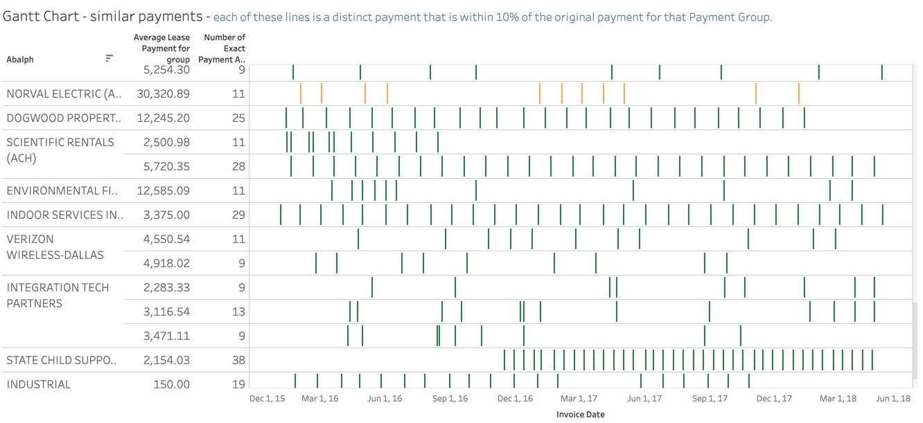
More recently we’ve used Tableau to identify groups of disbursements that may have implications for ASC 842 (a new Standard on Accounting for Leases). The white space in each vendor payment row in the Gantt chart below shows the time between payments of similar amounts. Regularly-spaced groups of vertical lines indicate an increased likelihood that these payments represent a lease requiring disclosure under this new accounting standard.
What visualizations have you created that have made an impact on your finance and internal audit teams? For more inspiration, consider joining the Tableau Office of Finance community user group and attend meetings to interact with and learn from your peers.
To discover how to take a proactive approach to exposing risk and improving audits, visit the Tableau Audit, Risk, and Compliance Analytics solutions page.
Related Stories
How EMD Serono is improving patient care with personalized, AI-powered insights from Tableau
 September 30, 2024

Embedded Analytics: Should you build or buy?
 June 7, 2022

Data fabric’s value to the enterprise
 May 11, 2022