Express your data artistry with transparent worksheets in Tableau


Unleash your inner data artist with transparent worksheet backgrounds in the newest Tableau release (2018.3). For added consistency, you can use this feature in combination with existing transparent filters, highlighters, and parameters.
Make any worksheet background transparent (including maps) with just a few clicks. This allows you to align with company brand standards or be creative by adding a custom background image to your worksheet or dashboard.
How to create transparent worksheets
Start by selecting a worksheet. From the menu, choose Format. In the Formatting pane, set the Worksheet color to None. You may want to adjust font color to maximize readability.
![]()
To adjust the level of opacity, go to the dashboard Layout pane, select the worksheet, and change the dashboard background color opacity setting.
To make your background transparent for maps, it takes a few extra steps. To apply transparency, select the worksheet with the map visualization. In the Formatting pane, set the Worksheet and Pane background color to None. When creating a new map, Tableau will automatically set these colors.
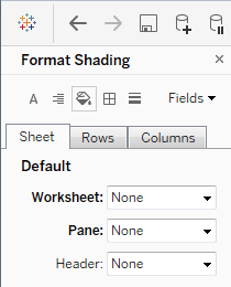
Also, turn off the borders and lines while you’re there. Next, in the menu, click Maps > Map Layers. In the Map Layers pane, remove the base layer, which is opaque.

If you are zoomed out, you probably want to turn on the coastline layer to see the geographic outline of land masses. Try turning other layers on and off to determine the best view for your analysis. Because the default Tableau map style has numerous layers that you can selectively remove, the viz type works well with transparency.
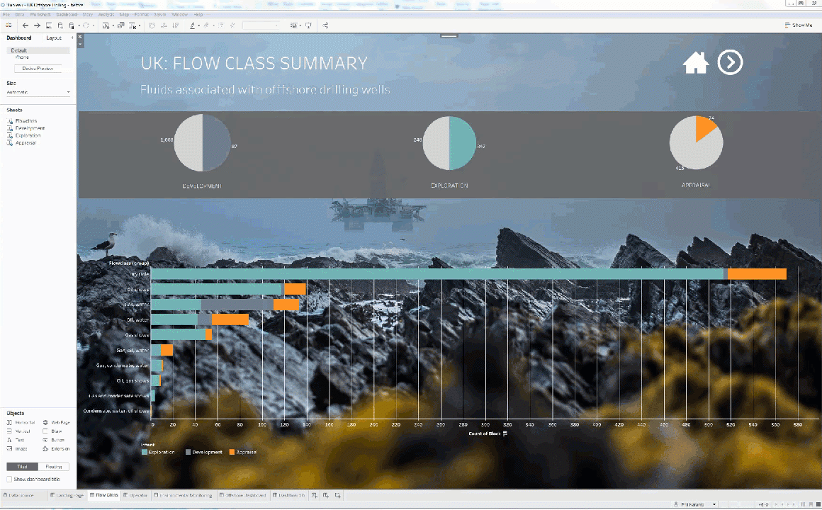
Here’s a dashboard that I created using this style:

Tips and tricks for working with transparent worksheets
Transparent worksheets open up a lot of exciting possibilities to express your creativity. Here are some other helpful tips to make the most of this feature:
Data first. Worksheet transparency enables you to create beautiful, stunning dashboards. However, keep in mind that the subject of your data should always drive the formatting and analytical usefulness and readability should always come first. When choosing background images, ensure that those images aren’t obscuring axes, labels, or marks. For starters, stick with visually simpler background images with long stretches of uniform color like a blue sky, the sea, etc.
Layering worksheets. Advanced authors may want to create layered vizzes by stacking multiple worksheets. It’s a compelling way to reveal insights by combining several visualizations into a single view. If you do, keep in mind that that feature makes the background transparent. It doesn’t auto-align and synchronize axes across layered worksheets.
Polishing lines. To polish vizzes, you can remove some of the lines on your dashboard (row dividers, grid lines, etc). Alternatively, you can also change the line color to optimize their contrast with respect to the background image. You can make these changes in the Formatting pane.
Adding background images. To add a background image, go to the bottom of the Dashboard pane, set the layout mode to Tiled. Next, double click on the image object and choose an image. Use the fit and center options to position your image. To eliminate white padding around the image, switch to the Layout pane and set the outer padding to zero pixels. Be mindful that very large images might impact dashboard load times when viewed from Tableau Server.
Captions & Upgrade. In some cases, when you upgrade to Tableau 2018.3, you may notice a change in your existing dashboards. In floated worksheets where captions are above an image or other item, the caption might be set to transparent. If you’d like to override this change you can always manually change the caption background to opaque.
Start creating!
Worksheet transparency is a valuable tool for making beautiful dashboards with just a few clicks. It was a frequently requested feature on the Tableau community forums and we are excited to see what creative possibilities it unlocks for you. If you’re looking for ideas for how to use this feature with your dashboards, be sure to check out the Tableau 2018.3 viz gallery for more examples of transparent dashboards.
Get the newest version of Tableau today, and if you’d like to be involved in future beta programs to test new features, please sign up to participate!
Related Stories

The Tableau+ Bundle with Premium AI, Enterprise Capabilities, and Premier Success
 June 24, 2026
What is Tableau Prep?
 April 30, 2026
Insights Wherever You Work: Meet the Tableau App for Microsoft 365
 March 16, 2026