Dynamic Color Ranges in Tableau: Clearer Visual Analysis


Andy Kim, based in Seattle, WA has been a developer at Tableau for nine years. He was a key part of the team that built the underlying platform to ship a variety of “dynamic” features in the past, including Dynamic Zone Visibility, Dynamic Axis Ranges and Titles, and Dynamic Parameters. Andy and his team have always had a clear vision: to provide the essential building blocks to empower users to create unique visualization experiences.
Outlier data can wash out nuanced data. Imagine analyzing sales performance across thousands of regions. A few exceptionally high or low outliers, while important to note, can distort your entire color scale, making it impossible to distinguish subtle variations within the vast majority of your data points. The entire map might appear as one uniform shade, or simply black and white, washing out the crucial middle ground where most of your actionable insights reside.
Historically, Tableau's color range options were either fixed or automatic. While functional, these approaches presented limitations:
- Limited User Empowerment: Users with view-only permissions could not update the color, which greatly limited their ability to explore and analyze data independently.
- Contextual Blind Spots: The automatic option would update the range values only according to the data in the viz, which meant that you could not see how the filtered out data looked relative to what remained.
To empower users with clearer, more consistent visual analysis, Dynamic Color Ranges offer a transformative approach. This feature allows creators to quickly create visualizations that can account for these outliers and help viewers consume the data in a fast and effective way. Now, you can keep the data and effortlessly drill down into the insights that matter most.
What are Dynamic Color Ranges in Tableau?
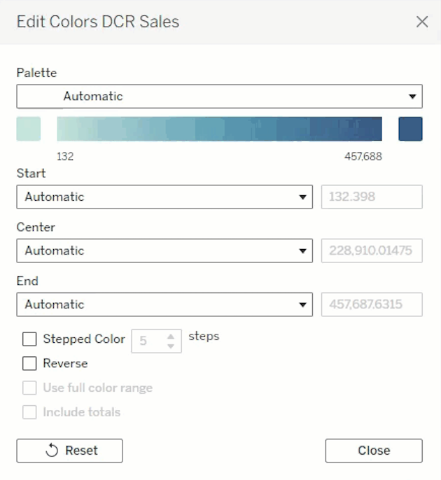
In Tableau 2025.2, we've introduced a significant update that fundamentally reimagines the Quantitative Color Dialog. Along with a refreshed UI, we've integrated a powerful new capability directly into the heart of how you apply color to your data. This update represents a seamless evolution of existing functionality, making it more robust and responsive than ever before.
The core innovation is the ability to set your color range values—be it the start, end, or even the center point to the value of a parameter. This means that instead of fixed numbers, your color legend's boundaries can now be driven by any parameter you create in Tableau. Think of it as making your color scale truly intelligent and interactive, capable of reacting instantly to user inputs or underlying data changes. This flexibility ensures your visualizations always display the most relevant and impactful insights.
This is a highly requested enhancement, similar to how we previously empowered users to make axis ranges dynamic by linking them to parameters. By extending this flexibility to color ranges, we're bringing a new level of control, precision, and analytical depth to your visual analysis, transforming static color legends into dynamic tools that truly illuminate your data.
How Dynamic Color Ranges Work
Dynamic Color Ranges revolutionize how you interact with your data's visual representation. Now, you can update the range value dynamically by tying it to a parameter. This addresses the previously mentioned issues and because these are tied to parameters, a core component in Tableau, this even allows for several new capabilities:
-
Show the Parameter Control: The most straightforward way to leverage Dynamic Color Ranges is by simply showing the parameter control. This immediately grants your viewers newfound analytical capabilities without needing permissions to edit. Instead of relying on a pre-defined scale, they can now directly update the range values. This empowers a truly self-service experience, allowing users to ask "what if" questions and visually explore data from countless perspectives.
-
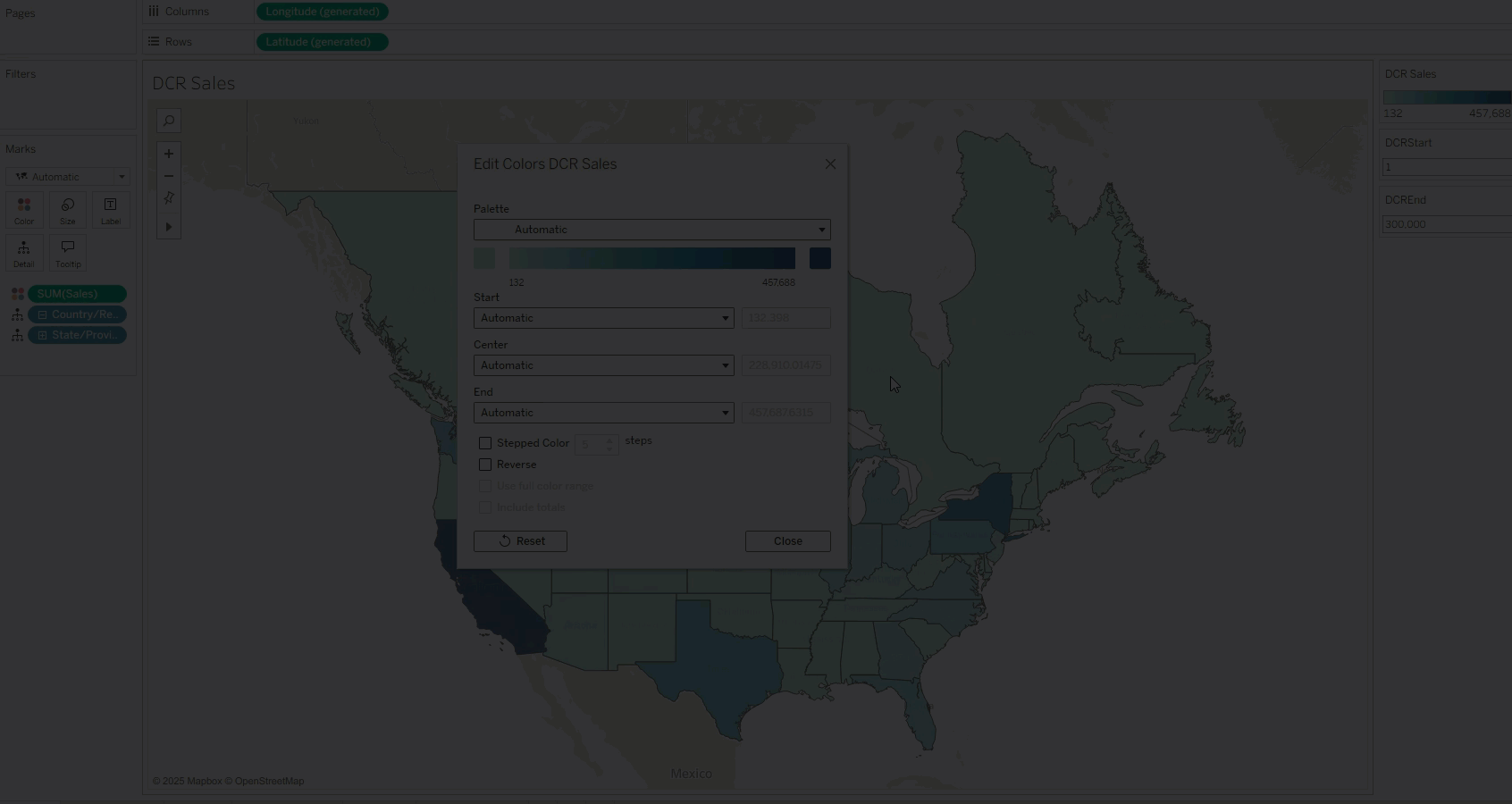
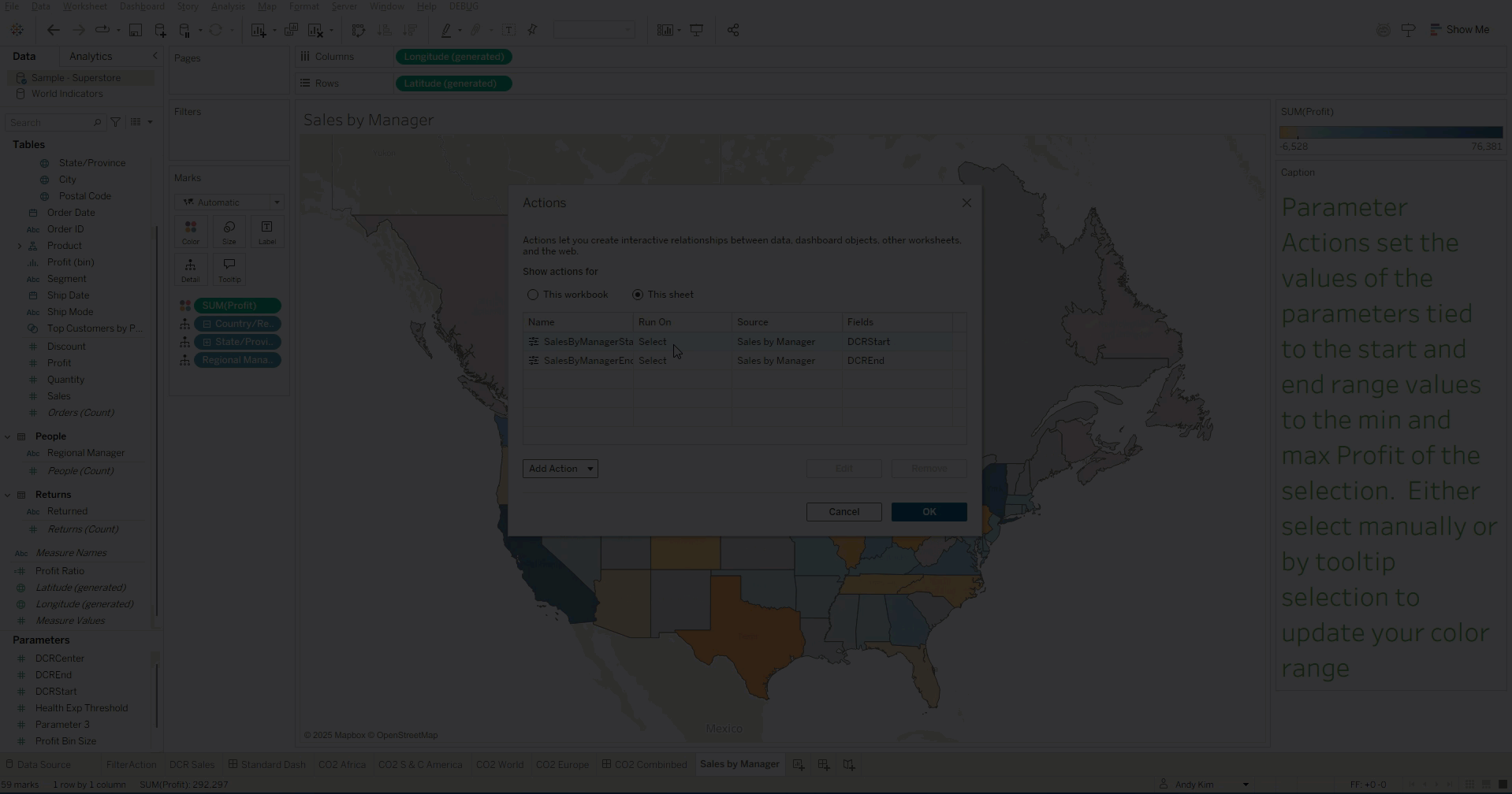
Interactive Exploration with Parameter Actions: This is where Dynamic Color Ranges demonstrate their transformative potential for advanced interaction. Coupled with parameter actions, you can now interactively update the color ranges based on your selection or on mark hover. Thus, you can see how your data looks relative to your selection. Here’s an example of selection being driven manually and through Tooltip Selection:
-
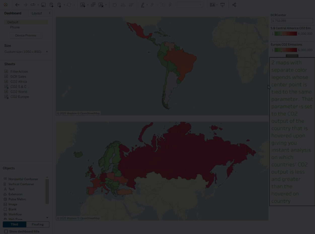
Sync Color Range Values Across Multiple Visualizations: Consistency is paramount in effective dashboard design, especially when presenting complex information across several related views. Maintaining a consistent and comparable color scale across multiple charts on a single dashboard has often been a design and development challenge. Dynamic Color Ranges solve this elegantly and efficiently. You can now tie the same parameter to multiple color legends, thereby syncing your range values between visualizations. This creates a cohesive, synchronized analytical experience, making comparisons seamless, reducing cognitive load for your audience, and maintaining visual integrity. Here’s an example of a divergent color palette’s center being instantly set on the hovered upon country:
Use Cases for Dynamic Color Ranges
Dynamic Color Ranges are another example of core capabilities that will unlock advanced analytics. We like to call these “building block” features. As seen previously, combining these with different building blocks such as actions help give viewers a new way to look at their data interactively, giving them instant insights that were not previously possible. Some of the powerful new ways you can use dynamic color ranges include:
- Customize the actions such as aggregating your range value to the first or third quartile (instead of min or max) in order to ignore outlier data that washes out the palette.
- Add more fields to your viz detail so that Tooltip Selection can drive the selection actions by more dimensions.
- Make your parameters dynamic so that they update automatically as your data refreshes.
Clearer visual analysis means more accessible insights for everyone. As you leverage Dynamic Color Ranges to highlight nuanced data, consider how these dynamic controls can also enhance the accessibility of your dashboards for users with diverse needs. By providing flexible control over color scales, you can adjust palettes to their preferences, or ensure that key data distinctions remain clear even when viewed through different accessibility lenses. This commitment to inclusive design ensures your powerful insights are truly available to a broader audience.
Learn more about Tableau features and connect with the Tableau Community
Discover all the features brought to you in Tableau 2025.2 by visiting the full release page today. Upgrade to the latest version of Tableau to start using all of these powerful new features. This feature is available in Tableau Cloud, Tableau Desktop, and Tableau Public. Learn more about Dynamic Color Ranges, and connect with the product managers behind Tableau’s innovations—register for Tableau’s DataFam Discovery Inside Track events and join the Tableau Community Slack Workspace to get exclusive insights, resources and helpful content to help you build your data skills.
Related Stories

The Tableau+ Bundle with Premium AI, Enterprise Capabilities, and Premier Success
 June 24, 2026
What is Tableau Prep?
 April 30, 2026
Insights Wherever You Work: Meet the Tableau App for Microsoft 365
 March 16, 2026