5 built-in statistical functions you didn’t know Tableau had


While Tableau’s speedier release cycle means you get your hands on new, sexy features faster, it also means that some older, more basic ones can get lost in the hype. Statistics-related functionality is in demand more than ever, but Tableau is generally better known for its ease of use than analytical rigor. While statistical tools conjure images of complex equations and calculations, Tableau does many of these computations with a drag and a drop.
This post discusses a few easy, but powerful features for statistical analysis, and offers additional resources so you can make the most of your data with the right analytics.
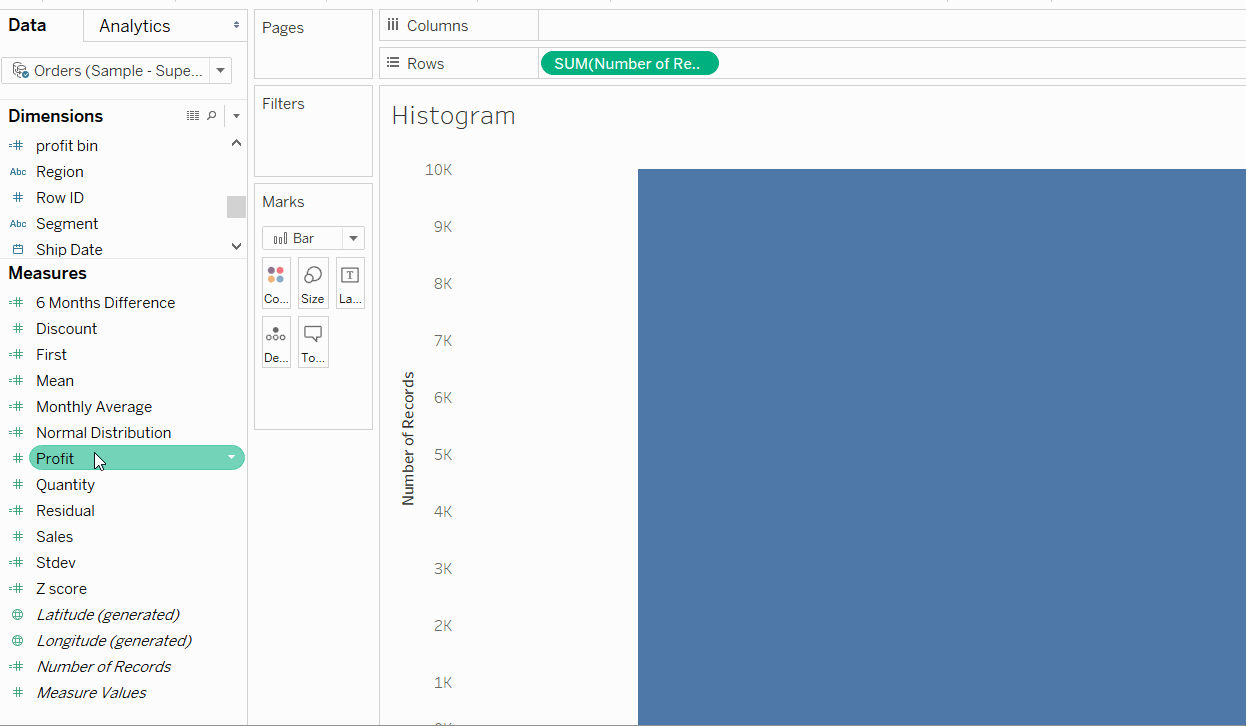
Histograms: More than just a bar chart
Histograms are a powerful tool for making sense of large data sets. They show the frequency of data broken into equal-size bins. Plotting this data shows whether it’s distributed normally or skewed.
In Tableau, histograms can be created with just two clicks. Not many users know that if you right-click on a measure and navigate to the Create menu, you can easily make bins, parameters, calculations, and groups. Tableau will even suggest a bin size for you!
A classic example of a histogram is the distribution of SAT scores. The scores are bucketed in increments of 50 or 100 points and the bars represent the number of students scoring in that bin. Students are reassured that a score of 1600 is rare, and most scores fall in the middle of the range.
Residuals: How accurate is that trend line, really?
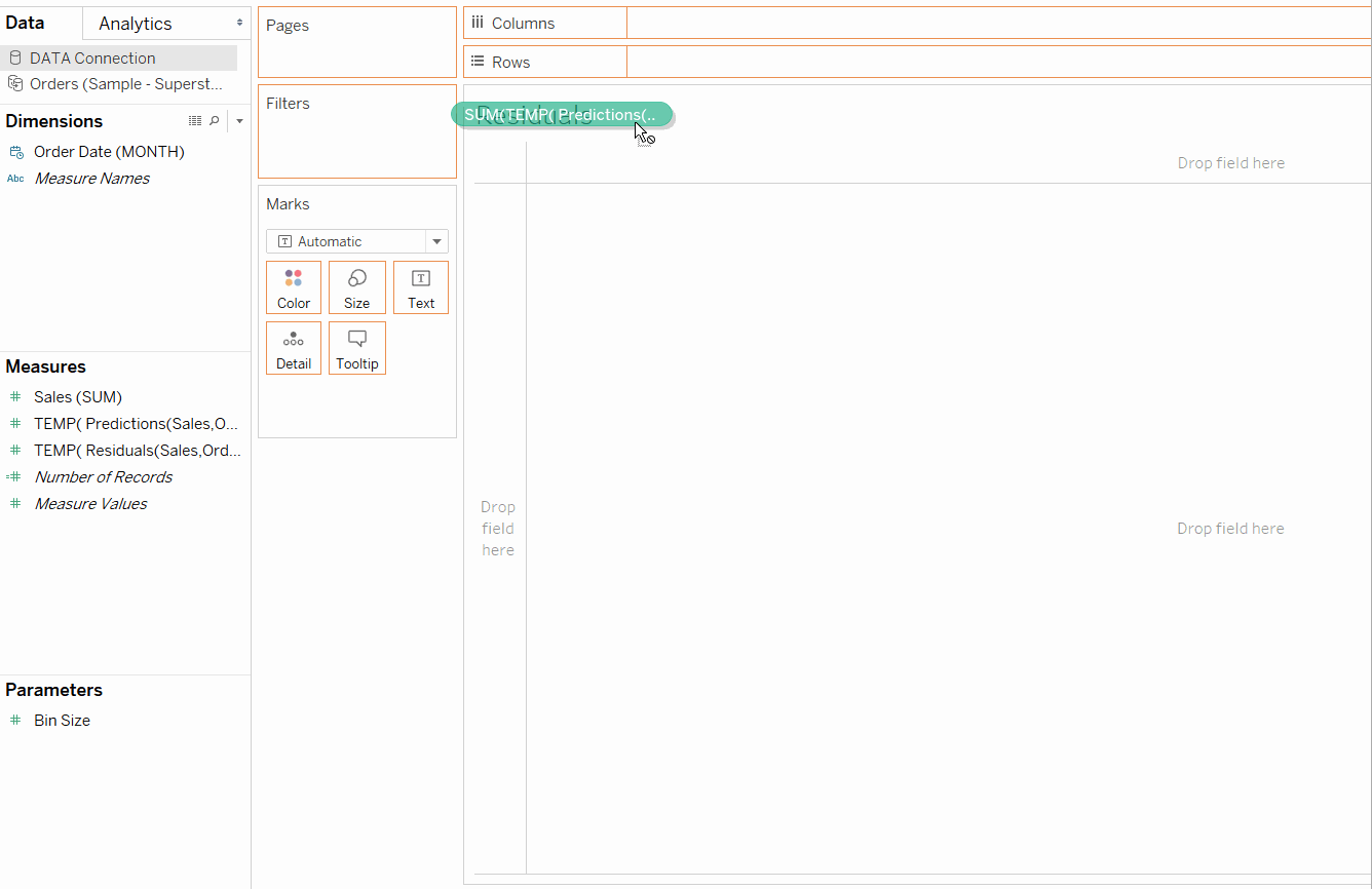
A residual, also known as the error, is the difference between the observed, or actual, value and the predicted value. Creating a residual plot is a visual way to determine how accurate a regression model is. Of course, you can also examine the R squared and p-values in Tableau.
On Windows, Tableau allows you to export residuals from views with a trend line. From the worksheet menu, navigate to Export, Data, select your data file, and the residuals will be saved as an Access file. You can choose to directly connect to this new data source that has the dimension that was on the x-axis (Order Date in this example) and measures for the predictions and residuals. Drag residuals to Rows and predictions to Columns, then drag your dimension to Detail. The more spread out the points are on the resulting scatterplot, the more accurate the model.
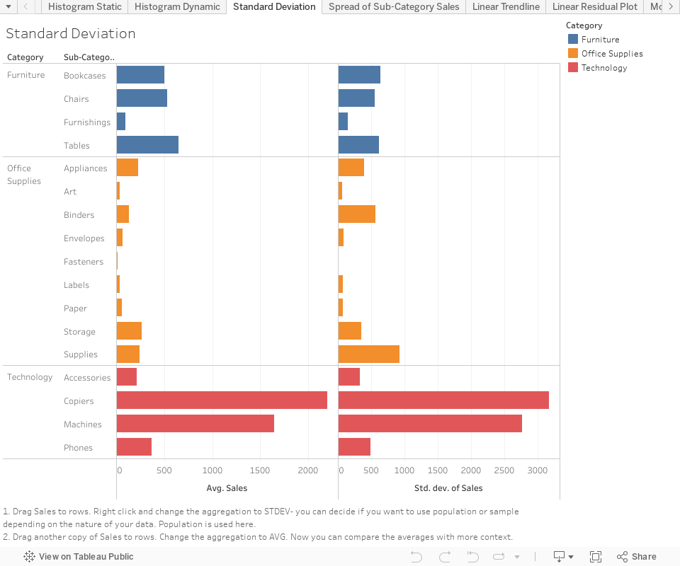
Standard Deviation: How spread out is my data?
Standard deviation is an equation you probably learned in high school, but haven’t thought much about since. Standard deviation is simply a measure of how spread out data is from the mean. There are actually two methods of calculating the value: one for the population and one for a sample. This is exactly what it sounds like: If you have an entire dataset, use the population equation; if it’s a sample of a larger dataset, use the sample equation.
Finding the standard deviation in Tableau just involves changing the aggregation of a measure. Both population and sample standard deviations are built-in aggregation options. In the example below, the standard deviation puts the mean in context—copiers have a high average sales value, but also a high standard deviation. In the plot below, we can see that there is a sale of one very expensive item that is driving the mean higher.
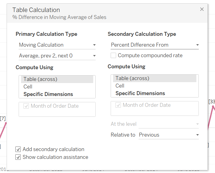
Quick Table Calculations: Moving Average and Percentile
Table calculations are a very popular feature in Tableau, but some of the calcs don’t get as much love. In particular, Moving Average and Percentile.
A moving average helps to filter out some of the noise in the data and visualize a trend. In Tableau, the Moving Average calculation is customizable. You are able to choose how many periods to compute using, which dimensions to use, and even add another table calculation on top of the moving average—for example, a percent difference from.
Percentile conjures the image of your pediatrician telling you you were in the 90th percentile for height in your age group. But, it can be a helpful way to compare data points (or aggregations) to the larger distribution. Instead of just eyeballing numbers (Sales, for example), the percentile calculation will rank where data points fall in the distribution.
Not-as-quick Table Calculations: Window and Reference Calculation
Functions like LOOKUP(), PREVIOUS_VALUE(), and FIRST() can seem intimidating at first. You probably saw them in a calc you copied off a Tableau blog post, or when you materialized a quick table calculation. LOOKUP() is the foundation of many calculations, such as percent difference.
The function allows you to reference another value in the partition, by the offset you specify (or make it dynamic with a parameter). Although most straightforward percent change calculations can be accomplished with the Quick Table Calculation, using LOOKUP() is valuable in understanding how the underlying functions work. Then, you can include them in more complex calculations such as logical statements and date calculations.
Window calculations are great for summarizing data in a view. They allow you to add an aggregation on top of a measure that is already aggregated. For example, WINDOW_AVG(SUM([Sales])) will return the mean of every sum of sales in the view, the same value that adding an average line would return. Window calculations are especially applicable when you need to reference a value summarizing the larger dataset. In the example below, the Z score is calculated using WINDOW_AVG and WINDOW_STDEV. The expression is calculating how many standard deviations (of the data in the window) an observation is away from the mean.

Bonus: R and Python integration
Want to take your statistical analysis to the next level? Connect to an R server or install TabPy, and you can write scripts in R or python in calculated fields. Learn more about these functionalities in our whitepaper Advanced Analytics with Tableau.
Ready for more advanced analytics?
We believe that to help everyone see and understand data, we need to provide rich capabilities for users of all levels of technical ability. From simple, go-to metrics to advanced analytic techniques, Tableau provides a flexible front-end for data exploration with the necessary analytical depth for the data scientist. By leveraging sophisticated calculations, R and Python integration, rapid cohort analysis, and predictive capabilities, data scientists can conduct complex, quantitative analyses in Tableau, and share visual results to facilitate better understanding and collaboration with data.
Join the conversation with #HardcoreAnalytics, and check out these resources for an even deeper dive:
- Sign up for the Advanced Analytics webinar series.
- Read Advanced Analytics with Tableau to discover how Tableau's advanced analytics features work.
Related Stories
VizQL Data Service from Tableau: Use Your Data, Your Way
 August 8, 2024

When and How to Use Multi-fact Relationships in Tableau
 August 1, 2024

Top data books of 2021
 December 12, 2021