Who’s Leading Whom? Predictive Markets Versus Polls


 The attached packaged workbook offers quick filters that let you interactively explore the leading/lagging correlation in more detail. You can view this packaged workbook using the free Tableau Reader, or for a complete experience download the free trial of Tableau Desktop.
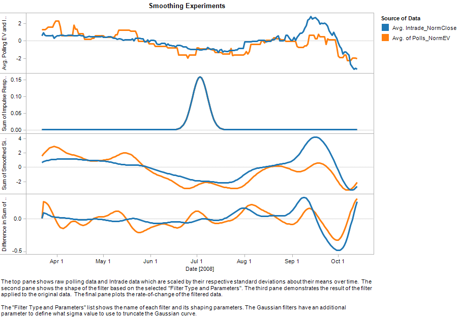
This workbook helped us explore how to generate a smoothed version of the raw polling and Intrade data, as visualized in the middle pane of our guest post chart. This was a key step in our analysis, because the final pane uses a rate-of-change table calculation in Tableau that is very sensitive to the rapid day-to-day changes in both the polling data and the Intrade data. Like focusing a camera lens, we needed to blur the short-duration changes in order to focus our attention on the longer-term trends.
Using Tableau's quick filters in the attached workbook, you can experiment with the parameters for our approximate-Gaussian smoothing filter. You can see how important it is to use a good low-pass filter; for example, a Gaussian must be “clipped” in practice (to yield a finite support), but too much clipping erodes its low-pass characteristics and produces graphs which are significantly obscured by high-frequency noise.