Animated GIFs with Tableau?!?
Editor's note: Darrick Bartley is a Finance Analytics Analyst at Tableau, and a contestant in this year's Vizzart contest with his animated masterpiece, Blue Measures Cult.
As a data analyst here at Tableau, I spend most of my day using our products to help my fellow Tabloids see and understand the vast amount of data we create during our daily operations. I regularly create vizzes and dashboards that some may say are a work of art, but it’s not very often I get to use Tableau to create actual art.
A while back, there was a blog post about recreating Photoshop in Tableau that really captivated me. When the internal Vizzart Competition was announced, I knew I had to do something using a technique similar to that described by Merlijn in his blog post. However, I wanted to take it one step further.
The Pages shelf has allowed me to “animate” vizzes to show how data changes over time; so I thought to myself, “why not use it to animate my picture? Can I make a GIF in Tableau?”
First things first: find a donor GIF
The internet loves a good GIF, so there is no shortage of them to choose from. For the sake of simplicity, I chose one that was fairly short, only 5 frames. The more frames your GIF has, the more data prep you have to do. After a brief Google search, I found an online tool that will deconstruct an animated GIF into individual files for each frame.
Turn pictures into data
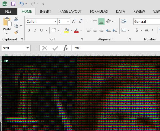
Now that I had broken my GIF into 5 separate (non-animated) files, I needed to convert them into a format for Tableau to read. Think Maths has a great tool for turning pictures into Excel spreadsheets. Each cell in the spreadsheet represents red, green, or blue and has a number in it that represents the intensity of the color.
If you zoom out on the spreadsheet, you can see your picture start to take shape:
Prepare the data
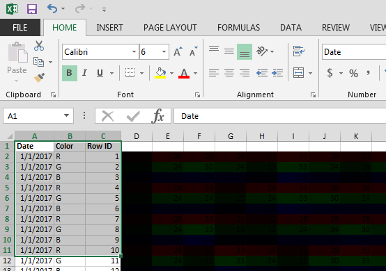
After converting my five pictures into 5 spreadsheets, I needed to do some data prep to allow Tableau to utilize my data easier. To each spreadsheet, I added three columns:
- Date – This doesn’t necessarily need to be a date, it can be any continuous value. Every row should have the same value, but each file should have an incrementally larger value (in my case 1/1/17, 1/2/17, 1/3/17, etc.).
- Color – This field isn’t required, but is helpful if you want to experiment with color in your workbook. The values in the spreadsheet represent Red, Green, and Blue in a repeating order.
- Row ID – A continuous value from 1 to whenever your file runs out of data (288 in my case)
After doing that, you can either combine everything into one large spreadsheet, or utilize the Union function in Tableau to save you a step.
Tableau time!
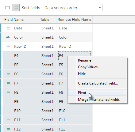
Connect to your Excel file(s) in Tableau. Once you’ve done that, click the Manage Metadata icon and select all of the unnamed fields (Tableau will default to naming them F1, F2, F3, etc.). Right click on the selected fields and choose Pivot. This is what the Data Source tab looks like before you pivot:
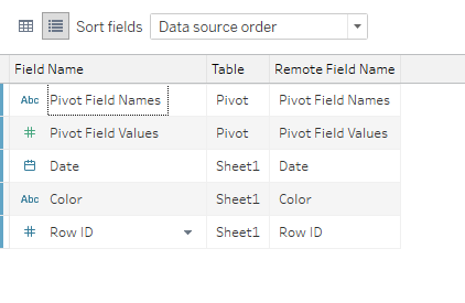
This is what the Data Source tab looks like after you pivot:
Build your viz
Building the viz is a fairly straightforward process: Place the Pivot Field Names dimension on the Columns shelf, and place the Row ID dimension on the Rows shelf as a Continuous measure.

Next, place the Pivot Field Values measure on the Marks shelf. Change the Mark type to Square or Circle (I prefer Square). You may to need play with the size of the shape a bit to get your picture looking its best.
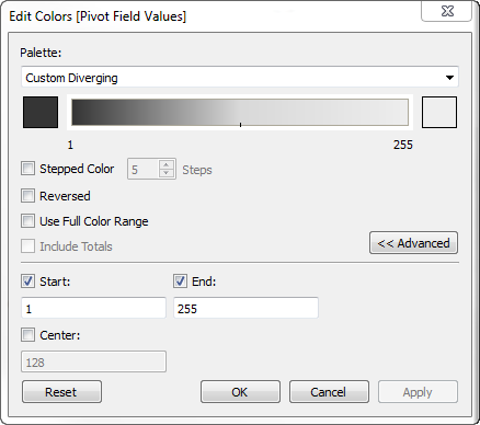
Now you should have a bright blue upside down version of your picture. Edit the Row ID axis to reverse the scale to get your picture pointing in the correct direction. Once you have done that, edit the color and create a Custom Diverging color scheme that starts at 1 and ends at 255. Small numbers get a dark color, and large numbers get a light color. I find that using a dark gray to light gray color spectrum gives better looking results than using a true black/white scheme. Once you’ve done that, it also helps to experiment with the opacity a bit.
But what about color?
Full color is definitely possible, but in the interest of simplicity for this tutorial, we are going with a monochrome color scheme. If you’d like to take your Tableau GIF to the next level, check out the Think Maths tool I referenced in the second paragraph.
Make it move
Now for the fun part! Take your Date field and add it to the Pages shelf. Set it to Loop Playback, choose Fast for the speed and hit Play. You just made a GIF in Tableau!

As much fun as it is to make a GIF with Tableau, it is also a great example of the power of Tableau. Each “frame” of my GIF is 288 rows by 128 columns in Excel; that’s over 184,000 marks that need to be calculated for a simple animation!
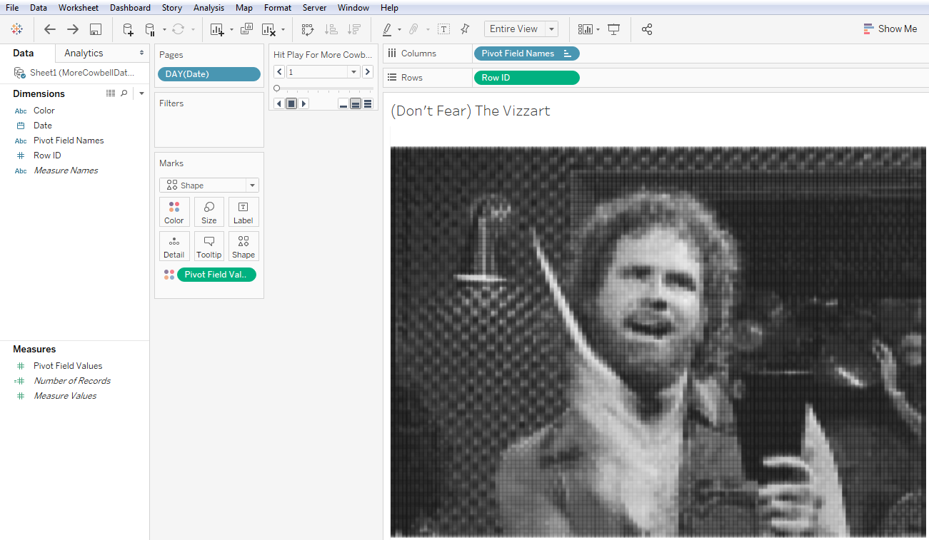
Here's what the viz looks like with the pages shelf in action!

Download Darrick's original workbook from Tableau Public to see how he made Blue Measures Cult, and then share your animated GIFs with us! Send links to your published, downloadable vizzes to the Tableau Public team or give us a shout out on Twitter.


