Now available in Tableau: Relationships, Metrics, powerful analytics enhancements, and more


The newest release of Tableau is here! Tableau 2020.2 brings significant enhancements to help you make sense of your data and get to insights faster. We want to help you use data to move quickly and make confident decisions during this challenging time, and we will continue to provide our support and innovation to keep moving us forward together. Upgrade to take advantage of these new innovations, and visit the Tableau COVID-19 Data Hub for more resources to help you see and understand data in context of the coronavirus outbreak.
Let’s look at the highlights in this release:
- Define relationships between database tables for more flexible, intuitive analysis.
- Monitor key performance indicators (KPIs) for your business from anywhere with Metrics.
- Dynamically change the members of a set with set control, and enjoy spatial data updates to enhance your geospatial analysis.
Let’s take a deeper look at some of the biggest features in this release.
Define relationships in your data to power flexible analysis
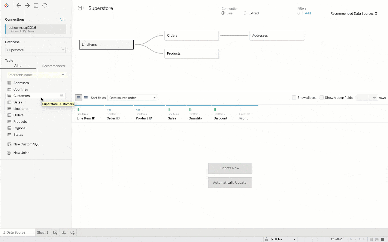
We’ve enhanced Tableau’s data model with relationships to help you easily analyze data from multiple tables at different levels of detail. Different from joins, which create a fixed output before analysis, relationships combine tables and aggregate data during analysis, querying data at the level of detail needed based on fields and filters in a viz. With relationships, you can combine tables with confidence because Tableau handles aggregation and joining automatically to fit the context of your analysis, resolving many data duplication scenarios, and ensuring you get accurate results without relying on LOD calculations.
Relationships help analysts and data stewards create flexible data sources, powering more analysis scenarios. Because you can preserve the level of detail for multiple tables within a single data source, each data source can help you answer a wider variety of questions. This means fewer distinct data sources for your organization to create and maintain.
Relationships are easy to create. When connecting to data in Tableau Desktop or in a browser, drag-and-drop tables into the canvas. In many analytical scenarios, using the default settings for a relationship will give you all of the data you need for analysis. In some scenarios, you might want to adjust the Performance Options settings to describe your data more accurately.
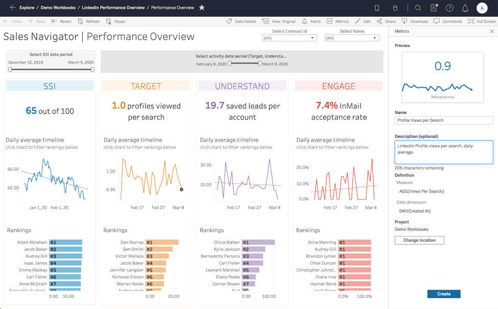
Put your data headlines at your fingertips
Metrics are a new content type that offers a simple way to monitor the key performance indicators (KPIs) you care about most. Metrics show an aggregate measure, such as sum of sales, and optionally a date dimension, such as order date. You get a headline view of your data in a consistent format, bringing you up to speed quickly. It’s just like checking your stock performance. Created from nearly any Tableau dashboard, Metrics provide a streamlined view of your KPIs across multiple dashboards all in one location—viewed either on the web or on the go with the Tableau Mobile app.
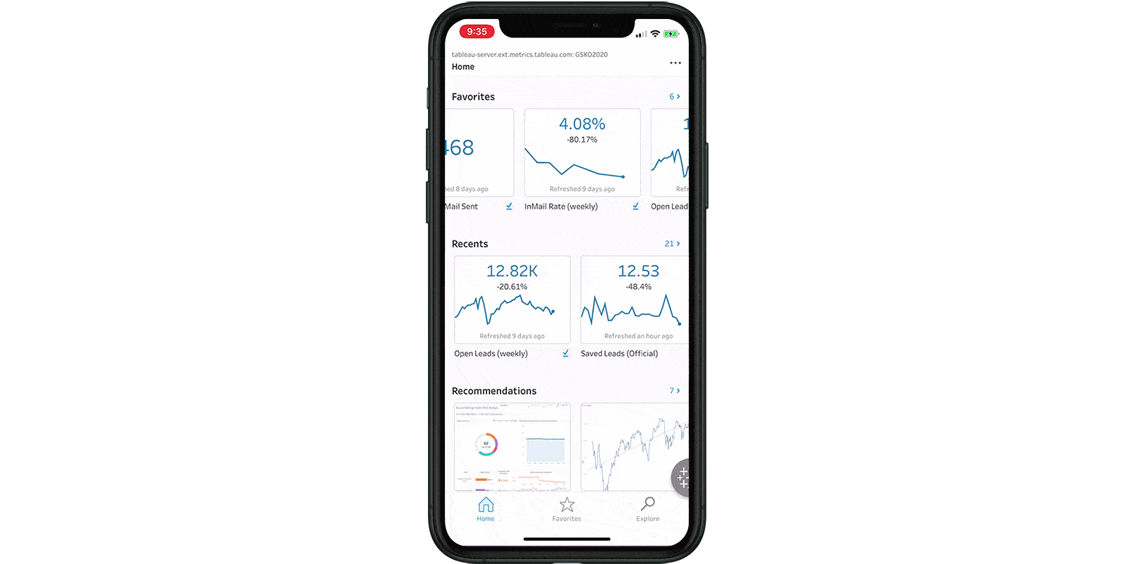
Metrics help those who don’t typically perform heavy analysis, but use data to make decisions and need a quick way to see their important KPIs. You no longer have to switch between different views and adjust filters to see the most recent values—with Metrics, you have a data digest that’s always up to date and informative at a glance. As a retail store owner, you might want to keep your daily sales value and the inventory of your most popular items easily accessible. In the current pandemic, many of us are carefully watching the daily count of new COVID cases.
For analysts who often have to create custom views for different stakeholders, metrics enable them to better scale their work across the organization, helping even more users get value from data. It’s easy to create a Metric, and because Metrics are a content type that lives within projects, users can move metrics between projects and favorite them.
Elevate your analysis with powerful analytics enhancements
Set control
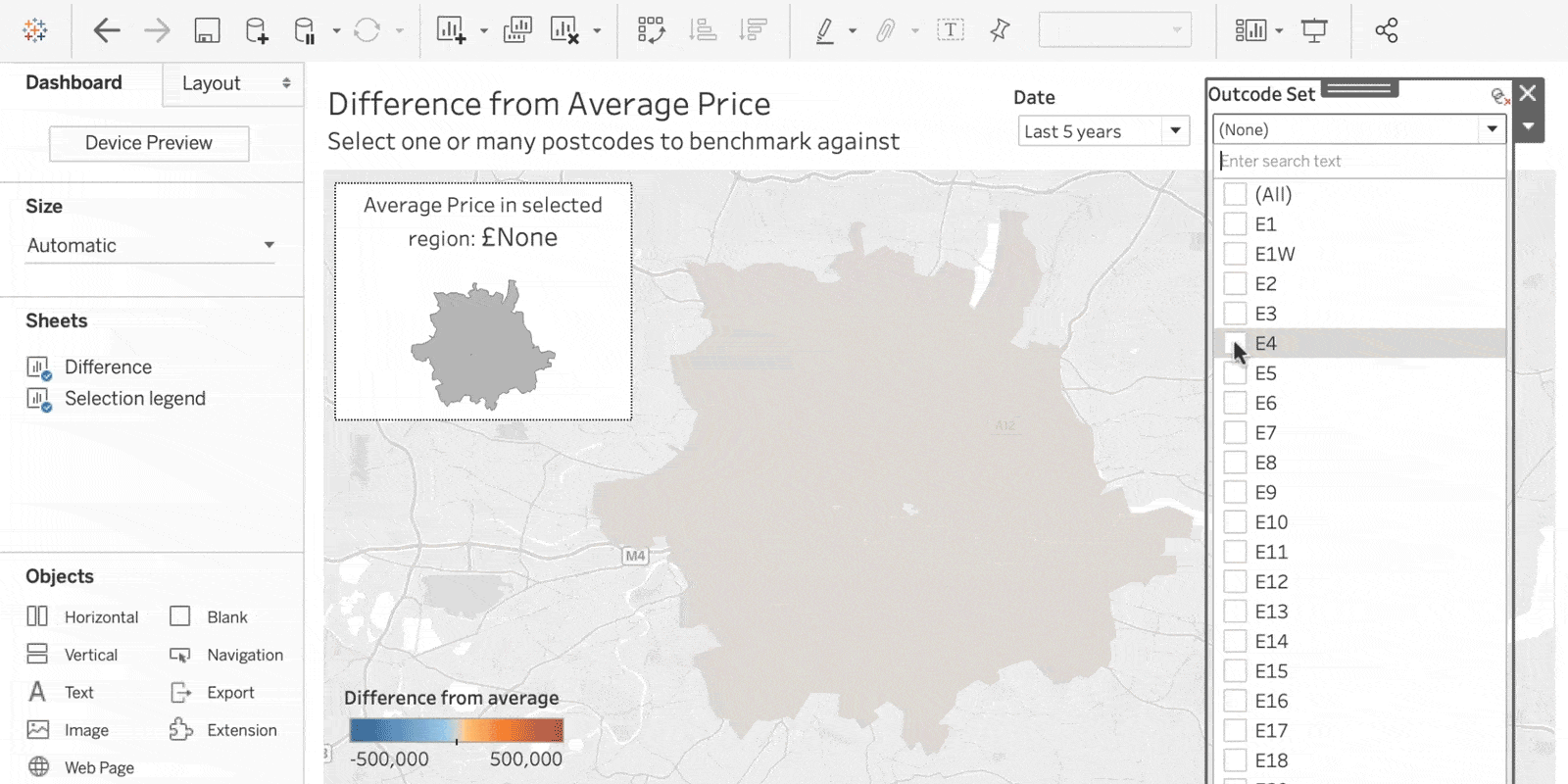
We’re expanding Tableau’s range of analytical options to power your dashboards and how people interact with them. In 2020.2, you can now perform set analytics with the same ease and familiarity as using a quick filter to drive complex analysis. With the new set control, you can dynamically change the members of a set using a quick filter-like interface. Supporting both single and multiple selection, simply click to select or deselect items to control which values are in the set—behind the scenes, these selections act as inputs that are fed into calculations that drive the visualization. End users now have a straightforward way to leverage the complex calculations that authors have already created to drive to their own insights. Plus, the domain refreshes automatically, so the freshest data is always reflected in your dashboard.
Let’s take a look at an example. The viz below describes average housing prices in various outcodes (what we know as postal codes) in London. London is built in concentric circles, and houses are more expensive as you get closer to the center of the city. The more expensive the outcode, the more orange the color. Let’s select outcodes E4, E5, and E6—located near the edges of London—to belong in our set membership. This means that we are averaging their prices together, and then comparing that to the average of the rest of the outcodes. This is why a lot of the outcodes suddenly look more red—they’re higher in average price compared to the outer edge areas we have selected to be in our set. And we could keep adjusting our set members to see how different groupings compare. This is just one example of how to use set control—imagine the analysis that’s now possible!
Spatial data updates
This release also brings significant updates to expand your geospatial analysis.
- Oracle spatial support: We’re expanding Tableau’s spatial database connections to make solving location-based questions easier than ever. You can now connect to tables in Oracle that contain spatial data, and instantly visualize that data in Tableau.
- Esri web data connector: You can now connect Tableau directly to your location data in Esri by simply entering an ArcGIS Server URL or GeoService API URL. Automated extract refreshes ensure that visualizations are always up to date, and enable you to spend less time sourcing data and more time in analysis.
These are just a few highlights from 2020.2. Check out the New Features page to learn more.
Thank you, Tableau Community!
You are at the heart of everything we do and the Tableau 2020.2 release is no different. We can’t do this without you, so thank you for your continued feedback and inspiration. Check out the Ideas forum to see all of the features that have been incorporated as a result of your brilliant ideas.
We’d also like to extend our thanks to the many testers who tried out Tableau 2020.2 in beta. We appreciate your time and energy to help make this release successful.
Get the newest version of Tableau today, and if you’d like to be involved in future beta programs, please sign up to participate.
Related Stories
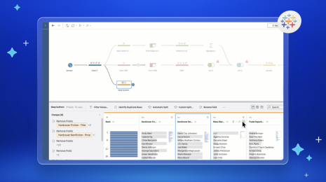
What is Tableau Prep?
 April 30, 2026
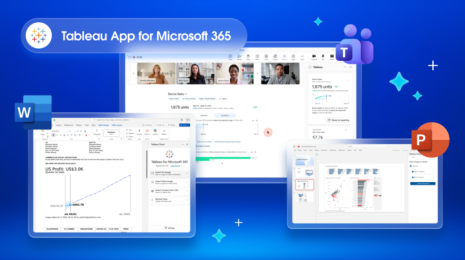
Insights Wherever You Work: Meet the Tableau App for Microsoft 365
 March 16, 2026
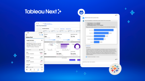
What is Tableau Next?
 March 12, 2026