Iron Viz: Student Edition—explore the top 3 winning visualizations


Iron Viz: Student Edition gives students the opportunity to develop (and show-off) their data skills, connect with the broader DataFam, and practice for future Iron Viz competitions. Iron Viz: Student Edition ultimately helps cultivate the next generation of data rockstars.
For this competition, students were tasked with using music data to tell a story. Using Spotify and Apple Music top charts, students were able to bring the data to life within Tableau. Participants then had to build a visualization that would be judged on the following four criteria: Creativity, Analysis, Beauty/Design, and overall Best Practices. Tableau Community leaders and internal Tableau data experts helped score the submissions.
We’re excited to announce that we received entries from students across the globe! It was a difficult task to narrow it down to just three winners, as we were blown away by all of the entries. A huge thank you and congratulations to all of the students who entered the competition—just participating is such a proud accomplishment.
Explore the top three student visualizations and follow the authors on Tableau Public
1. Michael Dunphy, University of Maryland
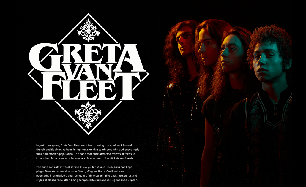
Feedback from judges: AWESOME. Super cool viz. The analysis was great, and was also visually appealing. I love the storytelling in this viz, it takes you on a journey through the history and success of Greta Van Fleet, I didn't want it to end.
2. Alex Johnson, University of Wisconsin
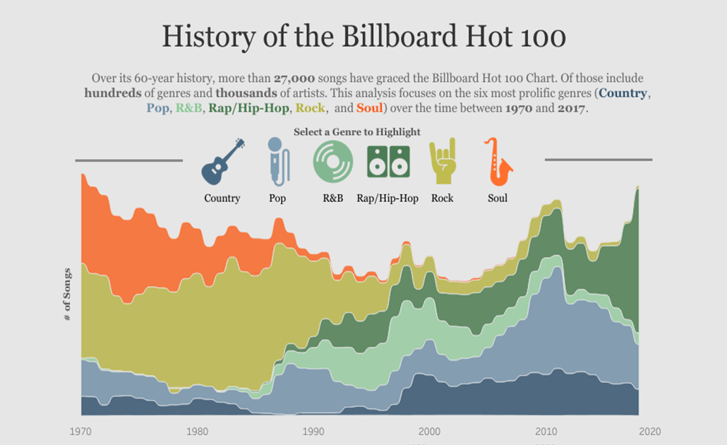
Feedback from judges: Beautiful viz! Clear story and progression of vizzes throughout the dashboard. It was interesting to see how popularity in major genres has changed over time. We’re eager to see the sequel to this viz that incorporates data from 2017 - 2021! Good design choices, especially for accessibility.
3. Nivedhitha Mathan Kumar, Georgia Institute of Technology
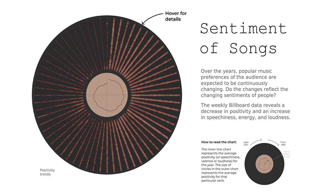
Feedback from judges: Beautiful viz! I'm not usually a fan of radial vizzes, but they were used really effectively here to show how music has changed over time. Interesting analysis of themes in the music over time as well. Good design choices make the viz accessible for most readers.
Student Iron Viz Gallery
Explore all the Iron Viz: Student Edition entries in our Viz Gallery! Connect with like-minded data students on Tableau Public and get viz-inspired with all things data + music.
Keep in touch for more Iron Viz: Student Edition
Hear from our 2021 Student winners in our fireside chat webinar on February 9, 2021, at 8:30 AM PST. You’ll get to hear how they built their viz + the story they were trying to tell, and advice to future contestants. Register now.
Thank you once again to all who submitted! Be on the lookout for our 2022 Iron Viz: Student Edition next fall! And don’t forget, you can receive a free Tableau license through our Tableau for Students program any time of the year.
Are you an instructor? Request new licenses for the upcoming term.
Related Stories

Explore the 2026 Iron Viz Entries
 December 15, 2025
Iron Viz 2025: Where Data Took Flight
 May 6, 2025

Meet 2025 Iron Viz Finalist Bo McCready
April 8, 2025