Tips and Tricks for Quick-Fire Sports Analytics


Note: This is a guest post by Joe Lipski from Javelin Group who worked with Accenture on the RBS 6 Nations coverage.
The RBS 6 Nations is an annual rugby union competition played in Europe between England, Wales, Scotland, Ireland, France, and Italy. We at Accenture are the Official Technology Partner of the tournament, and are responsible for the analytics and the official championship mobile application that allows fans to access, understand, and interact with match data.
The nature and importance of analytics in sport is rapidly changing with teams placing a huge focus and investment in the area. Organisations like Sky Sports and Opta Sports are now using statistics, visualisations, and analytics to tell the story of the game to the fans.
We created numerous applications and dashboards to bring the data to life for analysts, commentators, and, most importantly, the fans. I want to highlight a few tips and learnings from the process of creating these dashboards that can be equally effective as a marketing tool as well as an analytics tool.
The Vizzes
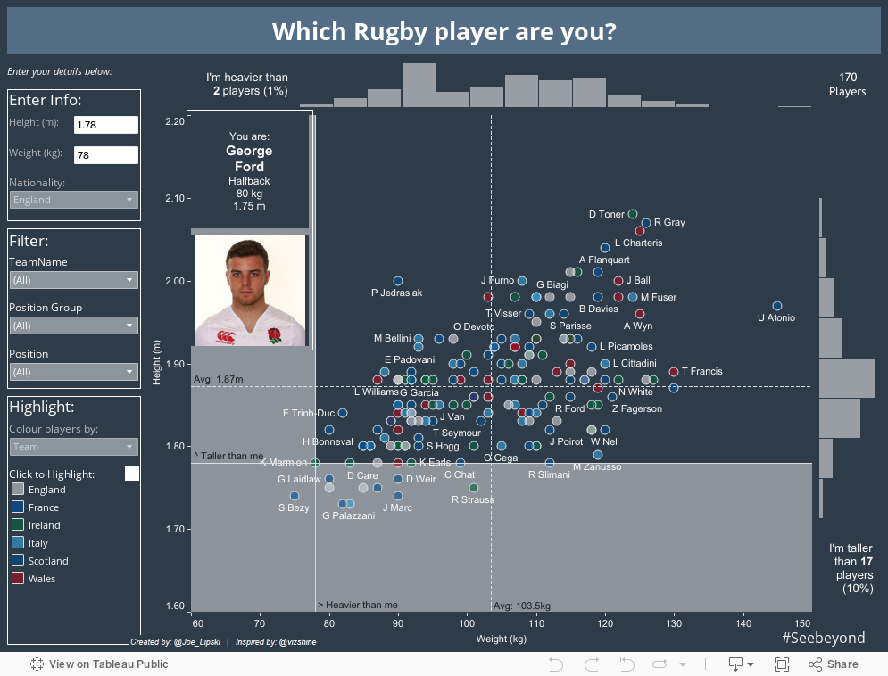
Which RBS 6 Nations Player Are You?
The first dashboard was inspired by @VizShine. It lets fans find out which player is most similar to them and also compare between teams, positions, etc. The average British male is 1.78m tall and weighs 79kg, and therefore shorter than 90% and lighter than 99% of players, which becomes apparent when using the visualisation. Enter your details below to see how you stack up!
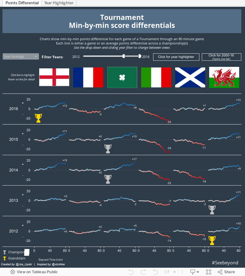
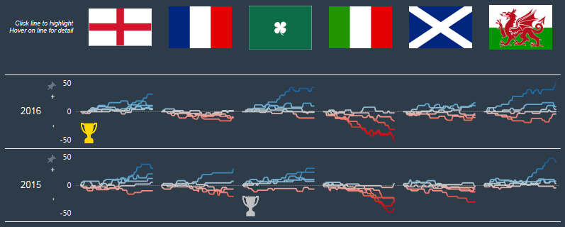
Min-by-Min Score Differentials
The min-by-min score differentials dashboard, also inspired by Shine’s amazing visualisation here, looks at how each of the teams perform throughout the 80 minutes of the rugby match. It shows both the teams’ individual-match data and their average across the tournament.
The small-multiples charts show clear patterns in each team’s performance each year, which reveals that in terms of points differential, Italy had its worst championship in a long time and Scotland its best! The ability to highlight one year against others on the highlighter tab shows this with even more clarity.
3 Tips & Tricks We Learnt
Blank Container
I learnt this first tip from Kelly Martin at TC15. I was amazed by its simplicity and the user-experience improvements it can yield. All you need to do is place a floating transparent blank object on top of an item that you do not want your end users to interact with. If they do, they will be clicking/hovering on the blank object, so nothing will happen. This is great for preventing interactions with axes and legends. However, this technique only works well with fixed-sized dashboards due to the floating object.
How to use a blank container
Transparent PNG Image for URL
So what if we want our transparent item to have an action—for example, to take the user to a webpage such as my Twitter handle @Joe_Lipski. There are a few different ways to achieve this (and please let me know if you know of others).
One way is to create an image of the text in PowerPoint or a similar tool and add it to your dashboard. However, I prefer to use a transparent image on top of a text object in Tableau as seen below. You can find a good transparent PNG image to add to your viz-kit here (right-click on the top-left of the page to save locally).
How to use a blank .png
Additional Icon on a Line Chart
This tip, which you can see in the points-differential viz, uses a dual axis to display the line showing the cumulative points over the 80-minute game. It also shows a trophy icon if that team won the championship that year.
In the data I have a field which indicates whether each team won the championship that particular year, with the options being: grand slam, winner, or no. My y-axis is fixed between -50 and +50 and my x-axis is fixed between 0 and 80. I can tell Tableau that I want to place this icon at 10 minutes on the y-axis and at -30 points on the x-axis. My simple calculated field looks like this:
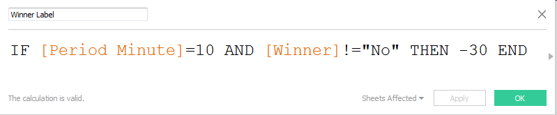
I then simply place this “Winner label” field on the Shape shelf and make the icons a suitable size with the output looking like this:
Watch this video to see how I did it:
How to add an icon to a line chart
Key Learnings
Steal, Steal, Steal
Tableau Public is by far my favourite resource for learning, but it is also my favourite resource for inspiring creativity and generating new ideas. I love looking for ways that people use data in insightful ways that I can apply to the data I’m working with, whether it’s in a personal or business environment. The main RBS 6 Nations dashboard was chosen as the Viz of the Day and subsequently as the Viz of the Week on Tableau Public, so I would encourage users to review and post their own.
Iterate, Cooperate, and Have Fun
The ability to iterate, cooperate, and have fun was crucial to our success in creating these 6 Nations visualisations. We worked in teams of enthusiastic data analysts iterating over many different worksheets and dashboards until we were happy with the insight that they generated.
In addition, each dashboard went through a peer-validation process where many different eyes examined the results to looks for ways to improve it. Each small change made the dashboard a tiny bit more beautiful and more insightful for the reader while helping me learn even more.
Got a sports viz of your own to share? Tweet it to us @tableaupublic.
Related Stories

Tableau's Iron Viz Winners

Explore the 2026 Iron Viz Entries
 December 15, 2025
Iron Viz 2025: Where Data Took Flight
 May 6, 2025