How to visualize Spotify music trends in Tableau


This summer, we’re celebrating Data + Music—music trends, artists, genres, and towns—in a series of visualizations from the Tableau community. Like Pooja Gandhi, who visualized audio features of top tracks, or Sean Miller, who visualized the greatest metal albums of all time. In a recent webinar with our team and Skyler Johnson, Data Visualization Designer at Spotify, we shared how you can dig into the data behind Spotify’s Top 200 and Viral 50 charts. Read this blog post to learn how to get started with Spotify data and create a basic dashboard to understand top tracks and artists by country.
If you’d like to learn more about how to connect to your own Spotify listening data with the Spotify API, watch the webinar with Skyler.
Connecting to Spotify data
Follow these steps to learn how to get the latest data from Spotify’s charts and bring it into Tableau for analysis.
Get the data:
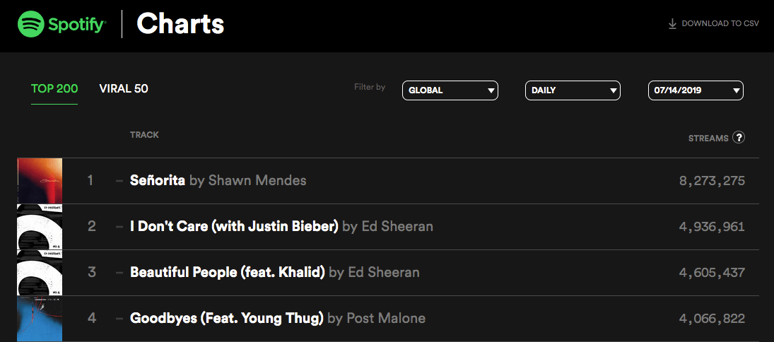
- Navigate to https://spotifycharts.com/regional to download data from Spotify’s Top Charts.
- Select Top 200 or Viral 50 depending on the purpose of your analysis—to see top tracks or trending tracks. For this analysis, we will choose Top 200.
- Use the dropdowns to filter by your specific country or select Global to see all country data. For this analysis, we’re going to focus on Global data so we can see listening habits by country. You can also choose to select Daily or Weekly data. For the purpose of this analysis, we will choose Daily and use the date dropdown to select the most recent date.
- Click “Download to CSV” in the top right-hand corner. Note: I performed this for all available countries and dates prior to July 1st, 2019 and combined the csv’s into one file called Spotify_Daily_Streaming. That can be downloaded here.
Bring it into Tableau:
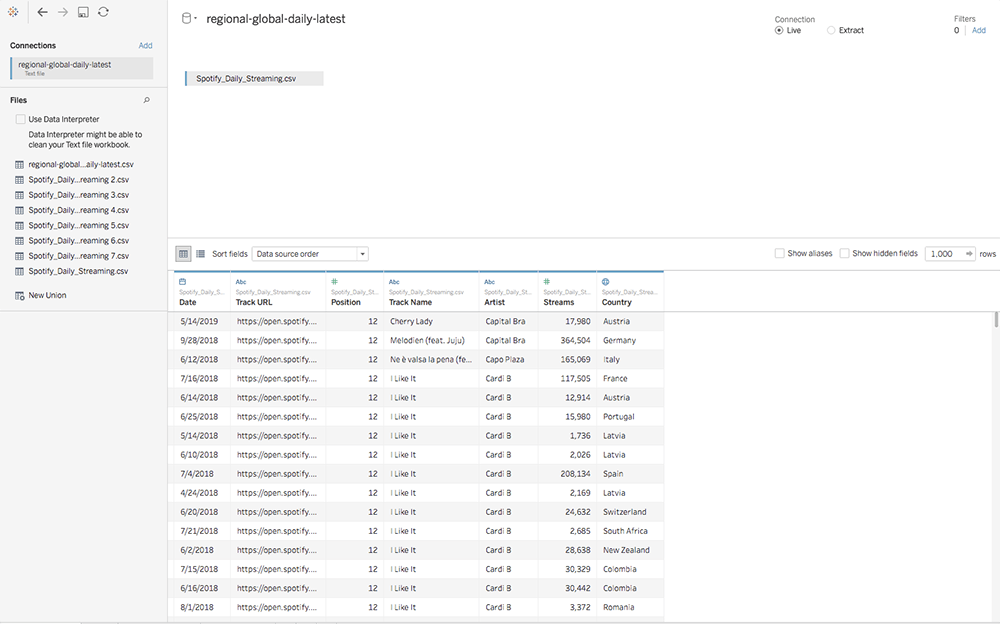
- Open Tableau. In the Connect pane, select “Text file” and open the Spotify CSV we just downloaded.
- Drag the Spotify_Daily_Streaming CSV onto the Canvas.
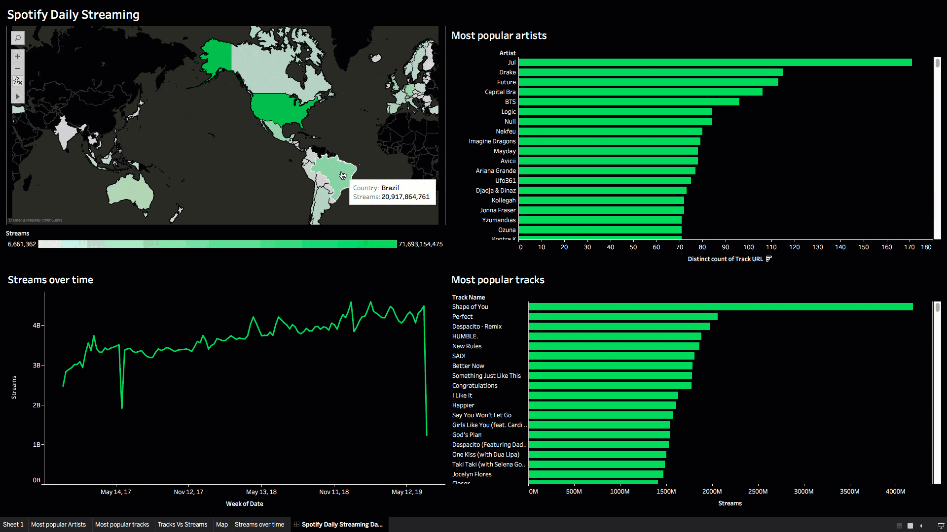
Most popular tracks and artists
Let’s start by analyzing the most popular tracks in Spotify’s Top 200 list. Note that we’ll be using the Track URL field as a unique identifier when we’re doing distinct counts of tracks since some songs may be named the same thing.
- Drag Track URL to Columns. Change the Measure to Count (Distinct). We quickly see that there are over 50,000 tracks within the data set.
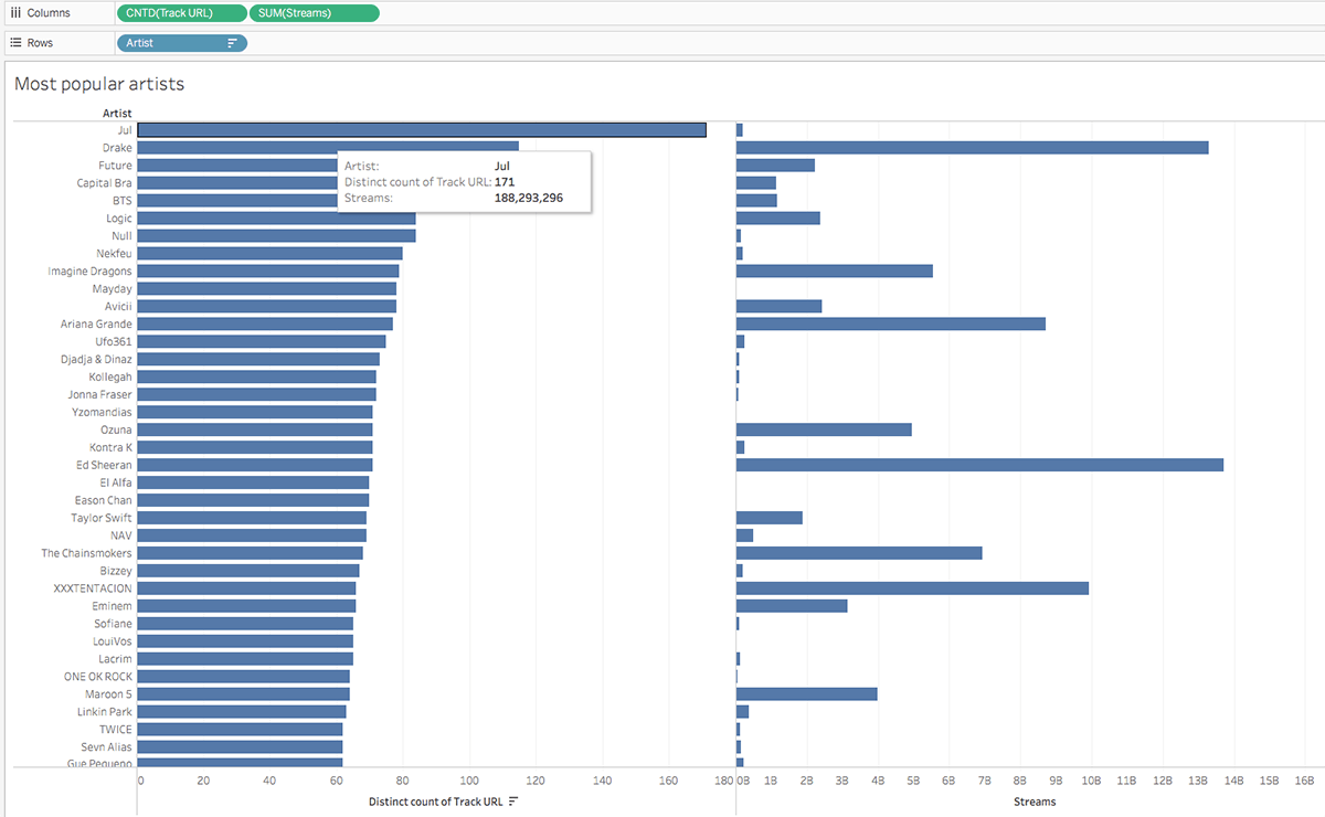
- Drag the Artist field to Rows. Sort from greatest to least to see the artist with the most tracks in the data set. But remember, just because an artist has the most tracks in the list doesn’t mean they have the most streams. We can see this in the screenshot below.
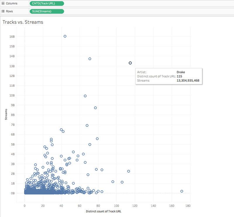
- Since we’re showing the relationship between two variables, let’s see this in a scatterplot view instead. Now we can see that Drake consistently has a lot of tracks in the Top 200 and these tracks get a lot of stream time.
Now that we’ve seen the most popular artists, let’s do the same with songs.
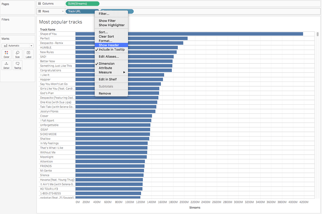
- Create a new sheet. Add SUM(Streams) to Columns and Track URL to Rows.
- Sort greatest to least.
- Add Track Name next to Track URL on Rows.
- Hide Track URL header by right clicking on the pill in Rows and deselecting “Show Header.” It looks like Ed Sheeran’s “Shape of You” has over 4 billion streams!
Popularity by country
It’s always interesting to see how listening habits differ from country to country. Let’s analyze Streams by country using a map in Tableau.
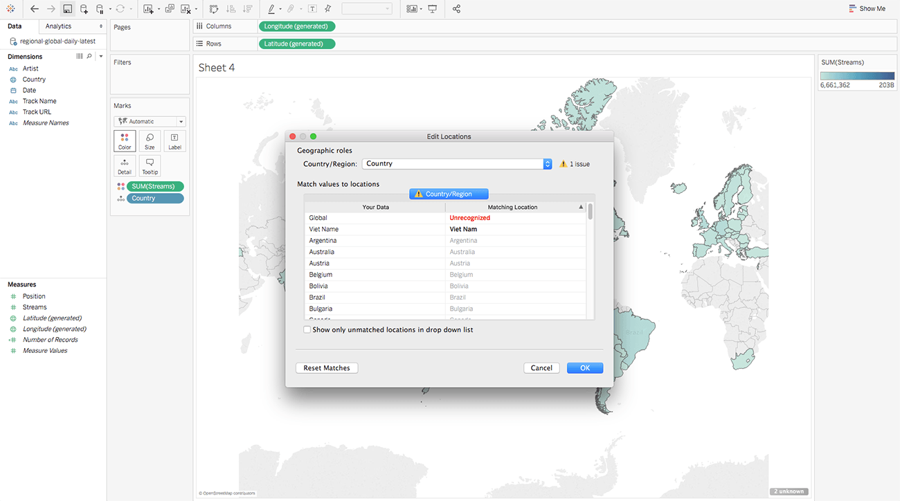
- Double click the Country field in the Data Pane. Tableau knows that this is a geographic field so it plots the data on a map.
- Drop the Streams field onto color to create a filled map. The darker shade represents more streams while the lighter shade represents fewer streams.
- Tableau may show some unknown values in the lower right corner. Double click the error notification to see where we need to do some data cleanup. It looks like there is a spelling error for Vietnam, so we can manually correct that by matching it with the field in the data. It is also not recognizing the Global field. This field represents all of the countries in the dataset.
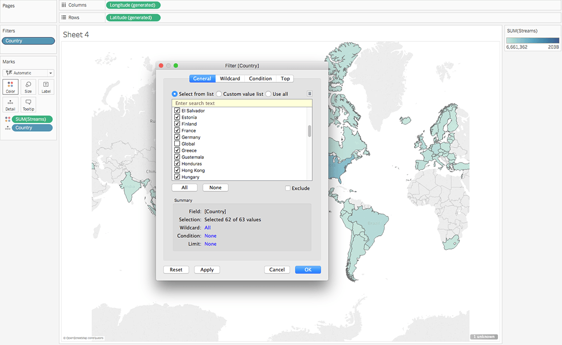
- Use a Filter to exclude this Global field as to not skew our data.
Streaming over time
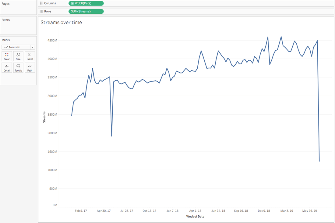
Finally, let’s look at streams over time. We’ll use this later in our dashboard to get a comprehensive view of streams for each song and artist.
- Add Continuous WEEK(Date) to Columns and SUM(Streams) to Rows.
- Filter out the Global data like we did in step 4 of the previous section.
Putting it all together
Now let’s see how this data all relates by putting it into a dashboard.
- Create a new dashboard.
- Drag the sheets we created for our “Most popular artists,” “Most popular tracks,” and “Streams over time” along with our map onto the dashboard.
- Select Use as Filter on our map as well as our bar charts.
- Finally, let’s customize the map to be Spotify colors. Select Format→ Dashboard to format colors, grid lines, and more.
There are so many other stories buried in this data, like seasonality for example. For a more in-depth tutorial, check out the recording of the Visualize Your Love of Music webinar. Share your own findings in this dataset by using the hashtag #DataPlusMusic on Twitter.
Related Stories

5 Ways to Use Tableau Public to Achieve Your Goals
 January 11, 2025

World Mental Health Day: Elevating Awareness Through Data Visualization
 October 10, 2024

From TV Screens to Tableau: Visualize Your Favorite Shows with IMDb
 August 31, 2024