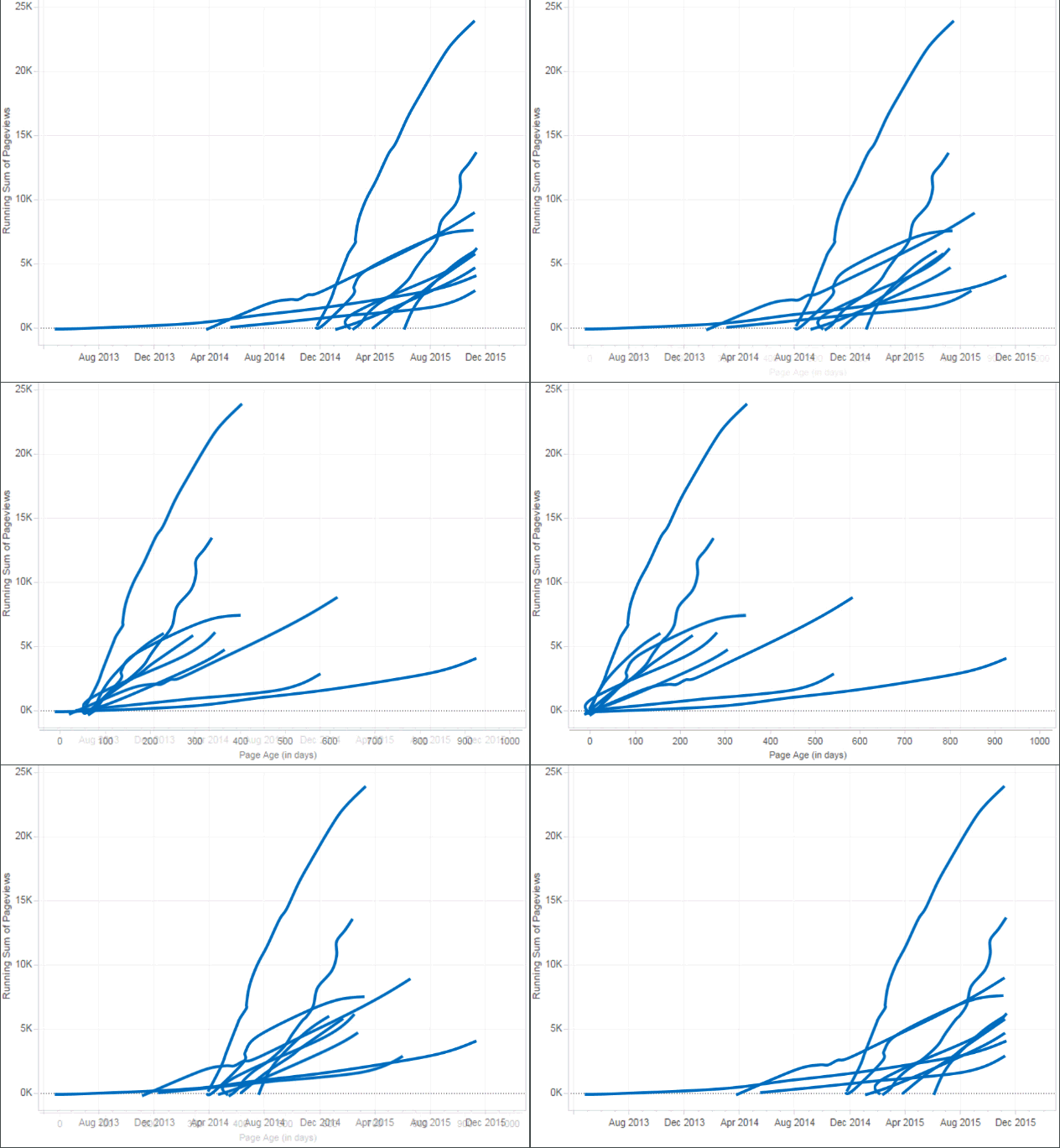
How a Small Data-Viz Tweak Can Tell a Radically Different Data Story

Do you see a frog or a horse?
Note: The following is a guest post by Tableau Zen Master Joshua Milligan.
It is amazing the difference a single change to a data visualization can make. Sometimes it changes the whole story, or at least gives a totally new perspective. Even a small tweak to your viz can uncover new perspectives and new data stories.
Example: Absolute versus Relative Time
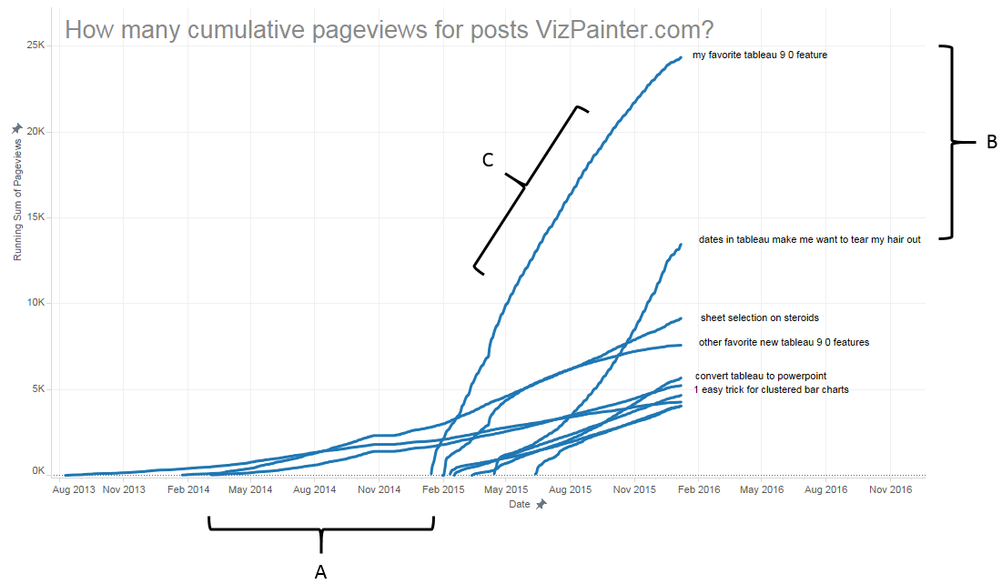
Take, for example, this view:

Notice the variations:
- X-Axis is Date: You see a running total of pageviews for every post on the popular Tableau blog, vizpainter.com, starting with the date of the first view.
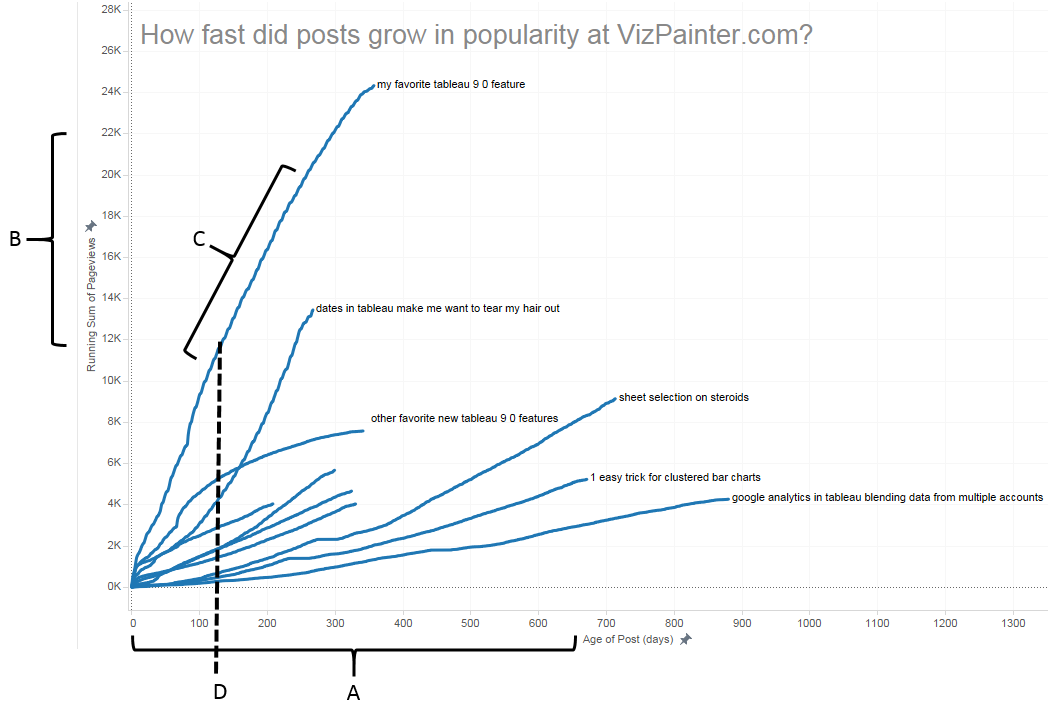
- X-Axis is Age: You see a running total of pageviews for every post, starting at day 0.
Now consider the similarities:
- Both are timelines (technically, you might consider the second a scatter plot).
- Both have the same number of lines.
- Both have the same exact shape of lines.
The only thing that’s really changed is the origin of the lines.
- In the first, the origin is absolute: It's the date on which the post was introduced.
- In the second, the origin is relative: All posts start on day 0.
And yet, the data story that is told is very different.
Data Story 1: How Many and When?

This story is focused on “when” and “how many," and there are certain aspects of the story that are relatively easy to see:
- When were posts published? (A)
- How long between posts? (A)
- What are the most popular posts (in rank order)? (B)
- How popular were posts? (B)
- How fast did posts grow in popularity? (C)
But contrast that with this story:
Data Story 2: How Fast?

This story is focused on “how fast” and there are different aspects of the story that are easy to see:
- How old is a given post? (A)
- How popular has a given post become? (B)
- How fast did a post grow in popularity? (C)
- How fast did a post grow in popularity compared to others? (C)
- How popular was a post X days after being published (D)
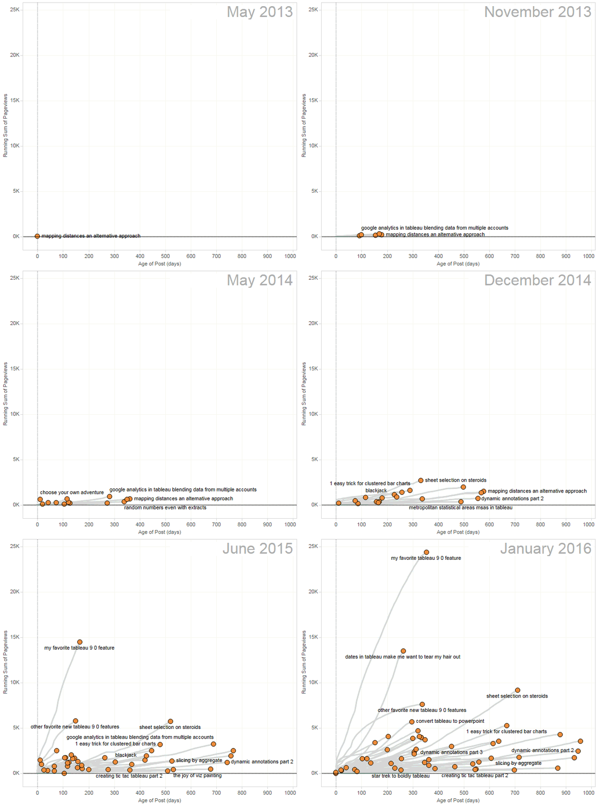
And now consider one final tweak that enhances the story in other ways:

Notice how the animation adds a few elements to the story:
- The absolute date becomes easier to see and understand again.
- There is a hint of relationship between posts (notice how once the most popular post comes into play, the trajectory of other posts change).
Now What?
Now you’ve seen my example. What examples do you have? What existing data visualizations do you have that could tell a different story if they were tweaked? What answers can you uncover in the data based on different visualizations?
So go home, take out your old data vizzes, and experiment! Let me know what you uncover!
And of course, you’d like to know how to build the relative time series and even animate it, wouldn’t you? You’d even like me to give you a Tableau workbook? Absolutely! That’s the next post on my blog, vizpainter.com.
Check out additional works by Joshua Milligan on Tableau Public, on Twitter, and on his website, vizpainter.com.


