How Do Charts and Text Interact?


Charts are used to communicate information about data to a reader. Authors often add text such as captions along with charts to provide additional context and clarification to help with their message to their intended audience. But what makes for a good caption? And how does the caption interact with the chart?
While charts can draw a reader’s attention to various visual features such as outliers and trends, it’s unclear what the reader takes away from both text and charts together. In a new research paper published this week at the CHI conference, we find that study participants described features doubly emphasized by both the chart and caption when they both provided a coherent message. However, when the chart and caption diverged in terms of the feature that they were emphasizing, participants were less likely to use information from the caption in their takeaways.
Let’s start with an example
Take a look at this line chart.
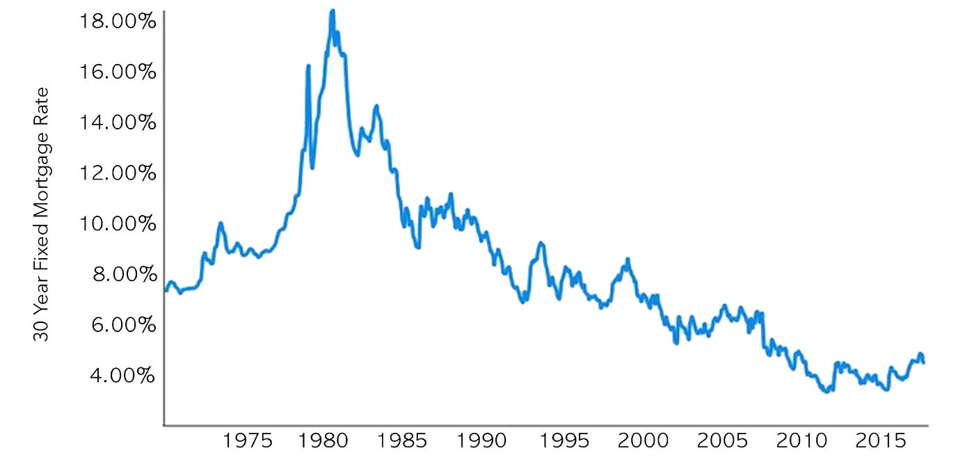
What do you think are the main visual features of the chart and what are your key takeaways?
Now, consider each of the following caption possibilities with the chart. How do your takeaways change with each one?
- The chart shows the 30-year fixed mortgage rate between 1970 and 2018.
- The 30-year fixed mortgage rate increased slightly from 1997 to 1999.
- The 30-year fixed mortgage rate reached its peak of 18.45% in 1981.
- The 30-year fixed mortgage rate reached its peak of 18.45% in 1981 due to runaway inflation.
The first caption simply describes the attributes graphed in the chart and only provides redundant information that could be read from the axis labels. Many of the automated caption generation tools create captions of this form. The next three each emphasize aspects of the data corresponding to a visual feature of the chart such as a peak or an upward trend. However, there are differences. The second caption emphasizes a feature of low visual prominence — a relatively local and small rise in the chart between 1997 and 1999. The third caption describes the most visually prominent feature of the chart — the tallest peak that occurs in 1981. The fourth caption also describes this most visually prominent feature, but adds external information that is not present in the chart and provides context for the data.
So, how do each of these different captions when accompanied with a chart, affect readers’ takeaways?
We explore this problem by first considering two main hypotheses:
- When a caption emphasizes the more visually prominent features of the chart, readers are more likely to treat those features as the takeaway; even when a caption emphasizes a less visually prominent feature, people are still more likely to treat a more visually prominent feature in the chart as the takeaway.
- When a caption contains external information for context, the information serves to further emphasize the feature described in the caption and readers are therefore more likely to treat that feature as the takeaway.
Studying chart-text pairs in line charts
We explored our hypotheses using a set of 43 line charts. We first generated 10 text caption variants using natural language templates for each chart Two captions (one with and one without external information) for each of the top three visually prominent features in the line chart, two captions (one with and one without external information) describing a minimally prominent visual feature in the chart, and a basic caption that simply describes the domain represented in the chart without describing a particular feature. We also included a no-caption variant.
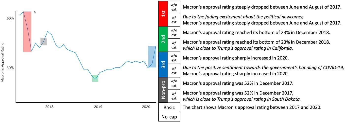
Visually prominent features in a line chart with the most prominent (red), the second most prominent (green), and the third most prominent (blue). The 10 caption variants generated based on these prominent features are shown on the right.
We conducted a crowdsourced study on Mechanical Turk with a set of 2168 participants asking them to report their takeaways after they viewed chart-caption pairs. For each of the 43 charts, we presented one of the 10 caption variants to each study participant and asked them to list as many text takeaways as they could in the order of importance.
Takeaways from the takeaways
Findings from the study support both of our hypotheses. Study participants described the feature doubly emphasized by both the chart and caption in their takeaways when they both provided a coherent message. However, when the chart and caption diverged in terms of the feature that they were emphasizing, participants were less likely to use information from the caption in their takeaways.
Going back to our initial line chart example, when the caption mentions the most visually prominent feature as in the third caption (i.e., the peak in 1981), readers will probably take away information from that feature. When the caption mentions a less prominent feature as in the second caption (i.e., the increase from 1997 to 1999), there is a mismatch in the message between the chart and the caption. Readers will have a strong tendency to go with the message conveyed in the chart and take away information about the peak value. Finally, the external information about the peak value present in the fourth caption will reinforce the message in the caption and the readers will more likely take away information about the peak.
Final thoughts and future directions
The work shows how charts and text relate to one another when they occur together. Findings from the study help authors to more effectively convey their message to readers by ensuring that both charts and captions emphasize the same set of features. For example, authors could make visual features that are related to their key message, more prominent through visual cues (e.g., highlighting, zooming, or adding annotations) or include external information to further emphasize the feature described in the caption.
Visualization authoring tools can provide guidelines for authors when they craft charts and captions together so that the intended takeaways are effectively communicated to the reader.
These tools could suggest chart design alternatives given a feature that the author would like to emphasize. Future work could study captions with different natural language expressions that emphasize multiple features or comparisons between these features for example. We would also like to explore how our findings generalize to different charts and caption pairs in the wild, such as in Tableau Public and support ways in which text with chart design can be made more effective for the reader.
More details about this work can be found in our CHI paper.
Authors
Dae Hyun Kim, Stanford University and Tableau Research
Vidya Setlur, Tableau Research
Maneesh Agrawala, Stanford University
Related Stories

Which Model Speaks Your Data Language? A User-Centered Approach to Evaluating LLMs for Conversational Visual Analytics
 April 14, 2026
Rethinking How Data Workers Revisit Analytical Conversations and Communicate Insights
 April 10, 2026
Stepping through Charted Territory: Creating Interactive Step-by-Step Dashboards Tours
 June 8, 2025