How to answer your data questions with a map in Tableau


The first step to creating a great data visualization is figuring out which visual chart type is best for the data story you want to tell. This post will explore maps in Tableau—if and when they’re appropriate for a data visualization, and how to make them more effective. If you think you want to use a map, it’s important to know why.
Maps can help you discover, verify, or communicate spatial patterns with data. With data maps, your starting point should always consider a spatial question. Your spatial question will ensure that a map will help you find an answer in the most efficient way.
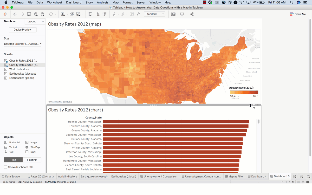
Let’s try an exercise by answering this question with a data map:
Which county in the United States has the highest obesity rate?

How long did it take you to answer that question? Can you quickly find the right location without hovering over every darker-colored county? I’m guessing not. This map, by itself, may not be the right path to answering this spatial question.
Now try to ask the same question again using the bar chart below.

It was probably easier to find the answer.
Go a step further and consider how the map and bar chart together might to allow you to answer your spatial question even faster.
In general, maps are good for helping you answer these two types of spatial questions:
- What is the value for a specific location or mark on the map?
- How do patterns compare between locations, regions, or attributes?
Here are some tips to help you better answer these questions.
1. What is the value for a specific location or mark a on map?
When you want to use a map to assess values at specific locations, you can improve the marks legibility, and get to your answers faster by using and improving tooltips. Tooltips are a convenient way to hover your mouse over a mark and see a list of all the underlying dimensions and measures present.
You can edit a tooltip to include both static and dynamic text. By doing so, you’ll improve the power of your map by editing your tooltips to tell a story—and make sure to delete the parts that don’t add value.
For example, which of these tooltips clearly tells you a story about earthquakes in Japan?
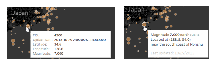
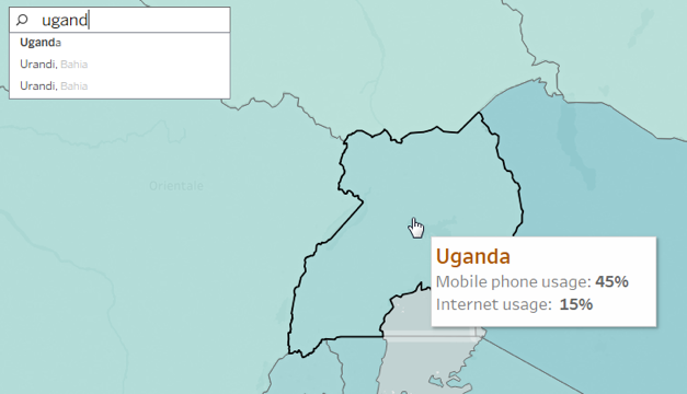
The tooltip can also improve speed-to-insight for this type of question because viewers of the map will be able to find individual locations they want to know about. Some instances are easier than others because the search is driven by geography (e.g. state and country).
For example, what is the internet usage percentage in Uganda?
Other times, finding individual locations is driven by a visual pattern in the data. For example, “That mark over there looks bigger than the others and is interesting; what does it represent?” For these questions, it’s important to make sure that the individual marks on your map can be distinguished from one another.
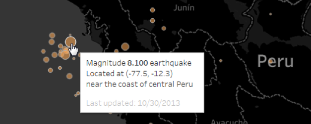
In this visualization about earthquakes, discoverability is improved by adjusting the sizing of the marks, and enhancing the contrast between the base map, mark color, mark outline, and opacity. This way, users can quickly distinguish outliers. (Note that the exact settings may need to be adjusted depending on whether your readers are more likely to zoom in close, like in the example below, or explore general patterns for the whole world.)
2. How do patterns compare between locations, regions, or attributes?
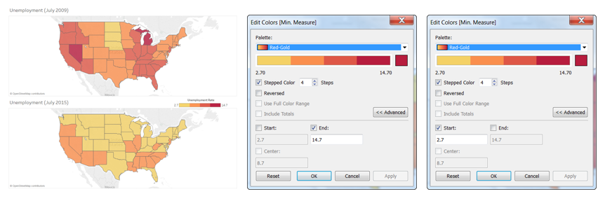
To answer this type of question with a map, the data, symbols and even colors you choose must allow for direct comparison. For example, when comparing these two sets of unemployment data, the default color encoding doesn’t add value for making direct comparisons because the dark red doesn’t represent the same value in both maps. This can get very confusing for a user who doesn’t know the details of the data. These visualizations incorrectly give the impression that Nevada’s unemployment in July 2015 is just as high as Michigan’s in July 2009.

The quick fix is to make sure the color ramps in both maps use the same range. The dashboard now only needs one legend, because the color ramp is exactly the same in both maps.
Another way to make your data more easily comparable is to adjust the color scheme, so that different color groups have the same semantic meaning. Semantically-resonant colors help people process information faster—so you’d use yellow to depict bananas, red to represent heat, or blue to represent cool.
In a different example, these visualizations show the food environment index and obesity prevalence rates, but they’re hard to compare because the raw data values have differing ranges—one from 10.7% to 46.6%, and the other from 0.5 to 10. If we want to explore relative rates between counties, we need to find a way to make these comparable.

By transforming the values into a percentile, and then mapping the data by quartiles (25% of the counties are in each group), we can compare the patterns based on whether counties are in the top 25%, middle ranges, or bottom 25%. There are plenty of resources in Table Calculations in Tableau that can be useful for this type of adjustment to your data.
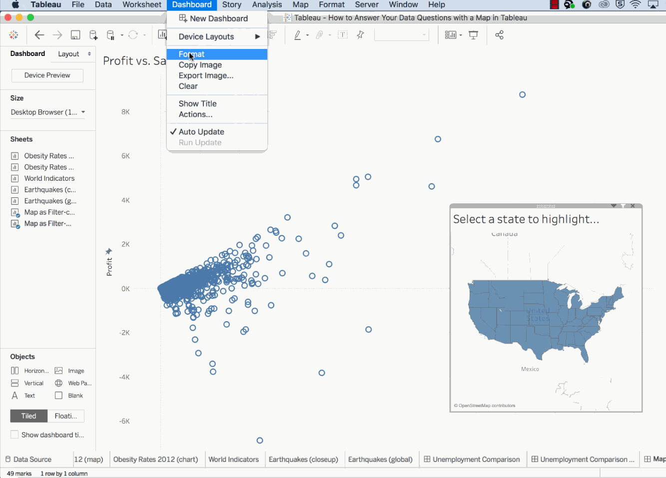
Bonus tip: How to use maps to drive other visualizations and act as a filter on a dashboard
Sometimes spatial questions and patterns aren’t the driving force of your map. For example, geography often makes it easier to find the data that interests you. For instance, if you wanted to look at sales in Washington, Oregon, and California, it takes longer to select those from a list in a filter than it would to do a quick multi-selection on a map using a highlighter action.
If you want to learn more about using maps in Tableau check out this free tutorial. You’ll learn how to get started working with geographic data, learn how to use the marks card and other map options to enhance your analysis.
Related Stories

5 Ways to Use Tableau Public to Achieve Your Goals
 January 11, 2025

World Mental Health Day: Elevating Awareness Through Data Visualization
 October 10, 2024

From TV Screens to Tableau: Visualize Your Favorite Shows with IMDb
 August 31, 2024