How Tableau Showcases the Power of Data, Innovation at Gartner BI Bake-Off


For more than two decades, Tableau has empowered organizations with the solutions to extract insight from data—to help people see and understand data. At the Gartner Data and Analytics Summit 2023—where I presented in Orlando, and Andy Cotgreave presented in London—we were excited to participate once again in the Analytics & BI Bake Off, demonstrating Tableau’s capabilities across a range of categories from data preparation to dashboarding and storytelling—and even a peek at some “cool innovation.”
Bake-Offs are fast-paced, informative sessions that let you see platforms side-by-side using demos and a common data set in a controlled setting. This year‘s topic was climate change—particularly the risk of flooding as global sea levels rise. Tableau, as well as two other analytics platforms, delivered demos in each of four categories: Data Management; Analysis, Content Creation, and Collaboration (Look and Feel); Share Findings; and crowd-favorite, Cool Innovations.
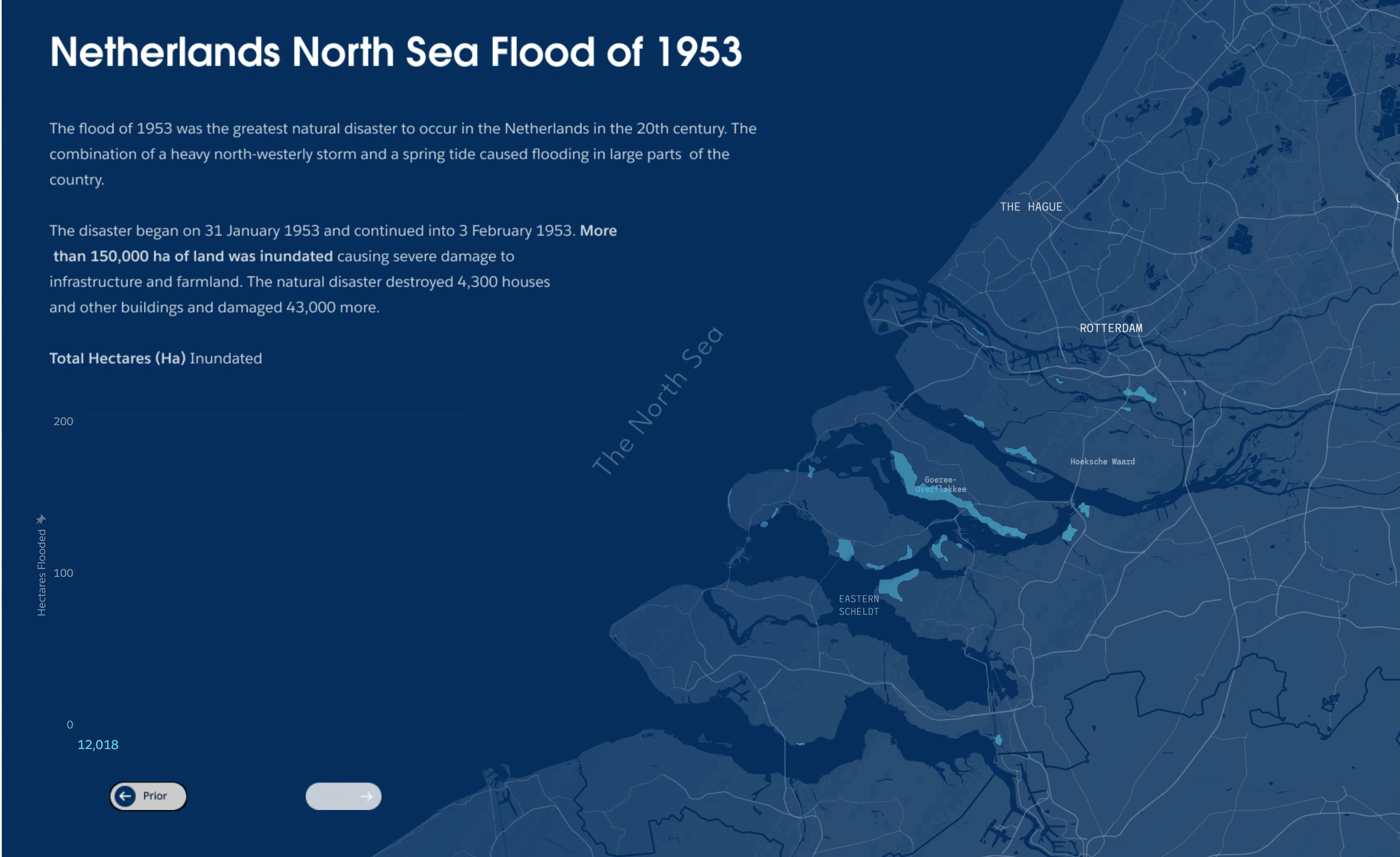
Tableau’s story focused on flooding risk in the Netherlands, a country where I spent much of my career, and where I remain connected with colleagues and friends who live there.
We began with data management, showing how you can bring together governed, secured enterprise data with public data—and any other data—to deliver broadly useful, clean data sets in a self-service fashion.
Data Management
I began with a classic problem: how do I find data, and how do I make sure that data is trustworthy? I started by searching the Tableau analytics catalog, a comprehensive collection of all my analytical assets. Unlike most data catalogs with lists of assets to scroll through, I visually browsed, and found a dashboard with a promising data set. After checking Tableau’s new data guide, I was confident I had found the right data set. Clicking through into the data catalog, I could see all the places where that contact was used, who offered it, and where it came from. This helped build trust that I had the right data set.
From the datasource, I jumped directly into preparing the data in Tableau Prep Builder, a visual, fun, and easy-to-use data preparation tool. With a few clicks, I brought in public data on flooding, flood, events, and weather to combine with our enterprise, organizational chart. Tableau Prep made recommendations to apply data rules to our data, and when I did that, I found a few data quality issues, which is common. No big deal, though! Prep highlighted which records needed to be fixed so I could quickly update the correct values.
As I brought in additional data, I joined datasets simply by dragging and dropping, and Tableau’s visual joint experience showed me where data was being inadvertently excluded. Through a visual preview of the data, I could see that a province name used both the Dutch spelling and the English spelling. The group feature let me combine those values so that the join succeeded and no data was lost.
With the data enriched, cleaned, and combined, I share this data using Tableau Cloud. I applied a data quality warning to note that this contains employee information, and is therefore sensitive. This ensures that all downstream consumers are aware at all times of the nature of the data they are working with. With the data enriched, combined, and secured—I’m ready to move onto visual analysis.
Look and Feel
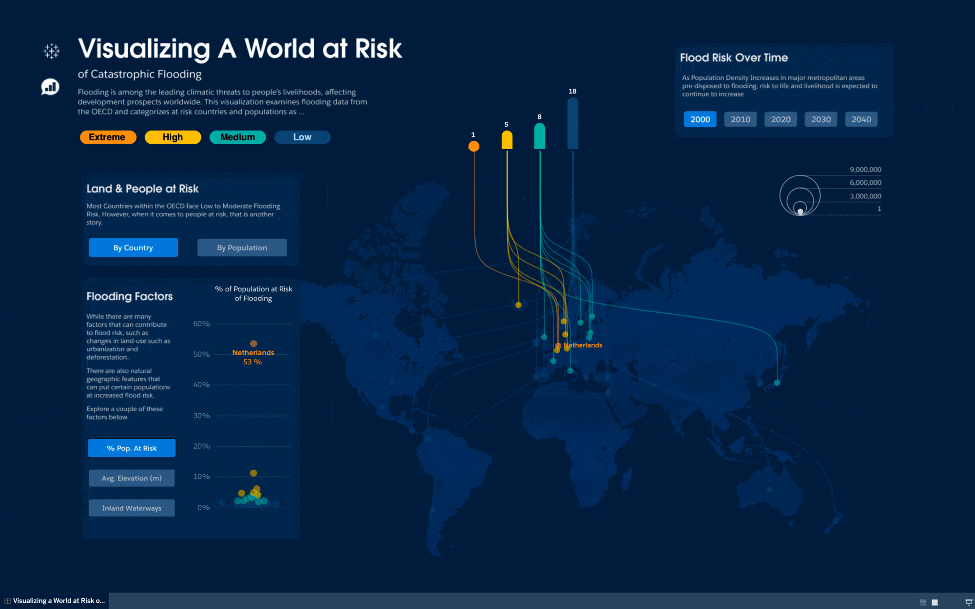
Tableau provides limitless possibilities for visual analysis, so we began with the art of the possible—a rich and beautiful infographic-style dashboard that illustrated the Netherlands’ uniquely risky position in the face of rising sea levels. Unlike other European countries, the Netherlands has the most square meters of land at risk of flooding, as well as the greatest population at risk of flooding. That population is growing, which means the risk is increasing as well.
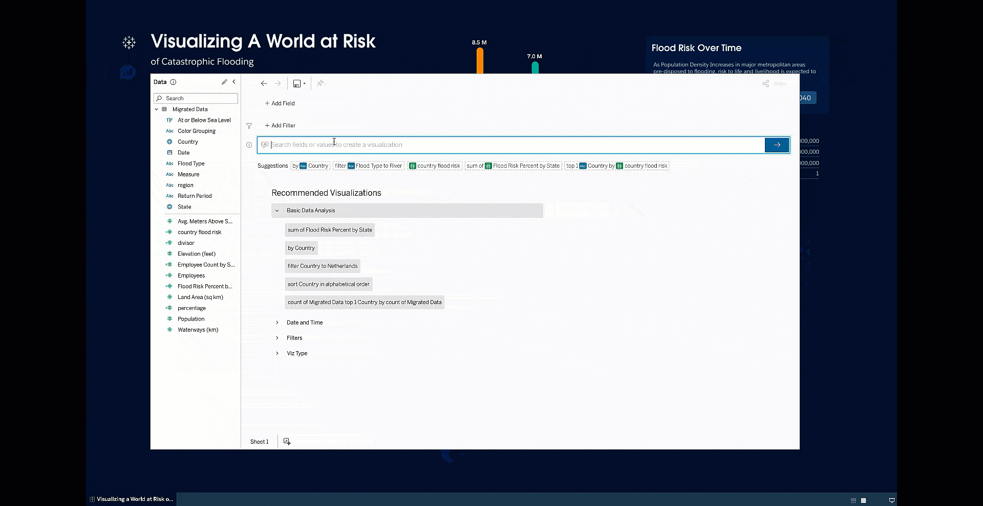
Going beyond exploring this rich visualization, we use Ask Data right from this dashboard, which Ask Data is available now, released in Tableau 2021.2. It’s clear that the Netherlands is at great risk, with 70% of the population at risk of flooding. Tableau lets me quickly answer questions of this data, whatever those questions may be, at the speed of thought.
Building visual analyses as rich as these might seem complicated, so next I showcased how easy it is to quickly build interactive analytical applications with Tableau. Beginning from our prepared data set, we identified employee locations and prepared an operational dashboard for managing each team's flooding risk. This dashboard could serve as a monitoring tool for HR and people managers to understand trends, risk, and even up-to-date flood warnings via social media.
Bringing this all together into a finished dashboard, we share this with others and set an alert on the main flood event KPI, so that we are notified if anyone on our team is subject to a heightened flood risk. The minute Tableau detects a flood event relevant to me or my team, I’ll be notified!
Share Your Findings
An email alert tells me there’s an elevated flood risk for someone on my team. Clicking through, I’m taken to the “My Climate Risk Portal.“ This one stop shop pulls together both qualitative content and visual analytics to empower HR and people leaders to stay on top of the climate risk for our globally distributed teams.
Here I can see clear, interactive KPIs, as well as a series of useful interactive visualizations. This one is a visual of the impacted org—it brings together what we know about flood risk with what we know about our team locations, so we can quickly drill down and get the list we want. And we know that a lot of business happens outside analytic platforms, so we make it easy to export into the formats you care about. Simple, easy, and visual.
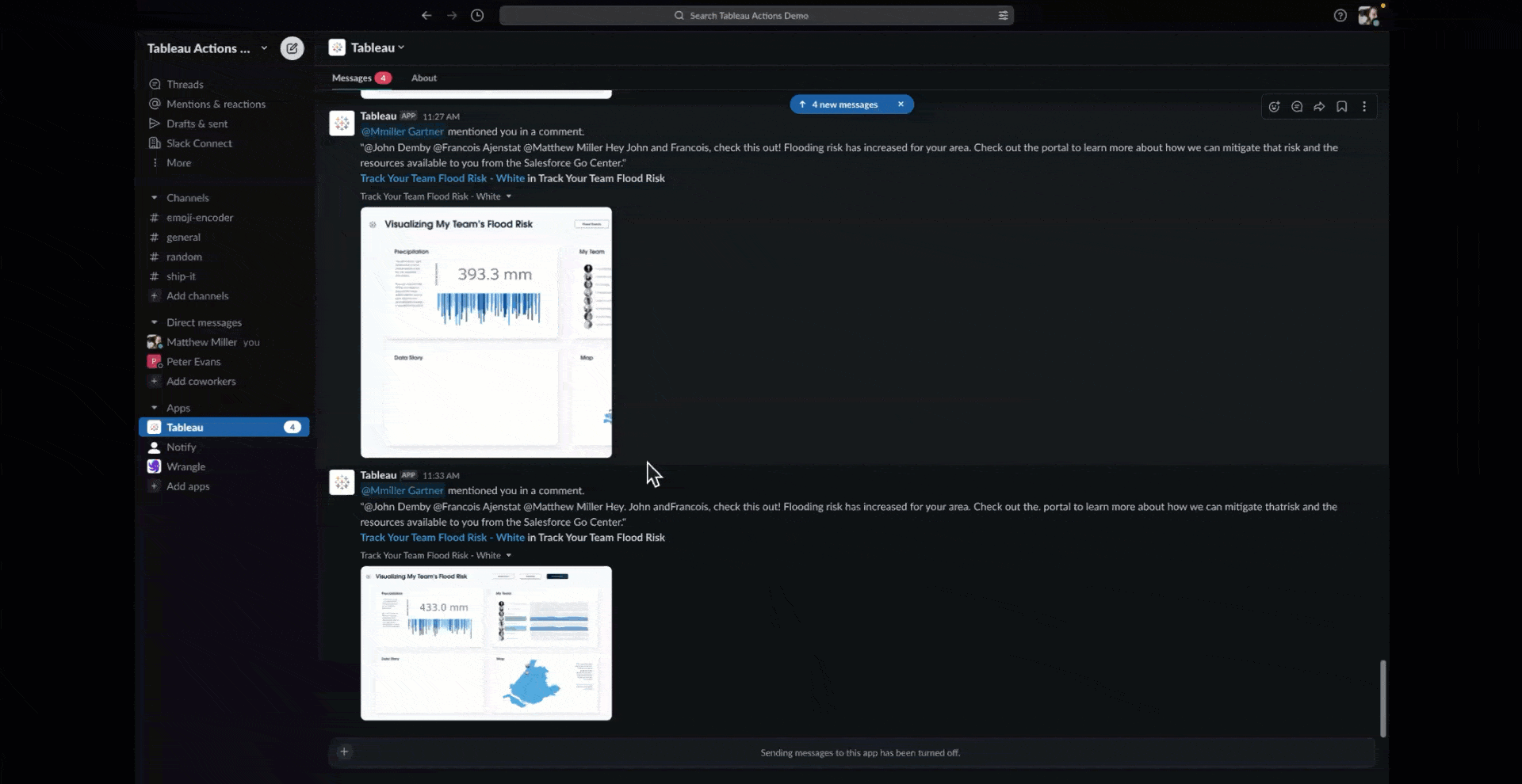
But remember what drew me to this page was an alert. Let’s take a look. If I focus in, I can see if there’s a heightened level for this one team member. From the comment pane, I can include an image of the visualization and tag them to share it to Slack.
And of course, we know that collaboration often happens in presentations such as Google Slides. We can select visualization to include as static slides, or we could even embed the visualization so that it’s live and interactive.
These steps show a real-world lifecycle with data—from finding data, exploring data, visualizing and organizing data, and delivering rich, interactive analytical applications integrated into the ways and the flow of your work.
Cool Innovations
Tableau Research has been exploring ways to integrate visual exploration into our workflows with Tableau Gestures—the ability to interact with viz overlays by simply pointing at them in live webcam video. Many of us spend our days in online meetings with our web cameras on. When we want to share some visual insight, we share our screens, and suddenly everyone’s faces disappear or become tiny. Communication is no longer front-and-center, it’s just a chart or slide.
With Tableau Gestures, however, we can overlay interactive, pointing-based analytical exploration into any meeting. Simply, by pointing at and gripping different data elements, we can drop them on the canvas of communication and interactively explore relationships and illustrate our points with data.
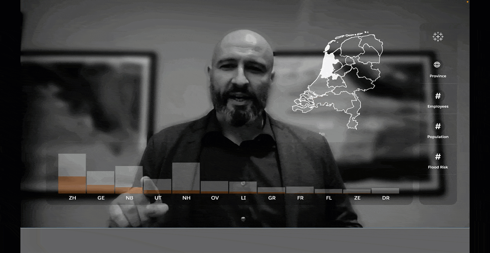
This demonstration of Tableau Gestures gets at a problem we all have: how to work well together in this new era of distributed hybrid work, and how to bring truth, driven by data, into those conversations with humans, and doesn’t distract from the narrative.
Tableau Innovation is Everywhere
From data management to visual analysis to collaboration, and even pointing-based exploration in the flow of work, Tableau is innovating everywhere, helping everyone see, understand, and act from any data anywhere—and do more with data.
Learn more about analytics and business intelligence, explore the latest features and what’s coming next in Tableau from Salesforce, and learn about more innovations at Tableau Conference.
Related Stories

5 Ways to Use Tableau Public to Achieve Your Goals
 January 11, 2025

World Mental Health Day: Elevating Awareness Through Data Visualization
 October 10, 2024

From TV Screens to Tableau: Visualize Your Favorite Shows with IMDb
 August 31, 2024