DataFam Roundup: April 28-May 2, 2025


Welcome! Dig into this week's DataFam Roundup—a weekly blog that brings together community content all in one post. As always, we invite you to send us your content—and the DataFam content from your peers that have inspired you! Find the content submission form here.
Community Highlight
To recognize new and consistent Tableau contributors—we’re excited to have a section within the weekly DataFam Roundup called the Tableau Community Highlight. Find out how to get involved.

Seun Adeyemo, Data Analyst and Researcher
Nigeria
Seun Adeyemo is a Data Analyst and Researcher. His journey with Tableau began during his Economics studies at the University of Lagos, where he was drawn to data visualization for academic assignments. Initially self-taught using large data sets like the World Development Indicators and the United Nations SDG Data, Seun later started teaching Tableau to university students, highlighting the role of both personal exploration and teaching in his skill development.
Currently, Seun is an active member of the Tableau Community, engaging with Tableau Public daily for inspiration and participating in the Lagos Tableau User Group. Inspired by a perceived gap in the economics curriculum regarding the Nigerian economy, Seun co-founded Rethinking Economics The Uploaders, leveraging data analytics for educational purposes. He actively shares his Tableau knowledge through a dedicated "Upskill" section on his Tableau profile, focusing on teaching the "how-to-build" aspect to foster deeper understanding by making all of his vizzes available for download.
Connect with Seun on Linkedin, X, and Tableau Public.
DataFam Content
Dive into content created by the Tableau Community:
- Adam Mico: Beyond Dashboards: Why Tableau Next is an Invitation to Level Up
- Gareth Branwyn: Tableau Next and Data Cloud Explained with David Spezia
- Steve Adams: Now on Salesforce+: Breaking Free From Spreadsheets (The Talk That Had People Nodding Hard)
- Nisar Ahmed and Ojoswi Basu: Content That Connects: Lessons From a Tableau Social Ambassador - S2 E14
- Johan de Groot: Animated icons in Tableau
- Tableau Vizzie Award "Favorite Viz of the Year" Virtual Viz Gallery
- Deepak Holla:
Team Tableau Content
Visualizations
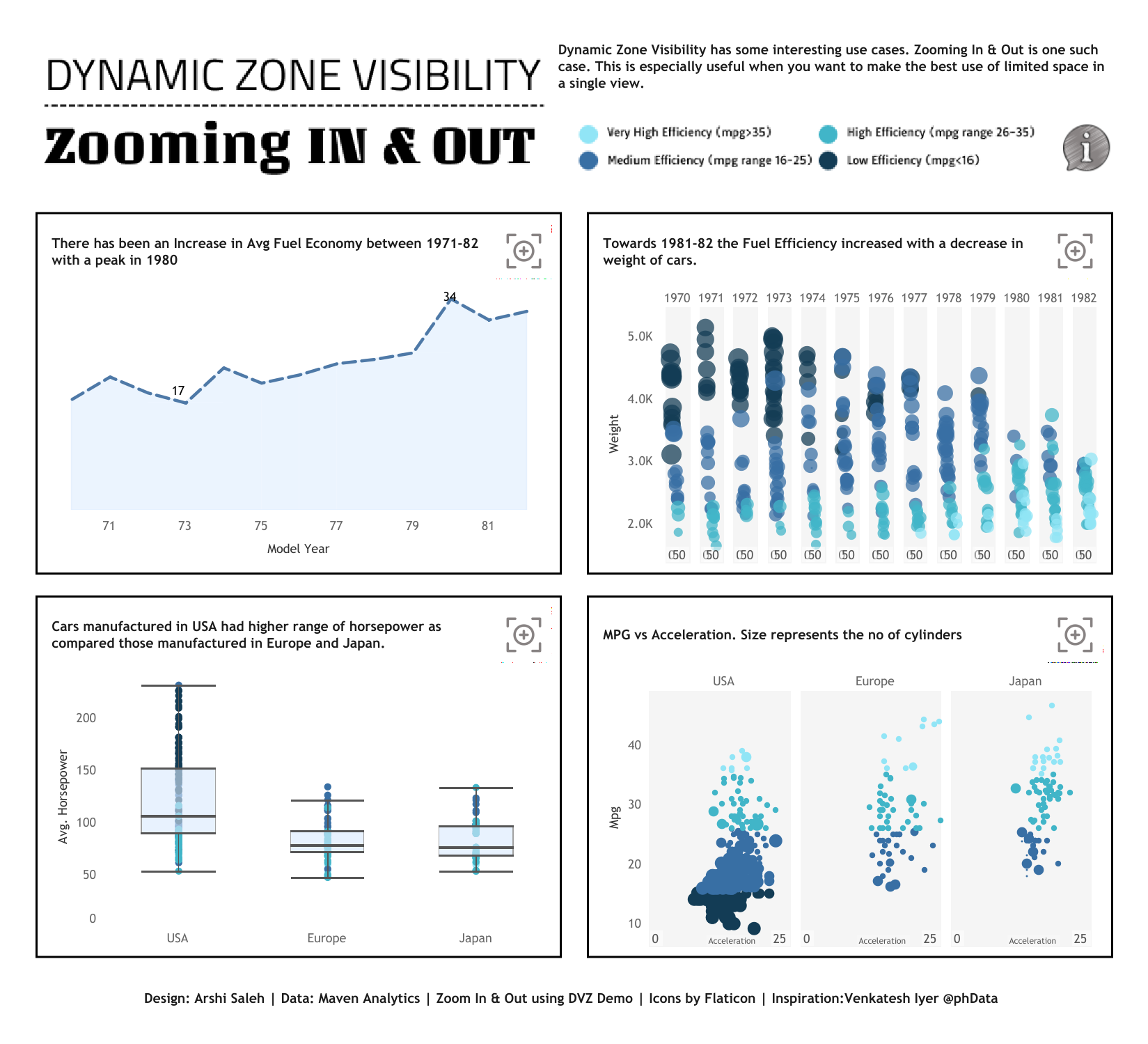
Arshi Saleh: Dynamic Zone Visibility - Zooming In & Out
See the latest Viz of the Day, trending vizzes, featured authors, and more on Tableau Public.
Check out some inspirational vizzes created by the community:
- Veronica Simoes: The 2024 Living Planet Index
- Shangruff Raina:
Community Projects
Back 2 Viz Basics
A bi-weekly project helping those who are newer in the community and just starting out with Tableau. Not limited just to newbies!
Web: Back 2 Viz Basics
X: #B2VB
Workout Wednesday
Build your skills with a weekly challenge to re-create an interactive data visualization.
Web: Workout Wednesday
X: #WOW2022
Preppin' Data
A weekly challenge to help you learn to prepare data and use Tableau Prep.
Web: Preppin’ Data
X: #PreppinData
Makeover Monday
Create business dashboards using provided data sets for various industries and departments.
Web: Makeover Monday
X: #MakeoverMonday
Visual Climate
Collaborate and share climate data.
Web: Visual Climate
X: #VisualClimate
DataFam Con
A monthly challenge covering pop culture and fandoms.
Web: DataFam Con
X: #DataFamCon
EduVizzers
A monthly project connecting real education data with real people.
Web: Eduvizzers
Games Night Viz
A monthly project focusing on using data from your favorite games.
Web: Games Nights Viz
X: #GamesNightViz
Iron Quest
Practice data sourcing, preparation, and visualization skills in a themed monthly challenge.
Web: Iron Quest
X: #IronQuest
Storytelling with Data
Practice data visualization and storytelling skills by participating in monthly challenges and exercises.
Web: Storytelling with Data
X: #SWDChallenge
Project Health Viz
Uncover new stories by visualizing healthcare data sets provided each month.
Web: Project Health Viz
X: #ProjectHealthViz
Diversity in Data
An initiative centered around diversity, equity & awareness by visualizing provided datasets each month.
Web: Diversity in Data
X: #DiversityinData
Sports Viz Sunday
Create and share data visualizations using rich, sports-themed data sets in a monthly challenge.
Web: Sports Viz Sunday
X: #SportsVizSunday
Real World Fake Data
Create business dashboards using provided data sets for various industries and departments.
Web: Real World Fake Data
X: #RWFD
Data Plus Music
A monthly project visualizing the data behind the music we love!
Web: Data Plus Music
X: #DataPlusMusic
Related Stories
DataFam Roundup June 2026

Tableau Ambassador Nominations and Applications are Open
 June 10, 2026