Accelerating understanding with the Executive KPI Dashboard Starter Kit


I was looking over the hospital compare website the other day and was amazed at how many measures are now publicly reported here (78 distinct KPIs). Many of these are directly tied to reimbursement and all are considered critical. And this is just the tip of the iceberg! NQF endorsed measures now number over 700 and KPIs like employee engagement, internal productivity, strategic market share, and physician satisfaction all play critical roles in determining a health provider’s success. Many of my colleagues have wondered where to begin, how to make sense of prioritizing what to work on next, and how to respond to ever-changing needs. With fixed resources to improve the patient experience, reduce the cost of care, and improve the health of populations (IHI’s Triple Aim), having an agile framework that supports rapid deployment is key.
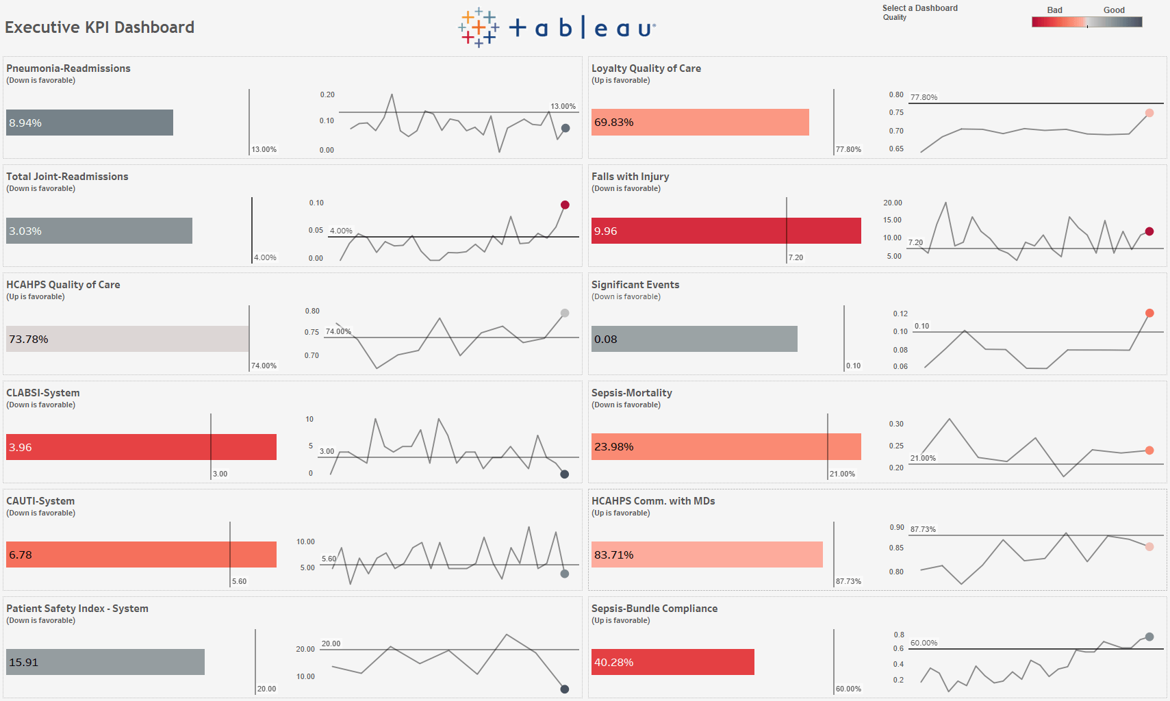
Figure 1. The Executive KPI Dashboard inspired by Lindsay Poulter
The Executive KPI Dashboard Starter Kit for Tableau was designed to help hospitals rapidly deploy a solution to see and understand their most critical key performance indicators. With hospitals facing as much as a 6% reduction in inpatient Medicare reimbursement annually millions if not tens of millions of dollars per hospital), it is imperative that hospitals clearly understand their performance so they can focus efforts where they stand to maximize returns and not get distracted by or overwhelmed with the hundreds of publicly reported measures that are out there. This Starter Kit serves to accelerate the sharing of information and provides a scaffolding to further automate the collection of critical data elements as well as unify analytics across multiple platforms.
The Executive KPI Dashboard itself accomplishes this by employing a consistent, simple, easy to understand visualization of your most critical measures. A three-second glance at the dashboard allows you to quickly understand the state of 12 KPIs and see how you are doing (the number on each bar) against a goal (the color based on performance against benchmark), over time (sparkline), and most recent (ball color at end of sparkline). From here, you can drill through to a linked dashboard to learn more (perhaps another Tableau dashboard that you recently built or even a dashboard on another platform so you can provide a one-stop shop for your KPIs). You can also link to reference material (perhaps an NQF measure specification or an internal wiki page) and even look at the performance through the lens of an SPC chart (with the signals for special cause variation automatically called out). And with dashboard layouts designed specifically for the Tableau mobile app, you can check on how you are performing while waiting for a plane at the airport.
As part of the Starter Kit, you will find:
- The Tableau workbook, built to handle customization of number formats, desired directions for measures (up is good for net margin, but bad for infection rates) and multiple measure/dashboard combinations.
- The Starter Guide to help you deploy the workbook.
- An Excel-based data source to enable the robust features of the workbook.
- A Tableau Prep flow to tie the data together.
- Sample Tableau Prep flows to inspire you to further automate your data collection.
Author’s note: As I thought about how to solve this problem, I drew inspiration from a number of excellent community posts over the years. Andy Kriebel’s A New Way to Visualize an Income Statement Analytic served as a great starting point, and I knew I needed to build on Jonathan Drummey’s work outlined in User Defined Functions and Process Control Charts to include support for the widely used u, p, x and c statistical process control charts. I also want to acknowledge the thought leadership of Lloyd P. Provost and Sandra Murray. Their contributions around demystifying statistical process control charts in healthcare delivered via the Institute for Healthcare Improvement (IHI) has had a tremendous impact on the process improvement community at large. Also shout-outs to Patrick Murphy, Alexis Guinebertiere, Matt McWhorter, Ray Ready, and Diane Campbell who all helped bring this to life through their influence and hard work.
Related Stories
VizQL Data Service from Tableau: Use Your Data, Your Way
 August 8, 2024

When and How to Use Multi-fact Relationships in Tableau
 August 1, 2024

Top data books of 2021
 December 12, 2021