Gartner BI Bake Off: Using Tableau to understand the opioid crisis


For over a decade, Tableau has empowered organizations, and the people they employ, with the solutions to extract insight from data. Every day, thousands of data stewards - from financial services powerhouse Charles Schwab to retailer REI - have the power to see and understand governed and secure data that helps propel business. And they do this using Tableau’s innovative products. For this reason, Tableau has been a Leader in the Gartner Magic Quadrant for six years.
Each year, Gartner invites the leader to take part in their BI Bake Off, where each vendor does scripted demoes to highlight their products. This year, I got asked to present our behalf. I highlighted Tableau’s capabilities in five categories, which included Dashboarding, Data Preparation, and Governance. I also previewed Project Maestro in the ‘Cool and Innovative’ section.
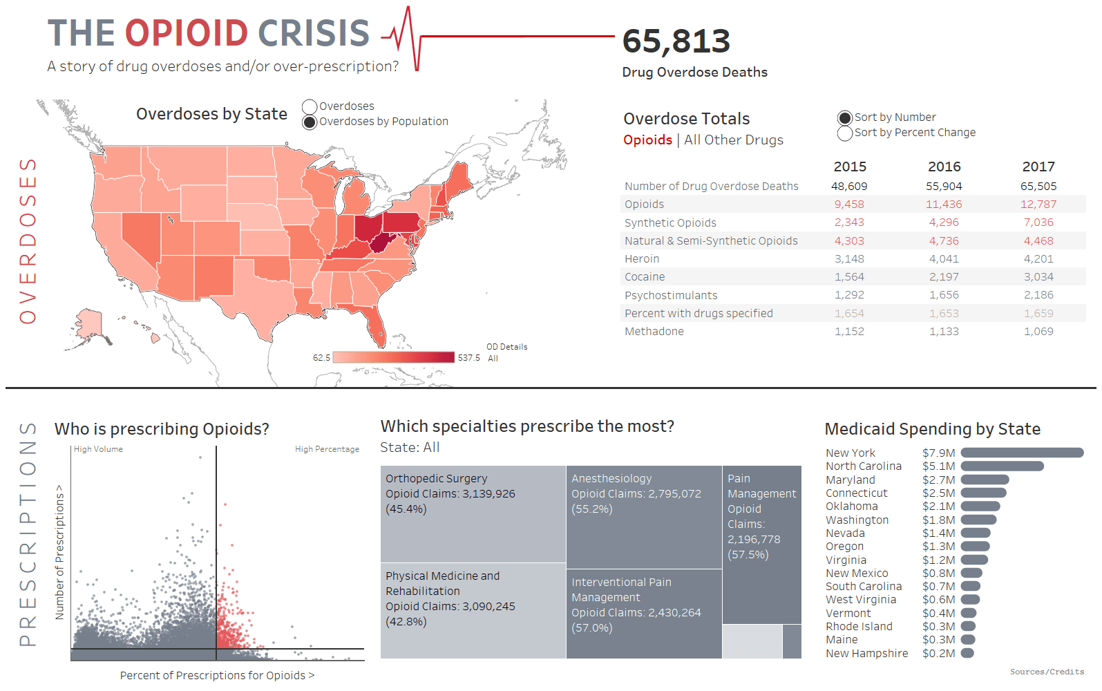
This year’s BI Bake Off, we were given data about the Opioid Crisis in the USA.
Dashboard Demo
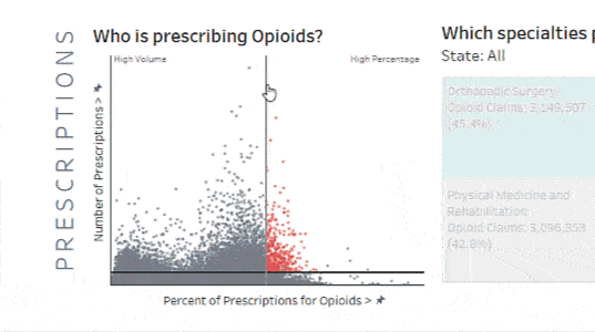
In Tableau you can do powerful analysis with all your data with simple gestures and a few clicks, never having to program. The video shows how I demonstrated my findings. First, I used a scatterplot to show all doctors who prescribe opioids (over 700,000 of them!). Using Tooltip Selections, I extracted incredible insight by highlighting any doctor’s peers, by County and Specialty. For example, I was able to show how Dr. Mark Murphy, previously accused of over-prescription, compares to other doctors in pain management and those in Morgan, Alabama.
Moving onto the map, I showed that West Virginia has the highest overdose rate. But, as revealed in the Viz In Toolip launched in January with Tableau 10.5, Maryland has the highest opioid overdose rate. My story continued by looking at Maryland in detail. Synthetic opioid overdoses in 2017 were 106% higher than in 2016.
With a few clicks, I arrived at powerful insights that allowed me to broaden my questions, like how can we stop this shocking rise? Could we create new intervention plans to reduce the number of opioids being prescribed? With the data available, I drilled down to the highest prescribers in Maryland: would these be the doctors we could target, to attempt to come up with new ways to break the pipeline between prescription, addiction and, tragically, overdoses?
Data Preparation
I love doing data preparation in Tableau. Tableau allows you to prep your data visually and directly with instant feedback. In the the data window you can build complex models, joining and unioning data, splitting fields, pivoting, and much more. And you can also extend a data model with new dimensions and measures in the analytics pane itself, visually verifying everything instantly.
In the demo, I show how easy it is to create permanent calculations, blend and join new data, and do visual grouping.
Cool and Innovative: Project Maestro
In the final section, all vendors are asked to show something cool and innovative. Last year, we showed an integration with Alexa using existing APIs. Since then, we’ve enjoyed seeing our community build similar Tableau integrations, such as Ann Jackson’s use of smart light bulbs.
This year I wanted to show something you will be getting your hands on soon: Project Maestro. I am so excited that we are bringing the magic of Tableau to data prep. Project Maestro gives you a complete view for immediate understanding. Using advanced algorithms, it’s smart, so that you can work faster. Finally, there’s seamless integration with Tableau giving anyone the ability to switch between data prep and analysis, easily. I showed how easy it is to clean data using smart algorithms, pivot tables, and join different connections together. Project Maestro is coming soon, and you can sign up the public beta today!
Project Maestro is just one of the innovations on our roadmap. Last year, we acquired Cleargraph, a company that enables smart data discovery and data analysis through Natural Language Processing (NLP). Combined with the work our Research Team has already done on NLP, led by Vidya Setlur, smart analytics like this will make it easier for all users of Tableau to get answer more quickly from their data.
Conclusion
Taking part in the Bake Off was an honour – and a great deal of fun. I enjoyed the chance to show the best of Tableau to attendees at the Gartner Summit.
I was also humbled by this experience. I’m British, and only knew scant details about the opioid crisis in the USA. I certainly learned a great deal when exploring the data.
Our own Tableau Foundation, helping build a better world with data, is working with organizations on the front line of this crisis. For example, it is helping Talbert House in Ohio use its own data to optimize responses to opioid overdoses. As data workers, it is important for us to do what we can to shine a light on the problem, and to improve people’s lives.
Related Stories
How EMD Serono is improving patient care with personalized, AI-powered insights from Tableau
 September 30, 2024

Embedded Analytics: Should you build or buy?
 June 7, 2022
Data fabric’s value to the enterprise
 May 11, 2022