The Density Mark type brings a new kind of heatmap to Tableau


New in the Tableau 2018.3 release, heatmaps allow anyone working with dense, overlapping data to easily make sense of the data’s concentration. This makes it easier to recognize spatial patterns in geographic data. But heatmaps are not limited for use on maps. You can use them on scatterplots, dot plots, and more!
It’s easy to create heatmaps in Tableau. Simply change the mark type to density and off you go. You also have a number of configuration options for working with heatmaps in Tableau. Change the density around a mark by adjusting the Size slider to modify the area where marks have influence, apply a weight to the density by dropping a measure on Color, or show more or fewer hot spots in the data by adjusting the intensity slider. We also created new color palettes designed for light or dark backgrounds to align with visual best practices. And existing capabilities like filters, pages, and small multiples all work intuitively.
There are countless real-world applications for heatmaps. In this post, we’ll explore a few common use cases.
Mapping latitude and longitude: Comparing 311 calls in New Orleans
It is common practice for municipal governments to share thematic data about events, incidents, and operational activity with the public. New York, Toronto, and Melbourne are all great examples of cities increasing transparency through Open Data. Having recently visited the great city of New Orleans for Tableau Conference 2018, I wanted to further explore some of this publicly available data. I decided to look at 311 calls placed in the last six years. 311 calls represent minor problems the citizens of the city want fixed.
When I connect to the data in Tableau, I can easily build a map of all 311 calls using the latitude and longitude fields in the dataset.
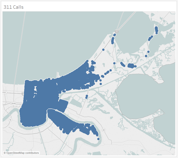
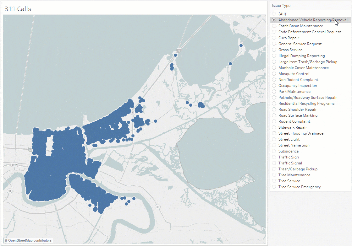
The problem with a map like this is that it is hard to make sense of any pattern in the data without filtering. To get a better sense of spatial concentration within the data, I can Show Filter to look at the types of issues being reported. However, there is still too much data to make sense of and any further filtering constrains my analysis. Comparing these two issue types is difficult since the data points appear to cover very similar locations.
With heatmaps, spatial concentrations are instantly recognizable. Differences are obvious when comparing 311 issue types or any categorical data. Simply change the mark type to Density and compare for yourself.
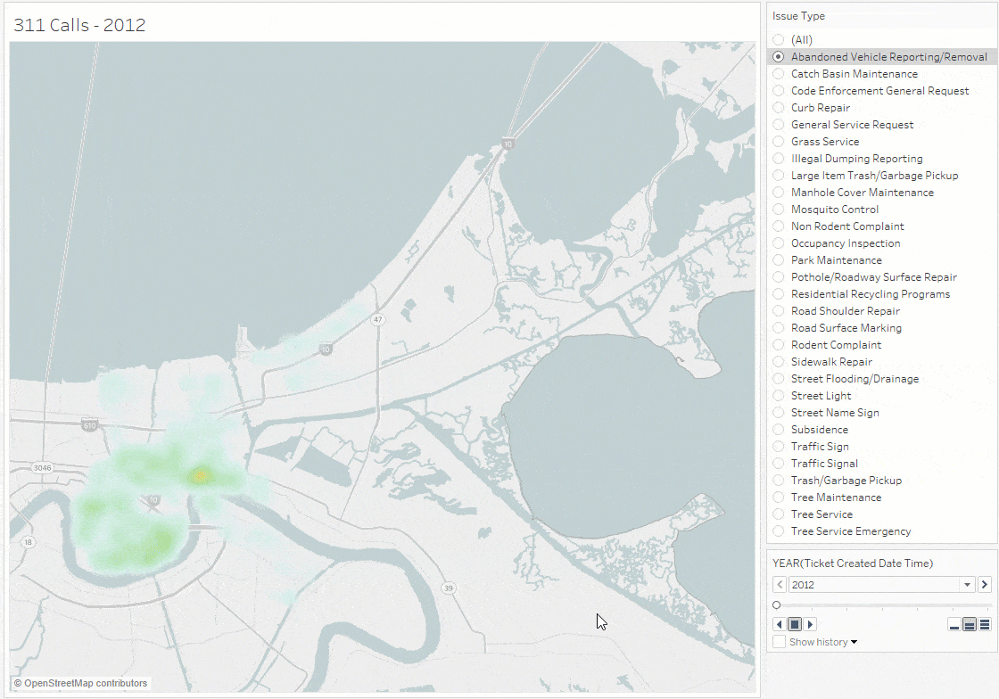
Heatmaps make it easier to understand spatial patterns, but you can take it a step further and show how those patterns change over time. Using Pages, you can easily move through the abandoned vehicle issue and see that the number of reported incidents has increased each year, but the areas of concentration have remained relatively the same. With Pages, the density is calculated for the entire dataset, so you can see relative comparisons as you animate the data.
Scatterplot: Spotting patterns in basketball shot data
Analytics has changed the way businesses operate. One of the most publicly visible applications of analytics comes from the world of sport. Almost every sport is exploring spatial patterns of shots, goals, defenses, and player movement; with teams looking for a competitive edge. Basketball is one sport that produces a lot of data and it can be difficult to discover patterns. Here is a view that looks at all the shots attempted in the NBA across a sample of 100 games.
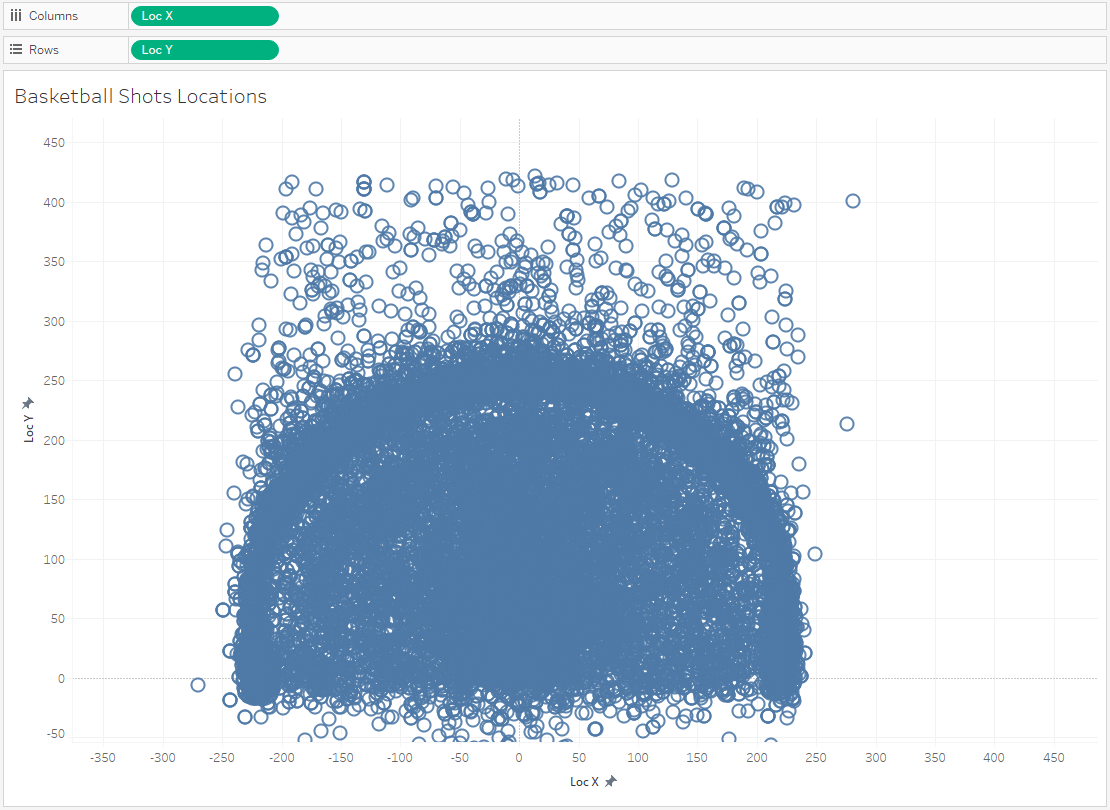
The three-point line stands out, but beyond that, the data does not reveal any pattern to explore. Now you can use heatmaps in Tableau to turn curiosity into insight. What does shot selection look like across the NBA? What are the tendencies of individual teams? Let’s take a look.
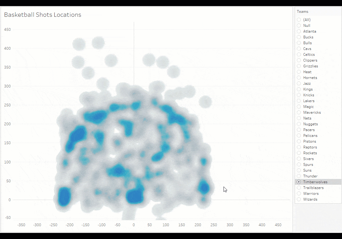
NBA shots for all teams
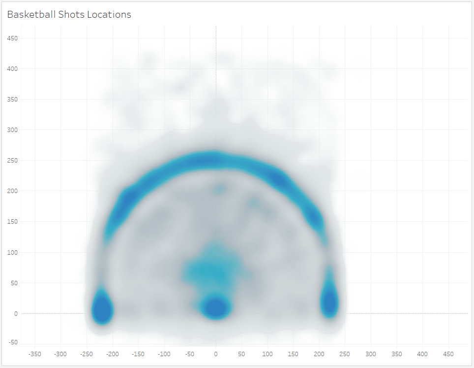
When comparing shot selection across teams, a number of observations jump out. The Trailblazers shows a fairly even spread of three-point shooting locations, with almost no concentration in the mid-range. The Warriors balance their shots from distance, with high percentage mid-range and close-to-the-basket shots.
If you’re going to share and analyze sports data, don’t forget to use a background image to provide the right context. In this viz, I’ve added the basketball court to make it that much easier for visual analysis.
Dot plot: Analyzing product orders over time
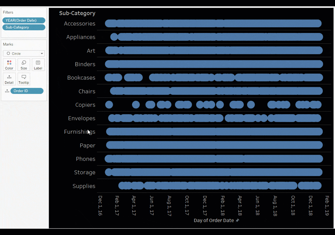
Heatmaps are perfect for looking at dense data on a scatterplot, but they can also be used in other creative ways in Tableau. Let’s look at a recent history of product orders. There are many useful ways to visualize data over time, but let’s start by simply visualizing each separate order.
In this view, I can't see any specific pattern, outside of the obvious—copiers are never a top seller. If we switch the view to use Shape marks, it becomes slightly easier to see concentrations (or patterns) of orders.
I can tell that paper has more frequent orders—certainly more frequent than bookcases, copiers, envelopes, and supplies, but I have to scrutinize this view to determine my next question. Look what happens when using heatmaps.
Heatmaps allow you instantly see a trend for each product and to compare products as well. Your data could be for any event over time, like individual orders by customer, bank machine deposits and withdrawals, or wildlife observations; and with heatmaps you have more ways to explore and explain your data.
Heatmaps in Tableau make it easy to understand the concentrations that exist within your datasets. Built to be flexible and configurable, you can use them on maps and non-maps, while using color, size, filters, pages, and actions to create your perfect view. See more heatmap examples in our Viz Gallery.
Related Stories

The Tableau+ Bundle with Premium AI, Enterprise Capabilities, and Premier Success
 June 24, 2026
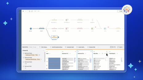
What is Tableau Prep?
 April 30, 2026

Insights Wherever You Work: Meet the Tableau App for Microsoft 365
 March 16, 2026