What happens when you empower college students to explore their data


It’s one thing to be told what’s what. It’s quite another to figure things out for yourself.
That’s the lesson a group of college students learned during a recent visit to Tableau’s Palo Alto office.
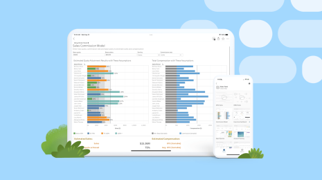
“The whole point of Vizable is implicit in the name. It’s bringing data to life,” Tableau’s own Dash Davidson told the students. “What’s really cool here is you can have a question and answer it in just a few swipes.”
The students, from Houghton College and the University of Tennessee, watched a quick demo then dove right into an exercise.
Using Vizable, they connected to a rich data set on fantasy football players—which school they attended, which conference they played in, how they scored on the Wonderlic test.
And just 10 minutes after opening Vizable for the first time, they were already pinching and swiping, answering Dash’s questions.
“See if you can figure out how to add a school column, and tell me which school produces the most fantasy players,” Dash said.
On the heels of Dash’s words came the answer: “Miami—by a LOT,” said Cayce Wainscott.

“Now figure out why Miami is number one. Which player is really driving Miami’s ranking?” Dash said.
And not a moment later, the students had the answer: It’s not one player; Miami boasts a number of talented alums.

“Let’s try a filter. Let’s only look at PAC 12 schools,” said Dash. The students took no time finding the top school (USC) as well as the bottom school (Washington State—sorry, Cougars).

The students were ready to dig deeper, so Dash turned to the Wonderlic score to look for players with brains and brawn. The group quickly identified the top scorer (Ryan Fitzpatrick of Harvard), the top-scoring position (QBs), and the top-scoring running back (Tim Lester).

Then Dash set them loose: “Play around, find something interesting, then share it with the rest of us.”
Theresa Taggert had something to share. She learned that Louisiana ranks high in fantasy QBs, thanks to the Manning brothers.


But once you filter out the Manning brothers, it’s a different story.
“Now, Louisiana drops really far down,” she said.

Bjorn Webb took a different approach: “I’m a big Kansas City Chiefs fan, so I was looking to see where their players ranked against other teams’ players.”
Alas, Bjorn’s Chiefs didn’t score so well on the Wonderlic. But he did learn something else: being able to explore one’s own data is a powerful thing.
“When you see research done, it involves questions that other people asked that they’re showing you the answers to. This is asking our own questions and finding our own answers. We’re the ones asking the questions,” Bjorn said.
And something happens when you start asking your own questions, said Cayce.
“It’s a way to learn about things you didn’t think you could discover on your own. Stuff you didn’t even think about,” he said.
Theresa thinks the visual aspect of Vizable has a lot to do with that.
“When you’re just looking at numbers, it’s a lot harder to pull things out,” she said. “It’s a lot easier [with Vizable]. It’s really user-friendly."

Just a half-hour of using Vizable, and the students were already full of ideas for its use, from school assignments to healthcare, to even “winning an argument,” as Cayce put it. The students had become data explorers, ready to make sense of the data that surrounds them.
“[Vizable] can literally be applied to anything,” said Isaac Hess, “to any type of business, to looking at your competitors, budgeting—pretty much any career, any aspect of life, really.”
As the students pointed out, #dataiseverywhere. What kind of data are you exploring with Vizable? Tell us over on Vizable World or via Twitter @VizableApp.
Related Stories
How to Improve Business Productivity with Tableau Mobile
 August 31, 2022

Introducing improved online/offline flows in Tableau Mobile
 November 17, 2020
Metrics, headlines for your data
 May 28, 2020
Learn about Metrics for Tableau—Optimized for mobile, track all your KPIs from various dashboards at a glance, all in one place—anytime, anywhere.