Visually Exploring the COVID-19 Research Literature


The swift and sudden emergence of the SARS-CoV-2 pandemic left societies scrambling for answers. Researchers responded and over the span of a few months released an exponential number of studies with new information about the virus and the COVID-19 disease that it caused. Effectively tapping into the rich resource of research findings and data is essential in our strategic abilities to control and contain the pandemic. Yet the sheer volume of new information has quickly grown untenable. If you have a question in mind, for example, ‘How does the virus spread?’ and ‘What treatments exist for COVID-19?’ you might be able to narrow down the research to a reasonable set of articles. But the problem with this strategy is that it’s only as good as the question you can think to ask. For example, did you ever think to ask ‘Can cats get COVID-19?’ or ‘How did the public respond to public health messaging in prior pandemics?’
In this blog post, we want to shed some light on our research processes of designing a prototype for visual exploration of the SARS-CoV-2 pandemic research articles. We also want to share with you why we think this approach is complimentary to some of the more search engine style, query-based, approaches that others, including our sister team in Salesforce Research, have made.
The Big Picture
Our mission at Tableau is to help people see and understand data. At Tableau Research, one of our goals is to explore and develop new ways of visualizing and interacting with different kinds of data. Text data is one area that we are actively exploring through the lenses of algorithmic, visual and interaction design, and user experience research. In response to the growing scientific literature around SARS-CoV-2, we created a prototype for visually exploring the emerging research articles. Our prototype, shown above, organizes research articles into topics and allows individuals to click through and explore the research content.
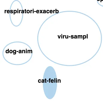
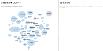
That question about cats? It was a question we asked after playing around with our own prototype! Turns out there was a topic of research articles on cats that our prototype found and grouped together with other animals. The proximity to the ‘dog’ topic and existing concerns in early March 2020 that dogs could contract SARS-CoV-2 from humans made us think that maybe cats could as well; quite unexpectedly, this insight proved true a few weeks later when some tigers at the Brooklyn Zoo got sick. This serendipitous finding reminded us that sometimes the most important part of discovery isn’t just ‘Eureka!’ but also ‘Huh, that’s funny’.
In building our prototype, we wanted to find a way to encourage those moments of serendipity in data discovery, which can ultimately provide a glimpse into those ‘unknown unknowns’ and help an individual consider the questions that they might not think to ask.
What we did
The Data
We used the CORD-19 research dataset that was released mid-March on the Kaggle website through the joint efforts of several organizations. While there existed several complementary datasets, the CORD-19 sources in particular emerged as a central and curated dataset of research knowledge. The dataset consists of both published and unpublished research articles, data summarizing additional details about the articles (who wrote them, when they were released, etc.), and in some instances the full text. When full text was not available, there was, at a minimum, a title for each article and an abstract (a brief paragraph that summarizes the key findings and conclusions of the document) that could be used.
The Status Quo
A human might read all the research articles, highlight important bits and pieces, and start to come up with categories to organize all the insights she is getting from reading all these research articles. For example, our intrepid human speed reader might start to see a lot of research articles about preparing hospital ICUs for pandemics, and start to make a little pile of them about those topics. She might make separate piles for vaccine development strategies or other respiratory illness similar to the SARS-CoV-2 virus. These categories are not necessarily ideas that she had ahead of time, but came up with and refined over time as she read through those research articles.
Most humans don’t have the time to go through all of those documents, even those humans with extraordinary speed reading capabilities. So we need a computer to help us. Algorithmically speaking, computers have been helping us to understand text data for a long time. Just think of every time you write a Google search — it returns a list of articles (web pages!) for you to explore and dig into. But a Google search, and other similar types of algorithms, relies on you having some idea of what you want to ask, or at least being able to execute successive queries until you arrive at something highly specific. For example, you might start by searching for ‘dogs’, and realizing there’s a lot of dog content out there, decided you wanted to search for ‘small dogs’ and over time evolve your search toward something more germane, such as ‘small dogs with good temperaments that don’t shed too much’. The idea here is that as you learn more about dogs and what you care about, you refine your query over time. While this query based approach is pretty routine it can also be time consuming, and it doesn’t provide you with a sense of what other questions you could have asked but didn’t think to. The same problem exists when you want to understand a large pile of research articles; you might have some high-level questions, but you don’t know everything that’s there and what else might be interesting to you.
What we came up with
Our own exploration of the pandemic research articles led us to new questions toward how people interact not only with text but also the underlying algorithms that analyze and summarize these data. We followed up this curious inkling with an investigation to visualize text data in a way that gave an individual a high-level view of those research articles, but also let them drill down and get details on demand for topics an individual was especially interested in. For this objective we developed a few research questions. How do we summarize a bunch of text documents quickly and effectively? What information does an individual need to know? How can they get more details on demand? Most importantly for us, how can we distill all of this information into a visual and interactive interface?
We came up with a prototype that leverages machine learning algorithms and data visualization to power the user experience. It has four major steps under the hood, which it carries out automatically :
- Preparing the text documents for analysis
- Identifying and clustering documents into topics
- Summarizing useful cluster information
- Visually presenting the documents, clusters, and contextual information to end-users
Our approach attempts to quickly generate topic clusters with no input from the end-user and without any prior training (labelled) data — everything happens on the fly according to the present dataset.
A look at our prototype
Our approach ingests some text data from research articles and automatically performs above Steps 1 to 3 ahead of visualizing data. The algorithm, which we have previously published, doesn’t require any input from the user and automatically tries out different possible ways to select topics and visualizes only its best guess out of many possible alternatives. Our visual interface is the point where a user can begin to interact with the topic clusters to start exploring the kinds of documents within each cluster.
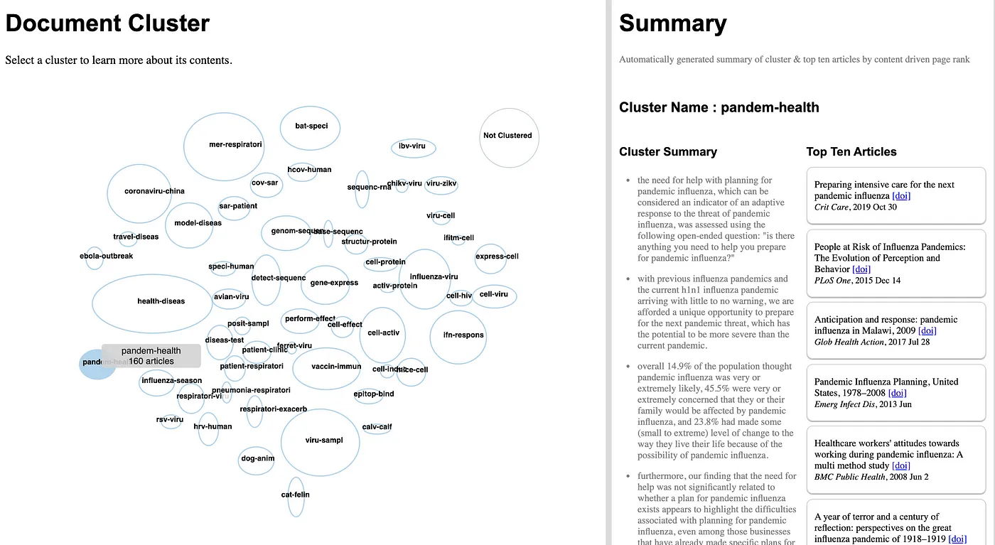
The UI for our prototype has two main panes: a document cluster pane and a summary pane. The document cluster pane shows all of the topics that our algorithm found. Each topic cluster is represented by a blue ellipse with a name in the centre; the topic clusters are currently given a very simple name based upon the top two most commonly used words in each cluster. Hovering over a topic cluster indicates how many documents (research articles) pertain to that topic. In the example below, the ‘pandem-health’ topic clusters have 160 articles. The size of the ellipse represents the total number of documents in that topic, the one exception is the ‘not-clustered’ cluster which has a fixed size. Clicking on a cluster populates new information in the summary pane. The first bit of summary information are five bullet points with content drawn from the multiple research articles that attempt to summarize what this topic is about. The second bit of summary information are ten articles, which are order according to their representativeness of content in the topic cluster. So, once the ‘pandem-health’ topic is clicked on, we get five bullet points that tell us that the contents of this topic appear to be toward how people plan and prepare for pandemics. The top ten articles are also all about planning and preparing community and hospital systems for the pandemic. A person can click on link within each research article to read the original work. Some documents don’t cluster into any topic, this can be for a number of reasons, and are put into the ‘not-clustered’ topic.
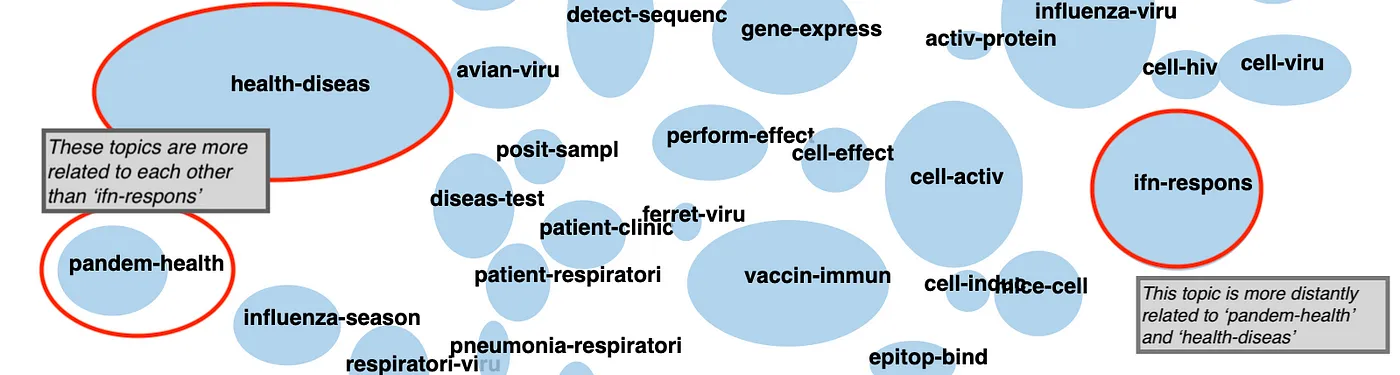
Finally, the topic clusters that are close to each other in the document pane tend to be more related that those that are further apart. So the ‘pandem-health’ cluster is much more similar in content to the ‘health-diseas’ cluster than it is to the ‘ifn-response’ cluster.
With this prototype, an individual can explore different clusters as well as individual research articles. Our intent here is that it may help them triage the kinds of information that is relevant to them, or at the very least get a holistic sense of what’s in this text dataset. Through the exploration processes an individual might even form a more refined idea of a specific thing they want to search for.
What we’re going to do next
Text data is abundant within many organizations and being able to unlock its utility, without requiring an advanced degree in computer science, is our ultimate goal. The project we have shared with you here is a start toward a that goal.
The CORD-19 research dataset presents many interesting challenges and demonstrates how a machine learning system that can analyze and visualize text data can distill critical information during uncertain times. We’re actively investigating these questions in follow-on projects with new data and end-users. Moving forward, it would be interesting to combine our prototype with a query based approach. One possibility of a hybrid approach is to add context to queries. For example, an individual could query the dataset for ‘Vaccine Development’ and the ‘ferret-viru’, ‘vaccine-immun’, and ‘epitom-binding’ topics would all light up because they contain information that is relevant to vaccine development. Highlighting the spread of research articles across clusters could help the individual more quickly form a germane query, such as, the ‘vaccine development immune response’. Another approach could be to suggest queries to the individual based upon the topic. For example, an individual could click on ‘pandemic-health’ and see an automatically generated list of queries based upon the content of the cluster. The individual could select a query from this list or use it as inspiration to form their own new query. Both of these approaches provide exciting avenues for exploring new ways of helping individuals see and understand large text-based datasets.
Related Stories

Which Model Speaks Your Data Language? A User-Centered Approach to Evaluating LLMs for Conversational Visual Analytics
 April 14, 2026
Rethinking How Data Workers Revisit Analytical Conversations and Communicate Insights
 April 10, 2026
Stepping through Charted Territory: Creating Interactive Step-by-Step Dashboards Tours
 June 8, 2025