Once Again, with Style: Understanding and Supporting Partial Reuse in Dashboard Authoring


Ask any analyst what they consider the major pain point of dashboard authoring. Chances are, it will be the “last mile”: styling and formatting. Now, think about why.
You talked to your stakeholders, cleaned your data, and curated your views. In comparison, tasks like view placement, adjusting fonts, configuring margins, and matching the corporate style guide are all easy and minor, but are also manual and repetitive fine-tuning work that you’ve already done for a dozen other dashboards. This so-called “last mile” feels more like a marathon, doesn’t it?
You might then ask: what about dashboard templates? They can be useful, yes, but only if your use case is clear enough to anticipate what components and layout arrangements will be needed. Otherwise, they might actually require more fine-tuning than creating something from scratch, especially if only a few parts of the template are useful.
So let’s take a step back to reframe the problem a little differently from a perspective of partial dashboard reuse: what if we had the ability to replicate work already done, but pick and choose which parts or features to reuse? This question motivated us to pursue this research.
First, we understand: Digging into dashboard authoring pain points
Since this middle-ground approach to dashboard reuse is relatively unexplored, we started our investigation by digging a little deeper into these unmet needs. We invited several Tableau Community Leaders to help us answer this question: if technology weren’t an issue, what and how would you want to reuse partial dashboard features?
To do that, we gave them a digital whiteboard (Figure 1), and asked them to create a dashboard design mockup that referenced prior dashboards (Figure 1, right), however they saw fit. We also asked them questions about challenges they face with dashboard reuse currently in their own practice.
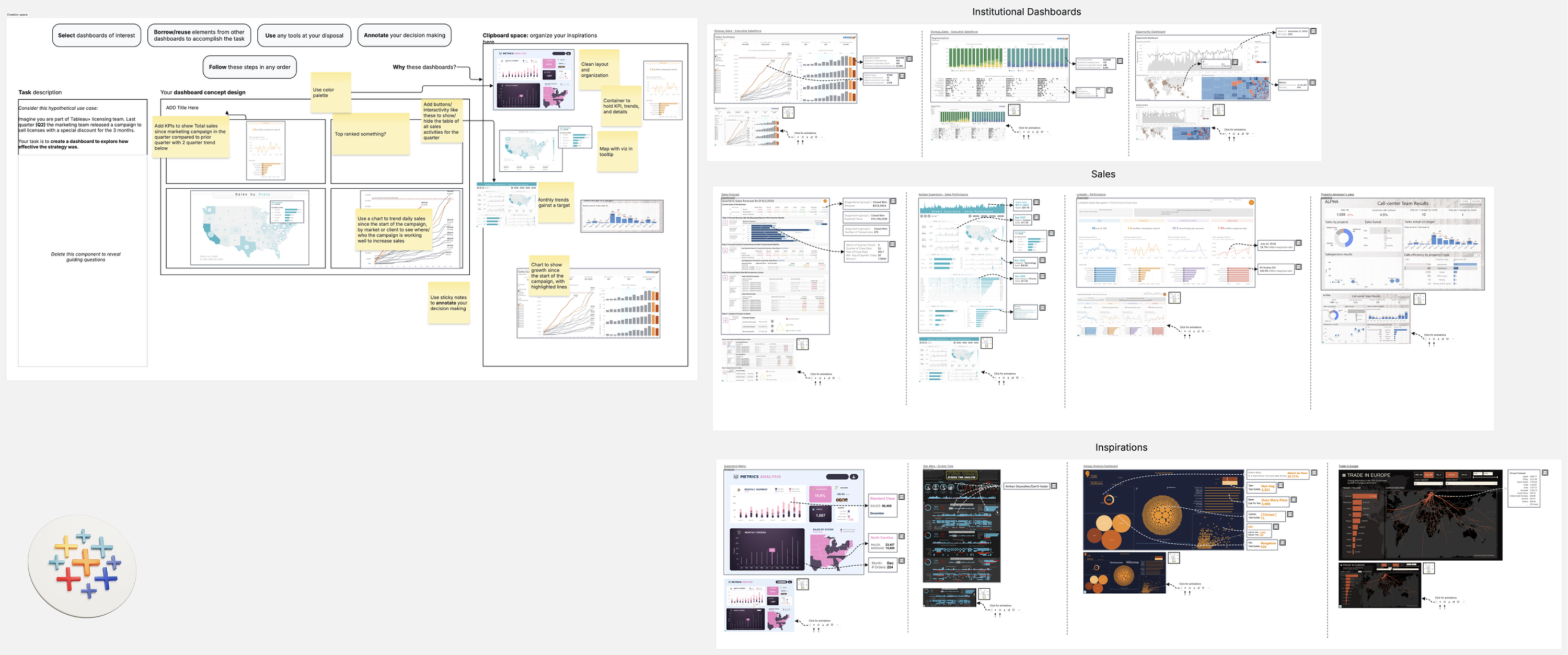
Figure 1. Whiteboard setup used in the study. Participants were given a task and a canvas space to create a dashboard design concept (left) by referencing elements and components from pre-existing dashboards (right).
Here’s what we found:
- Participants confirmed their frustration with the repetitive nature of dashboard authoring work. In particular, they cited styling and layout configuring as particularly onerous, especially in the contexts of (a) maintaining consistency across dashboards in their portfolio and (b) helping bridge the design expertise gap for novice creators.
- When working on their whiteboard designs, all participants borrowed inspiration from multiple dashboards as opposed to just one, underscoring the limitations of the single “dashboard template” reuse approach.
- Reuse intents also varied significantly in granularity and scope, ranging from well-defined features of specific components (such as “use color palette from this chart”) to more elusive intents with unclear targets (such as “I like the look and feel of this dashboard” or “I want a circular layout similar to this one”). This calls for a flexible approach that supports a spectrum of reuse goals, from specific to vague, and fills in the blanks when necessary.
Then, we create: How ReDash simplifies replicating visual design
Based on these findings, we created ReDash, a preliminary proof-of-concept for reuse of dashboard styling and formatting (Figure 2). Our goal was not to create a fully fledged reuse system, but rather, a concrete working example of dashboard reuse functionality to showcase the concept and mediate conversations.
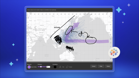
The idea is simple. Pre-authored vizzes (Figure 2 left) can be added to a central canvas (Figure 2 middle), with dashboard references (Figure 2 right) each accompanied by a list of design bundles listing dashboard features that can be reused with a single click (mainly centered around Layout and Style).
Reuse operations are highly flexible. Users can pick specific sources and targets for reuse operations, or let ReDash intelligently handle matches to fill in the gaps. For example, Style from a selected bar chart (source) can be applied to a selected line chart (target), and Layout reuse from a dashboard reference onto an empty canvas creates matching placeholders. Features can be borrowed from one or multiple dashboards, in a fast iterative workflow that encourages experimentation.
Figure 2. A demonstration of ReDash in action.
If you are curious about how it works under the hood, check out our paper & video demo and accompanying supplemental materials for implementation details.
Now, we look ahead: Scaling design consistency and collaboration
We again invited members of the Tableau community for early feedback on this concept. Even though ReDash is still a work in progress with much room to improve, there were many positive reactions to the value of the approach and enthusiasm about the prospect of having such a resource available to them in the future.
More interestingly though, having a concrete functional example helped steer the conversation towards user needs and challenges that were not originally on our radar, such as incorporating best practices to help fill in the blanks, leveraging source-target connections to propagate changes across multiple dashboards at once, and improving features for cataloging dashboard references as design inspiration.
We also discussed ethical concerns about lack of attribution and the tension between beneficial reuse versus “stealing other people’s work”, and how our approach offers a potential solution: the ability to track and automatically surface where design inspiration came from could bolster transparency and incentivize more authors to share in the platform, trusting that their work would be acknowledged.
Ultimately, evolving the notion of partial reuse from a simple style-transfer operation into a collaborative, trackable ecosystem of design inspiration helps us envision a future where we empower dashboard creators to achieve design consistency at scale, bridge the expertise gap, and focus their energy on what matters most: letting the data speak.
Interested in learning more?
The Tableau Research team will be presenting this work at EuroVis 2026 in Nottingham, UK, June 8–12. Come find us to talk about ReDash, see the prototype workflow in person, and chat about the future of dashboard authoring.
In the meantime, we would love to get your thoughts on the project. You can check out the full paper and a demo video on the Tableau Research page of our website.
This work was led by Gustavo Moreira (one of our amazing 2025 summer interns from the University of Illinois Chicago) alongside mentors Arjun Srinivasan and myself.
Related Stories
From ‘Here’ to ‘There’: Exploring Proximity Semantics in Multimodal Data Exploration
 June 3, 2026

Which Model Speaks Your Data Language? A User-Centered Approach to Evaluating LLMs for Conversational Visual Analytics
 April 14, 2026
Rethinking How Data Workers Revisit Analytical Conversations and Communicate Insights
 April 10, 2026