In praise of Tableau Public


Several years ago, I attended a gathering of Tableau enthusiasts where participants were asked to name their favorite thing about Tableau. Most people started by saying “Well, besides the community, my favorite thing is...”
At the time I said, “undo.” Don’t laugh. Let’s not take for granted that with Tableau, we can try things, fail, and gracefully return to where we started.
After the meeting, I thought more about this question and how there are unheralded aspects of Tableau and the analytics ecosystem that I count on, but that don’t get the attention they deserve. I realized that there is one thing in particular I use almost daily, and without it, I and scores of others, would be at a major loss. That’s Tableau Public.
What is Tableau Public?
Tableau Public consists of a free, downloadable version of Tableau Desktop to explore and visualize data, and a free cloud platform to explore, create, host, share and embed interactive visualizations.
While I use my regular copy of Tableau Desktop to explore data and fashion visualizations, it’s the free hosted version of Tableau Server (the cloud platform) that helps me do and learn so much.
Sharing visualizations
My website consists mostly of “how to” and “big picture” data visualization examples and many of these contain Tableau dashboards that are embedded directly inside my posts. I don’t have to ask people to download a reader and then download my dashboards, or even jump to a different website. The dashboards are right there.
Learning visual analytics
It gets better. Anyone with a copy of Tableau who is curious about how the viz works can just download the workbook, open it, and see how it’s put together. Or they can click “Make a Copy,” and explore the ingredients using the web editing interface.

For example, one of my fellow authors of The Big Book of Dashboards, Jeffrey Shaffer, wrote a terrific article about bar chart alternatives, showing Cleveland dot plots, lollipop charts, and so on.
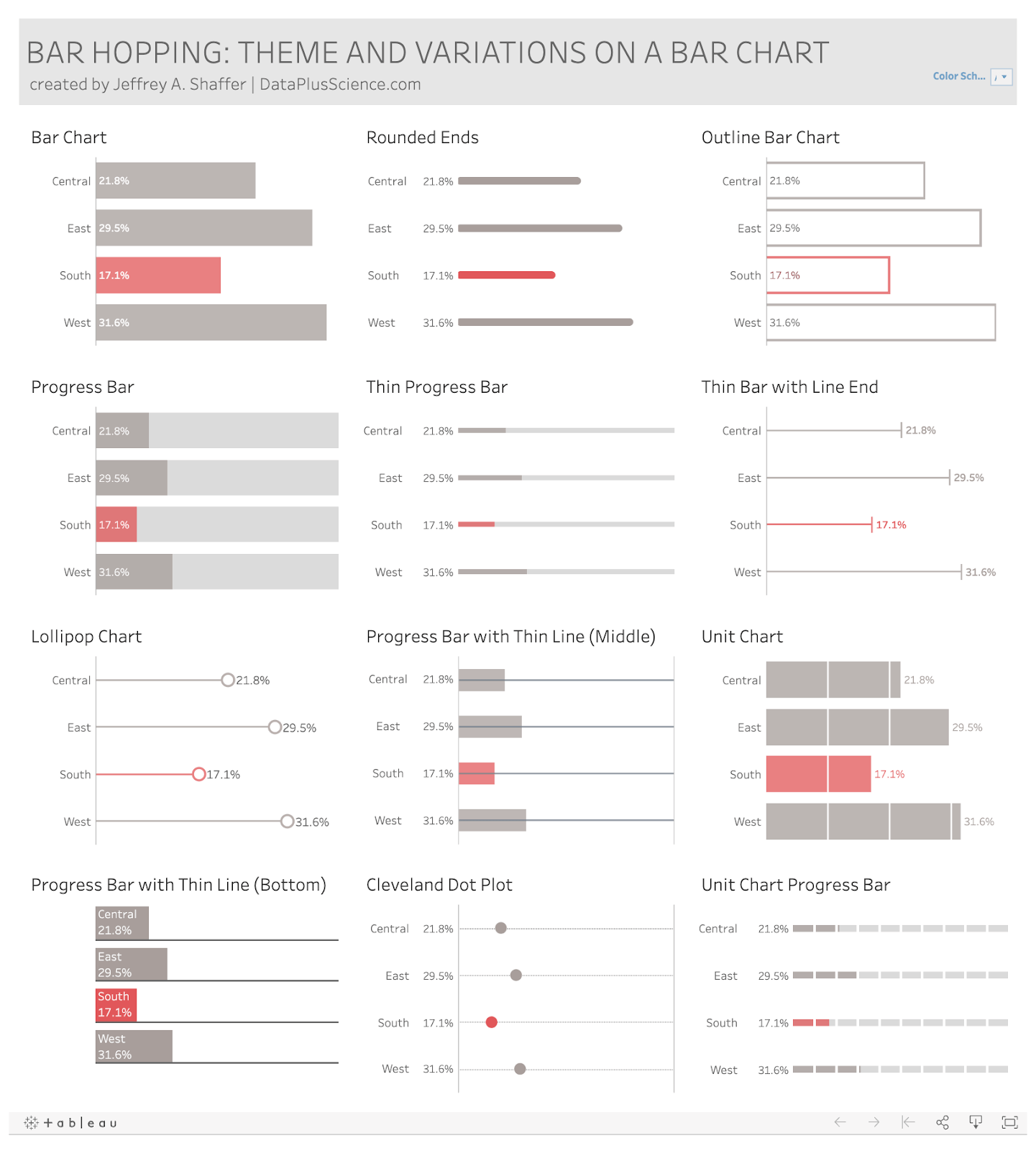
Figure 1 -- Jeffrey Shaffer’s theme and variations on a bar chart.
My reaction when Jeff first posted this was, “Ooh, that one there looks cool...I wonder how he did that?”
I got my answer in seconds. I clicked “Make a Copy,” and in essence, looked “under the hood.”
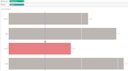
Figure 2 -- Jeffrey Shaffer's quick and easy technique for creating a unit chart.
And for the unit chart, my reaction was, “It’s just a bar chart with white reference lines. Clever!”
Over the years, I’ve downloaded hundreds of workbooks and have analyzed the individual brush strokes of Kelly Martin, Lindsey Poulter, Adam McCann, The Flerlage Twins, and dozens of others. The fact that I can do this so easily is nothing short of amazing. I don’t just get to interact with cool vizzes; I can download them and see how they work!
Here’s a dashboard by Adam McCann created that showcases the career of New York Giants quarterback Eli Manning.
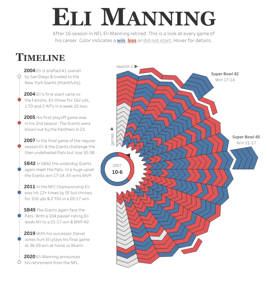
Adam McCann’s dashboard which inspired me to write a blog post and take a stab at visualizing the same data
What an interesting approach! Would I ever make something like this? Adam’s publishing of the dashboard -- and that he made it downloadable -- inspired me to not just take a stab at visualizing the same data set but to write a blog post on whether you should use dashboards to find stories or tell stories.
Oh, the discussions you’ll have!
Because the vast majority of Tableau Public authors make their work downloadable, you’ll see people modify and repost the work they downloaded. We see this at work in some of the amazing social media data visualization initiatives, including Makeover Monday, Workout Wednesday, and Real World-Fake Data. Speaking of making your work downloadable...
Pay it forward
If you use Tableau Public, unless your workbooks have proprietary data or use proprietary images, please, please, please make your workbooks downloadable. Chances are somebody along the way has helped you get better at vizzing, whether that be through a “how-to” article they wrote, a webinar to show you a technique, or posting a workbook to Tableau Public and making it downloadable so you can see what makes it tick. You pay these people back by “paying it forward.” You’ll never regret re-gifting the help and inspiration you received to others.
It isn’t just about Tableau
Tableau Public isn’t just about showcasing Tableau-specific example. I use Tableau Public to illustrate generalized visualization concepts all of the time. For example, in my workshops and presentations, I demonstrate how making the audience the centerpiece of a dashboard makes that dashboard almost irresistible. In this “Are You Over the Hill?” example, people can select a bar and see how much older or younger they are than other people living in the US.
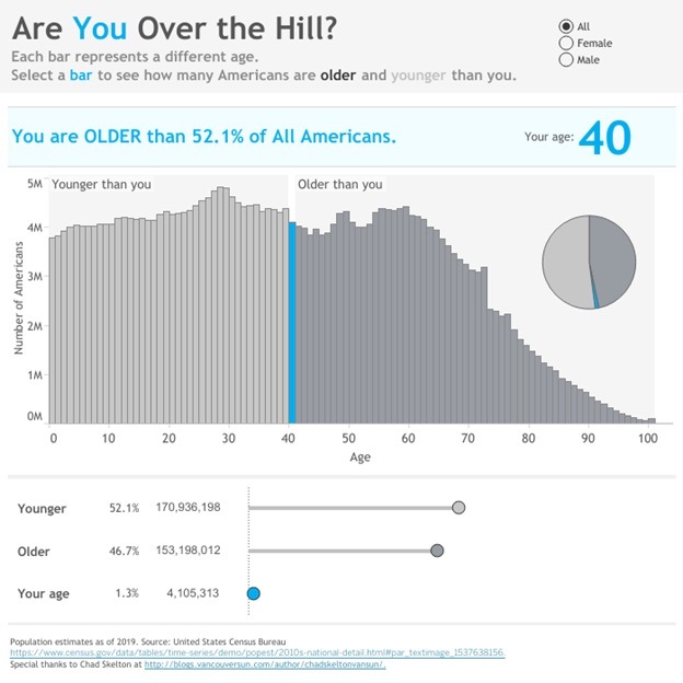
People can’t resist trying this—first for their own age—and then for their partners, parents, kids, and older siblings (yeah, I’m talking about you, Rick).
Note that the idea for this interactive dashboard came from my friend and colleague, Chad Skelton, who created something similar for people living in Canada. And you guessed it, he used Tableau Public to publish his work.
Okay, it’s not perfect
As Tableau comes out with new versions, they tinker and break things. I understand that Tableau Public is an evolving platform and improvements happen by adding new features. The problem is that I’ve had dashboards suddenly stop working, but Tableau has been great at responding to notices that things weren’t working properly. Just be patient as the team resolves the issues.
Favor: Please add my website to your test suite. In other words, do not implement any new features until you’re sure everything on my site works perfectly.
Okay, okay, okay...but it doesn’t hurt to ask.
Performance can sometimes be slow. But this is understandable. There are almost 1 million visualizations that have been viewed a staggering 2.5 billion times. It takes a lot of servers and bandwidth to present complex visualizations to thousands of concurrent users. An occasional slow-down is a very small price to pay.
My new favorite typeface doesn’t render. My Chart Chat colleague, Amanda Makulec, recently shared a dashboard that uses the Windows 10 typeface Bahnschrift, and I was smitten with it. Unfortunately, this is not available on Tableau Public, but a nice alternative is Roboto. Click here to see a list of all Tableau Public-safe fonts.
I’m grateful
I am first and foremost a teacher of data visualization and I need a way to create and share interactive examples. Tableau Public provides me, and tens of thousands of others, a free and robust platform to do this.
To the creators and original curators of the platform (e.g., Ellie Fields and Ben Jones), to the current keepers of the flame (Taha Ebrahimi and her team), and especially to the thousands who use the platform and share their work I say:
Thank you.
_________________
Steve Wexler is the founder of Data Revelations, a data visualization consultancy. He has helped scores of organizations worldwide understand how to visualize their data. Steve is in the Tableau Visionary Hall of Fame, has been a Tableau Iron Viz Champion, and serves on the advisory board to the Data Visualization Society. He is the coauthor of The Big Book of Dashboards: Visualizing Your Data Using Real-World Business Scenarios.
Steve’s newest book, The Big Picture: How to Use Data Visualization to Make Better Decisions—Faster is now available for purchase.
And Steve’s newest LinkedIn Learning course (based on the book) is available here.
Related Stories
DataFam Roundup June 2026

Tableau Ambassador Nominations and Applications are Open
 June 10, 2026