To move forward with data visualization, look backwards
Note: This post first appeared in ComputerWorld.
Presenting information in a visual way is not a novel concept. But best practices—such as the use of the x-axis to display a trend over time, for example—were once novel ideas. Rewind to the 18th century, and a combination of creativity, passion, and teamwork led to the birth of the x-axis.
In 1765, Joseph Priestley (an English educator and polymath) published the results of his own big data projects (3,000 data points was big data back then). These influenced William Playfair (a Scottish political economist and engineer), who is credited with the first statistical line and bar charts.
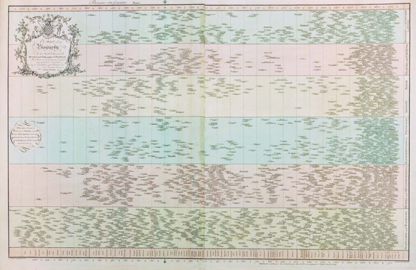
Joseph Priestley, A Chart of Biography, 1765
Priestly is best known for his Chart of Biography (above) and New Chart of History. These innovative visualizations showed the course of history by looking at individuals and countries, respectively. The former used bars to indicate the lifespans of people, so it’s easy to see who were contemporaries. The latter chart shows the same time period through the lens of countries. Together, these data visualizations give a micro and macro view of major historical events.
They also represent the first time someone used an x-axis to show time on a single page, and are truly ground zero for the visualization of time. (Jacques Barbeu duBourg made a similar chart in 1763, but his chart was long—54 feet long!) In order to come up with such new ways of communicating data, Priestley and Playfair used both intuition and ingenuity.
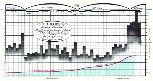
William Playfair's wheat and wages chart, 1821
Since then, their innovations have become best practices. The techniques these pioneers developed through intuition have more recently been supported by scientific research into how the brain best perceives visual representations of information.
On the one hand, that progress is promising, as it shows data visualization has gained impressive widespread adoption and acceptance. But on the other hand, it's at times led to dogmatic thinking about the "right" and "wrong" ways to communicate with data, which has stifled creativity. Doesn't it seem odd that people were more innovative with data 250 years ago than they have been in the past two decades? The main reason is that, in recent years, we have become stifled by spreadsheets and haven't been applying our own creativity and intuition to visualizations.
Remember: The point of data visualization isn't always to make the single most effective presentation of data. It's to communicate with people and engage them, and this might require creatively pushing the rules a little in order to generate emotion and drama.
For further proof, let's rewind again, this time to the 19th century. Florence Nightingale was another data visualization pioneer. She wasn't a data analyst; she was simply determined to bring about real change with impactful communication.
Nightingale realized it was not enough to simply treat the sick and injured; you had to know the exact causes and patterns of their problems. To that end, she developed the Diagram of the Causes of Mortality in the Army in the East (below). It led to legislative change in the way soldiers were cared for in military hospitals, saving thousands of lives.
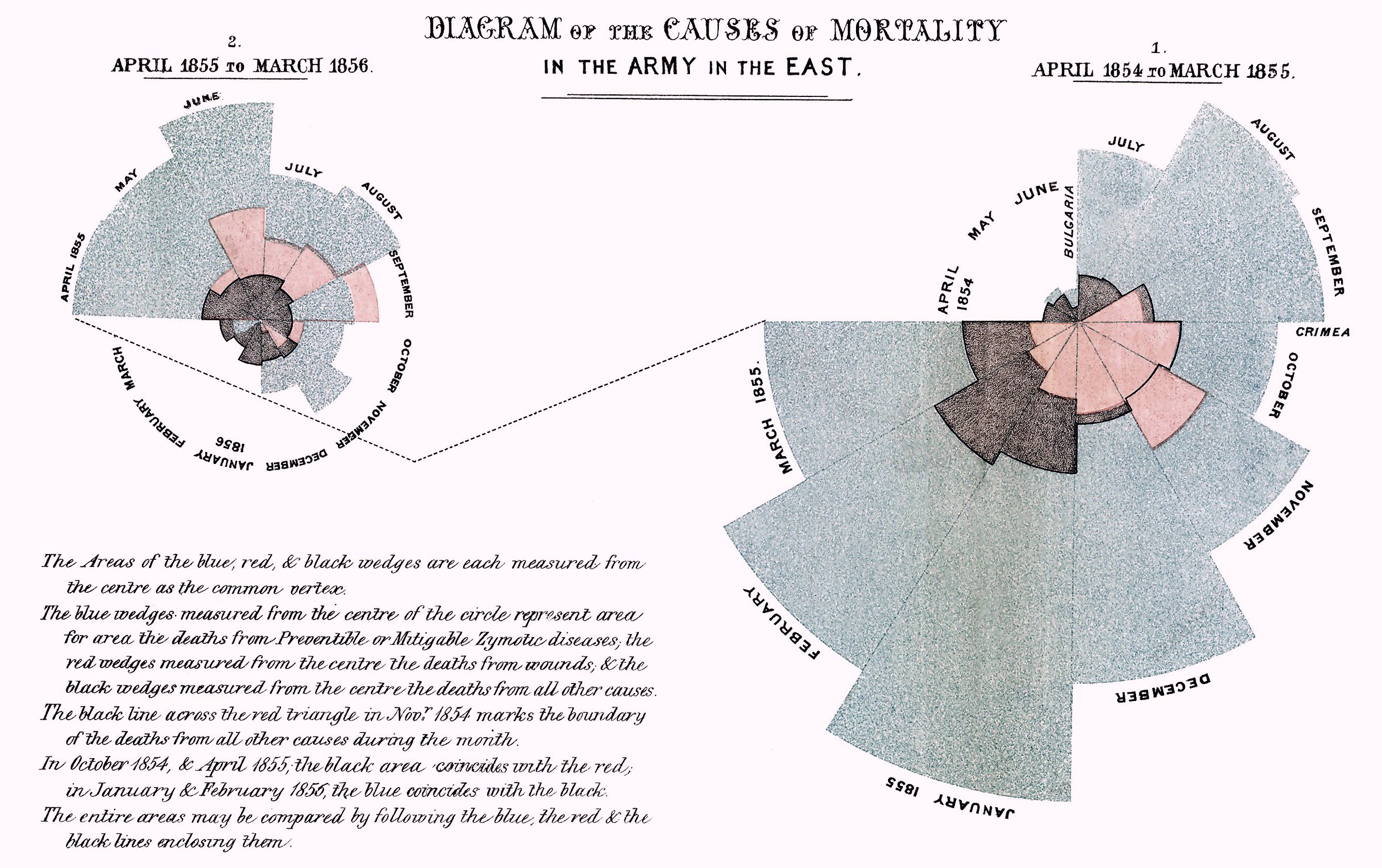
Florence Nightingale’s Diagram of the Causes of Mortality, 1858
As Nightingale herself put it: “Diagrams are of great utility for illustrating certain quantities of vital statistics by conveying ideas on the subject through the eye, which cannot be so readily grasped when contained in figures.”
That might sound obvious now, but Nightingale made these visualizations and a huge impact without hundreds of years of history and 30 years of science to guide her—much less the technology we have today. She simply had a pencil, paper, data, and a drive to make change.
These examples demonstrate why it's so important for modern-day data visualization to not be limited to just the default display provided by your charting tool. While those defaults have a 250-year history behind them (which is great!), you still need to think freely and creatively to consider if your message is going to get across to your audience, just like these pioneers did. That will ensure our technologies serve as enablers of innovation as opposed to chains.


