July Viz Roundup


Uber Laws by State
As car service apps like Uber and Lyft have gained popularity, so has the backlash against them from traditional taxi companies and municipalities eager for tax revenue. This visualization by NBC Chicago breaks down the legal environment by state for car sharing services.

Join the Movement
This visualization from Emily Kund shows how the prevalence, demographics and treatments of Multiple Sclerosis changed from 2008 to 2013. Take a look, and join the movement!

Highest Value MBA’s
Everyone who goes to business school learns the importance of return on investment. But, for those who want to start studying early, The Economist has created this interactive viz which shows the ROI for business schools themselves. Read up before you apply, the results may surprise you.

Airplane Crash Data
The disappearance and crash of Malaysia Airlines flight 370 has understandably raised renewed concerns about air safety. David Murphy’s visualization is a timely review of the history of air safety, and clearly shows that, despite the tragedy of 370, air travel is becoming significantly safer with every year that passes.

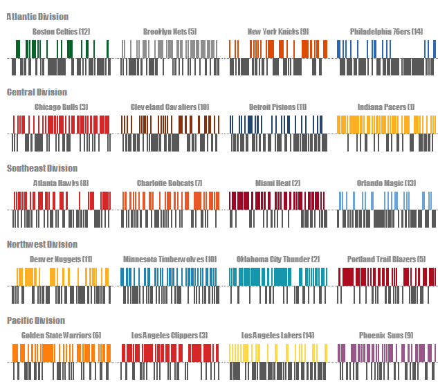
Ballcode: The 2013-2014 NBA Season
Small multiples are a fantastic way to tell complex stories in an elegant way. This beautiful and innovative visualization by Peter Gilks shows every single win and loss in the NBA season from 2013 to 2014. Individual teams and streaks can easily be viewed, yet the image of the season as a whole is also clear. The original viz is too large to post here but click through to see the interactive view.
Want to see more amazing visualizations? Subscribe to Viz of the Day and see one beautiful and informative visual story in your inbox every day.