Handling the COVID-19 traffic curve in Tableau Public


Surge in COVID-19 interest begins to drive traffic
Editor's note: This article was originally posted on the Tableau Engineering blog.
Early in the day on February 26, the Tableau Public dev team started seeing increased traffic to Tableau Public (“Public” to its friends and team), Tableau Software’s free platform that empowers anyone around the world to visualize data and share insights — a tool used by journalists and bloggers to tell stories that involve data and easily embed them directly on news and personal blog sites. An unusual aspect of the traffic that day was that it was being driven by a handful of vizzes while spikes are typically driven by only one visualization (what we call a “hot viz”) with peaks lasting less than 24 hours long. This time, however, we were looking at five vizzes: three by German news site n-tv, and two by El Mundo in Spain (you can see them at the end of the post). All five visualizations were attempts to understand the spread of the new coronavirus.
Tableau Public has a dedicated cluster in AWS which is configured to support millions of users per day. As a free, consumer facing product, Tableau Public has less predictable traffic than typical enterprise SaaS products and traffic spikes driven by topical data visualizations. At that time in February, our Public cluster consisted of 50 servers (AWS general purpose instances with 16 virtual CPUs and 64GB of ram each — m5.4xlarge). Our JVM (Java Virtual Machine) max heap size was 2GB for the core component of the cluster that serves vizzes, VizQL Server.
To further complicate matters, on Sunday evening March 8, Tableau’s COVID19 Data Hub went live with starter workbooks and a gallery of community-generated COVID-19-related Tableau Public vizzes, causing an additional surge of activity on the platform. And by late March, we had another major source of traffic: State and local governments were one by one migrating their local COVID-19 data trackers from their own on-premise instances of Tableau Server to Tableau Public. For many, this was an emergency effort to meet the 24x7 public demand for transparent pandemic data with a scalable service which organizations didn’t have time to build or manage themselves.
Identifying the first issues: an xml blob and table lock
Initial traffic resulted in a short outage on Feb. 26 due to an Out-of-Memory (OOM) issue across all 50 servers. James Schutt, Principal Engineer for Tableau Public, quickly increased the Java max heap size from 2GB to 8GB, which stopped the restarts. But our primary concern was to identify the root case of the OOM issues, which surfaced a glaringly large xml blob in the database that is passed around to make certain features work. This large xml blob required a database query and xml parse on every request, putting a huge load on the database, network, and Java servers. Additionally, we discovered a lock on the licensing table which prevented servers from restarting quickly, requiring manual intervention to keep the fleet of servers healthy. Finally, we also had to revisit our monitoring and alerting operational runbook to reduce incident reaction time.
That day in late February, Public registered 4.9 million impressions, which is the process of building and rendering a Tableau visualization (not the platform’s all time high, but close to it, and higher than any day in the last year). The next few days were higher-than-average with 2 to 3 million views per day. The traffic had certainly caught the team’s attention, but it was nothing Public couldn’t and didn’t handle all the time… until the next weekend.

The next weekend: addressing issues in real-time
From Thursday March 5 through the weekend, Public had several issues causing intermittent errors or high load times for users due to several hot vizzes. One viz, again from news site n-tv, was consuming 49% of traffic at one point, causing Public to go down for 18 minutes. Engineers addressed the issues as they came up by replacing “hot” interactive visualizations with static images and then manually rebooting unresponsive servers.
Traffic climbed steadily from 4,000 vizzes rendered per minute on March 2 to between 10,000–20,000 renders per minute (RPM) by March 8. On Sunday evening March 8, with Tableau’s COVID19 Data Hub live, the system was experiencing sustained loads.

All hands on deck: breaking the glass and chasing bottlenecks
The team brainstormed longer term solutions, one of which was a product enhancement to make it faster and easier to “break the glass” and replace a hot viz with an image that could be clicked through to an interactive viz. This technique had been applied manually by the team so far, but with the traffic coming from sometimes a dozen vizzes at time, day after day, we needed a more scalable solution. One team began working on “break the glass.”
At the same time, another team worked on chasing down bottlenecks in the system. We were finding the limits of our services. We partnered with teams in the Analytics and Data areas to root out issues surfaced by the load, including areas such as VizQL Server, which is the core component serving the interactive visualization, and other components from the browser client to the xml blob management code.
Finally, another team looked at our infrastructure to make sure the cluster was sized appropriately.
Peak: increasing server capacity
March 21. Jared Scott, Director of Engineering for Tableau Public:
Crazy traffic today, hanging around 50–75k rpm on Public.

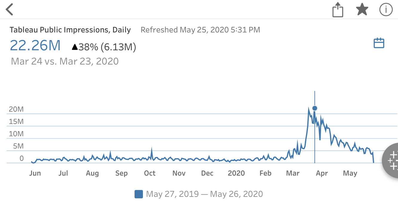
That day Public served 21.5m visualizations.
March 24. Jared:
Well we hit a new one today. Historically, when Public gets hit hard, it’s almost always caused by a single viz or by a couple vizzes…. Today we had a new problem. Many people were posting popular COVID-19 vizzes and we saw a whole swath of hot vizzes overloading our servers. The most popular one continues to be the n-tv one, with over 17 million views.
In the days prior to March 24, we had increased our F5 server to take 10X the amount of traffic and doubled our server capacity to 100 servers in the cluster. Along the way, the team was integrating changes from issues that had been identified and fixed in the prior weeks. This was the peak week, at 22.3 million per day, traffic roughly 20X our typical traffic.
While the service was working well, we decided to double capacity again, to 200 servers or 4x our normal capacity. We also got higher grade servers with more storage, going from AWS instances of m5.4xlarge servers to r4.4xlarge, effectively doubling the amount of RAM per machine, which gave us much better performance in service peak load across multiple visualizations.
By late March, the team was helping the states of Ohio, Virginia, Kansas, Colorado, California, and the home of Tableau HQ, King County Washington, to migrate their critical COVID-19 dashboards to Tableau Public. Ultimately, dozens of state and local governments published data on Tableau Public.
Meanwhile, the team continued chasing down issues. The night of March 24, they increased the database connection limit and worked on managing the volume of logs ingesting into Splunk.
Since Public relies on the core components built for our corporate solutions, this became a cross-development effort. Teams across Tableau were also working hard for solutions. The VizQL Server team was pursuing improvements in queuing and caching. Other teams were working to reduce client-side browser errors and, when necessary, making the client-side error messages friendlier.
Results
AWS jumped in to help after hearing about Tableau’s COVID19 Data Hub and all the local governments that were sharing data on Public. They generously offered to sponsor some of the infrastructure increases we’d made, and partnered with us technically throughout. We welcomed and greatly appreciated their partnership.
By this time many of the critical issues had been addressed and deployed. A fix to the xml blob handling reduced latency for more than 95% of our users. Server-side errors had been reduced from 1.5% error rate to below 0.5%. On the client-side, we saw similar reductions in errors. We had improved and updated our server health checks, and improved our runbooks and monitoring. Finally, the product enhancements for “breaking the glass” had been deployed — a feature the team had been considering for years.
Since the changes mentioned in this article went into effect, we have seen sustained traffic with no related degradations or outages. The changes made by the collective Tableau dev team have led to us being able to handle our biggest traffic surge ever.
Reflection
Tableau Public pushes the frontiers of Tableau in many ways — in user-facing features, but also in operations and engineering. The COVID-19 traffic spike is a case-study of how sustaining 20k impressions per minute provided an opportunity to test the limits of our system. Teams across Tableau were able to identify and close new issues that we could see only at this magnified scale. And many of these fixes applied directly to the components in our corporate products, Tableau Server and Tableau Online, ultimately improving Tableau customers’ experience overall. Beyond that, Tableau Public pushed us forward not only on our engineering and product, but on Tableau’s mission of helping people see and understand data.
The last few months have been an extraordinary time for everyone, but one of the most extraordinary things has been the willingness with which people want to help. Teams always care deeply about supporting our production software, but this felt like we pulled together at another level. In the first weeks of the COVID-19 crisis in Europe and the Americas, the hunger for relevant and understandable data became massive and urgent. Everyone from developers to salespeople to our AWS partners jumped in with extra time and effort and a deep desire to help, all sharing a common belief that data is critically important to communities in critical times.
Note: The daily traffic charts in this post use Metrics, a Tableau capability that tracks and monitors KPIs. The charts showing rpm are from New Relic, used for monitoring infrastructure health.
Appendix
A selection of government dashboards:

The first two Hot Vizzes, back in February:


Related Stories
What we can learn from open data: COVID-19 in the Netherlands
 April 29, 2021

After a year of COVID-19 charts, eight data communication lessons learned
 April 19, 2021

Data innovations in public health: PATH creates COVID-19 diagnostic test dashboard
April 2, 2021