Explain Data helps you deeply understand your data with interactive explanations


How often do people ask you to explain why a number is lower or higher than they expected? If you are like most Tableau users, this probably happens pretty often. Have you ever wished you could have an assistant to help you field these questions? You might already build dashboards and workbooks that allow your colleagues to do their own digging. But wouldn’t it be even better if you had easy access to automatic guidance? Enter AI-powered Explain Data, released in Tableau version 2019.3.
Automatically generate explanations for data points
With Explain Data, you or your colleagues simply identify the data of interest and request an explanation from the context menu, the analysis menu, or the new icon in the tooltip. Explain Data analyzes your selection in context and brings up possible explanations. These explanations show additional data and visualizations that can help you better understand the data you selected. The vizzes can also be added to workbooks for further editing or sharing.
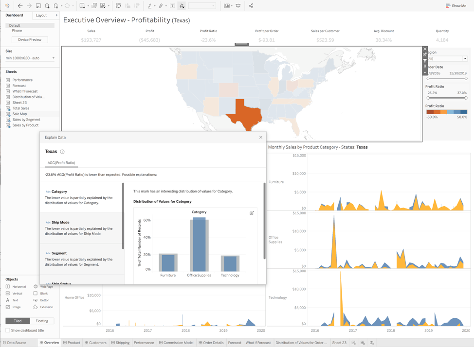
For example, here we are looking at Texas, which is a relatively unprofitable region in our familiar Superstore sales data set. If we click on the data point in the example below and ask for an explanation, the machine very quickly shows that the profit is lower than would otherwise be expected in this state. It also shows explanations relating to category of sales and of shipping-related factors. With a click, we can review those explanations and add some of the resulting visualizations to our workbook for further exploration.
Find extreme values that are skewing your results
When you click Explain, Tableau uses machine learning to analyze your selected data point in the context of the data visualized on the screen. It also compares the data point to the rest of your data that isn’t represented in the visualization. Explain Data then displays a list of explanations for the data point, including dimensions that could be affecting the underlying data.
Here is an example of a visualization showcasing bike share data on a map. It looks like the Prudential station in the middle of Boston is the most heavily-used station. To understand why this is the case, we can click on the data point and select Explain Data. Here, the explanation shows that a single outlier is distorting the results. The automatically-generated visualization shows what would happen if we remove this outlier from the data, and also creates a set and a selector so that we can see the data with and without the outlier.
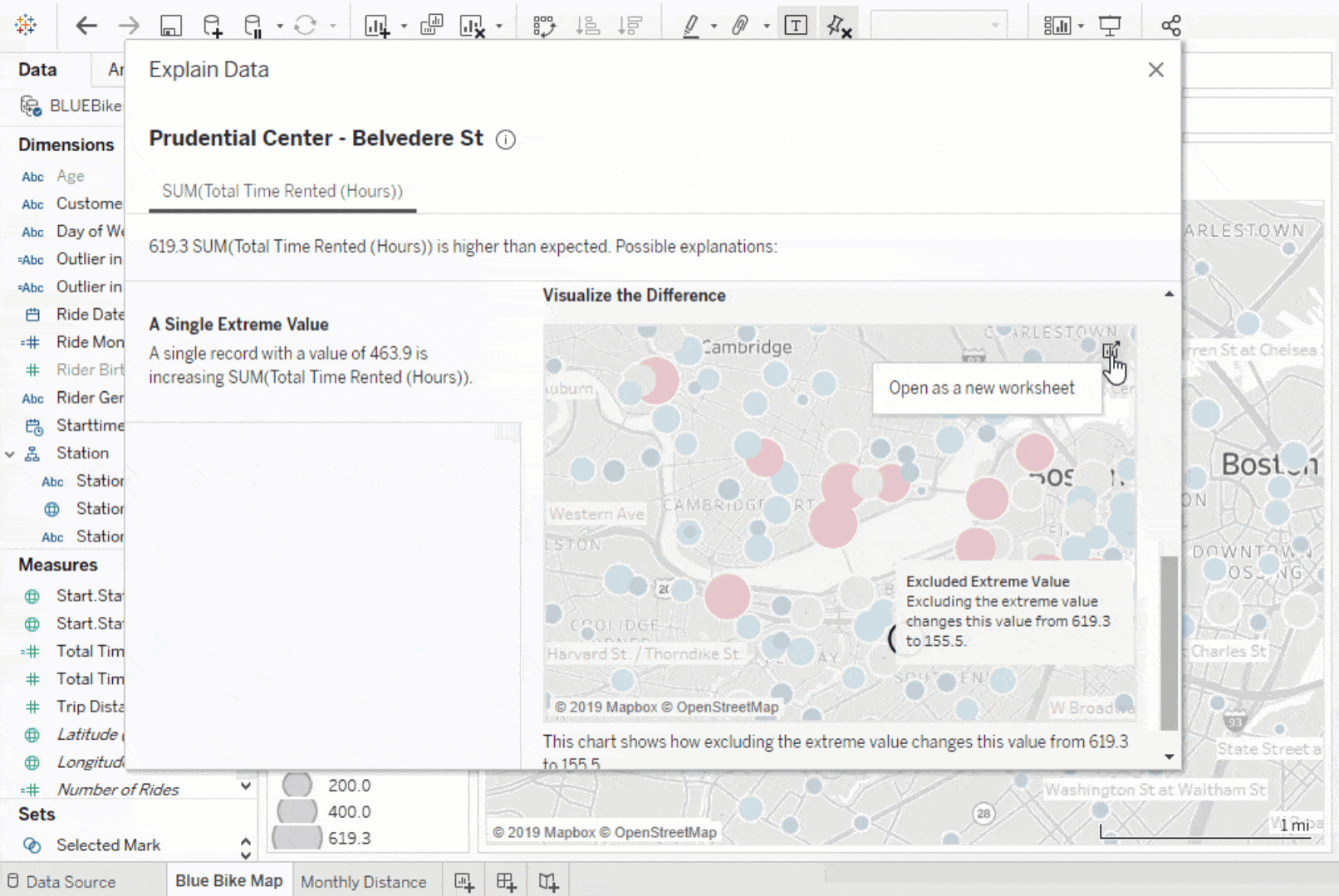
Explain Data is powered by proprietary, patent-pending algorithms, enabling it to fit dozens of models in real-time. In this example, first the machine models the data visualized on the screen to decide if the value is unlikely or surprising, and offers a suggested range. Next, the machine automatically fits models to analyze the explanatory power of dozens of candidate explanations. These models are fit using Bayesian techniques to quantify the level of uncertainty in the explanation. Explanations are scored based on how informative they are, and also how straightforward they are relative to their explanatory power. Only the most informative explanations are displayed.
Amplify your domain expertise
Using Explain Data, analysts can work faster, spending more of their time understanding data and less searching for explanations. Removing technical barriers allows people to quickly find explanations on their own. With Explain Data, you can more rigorously consider a range of potential explanations in the data. And by combining domain expertise with explanations, you can discover why something happened and what to do about it. Try it out today with our interactive demo or download the newest version of Tableau.
Related Stories
Extend Access to Embedded Tableau Content with On-Demand Access
 July 22, 2026

The Tableau+ Bundle with Premium AI, Enterprise Capabilities, and Premier Success
 June 24, 2026
What is Tableau Prep?
 April 30, 2026