Design Choices: Is the Juice Worth the Squeeze?


I often spend hours—days, sometimes—formatting a dashboard to death. The end result is mostly something I am proud of, but when I look back at some of the hoops I have jumped through, I question whether they were worth it. If something took two hours to implement and only made a tiny improvement to my dashboard, was it worth it?
In fact, is it worth changing any of the default formats in Tableau? Quite often, the answer is no. Tableau’s defaults are perfectly functional. (I covered this in more detail in my previous blog post "Are Our Defaults at Fault?")
In this post, I want to explore how you can choose which design changes you should implement.
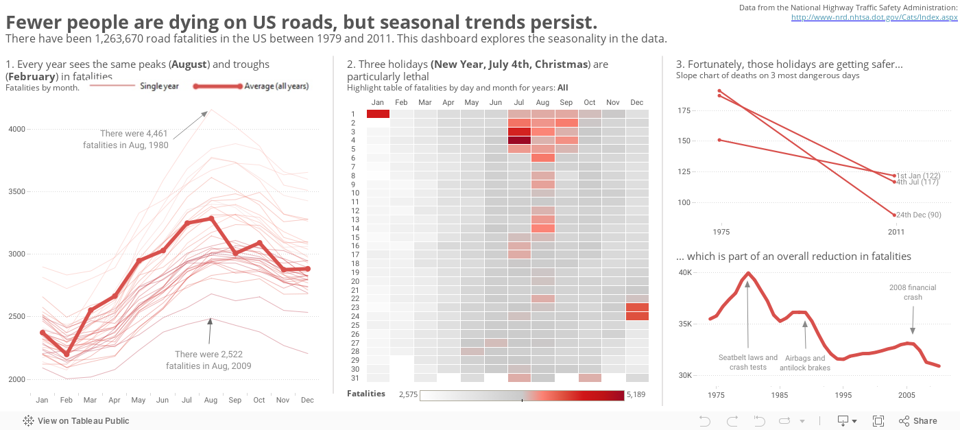
Here at Tableau, we ran an internal viz design competition using US road fatality data. My entry is the viz above.
Being the competitive type, I went all out to put in every design trick I could think of. I identified 30 conscious design decisions to alter the unformatted Tableau dashboard. I scored them based on the impact on the end result and the difficulty in implementing (based on time or complexity).
Below is the result of that scoring process. You can see four quadrants. Each mark is a design/format choice. (You can click each link to go see an explanation on my blog, Gravy Anecdote.)
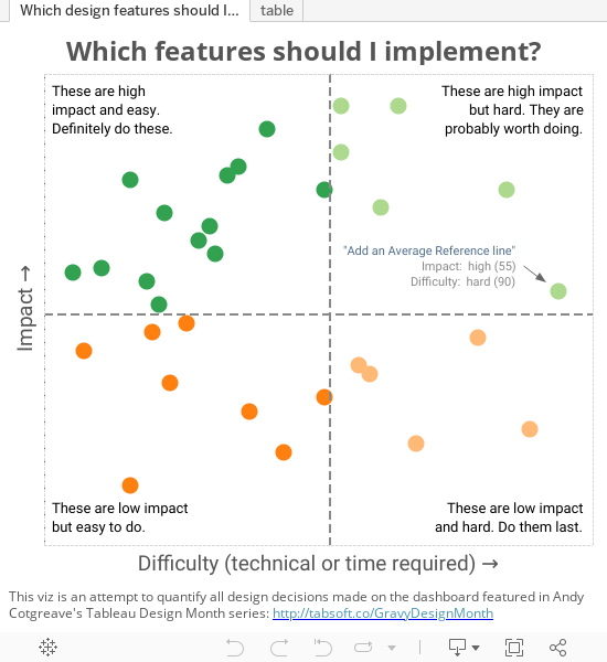
My scoring is very subjective. I’d love your thoughts. Would you have scored them differently? What design choices do you make, and how would you score them?
How can you apply this kind of model to your own work?
Without a doubt you should do the low difficulty/high impact type of change. After that, as with all things, it depends (discussed in detail on my Huffington Post column). It depends...
- on how much time you have. If you’re time-poor, do the easiest to implement.
- on what you’re building the dashboard for. If it’s for a very prominent place, go the whole distance. If you’re building to enter a competition or to learn more about Tableau, do all hard ones. If it’s to share internally with colleagues, maybe you only need to do a few.
- on your motivation. Seriously, if you just want to get the job done and go with something that is PERFECTLY FUNCTIONAL, just leave everything at its default. No one is saying you should change anything if the original option works!
- on the order in which they come to your mind. Design is an art. Some things will strike you as important and necessary, however easy or hard they are. I cannot tell you what they are. My dashboard emerged a little like a painting. I didn’t know what the end result would be, and I didn’t quantify the design choices before I made the dashboard. They all emerged rather organically. Part of this is experience. I’ve done quite a lot of these, so I know whether they’ll be worth implementing.
For reference, here’s the full list of posts and features:
Low-Impact, Easy to Do
- Use a menu action rather than a select action to reveal the interactivity
- Align annotation on time series chart
- Use a moving average for the time lines to smooth out the trend link
- Put individual years on first seasonality time line with graded colour palette
- Put a white border on the Highlight table
- Remove axis labels when the measure is obvious or it's in the title
- Use only two colours (tones of grey and red) to give the reader fewer things to decode
- Put dots on the some lines but not all
High-Impact, Easy to Do
- Do not include zero on the axes to emphasise relative change
- Be conscious of process and don't just dive in
- Turn off tooltip command buttons
- Remove all borders
- Focus on seasonality; switch from default time dimensions
- Choose a colour that reflects the topic (red for danger/fatality)
- Use red-grey diverging palette instead of red-black or red-green
- Number the worksheet titles to aid the flow across the dashboard
- Use medium-tone grey for axis labels and text in order for the data to stand out
- Label the peaks and troughs on the trend line to answer inevitable questions
- Remove all borders and lines except for the horizontal gridlines
- Get feedback from colleagues and friends before publishing the dashboard
- Remove labels from axes
High-Impact, Hard to Do
- Customize the tooltips
- Vertical lines to separate the charts
- Which chart types? Why use a highlight table? (hint: to emphasise individual days)
- Which layout should you pick? Horizontal? Vertical? Story Points?
- Axis range set very specifically on slope chart to give space for labels and centre the start/end years (using fixed axes and Tick Origin
- Add an average reference line
Low-Impact, Hard to Do
- Put year value in the title on the highlight table
- Set tick origin on time series charts in order to ensure round numbers appear on the axis
- Create date parts in order to remove the hierarchy plus buttons
- Make a colour legend in another package
- Make the average line only show the first value to prevent anti-aliasing
There are endless different design choices you can make to enhance and improve your visualizations, only a few of which I’ve covered here. I hope I've helped you think about how can you apply this kind of model to your own work.
Related Stories

5 Ways to Use Tableau Public to Achieve Your Goals
 January 11, 2025

World Mental Health Day: Elevating Awareness Through Data Visualization
 October 10, 2024

From TV Screens to Tableau: Visualize Your Favorite Shows with IMDb
 August 31, 2024