If Data Could Talk: Mapping COVID-19 Data


Welcome back to another recap of our livestream series, If Data Could Talk! Each episode, data experts from the community share resources you can read, watch, or listen to around the topic of data literacy. This episode features co-hosts Andy Cotgreave, Technical Evangelist at Tableau, and Amanda Makulec, MPH, Senior Data Visualization Lead at Excella, along with special guest William Watkins, Senior Solution Engineer at Tableau.
Mapping hospital overload risk
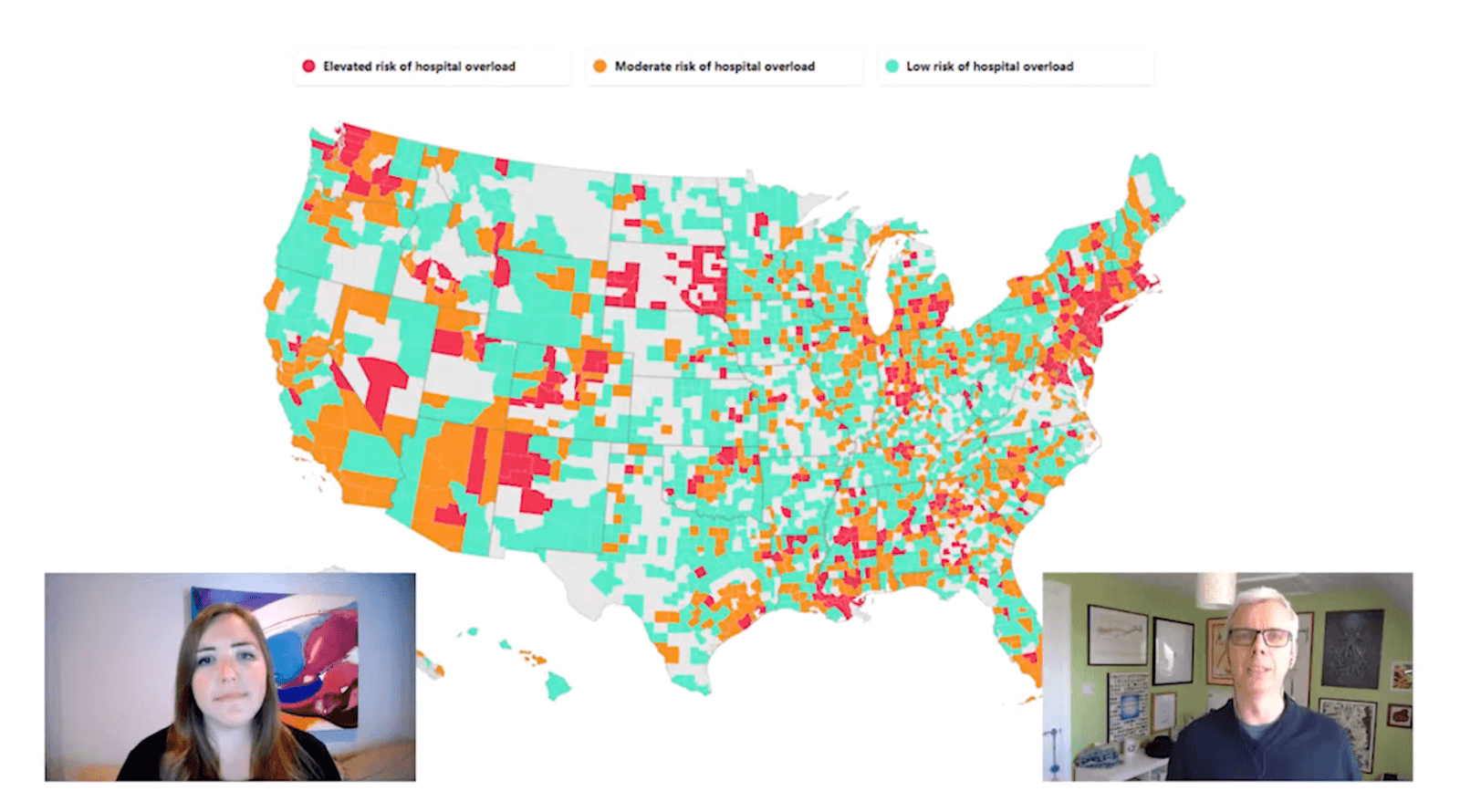
The discussion starts off with a map from the COVID Act Now project, which illustrates the risk of hospital overload for different parts of the U.S. Our guests take turns sharing their thoughts about the visualization—calling out the capability to drill down as a great user interaction and suggesting a more neutral color palette to more quickly identify elevated risk. Watch the segment here.
Using geospatial analysis to better understand the pandemic
Next up, Amanda and William chat about mapping COVID-19 data and the different types of geographic boundaries we might use to better understand the situation. William emphasizes that a key part of geospatial analysis is adding context to a map to make sure you’re telling the whole story. Watch the segment here.
Wait—there’s more!
- Want to catch the next episode of If Data Could Talk live? Tune in on Facebook, Twitter, LinkedIn, or YouTube.
- Watch the entire series or revisit an episode by checking out our YouTube playlist.
- To learn more about COVID-19 and see how Tableau can help you start analyzing the data on the virus yourself, visit our Data Resource Hub.
Related Stories
Learn the Basics of Well-Structured Data
 December 6, 2024
How To Spot Misleading Charts: Review the Message
 October 24, 2024
How To Spot Misleading Charts: Check the Axes
October 17, 2024