How to design a viz that doesn’t answer a specific question


A few months ago, I outlined data-viz lessons in photography. As I shared then, it’s importance to design a viz with an intent in mind; a viz should answer a question or test a hypothesis.
However, sometime this approach does not work. In those cases, it becomes much more difficult to make a good visualisation.
For example I recently had the chance to collaborate with UNICEF to promote the release of The State of the World’s Children Report 2016. This data set is a gold mine with more than 246 KPIs at the country level on very different subjects like nutrition, health, HIV, and demography.
My first reaction was to apply my usual recipe. I asked which question I should answer with the visualisation, and I tried to reduce the scope to focus on one question. But my UNICEF contact explained that the goal of the visualisation was to promote the whole data set, which had required a lot of work to produce.
At first, I was lost. But I remembered two data visualizations I’d seen:
- This Tableau Public viz explored a big survey about the British Brexit
- This United Way Population Fund dashboard on global and demographic indicators
I also remembered situations during my career when an exploration viz was necessary:
- When a company executive wants a dashboard showing an overview of company activities
- When IT admins need to monitor their servers and applications activities
- When you need to give access to a large data set to a user who does not know how to use Tableau or any query tools
When we end up in similar situations, the risk is to build a visualisation that does not lead to any insight and instead confuses the viz user with too many filters and numbers. Even if you’re not answering a specific question, you need to help the reader. You need to drive him to insights. To do so, I have four recommendations:
- Define your KPIs wisely
- Segment
- Use aggregation calculations with caution
- Keep it simple
1. Define your KPIs wisely
I was lucky. In the case of the UNICEF project, all the KPIs were already defined; the goals were already set. For instance, one of the topics is children protection. In this category, UNICEF defined 14 KPIs acting as goals, like the percentage for children labor, children marriage, violent discipline, and so on. If you are not as lucky as me and if you need to define the KPIs yourself, I would suggest these four rules:
- A KPI is only valuable if it helps the reader to reach his goal. It must help him to take actions.
- It should work with all your segments and allow comparison against the KPI.
- It must be simple and understood by everyone within few seconds. A KPI must be used as a communication tool. In the beginning, I tended to use complex KPIs (composite KPIs). They were able to summarise complex situations, but they were not used because they were not trusted.
- You should evaluate your KPIs regularly. Are they used? Do they allow people to make better decisions?
2. Segment to spot outliers
Now that we defined goals with our KPIs, we can move to the next step: segmenting the data. By segmenting the data, we can use the viz to detect and identify abnormal figures. It’s often by finding the appropriate dimension segmentation that I found the most valuable insights.
You will never lose your time by investigating new segmentations. Some are obvious and usually lead to interesting contrasts, like time, gender, or country. Other are more difficult to obtain but equally interesting, like customer segment, customer behaviour or distribution channel. In the UNICEF example, I used the only segmentation available, the countries.
3. Use aggregation calculations with caution
One risk with an exploration visualisation is to summarise too much, effectively hiding insights and outliers. Have a look at Robert Rouse’s viz below. The stunning comic viz explains how to better visualise an average profit:

Robert displays the average with a dot on top of two bars (red is the sum of sales with a negative profit, and grey is the sum of sales with a positive profit):

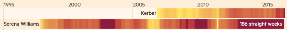
In John Burn-Murdoch’s visualisation of the history of women's tennis, the data is not aggregated; it allows the user to detect counter-performances easily:
In my UNICEF viz above, I indicated the selected country with a triangle, but also all the other countries to give context and spot outliers easily:

4. Keep it simple
Another risk with the exploration viz is to try to display too much. To counter this tendency, we should apply the same simplicity rules as for any visualisation:
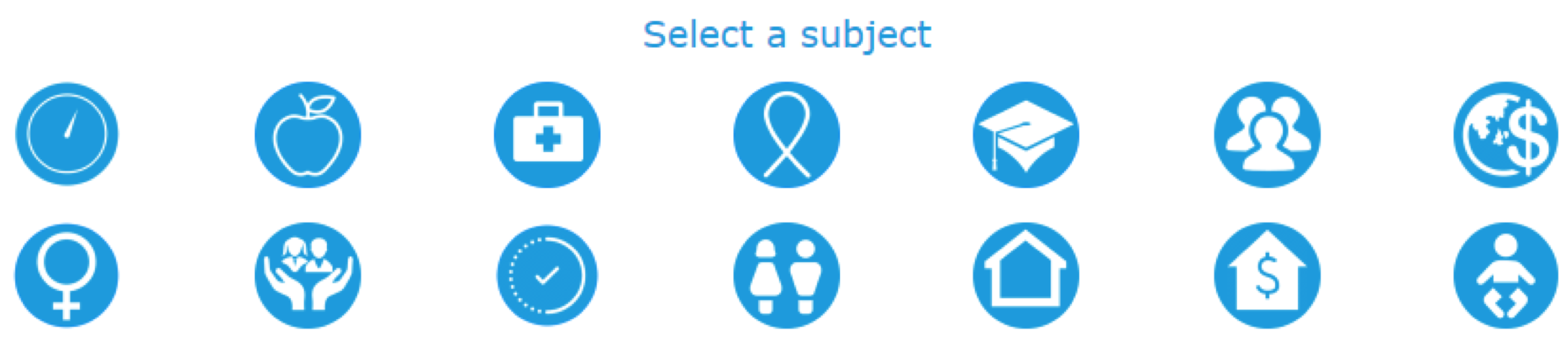
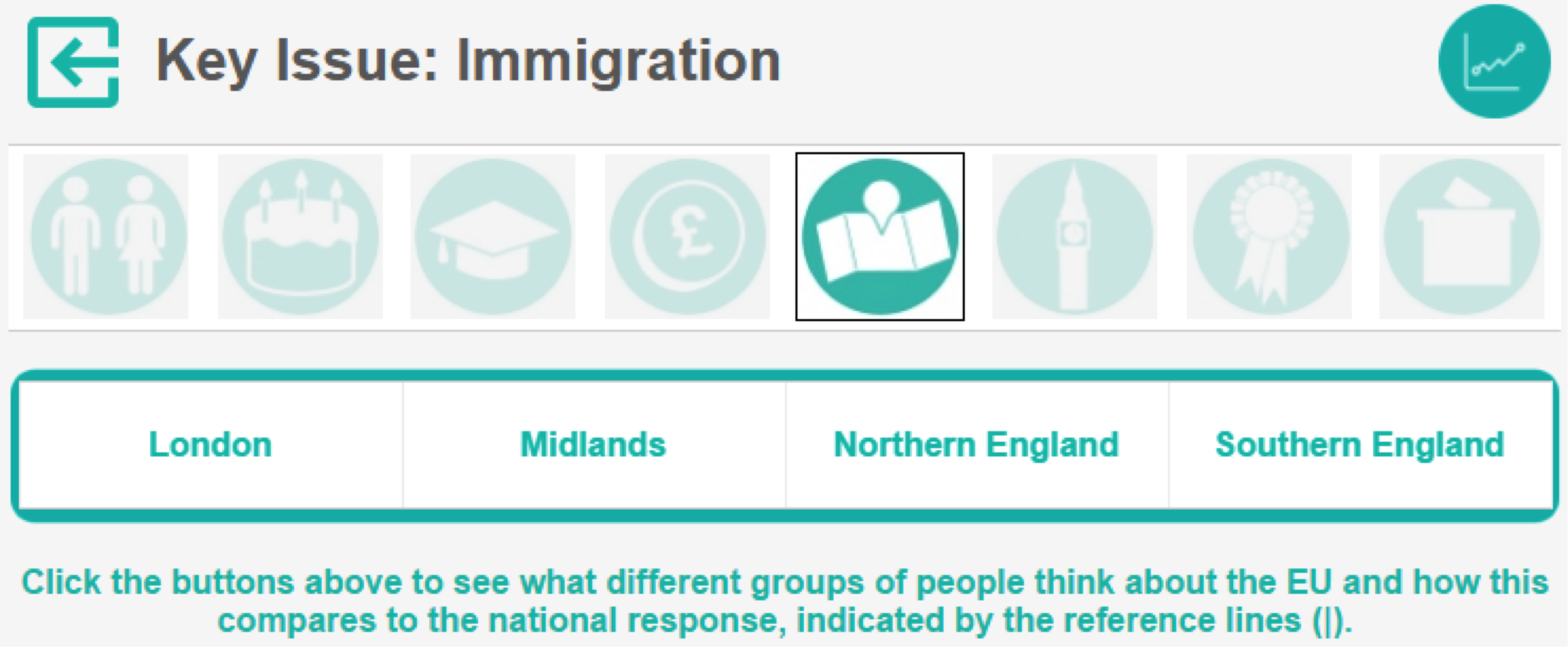
- Use a simple navigation process: Display less than five charts at a time on any given dashboard. You can use a menu or a visual filter to enable people to explore the data. Remember, even the navigation process has to be simple, so exclude navigation made of more than two filters. Here are some examples of simple navigation solutions:
Icons from my UNICEF viz:
Icons and menu from the Tableau Public viz on the British Brexit survey:
- The one-third rule: I try to keep this website-design rule in mind when designing a viz: One-third of the space should be used by text, one-third by illustrations (in our case, visualisations), one-third should remain blank. This is not a strict rule but very useful to build dashboards that are not too crowded.
- Try to stick to two colors and two fonts: Alberto Cairo, in his book The Functional Art, suggests applying three graphic design principles: unity, variety, and hierarchy. A good way to produce a visualisation that has a strong unity and at the same time that is not too simple, not boring. A good approach is to use two colors (never more than five) and two fonts and to play with the color shades and the font styles:

Follow these four tips to design great vizzes when you don't have a single question to answer. If you have additional questions, you can reach me on Twitter @YvanFornes.
Related Stories

5 Ways to Use Tableau Public to Achieve Your Goals
 January 11, 2025

World Mental Health Day: Elevating Awareness Through Data Visualization
 October 10, 2024

From TV Screens to Tableau: Visualize Your Favorite Shows with IMDb
 August 31, 2024