Visualizing More Than Five Million Flights


May 2015 has been #10xMonth because we've increased the amount of data that you can visualize and publish using Tableau Public from 1 million rows to 10 million rows. Visualizing airline on-time performance is a great case study in how this new limit can be quite useful.
The U.S. Bureau of Transportation Statistics makes available for download on a monthly basis on-time performance of major airline carriers operating domestic flights. Each month, somewhere in the neighborhood of 400,000 flights are recorded, including departure delay and arrival delay in minutes, cancellation status, tail number of the aircraft involved, and a host of other attributes of each flight. If you download the twelve CSV files for each of the months of 2014 and combine them into a single CSV file (2014FlightDelaysUS.csv, 1.5GB), you end up with over 5 million rows of data. Until this past month, that would have been too much data to publish to the web using Tableau Public. Not any more.
Here's a dashboard that allows you to choose an airport of origin, such as JFK or LAX, and a carrier, such as Delta or United, and see the number of flights to each domestic airport along with the average departure delay times experienced by travelers in 2014:
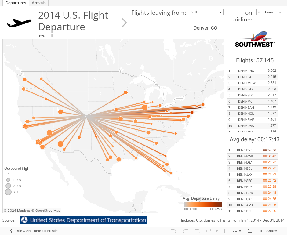
Note that the data from the DOT site does not include airport location (latitude and longitude). To get this geographic data, I downloaded an airport location Excel file obtained from OpenFlights.org and blended it with the DOT CSV, using the airport code (e.g. "SFO" for San Francisco) as the common field for blending.
Also, to create the lines that connect each possible origin to each possible destination, I added roughly 4,700 extra rows - one for each origin->destination combo, such as SEA✈SFO. These extra rows were assigned a "Path" variable of 1, and the actual flight data was given a "Path" variable of 2, so that the "Path" data field could be used to draw the connecting lines. That part was a little tricky. Hat tip to FiveThirtyEight for creating an amazing interactive out of a similar data set - "Which Flight Will Get You There Fastest?".
This dashboard only shows departure delay data. Another similar view could be created with arrivals delay data. (Updated: it now also shows arrival delay data on the second tab!) Yet another view could be created that shows other interesting information, such as the aircraft with the most number of flights in 2014 (hint: it flies back and forth in Hawaii) or the aircraft with the most air time (hint: it's a Delta plane).
I hope you find this data useful! Consider using it for your submission to our 10X Data Viz Contest. You might find yourself on the big stage as an Iron Viz contestant at TC15 in Las Vegas this fall!
Related Stories

Meet Iron Viz 2024 Finalist Jessica Moon
 April 15, 2024

Meet Iron Viz 2024 Finalist Pata Gogová
April 8, 2024

Student to BI Analyst, How Tableau Can Lead to a Successful Data Career
 March 20, 2024
Subscribe to our blog
Get the latest Tableau updates in your inbox.