Celebrating International Chart Day


Did you know that tomorrow - Thursday, April 26th, 2018 - is the very first International Chart Day? It's a day set aside to celebrate charts and graphs, to share some of our favorite examples, and to educate the public about "the history and value of charts, and sharing insight in how to create high-quality, visually engaging, informative visualizations." It's all about data literacy, and the power of data visualization to shape our minds and our world. How cool is that!?
If you happen to be in the D.C. area, you can attend a free daytime panel or evening reception to hear from experts like Alberto Cairo and Simon Rogers. Learn more about that event and register here, and read Alberto's comments about the commemoration here. If you do manage to go, you'll likely bump into Tableau Ambassador and co-organizer of the DC Data + Women group Brittany Fong of BFong Data. Make sure to say hi to Brittany for us.
For the rest of us not in D.C., we can get involved and participate, too! Organizers of the event are calling on everyone to "Share your favorite charts and data visualizations online and tag them with #ChartDay. Bonus: If you are holding up the chart in the photo, tag it with #HumanEasel". Cole Nussbaumer Knaflic, author of the book Storytelling With Data, is encouraging everyone to share a visualization from media using the hashtag #InternationalChartDay.
Let's do the same! Share a link to one of your favorite Tableau Public visualizations, include the hashtag #ChartDay, #InternationalChartDay, or #HumanEasel, and be sure to explain why you think it's particularly effective at both conveying information and engaging audiences visually. It's all about educating each other and the public, and working together to build our visual communication skills.
If you'd like some inspiration, be sure to check out our Featured galleries, as well as our Viz of the Day gallery for some of the best and most engaging work published to Tableau Public.
Viz Showcase: Effective and Elegant Examples to Consider
Here are five recent Viz of the Day winners that our team would like to put forward as particularly effective examples of communicating data.
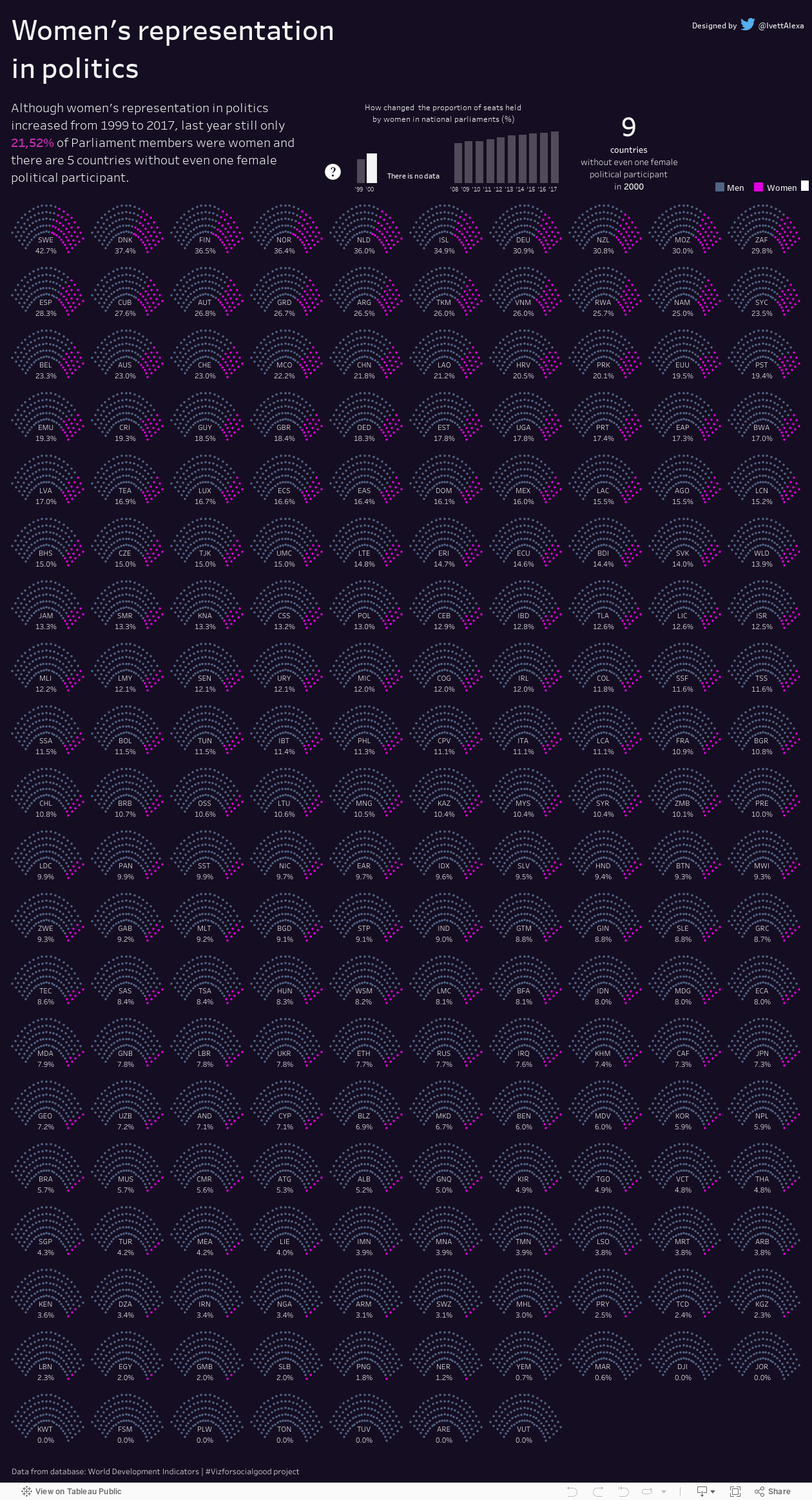
1. Women’s Representation in Politics by Yvette Kovacs
- About the viz:In this viz, Yvette Kovacs of Starschema in Budapest, Hungary shows the degree to which women are represented in parliaments around the world, and shows how the percentage has changed for each country since 2000.
- What we like about it: Yvette makes powerful use of small multiples in the general shape of a parliament seating chart to convey the data clearly and beautifully. She also makes effective use of the new Viz in Tooltips feature to allow readers to hover over each country to see a timeline of female representation.
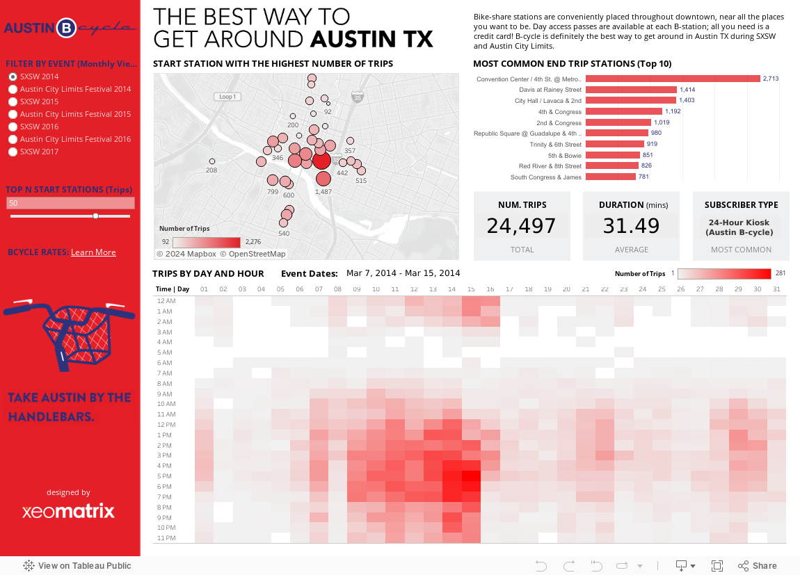
2. The Best Way to Get Around Austin TX by Xeomatrix
- About the viz:In this multi-faceted data dashboard that won Viz of the Week for Tableau Public last month, Xeomatrix shows the hotspots for bike share usage around the city of Austin, Texas at different times of the day.
- What we like about it: There are many individual charts in the view, but it doesn’t feel cluttered due to minimal use of color and elegant layout. The filters for the dashboard are included on the left-hand red panel, making it easy for the reader to see how to control what’s shown.
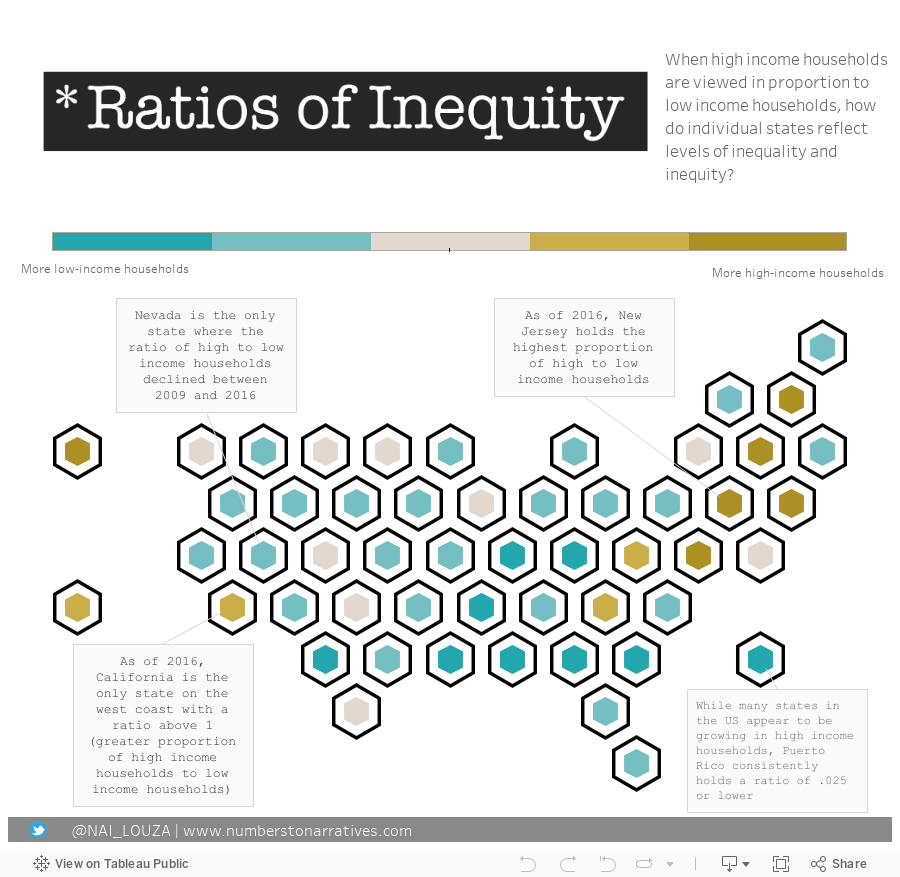
3. Ratios of Inequity by Nai Louza
- About the viz:In this hex map visualization, Nai Louza of UBS in London shows which states have the highest and lowest ratios of high-income households to low-income households.
- What we like about it: This is an effective use of the hex map chart type, making it easy to see ratios for smaller states such as Rhode Island and Delaware. Also, Nai makes very effective use of annotations to call the reader’s attention to notable elements in the data, such as the highest ratio state (New Jersey) and the lowest (Puerto Rico), as well as calling out Nevada as the only state with a ratio that declined over the period in question.
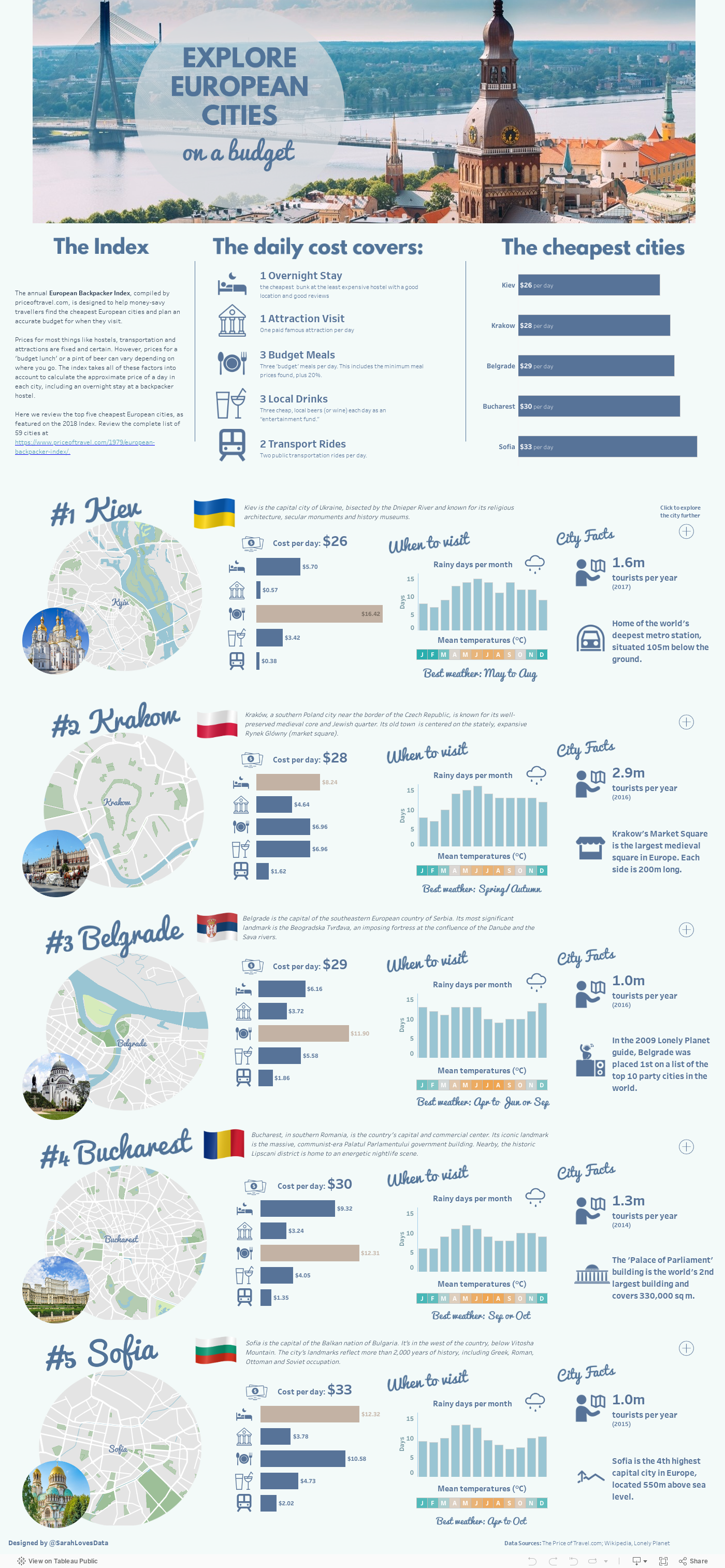
4. Explore European Cities on a Budget by Sarah Bartlett
- About the viz: In this infographic-style visualization that was one of the three winners of the recent European Cities Iron Viz contest, Sarah Bartlett of Slalom Consulting provides helpful information about the top five cheapest cities according to the European Backpacker Index.
- What we like about it: Sarah has created a gorgeous infographic that is both visually stunning as well as informative and easy to read. The excellent graphic design and inclusion of colorful flags, stylized city maps, and useful icons makes reading this visualization a truly pleasurable experience. She contains no less than 7 charts about each city, making the view full of information, but she does so in a way that isn’t at all overwhelming. A real masterpiece.
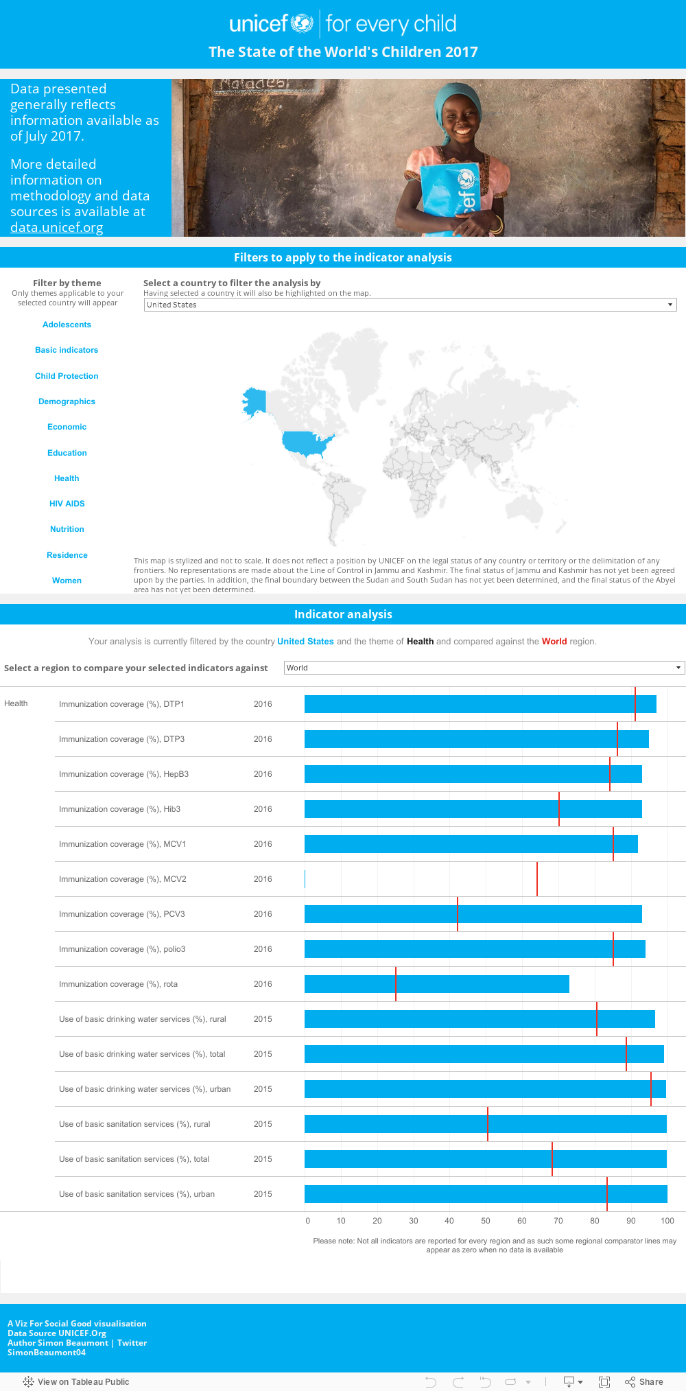
5. The State of the World’s Children by Simon Beaumont
- About the viz: Simon Beaumont of has worked with UNICEF to visualize the data of the 2017 State of the World’s Children report.
- What we like about it: A clean color palette and simple design is introduced to the reader by a beautiful photograph at the very top of the dashboard. Scrolling down, the reader can use this dashboard as a visual encyclopedia, looking up 167 statistics for 218 countries and areas organized into 11 different themes. The reader can also choose whether to compare each country with global figures or regional ones using a drop down filter that affects the reference lines in the bar chart. This visualization shows that even simple bar charts can be visually appealing and informative on topics of critical importance.
Happy International Chart Day! We'd like to say a special thanks to all Tableau Public authors around the world for all that you're doing to show what can be done with data!
The Tableau Public Team
Related Stories

Iron Viz 2026: Read Between the Data
 May 28, 2026

Tableau's Iron Viz Winners

Explore the 2026 Iron Viz Entries
 December 15, 2025