If Data Could Talk: Visualizing COVID-19 data


We recently launched a weekly video series called If Data Could Talk, where experts from the data community discuss visualizations, data topics, and current events. In the first episode, Andy Cotgreave, Technical Evangelist at Tableau, and Amanda Makulec, MPH, Senior Data Visualization Lead at Excella, look into some of the thought-provoking COVID-19 visualizations that have been shared around the community. Read on for a recap of their conversation.
Have you ever heard of ‘scrollytelling’?
Andy starts off by sharing an article from ABC News Australia, which examines what we can learn from countries winning the fight against coronavirus. The article stands out for its use of “scrollytelling” and its ability to explain a complex concept by introducing it piece-by-piece. Watch the segment here.
Front page vizzes
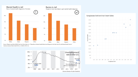
Next up, we look at two examples of media outlets using their front page to emphasize exceptional data points—one from the Wall Street Journal and the other from the New York Times. Both of these charts display U.S. unemployment data, using a “boundary-breaking” technique to drive home the startling message of the data points. Watch the segment here.

What’s a sawtooth chart?
Amanda shares insights on Romain Vuillemot’s “sawtooth chart” that visualizes how quickly some countries had repeating patterns of 500 deaths. “What’s interesting about this chart is both its novelty and the visceral response you get when you see this accordion effect,” says Amanda. Watch the segment here.

Stay home to stop the spread
Finally, we look at a map from Tectonix, which tracks peoples’ movements based on cell phone GPS pings. This example showcases the importance of social distancing, and how quickly exposure can spread when guidelines are ignored. Watch the segment here.
Wait—there’s more!
- Want to catch the next episode of If Data Could Talk live? Tune in on Facebook, Twitter, LinkedIn, or YouTube.
- Watch the entire series or revisit an episode by checking out our YouTube playlist.
- To learn more about COVID-19 and see how Tableau can help you start analyzing the data on the virus yourself, visit our Data Resource Hub.
Related Stories
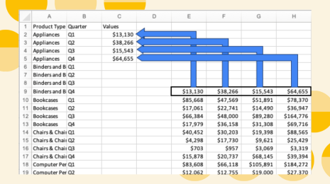
Learn the Basics of Well-Structured Data
 December 6, 2024
How To Spot Misleading Charts: Review the Message
 October 24, 2024
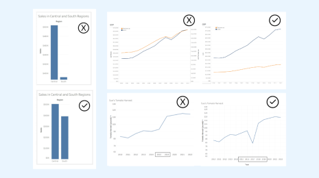
How To Spot Misleading Charts: Check the Axes
October 17, 2024