Making the NYC subway user-friendly through effective visuals


A version of this post originally appeared on Nightingale, a publication by the Data Visualization Society. For more on this topic, read "How Vignelli's Design Still Influences NYC's Subway Maps Today".
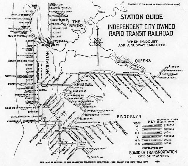
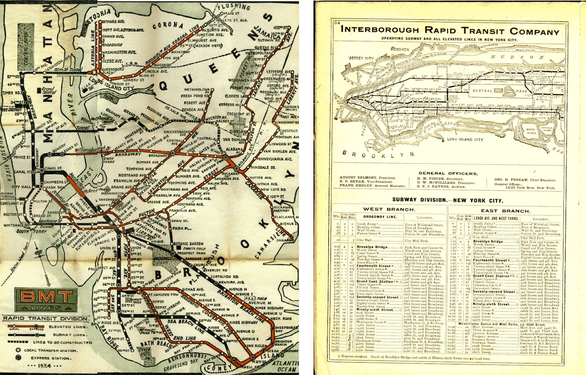
When the New York City Subway system consolidated under a single operator in 1940, it was clear that integrating three independently-owned subway systems (IND, IRT, and BMT) into user-friendly transportation would be essential. However, the subway system was incredibly complex: 472 stations in operation 24 hrs a day, 7 days a week, with 245 miles of routes, translating into 665 miles of revenue track. Each of the three original companies had their own styles, signage, and maps for their respective lines.
The newly-formed subway system needed to be cohesive and enable the customer to navigate without confusion.
Design principles and objectives for the new subway maps
Like the New York City Subway system consolidation, decluttering data visuals can enhance the user experience. Unifying how information is conveyed cuts down the processing time for users and speeds up consumption and comprehension of what is being presented.
Emphasis on text, numbers, and data points will lead the audience to the information we want them to know. Cole Knaflic’s book, Storytelling with Data outlines the following principles for effective visualizations:
1. Understand the context of what you need to communicate.
NYC subway riders needed to know how to navigate the system from what line to use and how to get to the platform. This also needed to be done in a consistent manner.
2. Choose an appropriate display to visualize it.
Subway riders needed visuals to help them understand where they were within in the station and along the subway route, especially those who aren't familiar with the system. There are various ways to display this information via maps, diagrams, and text.
3. Eliminate clutter.
The signage used in the subway system prior to the 1970’s were in disarray and had inconsistent lettering and positioning. The subway maps had a lot of extra information. This most likely confused subway riders and slowed down the processing of the information.
4. Draw attention where you want your audience to focus.
First and foremost, subway riders want to know where they are and where they need to go. The use of color, arrows, and lettering are a few elements that help riders as they enter a station—possibly for the first time.
5. Choose a visual display that will allow your audience to do what you need them to do.
There are various displays that help subway riders navigate the system. It’s important that as someone enters the system, they are able to identify and understand at first glance where to look for navigating the station, subway line information, and service changes.
Modernizing subway signage: The history behind Vignelli's subway maps
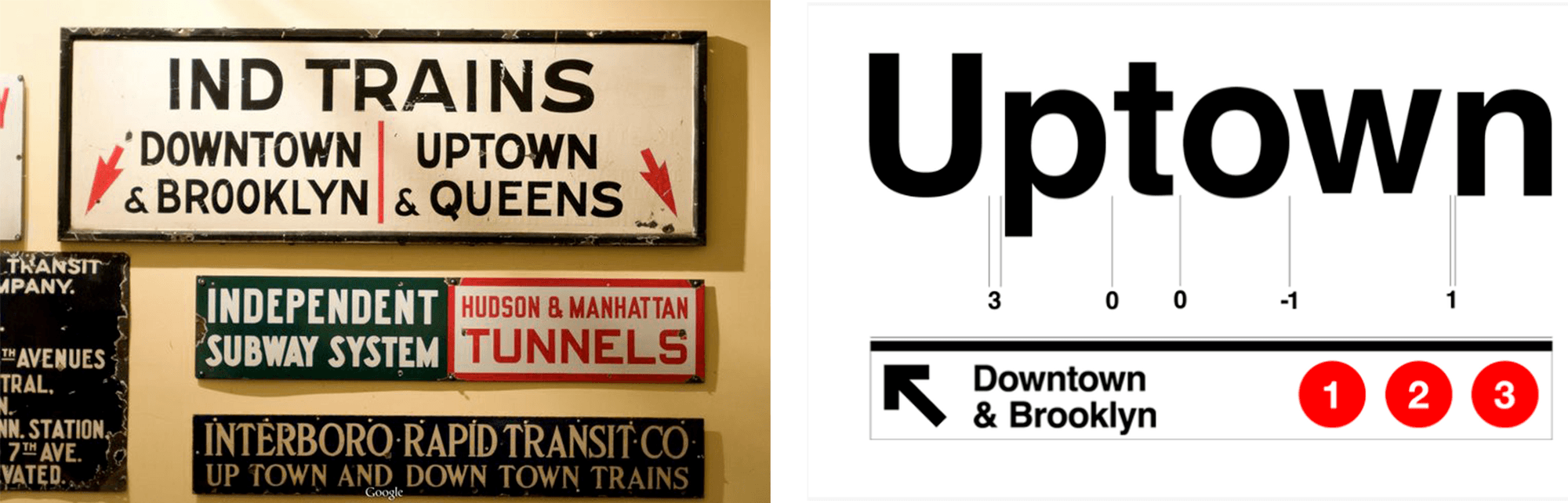
In 1965, Modernist graphic designer, Massimo Vignelli and his business partner, Bob Noorda would be commissioned to modernize and unify the subway’s signage and navigation system. For the first few years, they spent hours underground, watching the flow of passengers getting on and off trains and moving through stations. They studied their habits. Where did they go? Where did they look for information?
"Through their extensive research, they figured out what kind of information people were looking for, then they figured out where that information should be presented throughout the subway system and why,” explained design curator, Alexander Tochilovsky.
Vignelli and Noorda’s end goal was to have the minimal amount of information needed at each step of a user’s journey.
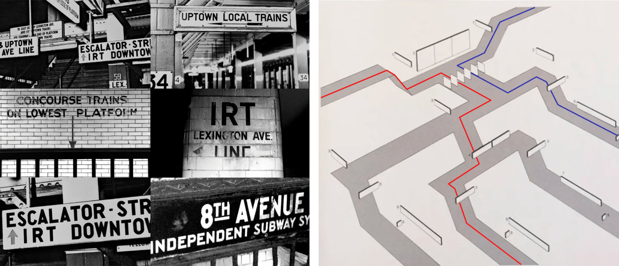
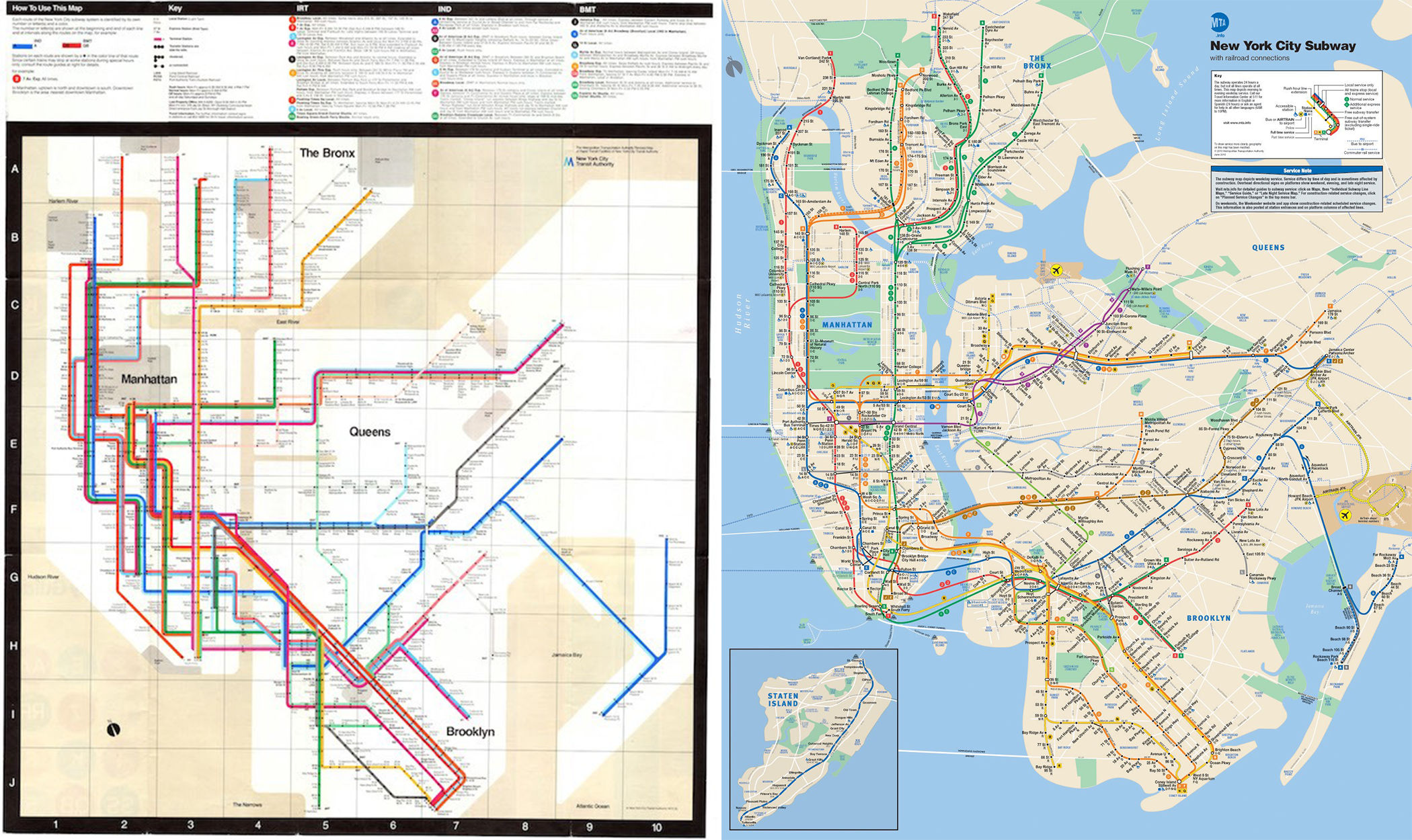
The designers used their research to create an eight-level schematic for placing signage that carefully followed the user’s journey through a subway station. They effectively predicted and designed the user experience down to the last detail. About five years later, this research culminated into The New York City Transit Authority Graphics Standards Manual.
The next step was creating a map that would help subway riders navigate the system. Vignelli aspired to make using the subway as seamless as possible. He called his concept going from “dot to dot.” He chose to omit above-ground details altogether, in favor of an easy to read color-coded system, showing evenly spaced stations that can be memorized by native New Yorkers and tourists alike. For Vignelli, the user experience was about knowing where you are on the subway line and where you want to go. The most likely scenario for the user is finding where you are on the line and counting the number of stops it takes to get to your destination.
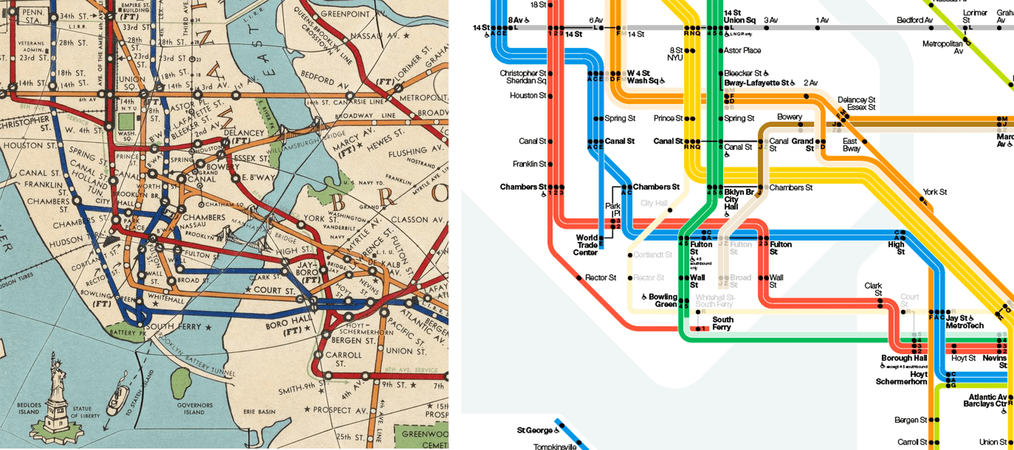
On August 7, 1972, the Vignelli subway map was published. To this day, it is still highly regarded by design buffs for its ingenuity and simplicity of a complex system. Vignelli had created a diagrammatic map that showed you how to navigate the NYC Subway system. Each station was shown as a dot and linked to its neighbor by color-coded routes running at 45 or 90-degree angles. Geographical references were minimized on the map as well. This began to reduce clutter and draw the audience’s attention to where they needed to focus. Sacrificing geographical accuracy, however, outraged Native New Yorkers. They saw it as a misrepresentation of their city. Tourists struggled to relate Vignelli’s design to what they found above ground. After much pressure, the MTA replaced the Vignelli diagrammatic map with a geographical one in 1979.
Why did this Vignelli’s design fail when it followed the guiding principles outlined by Knaflic?
There are a few answers to this question. The MTA rushed to release the diagram, calling it a “map” without consumer research. As a standalone “map,” New Yorkers balked at the simplification of the diagram map and lack of geographic context. Calling Vignelli’s diagram a “map” was most likely setting it up for unmet expectations. This was an era where map reading still involved a heavier use of scaled drawings and estimating distances.
Perhaps if going from “dot to dot” included time approximations, this would have made these diagrams more adoptable.
Most importantly, Vignelli did not intend for the diagrammatic map to stand alone. Each station would have the subway map plus one geographical map of the local neighborhood and the other of the entire transit network. In addition, one verbal map explaining in words how to get from point A to point B would also be posted. Would this complete set have satisfied the critics? I feel that it’s highly possible. Going back to the era Vignelli’s diagram was introduced, having a geographical map and verbal map would have been the “GPS” that was needed to navigate.
"Each subway station was to have the diagrammatic map, two geographical maps and a verbal map explaining in words how to get from point A to point B. I believe for this project to have been successful all three styles of maps needed to be launched together."
Vignelli was not consistent to the design principles of the diagrammatic map. Even though Vignelli set out to draw a diagrammatic map, he ended up including some geographical elements like Central Park. Additions like this caused distractions from the functional purposes and design intent, ultimately causing confusion. I believe that this design was ahead of its time and the general audience was not accustomed to ingesting data in this new style.A parallel could be found when having a graph with two y-axes; it solves the problem of showing two trend lines of different dimensions to scale, but can cause the audience to be distracted on how to interpret the diagram overall.
Lessons learned from Vignelli's maps
I think there are many lessons to be taken from Vignelli and the redesign of the NYC Subway. Although the map was not widely accepted and later changed, there were many successes to be noted here. The subway system began to come together visually with signage and graphic standards. Vignelli and his associates took on a huge undertaking and they spent countless hours researching what information passengers needed to navigate the subway system. I believe that for this project to have been successful, all three maps needed to be launched together, as they were mutually dependent.
One clear lesson that we have to be mindful of in our own work is that we have to make sure to gauge our audience and their ability to understand the visualization presented. Successful visualization design should be clearly understood by the masses.
Designers may feel that they have to sacrifice creativity and ingenuity, but that is not the case. Consistency is key. If you are ushering in a new type of visualization, you must ensure that they are easily understood. Complexity in data visualization, if presented to an audience that is unfamiliar with the format and/or data, could result in miscommunication. This was the case with the diagrammatic map, as it was not intended to be a stand-alone tool.
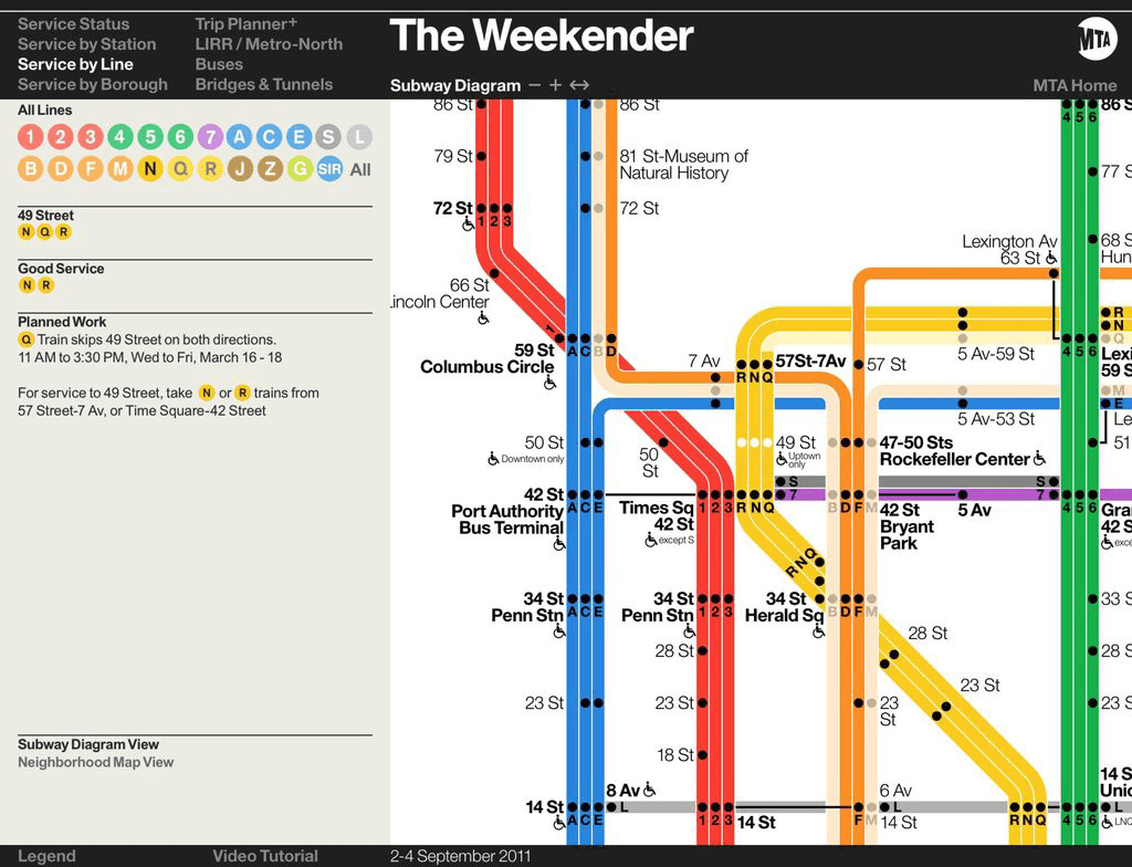
One happy ending for Vignelli’s map scheme...In 2011, the MTA introduced an interactive version of the subway map called “The Weekender” to let customers know about service changes that would impact the weekend schedule. They commissioned Vignelli to reinterpret his 1972 design for it. He did so on condition that it was described as a “diagram,” not a map, and that all parks were erased.
Notice the use of text along the left of the diagram. It gives information on the service status as well as any planned work along a given route. This guide is also a supplement to the subway map. It’s purpose is also well defined and doesn’t attempt to function as several tools for the subway ride. This Weekender has been well-received and proof that Vignelli understood the shortcomings of his initial “map” and that his design was ahead of its time.
Serve your audience with simplicity
The next time you’re creating a piece of work whether it’s an article, Microsoft PowerPoint deck, or Excel chart, make sure you know your audience. Once you’ve identified your audience, build your narrative. Once the narrative is complete, make sure to insert the proper visual cues to guide the audience’s eyes as you tell your story. Be sure to pay attention to basic design principles such as how you handle typography, use of color, and the right shapes or lines for your graphs. Simplicity is key and you should be wary of trying to make your work serve multiple audiences or functions.
Related Stories

5 Ways to Use Tableau Public to Achieve Your Goals
 January 11, 2025

World Mental Health Day: Elevating Awareness Through Data Visualization
 October 10, 2024

From TV Screens to Tableau: Visualize Your Favorite Shows with IMDb
 August 31, 2024