Eye-tracking study: 5 key learnings for data designers everywhere


The Tableau Research and Design team is always eager to learn from our amazing customers. Last year, our team hosted the first Tableau Labs at Tableau Conference 2016 with the intention of conducting real-time research with conference attendees. One activity garnered an incredible amount of attention: the Dashboards Eye-Tracking Station.
The question we had was simple: can we predict where people look when exposed to a dashboard they’ve never seen before? Translated into a customer’s voice: how do I, as data analyst, design visually compelling dashboards? We developed our hypotheses on concepts derived from cognitive psychology and established UX design principles. We expected to see certain design elements draw visual attention over others, but we also expected to learn something new. To our satisfaction, the study didn’t disappoint!
We didn’t give participants a task for this Tableau Labs activity, but that doesn’t mean our participants were not goal-directed. Humans are “meaning-making” animals; we can’t stop ourselves from finding a purpose. Every person looking at one of these dashboards had a task, we just didn’t know what it was. Perhaps it was “look at all the crazy stuff people create with Tableau?!” Or, “I wonder what kinds of data power plants collect?” Given this setup, we only explored what happens in the case of an unknown task, when the dashboard is novel to the participant.
Before we get into the details of the results, it’s important to note that some of these conclusions are not very surprising. People who have studied design would be able to predict the visual attention certain common dashboard design elements receive. However, what’s special about what we found is there seems to be a hierarchy to the things people are inclined to look at. Without further ado, here are five of those results:
- (BIG) Numbers matter: One of the most striking patterns we saw was the visual attention paid to very large font numbers. Dashboards with very large numbers showed concentration of visual attention directly on the big number. Additionally, this attention happened very early in the viewing sequence, i.e. the first time you viewed something. So, if you have an important number, make it big!
- Repetition fatigue: attention to repetitive elements was strong at the physical beginning of a repetitive set, but lost attention over the duration of the sequence. It’s common in dashboard design to have repetitive visualizations for different variables (e.g. bar charts for different KPIs so they’re easily compared). We found when there was high repetition of any like-element (repeated line graphs, repeated numbers), the attention waned based on left-right and up-down sequence. More attention was given to the top-most or left-most item, and then decreased as the person scanned the repetitive set. This result is a good reminder to designers that the sequence of presentation matters a lot, and one can take advantage of this when applicable.
- Humans like humans: if a human or human-like figure is present, it’ll get attention. We had dashboards with human-like figures (below) and others with pictures of people. The results were consistent: visual attention was concentrated on these forms. This isn’t too surprising; our brains really like to find and look at humans. That being said, a dashboard designer must be extremely judicious in the use of human figures. We can be certain the humans will get attention, so make sure it’s the attention you want (and that it doesn’t distract from your overall message). Let’s say that again: only use a human if it’s relevant to your data! Inappropriate usage and exploitation of this element will likely do harm to the reputation of your dashboard.
- Guide by contrast: areas of high visual contrast acted as guideposts throughout a dashboard. During the early viewing sequence, the eyes tended to jump from one high contrast element to the next. Almost like a kid’s dot-to-dot drawing, you can use high contrast elements to move visual attention around your dashboard. That being said, it’s notable that high contrast must be used judiciously. If used sparingly, high contrast elements will construct a logical path. Used abundantly, high contrast elements could create a messy and visually overwhelming dashboard.
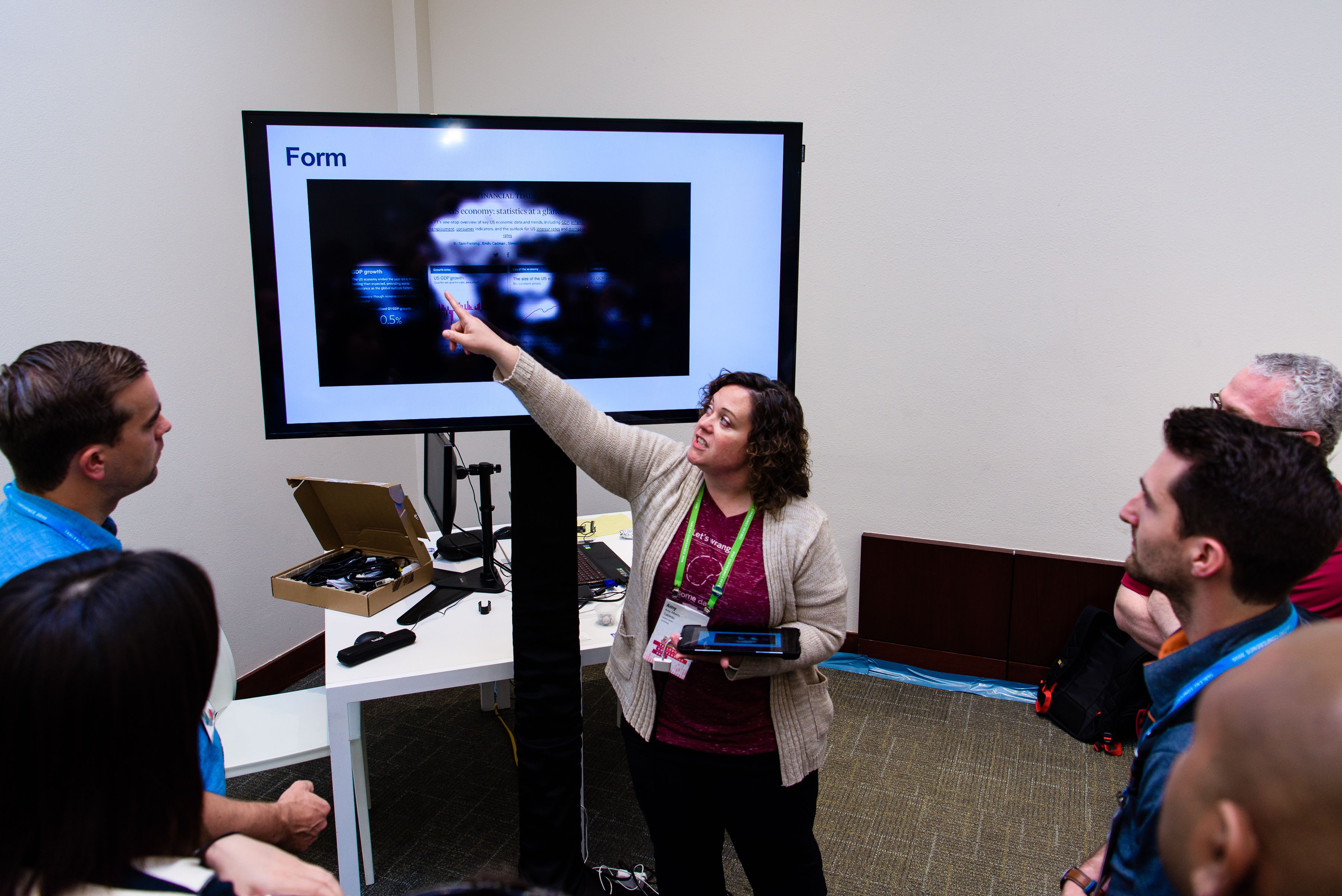
- Form is part of function: all dashboards have a form (triangular, grid, columnar) and the eyes follow this form. This result was both surprising and not surprising at all. Humans are information seekers: when we look at something for the first time, we want to get information from it. So, we look directly at the information (and don’t look at areas with no information). What’s important to note is the design freedom this gives an author. You don’t need to conform to rules like “put anything important in the upper left hand corner.” Instead, you should be aware of the physical form of your dashboard and use your space accordingly.
This dashboard was built by Dundas Data Visualization and is featured in The Big Book of Dashboards.
There were other dashboard design elements we thought would get attention (e.g. logos, icons, titles) but the data was not strong in their favor. We think the reason has to do with a combination of context and visual priority order. Context is a person looking at a business dashboard. At some level, they are primed to look for numbers. Given that priming, it’s not surprising that large numbers received such high amounts of visual attention. Also, our brain’s visual attention system is built to look for contrast. So something large and/or high contrast is simply more compelling than other design elements.
What does this study mean for you
The data from our study illustrates where people look on dashboards when the task is not clear and context is not set. A bit unrealistic? Maybe. Yet, there are two scenarios customers experience with their dashboards where we think this data could help:
"I've got 10 seconds..."
An analyst makes a dashboard that is sent to someone s/he doesn’t know. The most common version of this situation is a dashboard that’s created for a C-level executive. There’s a sense of urgency to communicate efficiently and effectively; to impress and convince. Can you get that exec, whom you’ve never met, to see what you want them to see, in the 10 seconds they’ll give the web link to your dashboard in their email? We suspect some of these design techniques could help you with that.
Remember me?
There are dashboards that receive intermittent, periodic attention. For these, although the viewer is familiar with the dashboard, they have not habituated to it. The lack of habituation likely results in the viewer needing to reorient, to look around, to find the data they need. In this case, their initial visual attention pattern will likely drift toward elements we identified in this study.
What we want to do next
Like any good research, this study surfaced more questions than it answered. We are planning a number of studies to investigate some of the more intriguing things we learned. To name a few:
- More big numbers: What is the relationship between the position of a big number and the visual attention it receives? Can we move big numbers to the bottom of a dashboard and still get attention to the number? What if we move them from the left to the right side of the dashboard? This study suggests a big number should get attention no matter where it is placed, but perhaps there are more nuanced rules.
- Validation: Our study only had 10 dashboards. Can we replicate these findings over many different dashboards and styles? Will we see the same trends if we study 50 or 100 different dashboards? A validation study will help us understand the scope of our conclusions and the strength of the heuristics we’ve derived.
- Comprehension: Do people retain the information they see on a dashboard? It’s one thing for the eyes to visit a dashboard element, but does the brain retain that information? Do big numbers convey information better than smaller numbers? One would expect that to be the case, but we can’t be certain that the visual attention these elements receive correlate to understanding and insight.
We’re excited to learn more and hope to provide valuable insights to our community and beyond. And if you’d like to learn more about the dashboards we used in this study (and others), check out The Big Book of Dashboards, co-authored by Tableau’s Andy Cotgreave.
Related Stories

5 Ways to Use Tableau Public to Achieve Your Goals
 January 11, 2025

World Mental Health Day: Elevating Awareness Through Data Visualization
 October 10, 2024

From TV Screens to Tableau: Visualize Your Favorite Shows with IMDb
 August 31, 2024