Use radar charts to compare dimensions over several metrics


Note: The following is a guest post by Jonathan Trajkovic.
Radar charts are a great way to compare members of a dimension in a function of several metrics. For example, when you want to buy a smartphone, you can use a radar chart to compare several devices across several metrics like battery life, camera quality, and memory capacity.
Here’s how to create a radar chart in Tableau.
Trigonometry, my best friend ever!
To create a radar chart, we have to use trigonometry formulas—you remember the circle with Pi, and numbers, and stuff like that?
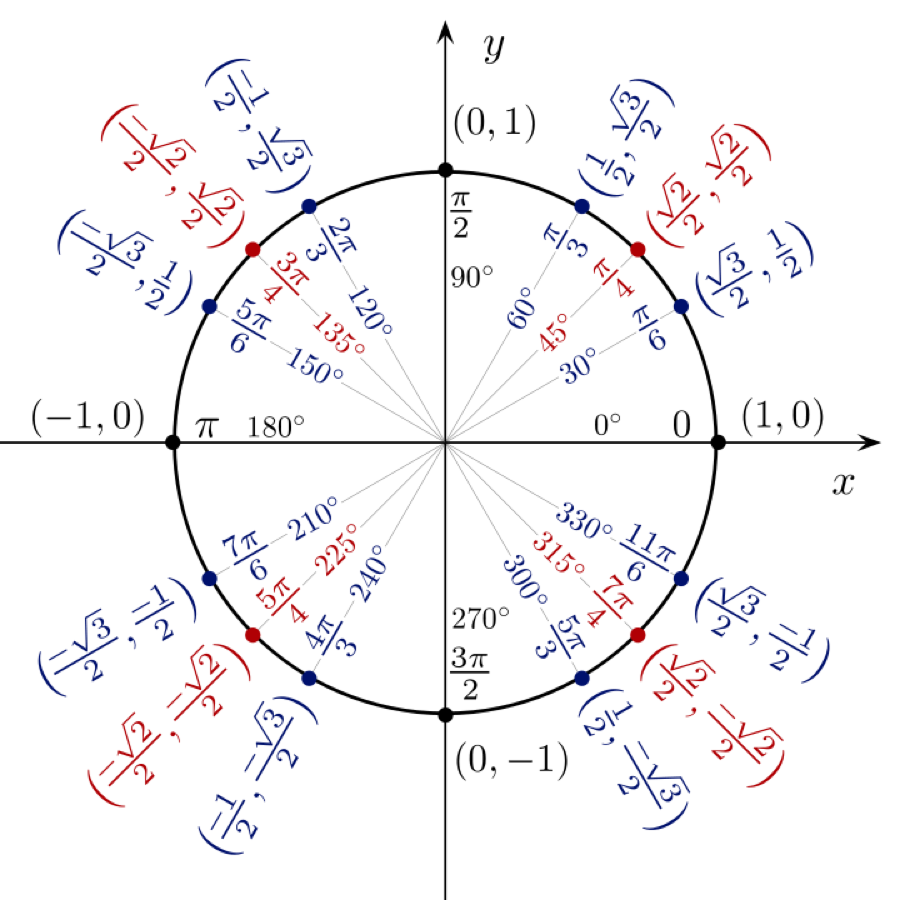
The exact formula you need depends on the number of metrics you want to display. For example, if you want to display five axes (= five metrics), your formula will differ from the one you use for a six-axis chart. In my case, I used a 12-axis chart, so I had to use several formulas as seen in the image above.
Thanks to the Internet, I was able to find the different formulas to create calculations in Tableau for the X axis and the Y axis. Here’s what they look like:
Calculation for [Xaxis]
case [Dimension]
when "Member 1" then 0
when "Member 2" then [Value] *(1/2)
when "Member 3" then [Value] *(sqrt(3)/2)
when "Member 4" then [Value]
when "Member 4" then [Value] *(sqrt(3)/2)
when "Member 5" then [Value] *(1/2)
when "Member 6" then 0
when "Member 7" then [Value] *(-1/2)
when "Member 8" then [Value] *(-sqrt(3)/2)
when "Member 9" then [Value] *(-1)
when "Member 10" then [Value] *(-sqrt(3)/2)
when "Member 11" then [Value] *(-1/2)
end
Calculation for [Yaxis]
case [Dimension]
when "Member 1" then [Value]
when "Member 2" then [Value]*(sqrt(3)/2)
when "Member 3" then [Value]*(1/2)
when "Member 4" then 0
when "Member 5" then ([Value])*(-1/2)
when "Member 6" then [Value]*(-sqrt(3)/2)
when "Member 7" then [Value]*(-1)
when "Member 8" then [Value]*(-sqrt(3)/2)
when "Member 9" then [Value]*(-1/2)
when "Member 10" then 0
when "Member 11" then [Value]*(1/2)
when "Member 12" then [Value]*(sqrt(3)/2)
end
It is very important to have the same [Value] scale for each [Dimension] member. Indeed, the 12 axes have to be the same. In my case, the scale was from 0 to 100.
Build the radar to detect everything
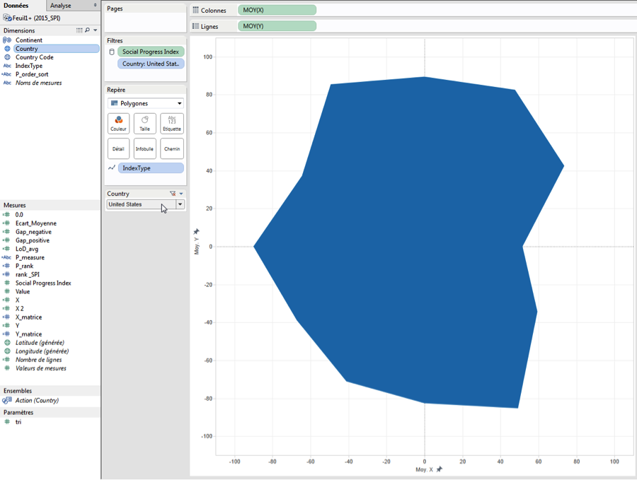
After the calculations comes time to build the chart. To do this, I just have to drag and drop the [Yaxis] on the rows shelf and the [Xaxis] on the columns shelf.
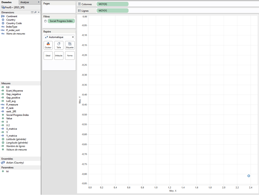
Note that I use the aggregation average (because sum will return the wrong results). Here, I have only one point.
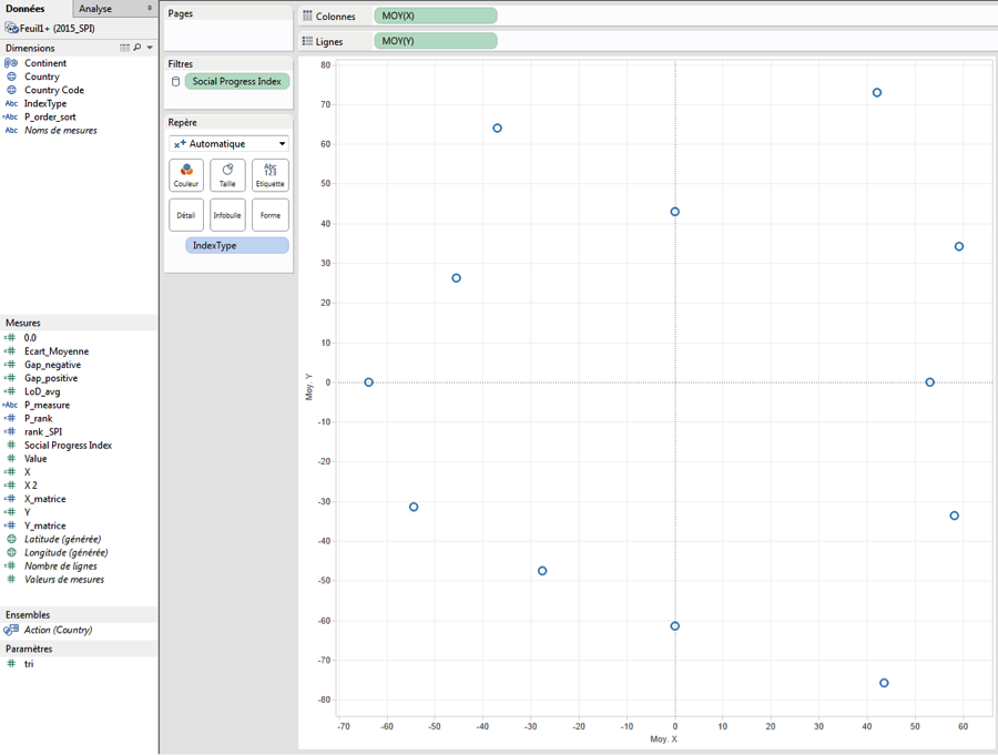
To create the radar, I have to use several dimensions—in my case, [Country] and [IndexType]. The [IndexType] dimension allows me to draw 12 axes because this is a dimension with 12 members. The [Country] dimension allows me to draw one radar by country.
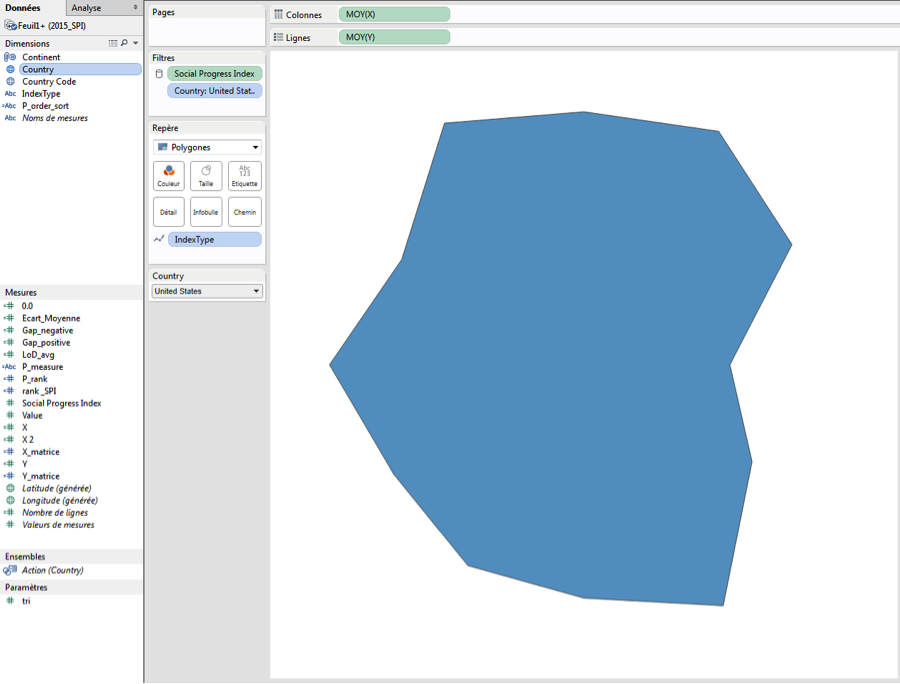
If I want to draw the average radar chart, I can remove the [Country] field. To have several points, I add [IndexType] on the Mark shelf as a Level of Detail.
Then I can change the Mark to draw a polygon and add [Country] as a quick filter.
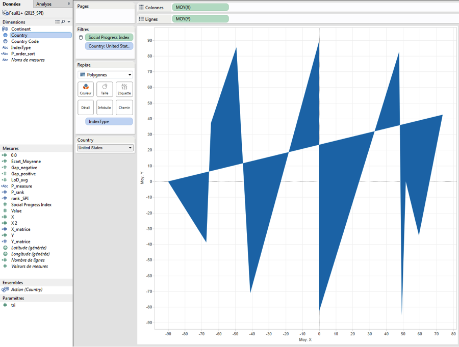
The last steps involve assigning [IndexType] as a path to follow, and fixing the axis between -110 and 110 (or whatever range you’d like to set to provide enough space between the borders and the chart).
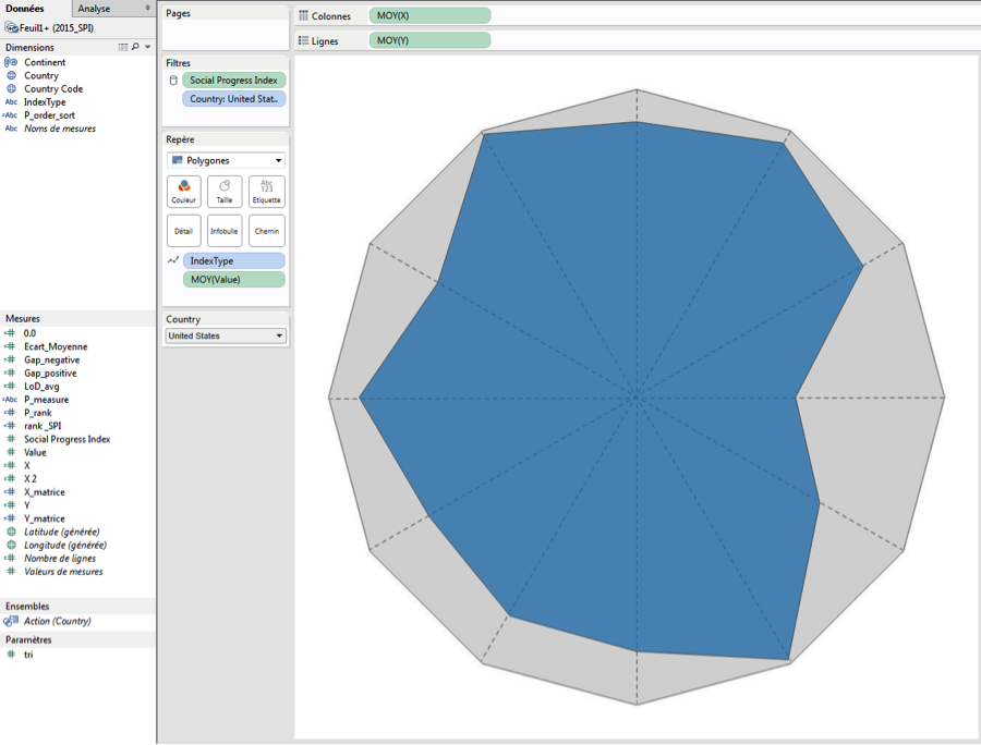
Some formatting, and voilà!
In my case, I made a few tweaks for the sake of design. I chose to remove the grid lines, the zero lines, and the borders. I hid the headers. At the same time, I added a border to my polygon and made the color more transparent.
Finally, I drew a background image to have a reference axis. I think it is better if you know where the maximum is.
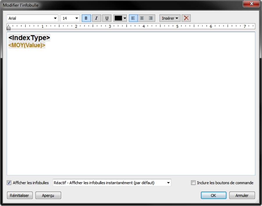
To style the tooltip, it is important to put AVG([Value]) on the Mark shelf and to configure the tooltip like this:
And voilà! The radar chart is done!

Related Stories

5 Ways to Use Tableau Public to Achieve Your Goals
 January 11, 2025

World Mental Health Day: Elevating Awareness Through Data Visualization
 October 10, 2024

From TV Screens to Tableau: Visualize Your Favorite Shows with IMDb
 August 31, 2024