Mobile dashboard design: Choose your orientation


Note: This is the second installment of a three-part series on designing mobile dashboards. Before you think about the orientation of your dashboard, first define your focus.
Now that you’ve picked the metrics to include in your mobile dashboard, it’s time to decide whether to go vertical or horizontal. It’s important to make this decision before you start building your dashboard or transforming an existing one. Why? The answer is simple: screen size. Because the phone screen is very small, the orientation you choose will impact many steps, from your analysis to the layout of your views. Here are some tips to get you started.
1. Choose Your Primary Design Orientation
Since phones are tall and narrow, it’s hard to design a visualization that works well on both vertical and horizontal screens. That's why we have to choose a primary screen orientation.
In my experience, I’ve found that the vertical format usually works better than the horizontal one. Plus many phone users seem to prefer consuming data on a vertical screen. That being said, users do have the freedom to flip their phones to their preferred orientation. So we have to make sure our dashboard doesn’t break when flipped to the non-primary orientation. Here’s an example that works in either portrait or landscape. Here's the portrait view:
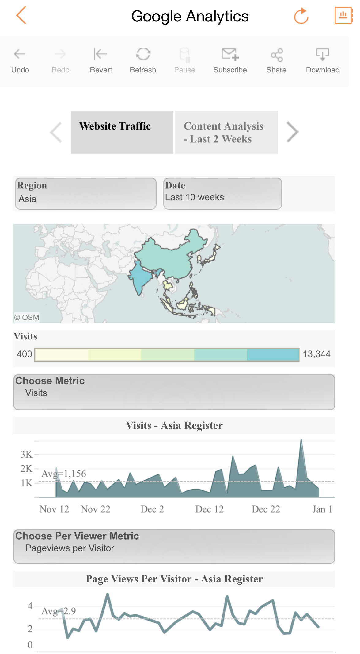

And here's the landscape view:
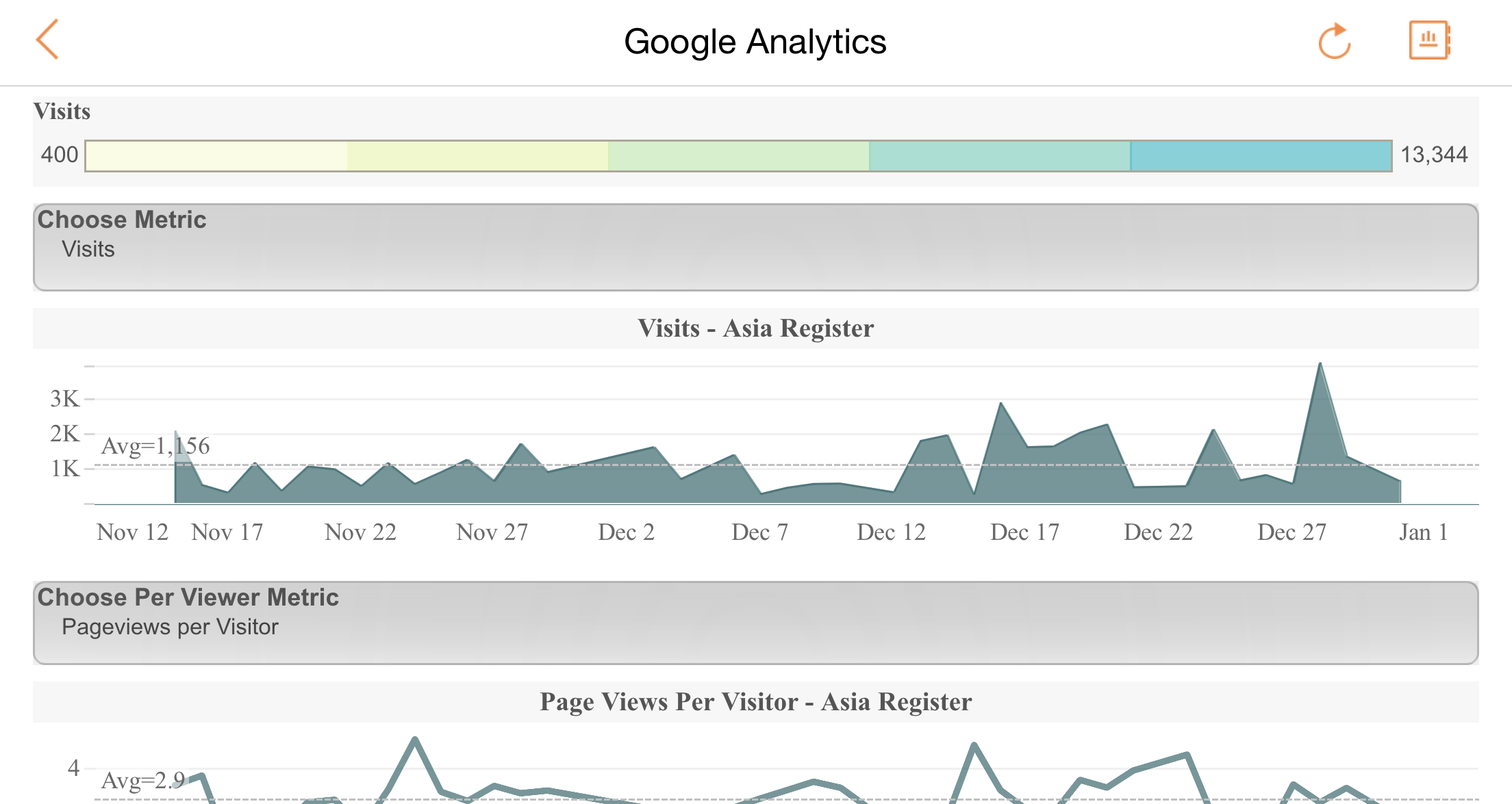
(Click on either image to view and download workbook.)
2. Define Your Navigation and Sizing
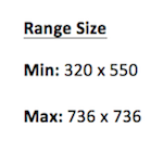
For simple single-tab visualizations, you don’t have to think about navigation. You just need to size your dashboard so that it fits nicely on your targeted devices in both orientations. My targeted devices are the iPhone 6 and the iPhone 6 Plus, and the dashboard sizes listed below work perfectly on both of them. This range size enables the visualizations to shrink and enlarge based your device sizes and orientations. The views will fit when vertical and scroll when horizontal.
For multi-tab visualizations, pick your navigation method first—before you start your analysis or lay out your views on the dashboards. Below is a simple chart to help you get started. Again, these size options are based on the iPhone 6 and the iPhone 6 Plus.
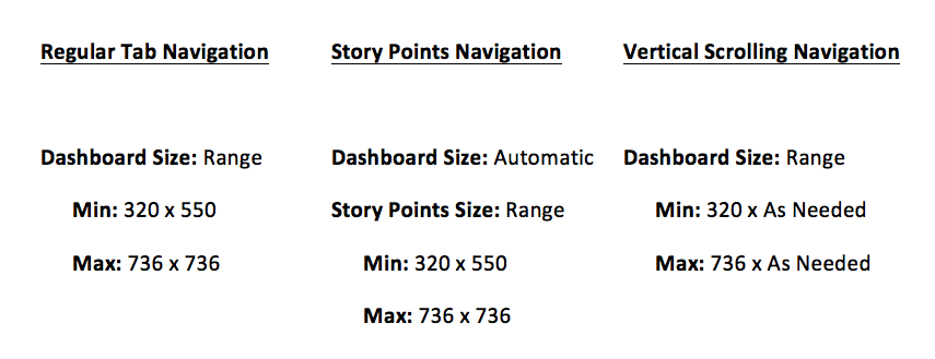
If you’re using Story Points, it may be useful to temporarily set the dashboard size to the desired range then shrink your window to your primary screen orientation (vertical, for example). This will give you a good guideline about the views, the height, and how all the elements will look together. Once you bring the views into Story Points, you can change the setting to range size (min: 320 x 550, max: 736 x 736), then reset your dashboard sizing from range (min: 320 x 550, max: 736 x 736) to automatic.
3. Use Layout Containers to Control Your Dashboard Elements
Layout containers are particularly useful when designing a mobile dashboard. Putting your views, filters, and legends in a vertical or horizontal layout container allows you to control their layout more precisely and fix their height or width as needed. This not only helps you customize your design, but also prevents scrunched views when your dashboards are seen on screens of different sizes or orientation. Click here to learn how to use layout containers.
Want to get started with mobile analytics? Download our new iPhone app.
Related Stories
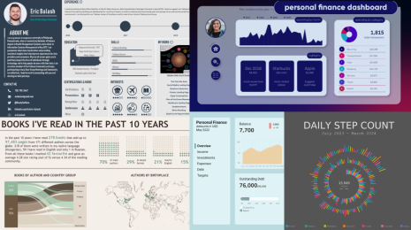
5 Ways to Use Tableau Public to Achieve Your Goals
 January 11, 2025
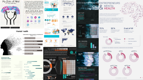
World Mental Health Day: Elevating Awareness Through Data Visualization
 October 10, 2024
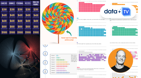
From TV Screens to Tableau: Visualize Your Favorite Shows with IMDb
 August 31, 2024