Reflections from a whole year of Makeover Mondays


Who would have thought that a phone call to Andy Kriebel in November 2015 would lead to nearly 500 people creating over 3,000 visualizations in one year?
That’s the humbling, amazing, inspiring, surprising, rewarding, astonishing result of Makeover Monday. Dec. 26 is the final Monday of the year, and we'll host the final makeover for which we will keep stats.
What a year! Andy and I are grateful for all the contributions and have been blown away, week after week, by the creativity and passion of the community. To wrap up the year, we're hosting a #MakeoverMonday Twitter chat on Monday, Dec. 19. Join us then to look back on the year and look forward to 2017.
So what has this year been like? I asked people to share their thoughts on what they enjoyed and what we can take away. Here are some of those reflections.
On learning to appraise others’ work, and seeing your own progress
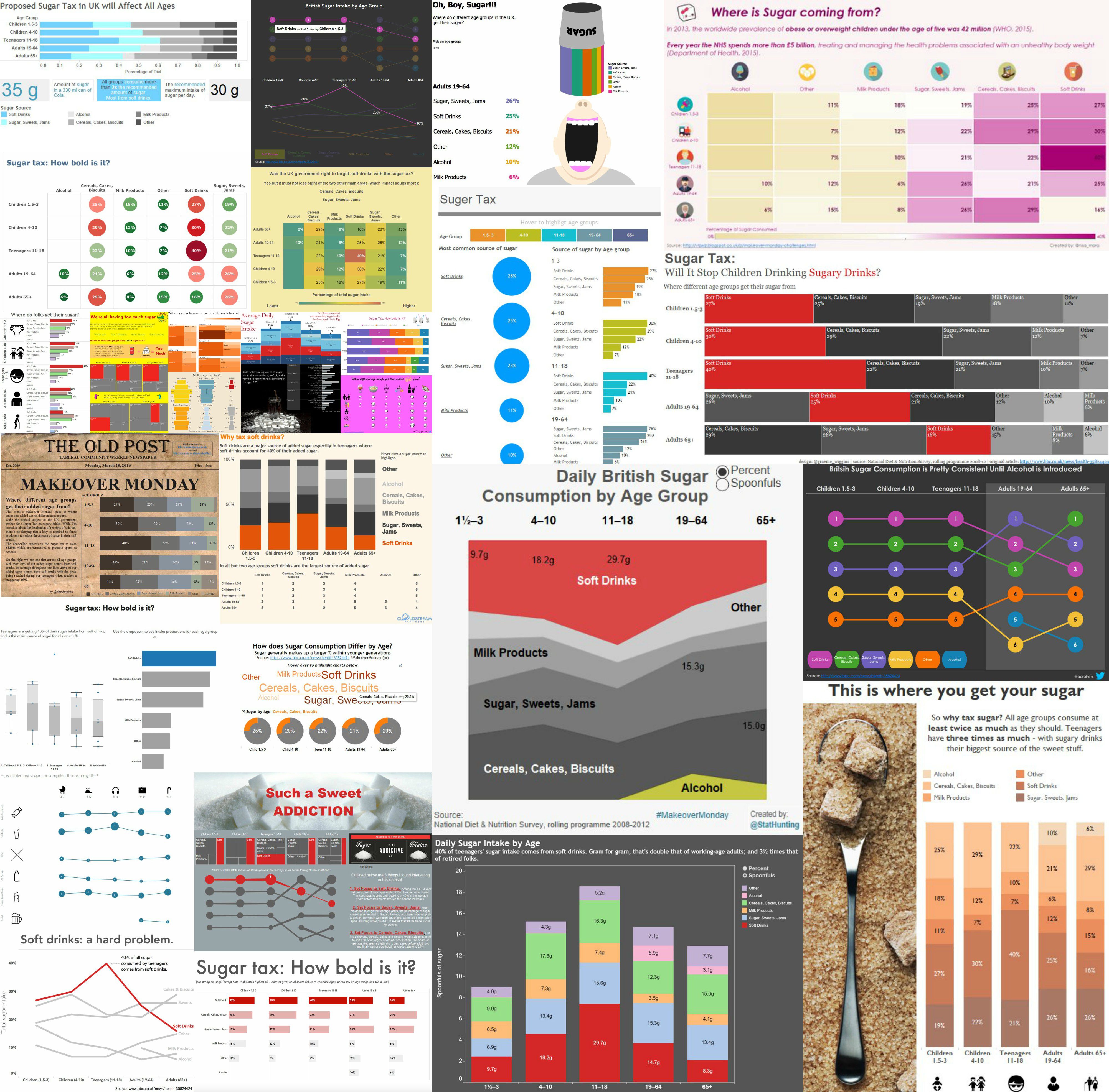
Week 13, sugar tax
Charlie Hutcheson told me Makeover Monday has made him a better vizzer.
"It has given me confidence to share my fumblings with the community, and to constructively appraise other submissions. I look back on my submissions and can see my development, technically and aesthetically, over the months," he says.
Charlie even extended the exercise to his team.
“As the manager of a team of analysts, it has given me a fresh data set each week to take my team out of their collective comfort zone and encourage them to try new things," Charlie says.
On becoming 'a valued member of the community'
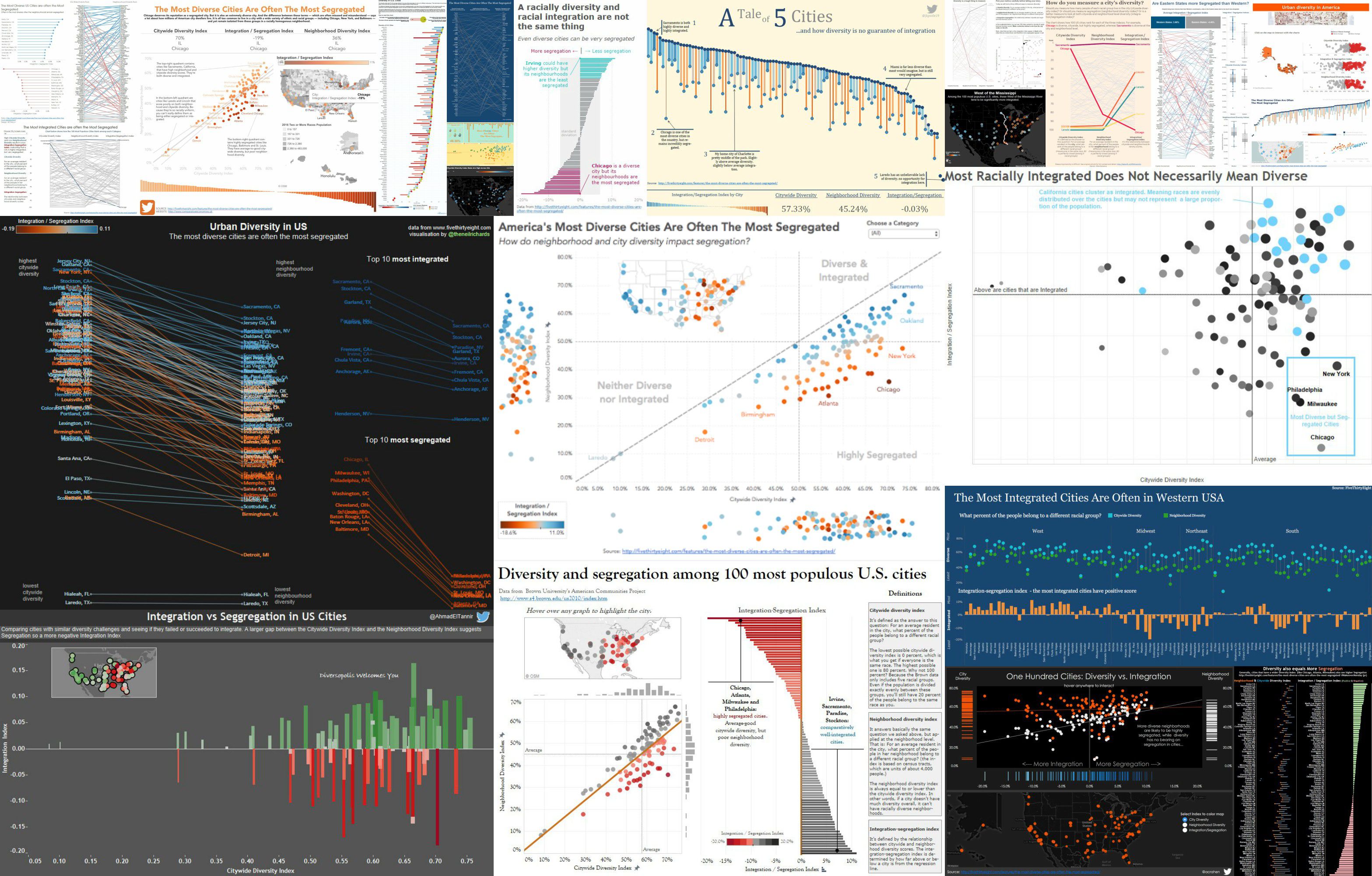
Week 14, urban diversity in America
Jeremy Poole, a newcomer to the community at the start of the year, tells a great story.
“My third week participating was week 14, urban diversity,” he told me. “I discovered the data set late on a Saturday night and jump right on it. When I woke up Sunday morning, I had over 50 new Twitter followers and over 100 notifications. I have no idea what has happened! Have I greatly offended someone? On Monday, it was named Viz of the Day. The following Monday, it was named Viz of the Week. That viz has over 14k views now. Something that astounds me daily.
“From this point on, I’ve felt like a valued member of the community and have been able to connect and collaborate with so many incredible people.”
Jeremy's story is worth reading in full.
On experimenting and taking creative risks
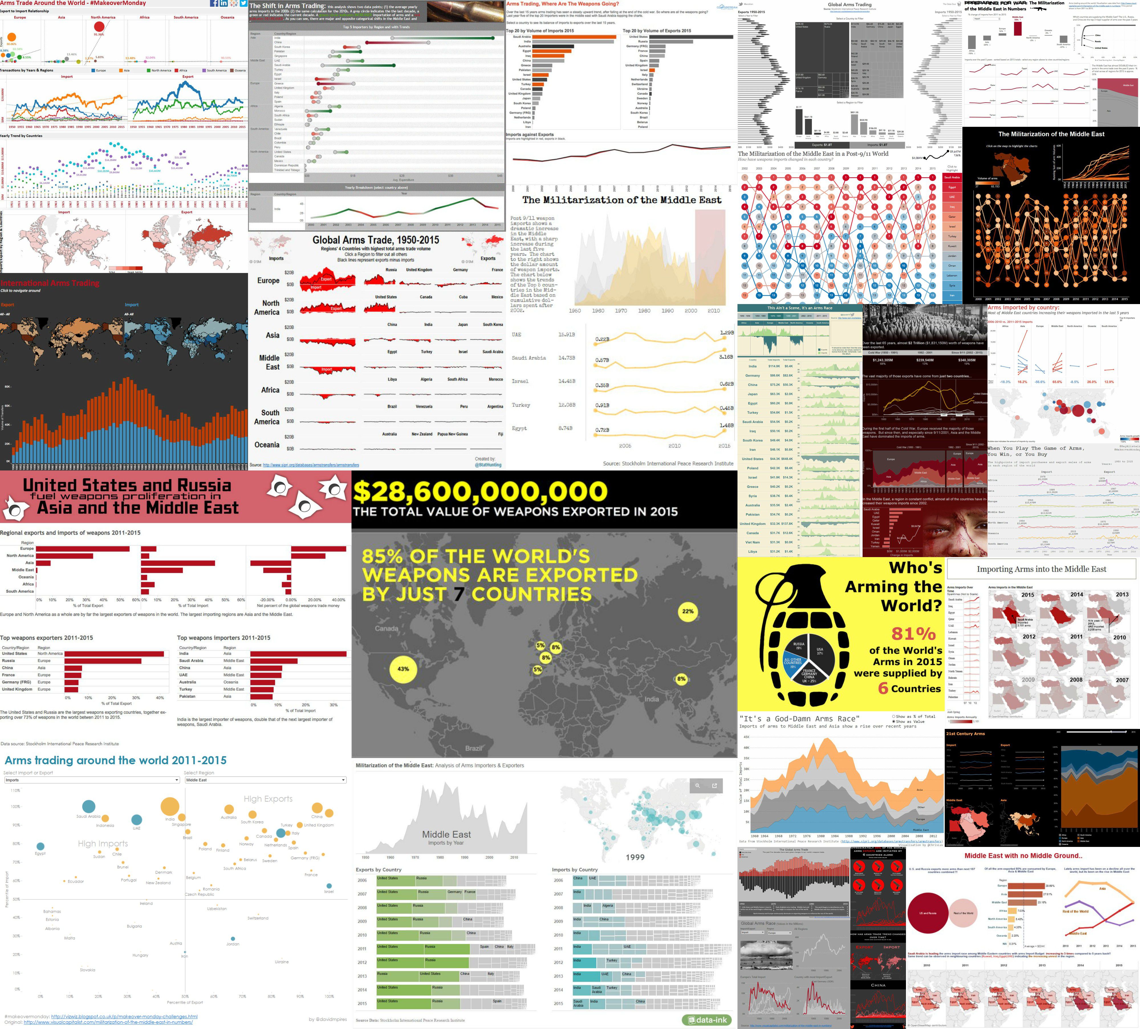
Week 21, arming the Middle East
Michael Mixon enjoyed exploring data on the arms industry in the Middle East.
“It was the first week when I spent a lot of time considering the entire ‘story’ of my viz and brought in design elements like background images to augment the data," he says. "From that week forward, I found myself far more likely to experiment and take risks with my vizzes.”
Michael says this community exercise has allowed him to "flex my creativity in ways I hadn’t associated with data viz before."
"Vizzing in public (vs. just for internal corporate reporting) encouraged me to pay more attention to things like color, font, layout, etc., which in turn has made data visualization so much more fun and satisfying than it had been prior," he says.
You can read more from Mike on his blog.
'Data can capture people’s imaginations'
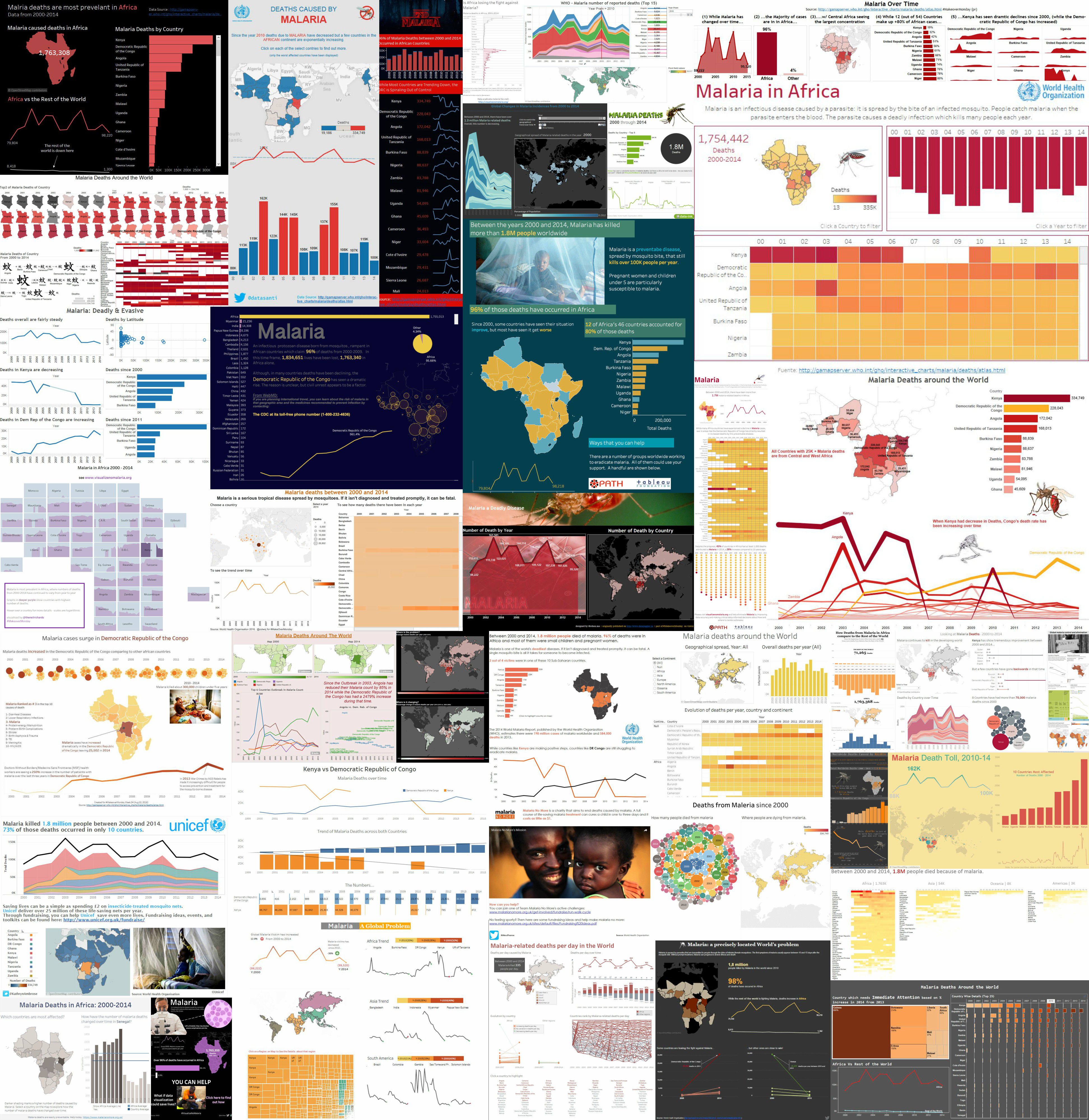
Week 34, malaria
Neil Richards' favourite week was week 34 when we looked at malaria. Why?
“What started as a quick hobby Sunday/Monday experiment got commissioned by a magazine in France,” he says. “It was proof that data can capture people’s imaginations in ways you hadn’t predicted. The healthy debate and differences in approach has been fascinating.”
Neil also listed the benefits of playing with new data each week and sharing it on his own blog, Questions in DataViz.
'You don’t need to be a subject expert' to gain insights from a data set
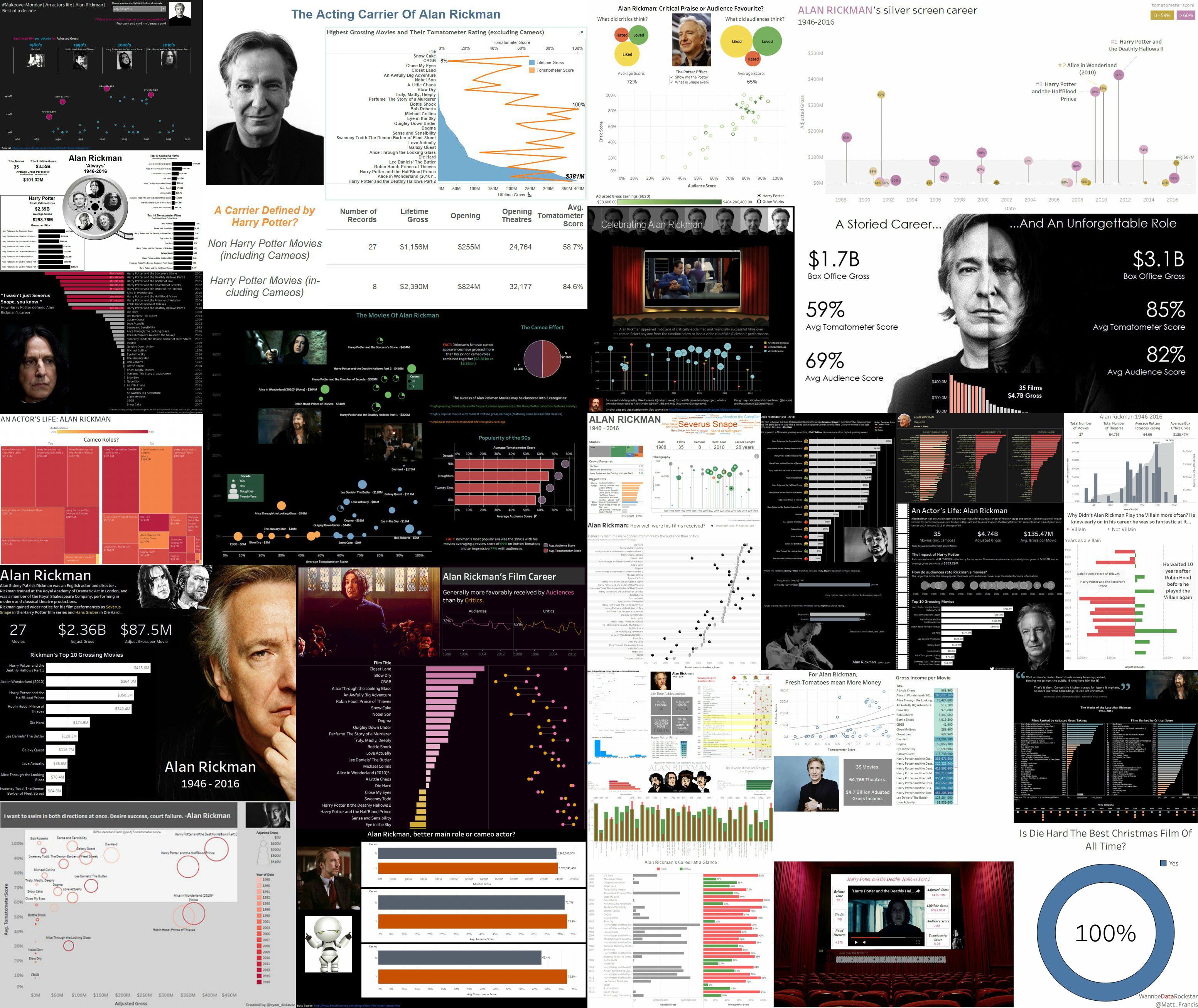
Week 36, Alan Rickman
Sarah Bartlett’s favourite week was when we explored the career of Alan Rickman.
“Prior to that week I had no idea who Alan Rickman was!" says Sarah. "Nevertheless, that week became my favourite Makeover Monday dashboard. It goes to show you don’t need to be an expert in the subject area to participate in the project.”
Sarah also relished the chance to connect with the community.
“Makeover Monday has also helped me form friendships with other participants all over the world, many of whom I was lucky enough to meet at #data16," says Sarah.
'One data set can be visualised in so many ways'
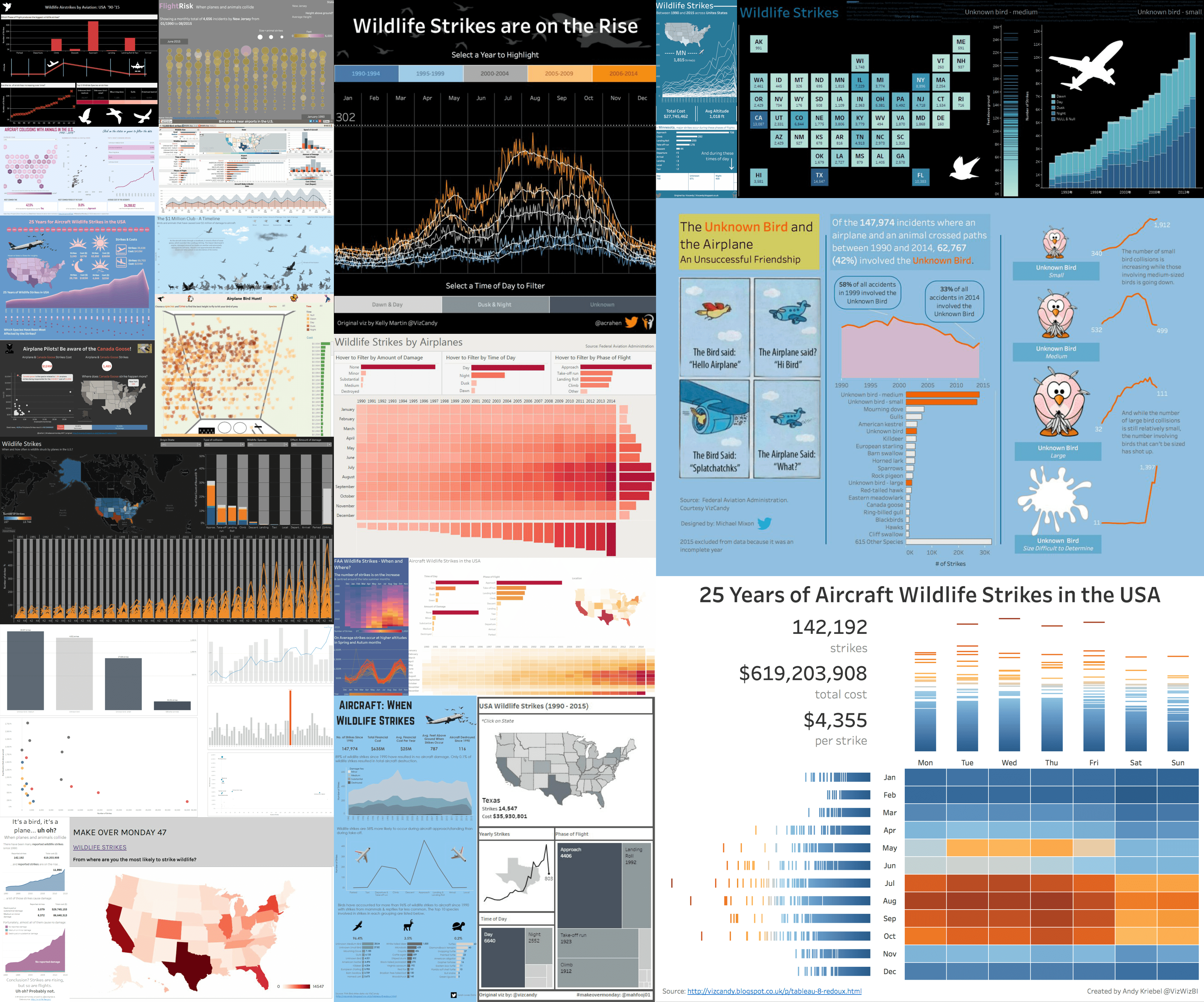
Week 47, wildlife strikes
Eva Murray says she “sticks to simple charts but tries to make them speak for themselves by giving them space and making them clear and concise.” It’s a formula that works.
“I find it fascinating to see how one data set, no matter how simple or complex, can be visualised in so many ways,” she says. “There have been great discussions, some straightforward, some more passionate, about visualisation topics. With every tweet, post and uploaded workbook, I have learned, improved, and hopefully also contributed something to the wider Tableau community.”
That neatly sums it up for me. I have had so much fun this year on this project. We’d like to thank everyone for turning this into such a success.
From January, Andy will continue to add new data sets each week. We’ll be sharing the work on Twitter but will no longer be updating the dashboard of the Pinterest board.
As this phase of Makeover Monday comes to an end, what else have you enjoyed about the project? Tell us in the comments below. If you haven't yet participated in Makeover Monday, go check out the website or listen to our appearances on the DataStories podcast.
Related Stories
DataFam Roundup: July 22–26, 2024
 July 26, 2024
DataFam Roundup: July 15–19, 2024
July 19, 2024
DataFam Roundup: July 8–12, 2024
July 12, 2024
Subscribe to our blog
Get the latest Tableau updates in your inbox.