DFID visualizes happenings in crisis areas—improving response times
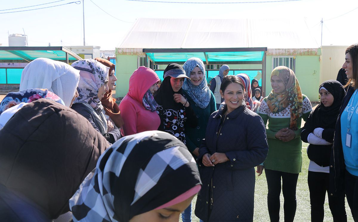
International Development Secretary, Priti Patel meets children at UK-supported, UNICEF-run, Makani informal education centre & safe space for Syrian children. Photo courtesy of UK Department for International Development (DFID).
DFID uses Tableau to rapidly analyze datasets from multiple partners in Syria and adjacent countries. Interactive, visual analytics enable DFID to accurately identify where to target aid and improve the coordination of humanitarian services, such as food, water, shelter, medicine, and education. By turning location data into interactive maps, DFID understands the latest crisis situation in any one of the 281 sub-districts of Syria. DFID analyzes information like age and gender of affected populations, number of healthcare cases, results of sanitation and hygiene activities, and availability of clean water sources. In turn, DFID helps meet the needs of vulnerable groups in Syria, including some in hard-to-reach areas and surrounding countries.
The DFID Syria Crisis Response
In response to conflict in Syria, the UK Government committed £2.3 billion ($3 billion) in aid since 2012, through The Department for International Development (DFID). DFID allocates funds to multiple implementation partners, including United Nations agencies and international non-governmental organizations (NGOs), helping meet the immediate needs of vulnerable people in Syria and the surrounding regions, including Jordan, Lebanon, Turkey, Iraq, and Egypt. DFID relies on multiple partners working in Syria and elsewhere to explain the situation on the ground. Armed with this knowledge, DFID can determine the best course of aid action. One of the challenges was determining where best to allocate funds and resources: which partners need which resources, when, and where. Implementation partners share data from the field, on subjects as varied as location, demographic, and medical information. One specific example is data provided on geo-political issues, such as which territorial borders are open to safely channel aid, the control in each of the 281 sub-districts in Syria, and updates on the provision of education services.
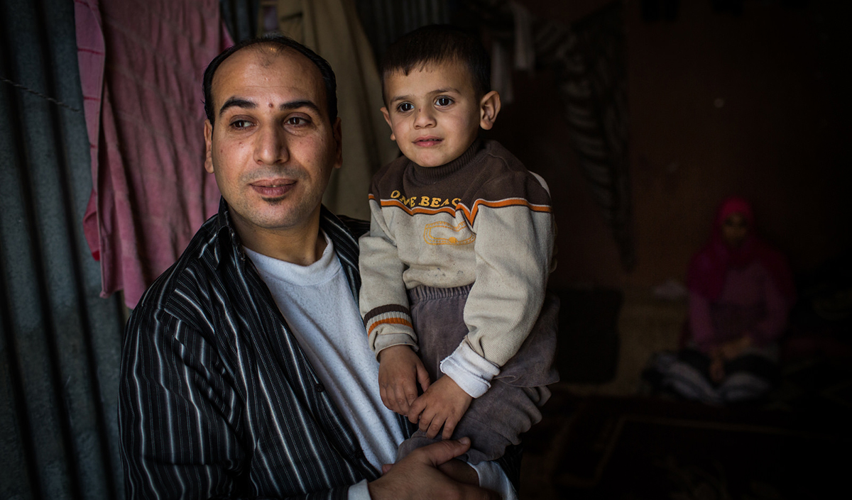
DFID helps support Syrian families most in need in Lebanon. Photo courtesy of UK Department for International Development (DFID).
Gerson Bergeth, Information Manager at the DFID, explains, “Partners provide the best picture they can, but it is limited to their area of visibility or expertise. So one NGO gives us rich datasets on children supported in formal and informal education, for example, while another gives us data on the number of food, water, or medicine packages distributed. Here in London, we need to turn this raw data into a complete, up-to-date picture of the humanitarian emergency.” These reports are sent from the field to DFID as spreadsheets, PDFs, or local Access databases, and comprise thousands of rows of data. With so many reports to consolidate, the DFID had a hard time creating a holistic picture of relief efforts.
Using data to determine the best course of action
For the DFID crisis response teams working in Whitehall, London it would take hours—sometimes days—to analyze the data and prepare presentations used for decision-making. Bergeth says, “The contracted reporting period is every quarter, so once you factor in the time needed to analyze the data, there is a risk that certain decisions are not based on the most recent data.” Other questions were hard to answer. For example, much of DFID’s Syrian aid work is affected by the status of the border crossing point, most notably between Syria and Turkey. If closed or restricted, affected populations may congregate at these points—with potentially dangerous consequences. DFID needs to analyze the border status over previous months and monitor closures. That way the organization can coordinate the delivery of aid more effectively, “Comparing the situation month-on-month was very difficult using spreadsheets,” says Bergeth. “You needed to be a serious ‘techie’ to build all the formulas. One error and the data was suddenly meaningless.”
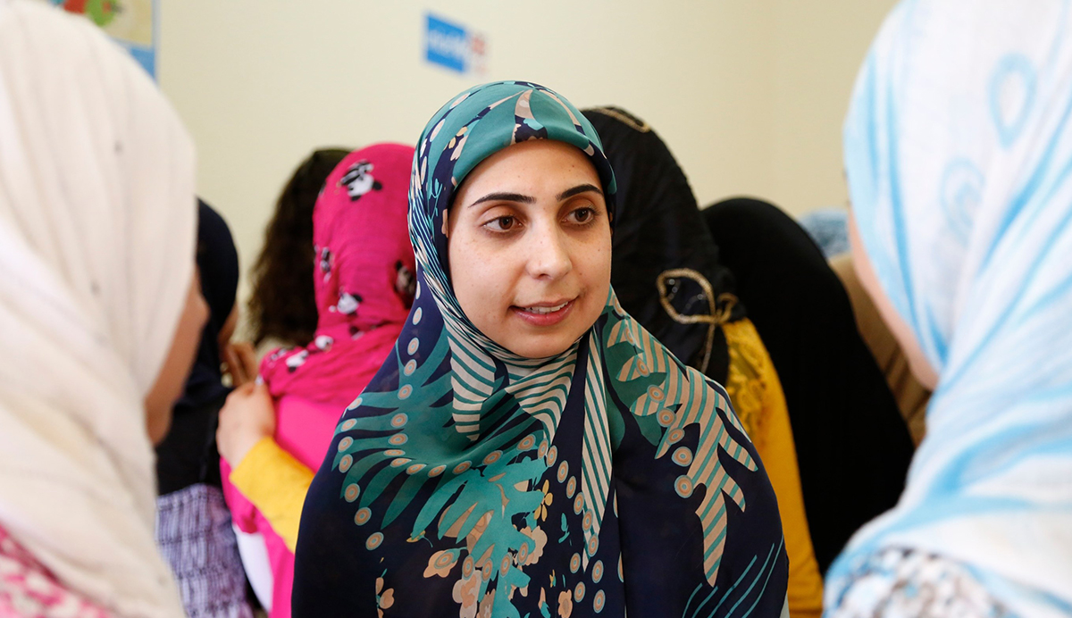
A Lebanese teacher talks to two Syrian refugee girls at an information session about gender-based violence and early marriage in southern Lebanon. Photo courtesy of UK Department for International Development (DFID).
Interactive visuals improve aid provision
In response to these data analysis challenges, DFID turned to Tableau as the state-of-the-art solution for information analysis and visualisation. Bergeth and his team use Tableau Desktop to create interactive visuals concerning aid provision. Data is blended from the disparate data sources provided by partners—in just a few clicks. Bergeth again: “The speed we can visualize data is phenomenal. With Tableau, you don’t need programming skills; you just drag and drop the sources you want to analyze. Then, once you have a visualization, you can switch instantly between views—to a pie chart, a bar chart or plotter or whatever you choose.” Three DFID users analyze in Tableau Desktop and share visualizations via Tableau Reader with up to 15 other users on the aid coordination teams in London. “It only took a day or two to learn how to use Tableau,” says Bergeth. “We mainly taught ourselves using videos on the Tableau website, and if we had any questions, the Tableau forums were a fountain of knowledge and expert advice.”
Ensuring aid reaches the right people, faster
The interactive visualizations enable DFID to pinpoint quickly and accurately where to target aid. Bergeth explains, “With Tableau it’s apparent very quickly what the humanitarian crisis is, where it is happening, and what response we need to put in place.” The situation on the Syrian border crossing points, for example, is visible now. Multiple Excel files are pulled into Tableau, giving the team in London a more complete view of individual circumstances. For example, whether a sub-district is within safe reach of implementing partners, the care taking place on the ground, and the status of refugees. Tableau’s geocoding is transforming the way the DFID looks at data. In a few clicks, Bergeth and his team can zoom into a map of any one of the sub-districts of Syria and analyze a wide variety of scenarios. For example, age and gender of refugees, number of primary healthcare cases, return on investment for sanitation and hygiene programs, and accessibility of clean water sources. DFID can also incorporate third-party datasets to enrich their insights. For instance, weather data from publicly available meteorological sites helps DFID plan measures to provide more blankets, tents, or additional water supplies in extreme weather conditions. DFID is not only using Tableau to support the humanitarian emergency in Syria. In Turkey and Iraq, analysis of the registration of arriving Syrian refugees also enables the provision of basic humanitarian assistance including food, shelter, and relief packages. Using Tableau dashboards, the DFID helps improve the quality of education for early grade primary school children in Jordan. And in Lebanon, insights from the data help provide humanitarian assistance, strengthens the resilience of refugees in a sustainable way. All photos courtesy of UK Department for International Development (DFID).