Tutorial
Apply Clustering Analysis to group the regions with similar average temperatures

In this tutorial, we will show you how to set the TabPy integration on Tableau Cloud and how to use it. TabPy (the Tableau Python Server) is an Analytics Extension implementation that expands Tableau's capabilities by allowing users to execute Python scripts and saved functions via Tableau's table calculations. For this tutorial, you are going to apply some advanced analytics techniques such as clustering algorithms to group the regions with similar average temperatures over time together.
Deploy TabPy to your Heroku account
- Log in to Heroku with your account via a browser.
- Go to the TabPy repository on GitHub.
- Click the "Deploy to Heroku" button.
- Configure the new TabPy server by setting environment variables. Be sure to remember all the information that you are entering: App name, PASSWORD, and USERNAME.

Configure Tableau Cloud
All the instructions can be found here
- Log in to your Tableau Cloud Developer Site.
- Go to Settings > Extensions.
- On the Settings page, click the Extensions tab and then scroll to Analytics Extensions.
- Select "Enable analytics extensions for site" (uncheck by default).
- Click Create new connection.
- Select "TabPy" for connection type
- In Analytics Extension Connection, enter the configuration settings for your analytics service:
| Setting | Current Value |
|---|---|
| Connection Name |
[insert-your-connection-name] |
| Require SSL |
Check |
| Hostname |
[insert-your-app-name].heroku.com |
| Port |
443 |
| Sign in with username and password |
Check |
| Username |
[insert-your-USERNAME] |
| Password |
[insert-your-PASSWORD] |
- Click Save

Apply Affinity Propagation clustering algorithm to cluster the regions based on the similarity of average temperature
Now that we have set up our Tableau Cloud Site to use the TabPy Server that we deployed on Heroku, it is time for us to use it.
-
Download the dataset here
-
Connect to the data a. Log in to your Tableau Cloud Developer Site. b. Open the Connect to the Data page. you can open this page two ways: Home > New > Workbook Explore > New > Workbook c. Select the tab "Files"
-
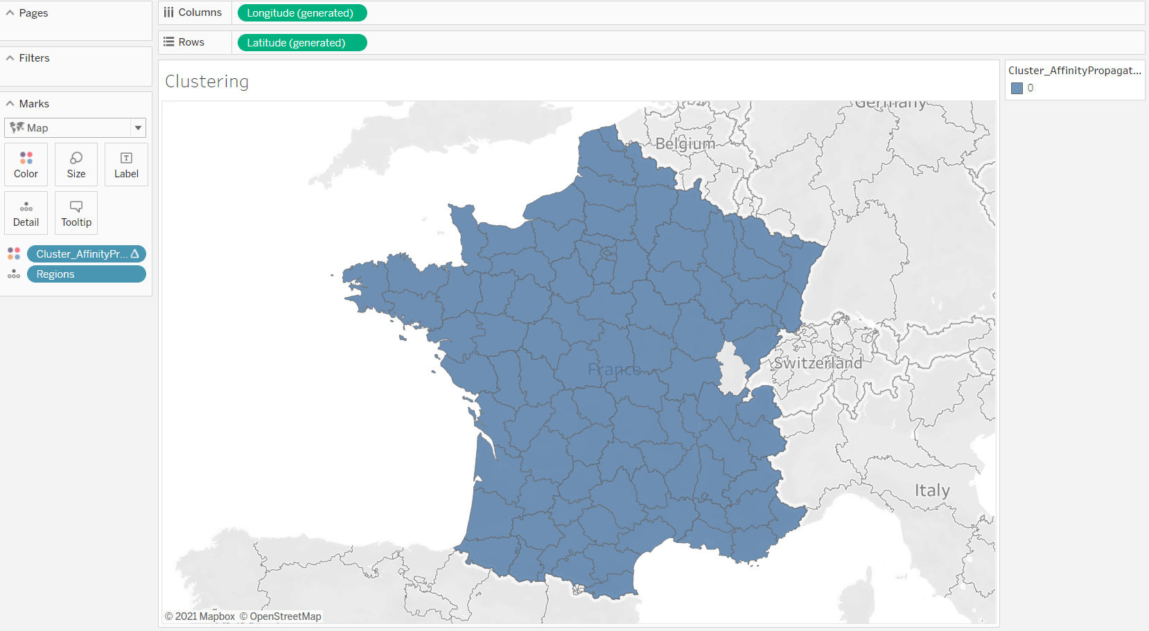
Create a map of all regions in France. Drag and drop the field "Regions" to Detail on the worksheet.
-
In this new workbook, create a new Calculated Field
-
Use the function SCRIPT_INT
Tableau can pass code to TabPy through four different functions: SCRIPT_INT, SCRIPT_REAL, SCRIPT_STR and SCRIPT_BOOL to accommodate the different return types.
-
We are now going to apply the Affinity Propagation clustering algorithm to cluster the regions based on similarity temperature for months of the year. You can copy/paste the script below
SCRIPT_INT(
"
import numpy as np
from sklearn.cluster import AffinityPropagation

X = np.column_stack([_arg1, _arg2, _arg3, _arg4, _arg5, _arg6, _arg7, _arg8, _arg9, _arg10, _arg11, _arg12])

db = AffinityPropagation().fit(X)

return db.labels_.tolist()

",SUM([April]),SUM([August]),SUM([December]),SUM([February]),SUM([January]),SUM([July]),SUM([June]),SUM([March]),SUM([May]),SUM([November]),SUM([October]),SUM([September])
)
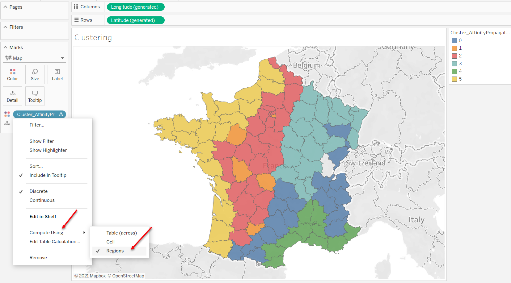
- Add the cluster as color on the map: Drag and drop the calculated field that you created at the previous step on colors. You may not see any change in the map as all regions are grouped together which is a surprise.
- Edit the way that your calculation is computed. Click on your calculated field that is on Colors, and select "Compute Using", and "Regions". SCRIPT_X is a table calculation and as the result, you need to adjust the dimensions. You can learn more about table calculation dimensions here.
Use two other clustering algorithms to compare with the climate zones of France
In this section, we are using OPTIC and K-mean clustering algorithms. The goal is to compare the results of the three clustering algorithms against the climate zones of France. You can find the climate zones of France here.
- Create a new calculated field.
- Copy/Paste this script for OPTIC clustering.
SCRIPT_INT(
"
import numpy as np
from sklearn.cluster import OPTICS

X = np.column_stack([_arg1, _arg2, _arg3, _arg4, _arg5, _arg6, _arg7, _arg8, _arg9, _arg10, _arg11, _arg12])

db = OPTICS().fit(X)

return db.labels_.tolist()

",SUM([April]),SUM([August]),SUM([December]),SUM([February]),SUM([January]),SUM([July]),SUM([June]),SUM([March]),SUM([May]),SUM([November]),SUM([October]),SUM([September])


)
- Create another calculated field for k-mean clustering. For k-mean clustering you can specify the number of clusters, we are going to set it to 5.
SCRIPT_INT(
"
import numpy as np
from sklearn.cluster import KMeans

X = np.column_stack([_arg1, _arg2, _arg3, _arg4, _arg5, _arg6, _arg7, _arg8, _arg9, _arg10, _arg11, _arg12])

db = KMeans(n_clusters=5).fit(X)

return db.labels_.tolist()

",SUM([April]),SUM([August]),SUM([December]),SUM([February]),SUM([January]),SUM([July]),SUM([June]),SUM([March]),SUM([May]),SUM([November]),SUM([October]),SUM([September])


)
- Try the two other clustering algorithms by adding the calculation to color to see which results are closer to the actual result.

Bonus: Compare the three methods
Take advantage of dynamic parameters in Tableau to be able to dynamically iterate over different clustering methods and compare it with the actual result in the same dashboard.
.gif?raw=true)
Last updated: September 13, 2021