A Decade of Oil Prices
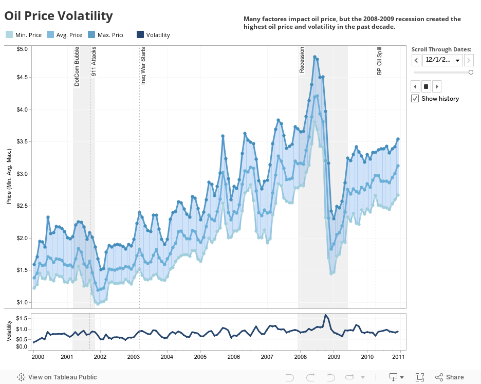
This visualization is simple but striking. The thee measures (average, minimum and maximum price) show us the difference in prices nationally. The color of the "path" in between them is the volatility, darker in times of violent price swings and lighter during more stable periods. In addition, you can see daily price volatility on the bottom chart.
Want to get started creating your own Tableau visualizations? Try It for Free