Bullet Graphs
Understanding and using Bullet Graphs
How do I read it?
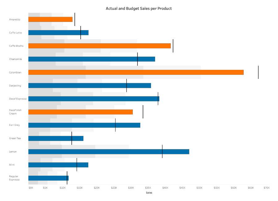
A bullet graph consists of a bar representing the featured measure. This bar stands out from the rest of the graph with its strong color and bold line. It positions itself in the middle of the graph. A reference line, denoting a goal or other critical threshold, is set perpendicular to the bar on the axis with the quantitative scale. When the main bar passes the reference line the goal has been met or the state has changed.
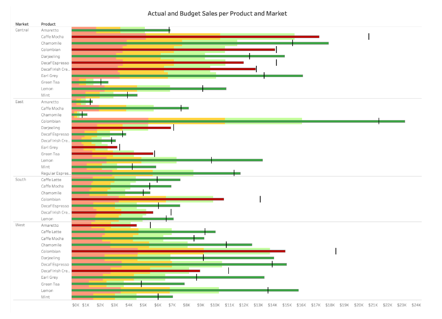
The use of shading, color, or lines in and around the featured measure add context. These can show previous performance, goals, forecasts, or highlight more dimensions. These allow for one display to enable concurrent monitoring and exploration. For example, suppose someone uses a bar graph to track expenses year over year. The graph allows them to check whether year-to-date expenses are below last year’s at a glance. Reference lines or shading enable the creation of thresholds based on previous data. They would then check to make sure the featured measure remains below the threshold.
What type of analysis does this support?
If you have a target goal that you need to meet at a regular interval of time, a bullet graph will help display your goal, the current data set, and previous data sets all in one visualization. These bullet graphs can stand next to each other and display multiple data sets to provide a sweeping overview of how one system works. The bullet graph is not good for analyzing change-over-time, part-to-whole, flow, or distribution. They are best used for making comparisons.
Bullet graphs are most often used to compare forecasts to actual numbers:
- Business analysts check if teams or departments are on track to meet their goals.
- Healthcare systems use them to gauge capacity at specific locations.
- Nonprofits measure progress towards fundraising goals.
Analysts also use bullet graphs to gauge a quantitative measure in relation to qualitative ranges:
- Manufacturers watch production levels and compare them to different ranges that denote performance.
- IT departments can check if network usage is above or below expected levels.
- Marketers watch the performance of their campaigns to determine if one surpasses others.
A bullet graph can measure how many customers frequent a store in a given day, compared to the average number. Or the user can create a goal of customers to serve in a given day and use a bullet graph to see if the store was able to meet that goal.
When and How to Use Bullet Graphs for Visual Analysis
Most of the use cases above focus on a single data set. Using more data, bullet graphs allow for analysis at a glance in a small visual display. Combining many bullet graphs into a dashboard, provides an overview across several data sets at a glance. Thus, analysts use them to track KPIs they need to check on a regular basis. While bullet graphs encode data more efficiently than gauges, they aren’t as widely used or understood as other charts. Ensure your audience is trained to understand what they’re seeing before using them.
You can use bullet graphs to display more than progress towards a goal. They can display both positive and negative values, which can help identify deviations in performance. A good example of this is comparing gross revenue, expenses, and profit in three bullet graphs. This allows you to put specific ranges or forecasts on each measure and identify issues at a glance.
When creating a bullet graph:
- Use a strong, clear color for the feature measure
- Use softer colors from the same color scheme to mark the comparative measures
- Make sure your sets of time are the same
Don’t use a bullet graph if:
- Your sets of data aren’t measured over the same lengths of time
- You want to compare the performance of many categories (Ex. products or regions)
- You don't want to check a quantitative measure against qualitative ranges or threshold
Example of this viz used well

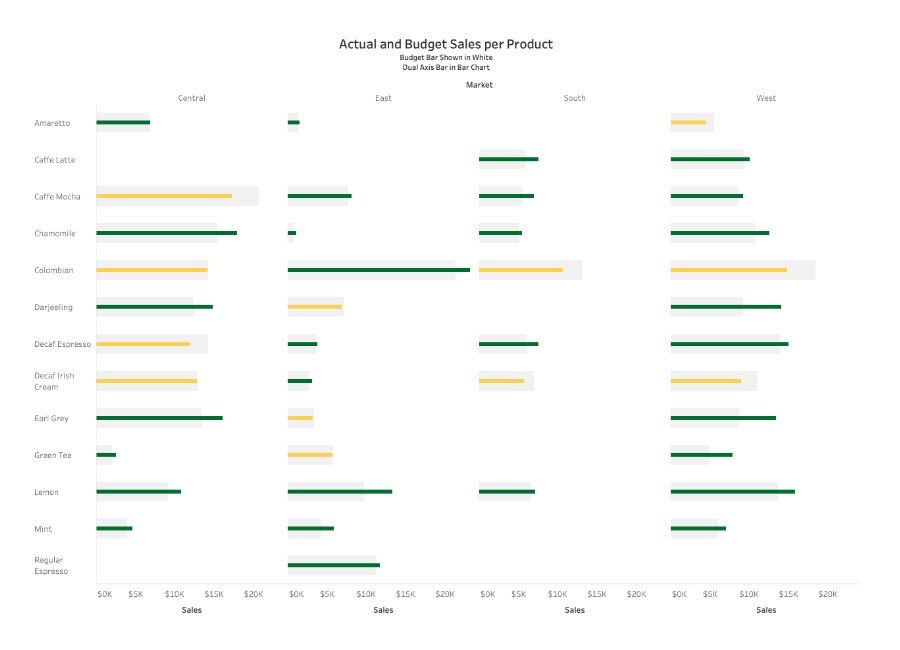
This bullet graph tracks the sales of different coffee products and compares them to the budgeted goal allotted for each product. Note the bars denoting the goals for each product.
This bullet graph:
- Uses a vertical bar to show the target for each Product
- Uses colors (yellow and green) to distinguish which product met its sales goals
- Uses gray to mark the goal bar around the product bar
- Starts at a base of zero

