7 Great Examples & Templates Of Sales Dashboards
Try Tableau for FreeHow often are sellers making decisions based on intuition or gut feeling? Sales dashboards present relevant and actionable sales data, allowing sellers to make data-driven decisions quickly. Having the right sales dashboards based on current data leads to time savings: sellers can be hyperfocused on which leads need contacting that day, how close they are to hitting their quota, what talking points to use in a call, and more. In this article, we'll share with you why sales dashboards are necessary to effective sales strategy, how to begin building effective dashboards people will use, and share seven examples to inspire.
Why are sales dashboards important?
Because time is limited, salespeople need to have information that quickly shows a holistic view of their deals with the ability to easily dive deeper into any data point—without requiring much time or effort. Sellers spend the majority of their time in a CRM tool because it contains information they need to close their deals. However, account details often get buried on multiple screens, and having an accurate, overall understanding of an account is difficult.
Sales dashboards allow sellers to focus their time on selling and less time on administrative tasks or searching for data they need. Sales analytics teams have the challenging task of cleaning up CRM data and analyzing it; exporting data from a CRM source system is highly manual and time-consuming, with ad hoc analysis of an account being nearly impossible. Data exported from a CRM tool often has a limited scope of information and immediately becomes static and outdated, left in an unviewed spreadsheet.
The case for sales analytics teams to create centralized, self-service dashboards is compelling. Having centralized sales dashboards means that everyone will be using the same data to make decisions—with these reports serving as single sources of truth. Sellers, sales managers, and senior leaders would speak the same language and work toward common sales KPIs. Using single sources of truth across departments means that critical decisions are made with data and not just gut feeling.
Using reports connected to live data sources with clean and validated sales data means you're better prepared and never caught off-guard—helping everyone in the organization be more agile, pivot quickly to hit quota or work opportunities more effectively. Analysts can produce more accurate sales forecasts, leaders can plan territories more strategically, and sellers can have an exact picture of where they stand against their goals.
What makes a great sales dashboard?
To begin building out impactful sales dashboards that your sales organization will use: focus on your audience and think about the KPIs that are relevant to this audience. Ask yourself the following questions before you start.
- Who is your audience? Who will be consuming this dashboard? Is this dashboard for a sales executive, a sales manager, or seller? Knowing your target audience allows you to focus on which sales KPIs you want to include.
- Which sales KPIs should you focus on in the dashboard? Design your dashboard to present select sales KPIs (e.g., quarterly forecast, quota attainment, growth, etc.) with the flexibility to drill down into specific data points. Do not try to combine all sales metrics into one dashboard. That is a recipe for confusion and low adoption.
- Is this dashboard connected to a live data source? Is this data source managed, certified, and prepared by the sales analytics team? How often does this dashboard need to be updated?
- How do you plan to share this dashboard? Can people subscribe to receive a snapshot of it regularly? Will you host it on an internal portal, or embed it into your CRM?
Having a comprehensive business intelligence platform like Tableau makes creating useful sales reporting that serves all of your audiences easy and scalable. Anyone in your organization can subscribe to a Tableau sales dashboard as well as create automated alerts based on any condition or value they determine. Sales leaders can remain focused on the bigger picture, but also have access to essential details on the ground with alerts for when teams have hit quota or when bookings or revenue have hit a certain amount.
Examples and templates of effective sales dashboards
Here are seven examples of sales dashboards to focus your sales teams to boost performance and facilitate decisions based on data. Use these as templates, inspiration, and places to start—and customize them to your individual business needs.
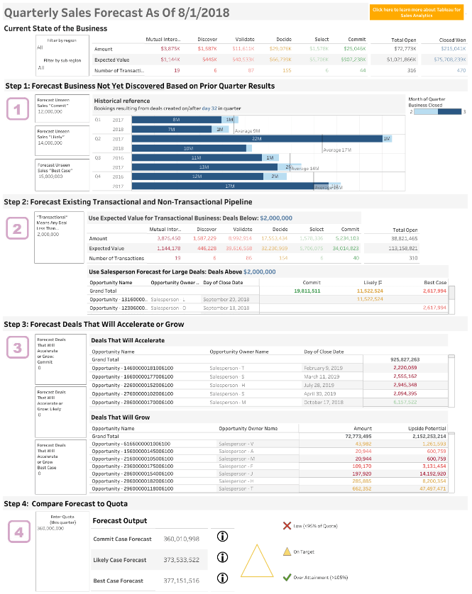
1. Quarterly Forecast Dashboard
In one view, you'll be able to have a holistic picture of opportunities, your pipeline, which deals will accelerate or grow, and be able to compare forecast to quota. Use this dashboard to forecast sales performance systematically and have a real understanding of what is the best case forecast compared to your commit case forecast—preventing unnecessary surprises. When presenting to senior sales leaders, you can feel confident that you're providing reliable data they can use for data-driven decision-making.
- Intended audience: This quarterly forecast dashboard is meant to be used by sales analysts. It functions as a calculator and functional tool.
- Focus metrics: Commit case forecast, likely case forecast, best case forecast.
- When to use: Use this dashboard when creating quarterly forecasts for your sales organization to compare YoY performance.
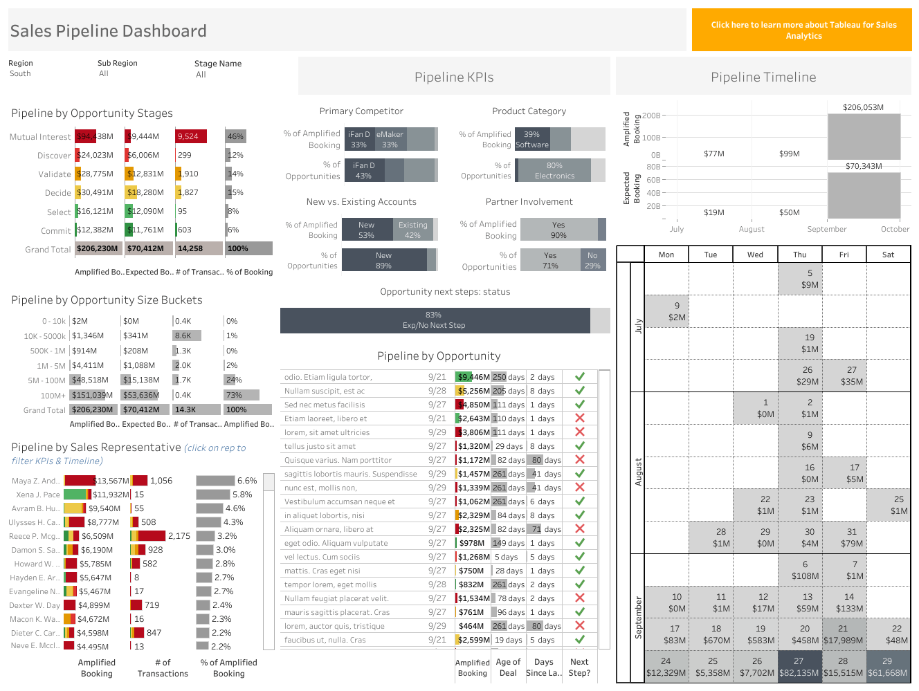
2. Sales Pipeline Dashboard
Use this dashboard to understand the health and status of your pipeline. Being able to slice the data and view pipeline by opportunity stages, KPIs, size buckets, timeline, and sales representative, means that you can spot opportunities that require you to pivot quickly, if necessary. Seeing a complete and accurate picture of the status of your sales pipeline means that you evaluate where your leads are coming from and take action early to help teams reach quota.
- Intended audience: This pipeline dashboard is meant for sales executives, managers, and sales analysts.
- Focus metrics: Opportunity stages, opportunities by size and seller, next steps for opportunities, age and timeline of deals, and custom KPIs (e.g., product category, partner involvement, and more).
- When to use: Use this dashboard for getting both high-level and detailed information about the health of your pipeline.
3. Sales Growth Dashboard
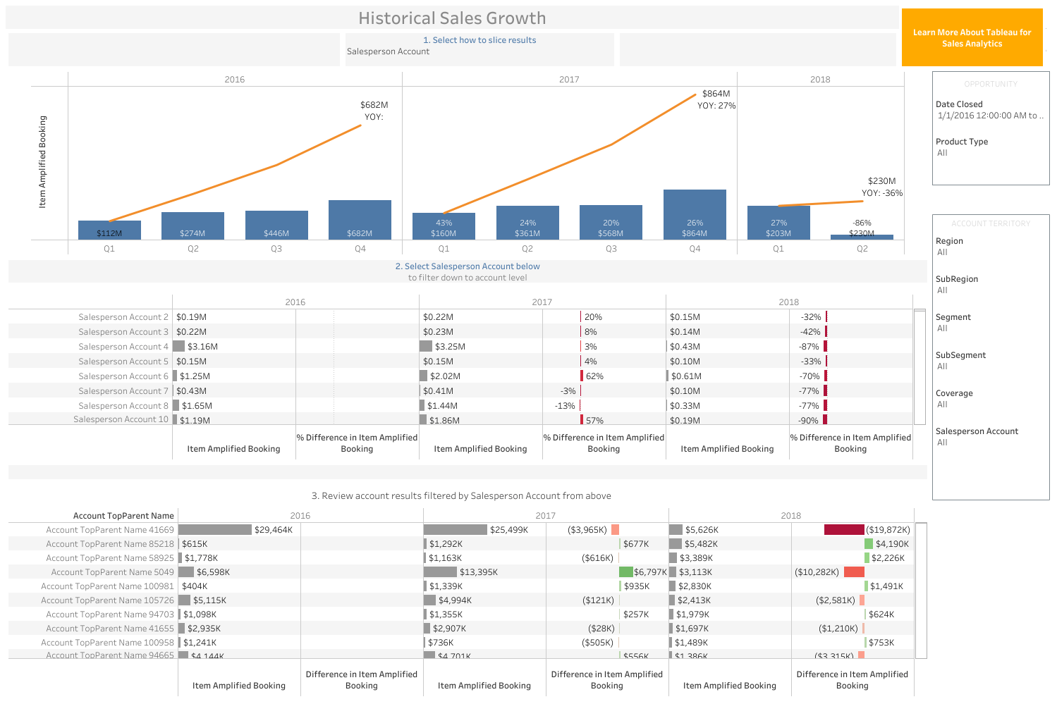
Quickly filter your sales growth data by region, segment, salesperson account with this dashboard and view YOY comparisons by selecting the filters you want in the top, dropdown menu labeled, "Select how to slice results." The most effective use of this sales growth dashboard will come from the context it provides, helping managers to identify patterns or trends, set realistic goals, and nurture sellers. For example, seeing the status of deals by representative means that you can help sellers change tactics and avoid leaving money on the table. These actionable insights can re-engage discouraged sellers, focus your team on customer success, and reduce uncertainty in planning.
- Intended audience: This pipeline dashboard is meant for sales executives, managers, and sales analysts.
- Focus metrics: Amplified booking percentage, all of the filters on how to slice results in various ways, see the data by account-level, and account details.
- When to use: Use this dashboard when setting sales goals to gain context around who reps are selling to, how reps are selling (eg., inside, field), what products they're selling, and where.
4. Sales Territory Assignments
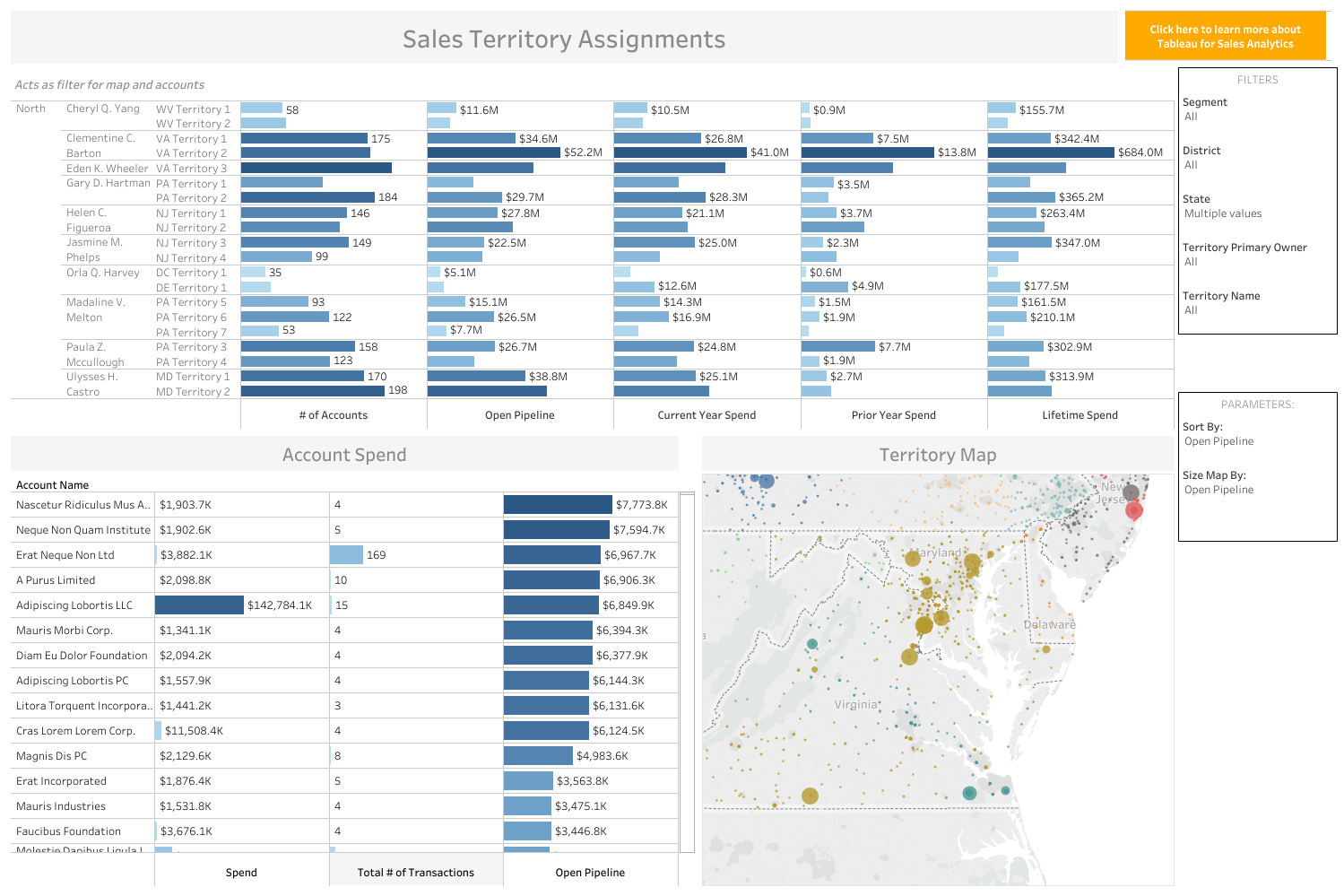
In the creation and assignment of sales territories, having a proactive approach can improve seller performance. We have found that optimizing territory design can increase sales from two to seven percent without changes in resources. You need the data to understand the sales KPIs impacting your territories to better balance workloads across the field and easily see unworked opportunities.
5. Account Management, 360-Degree-View Dashboard
- Intended audience: This pipeline dashboard is meant for sales analysts and sales managers.
- Focus metrics: The three filters of how to slice results in various ways, see the data by account-level, and account details.
- When to use: Use this dashboard when setting sales goals to gain context around who reps are selling to, how reps are selling (eg., inside, field), what products they're selling, and where.
-
Salespeople need complete data about every interaction in an account to avoid missteps in the relationship. Has the client had a bad service experience recently? Is there large deal pending the seller doesn’t know about? Have important sales KPIs in one view to have a comprehensive understanding of your accounts. Quickly understand how a company is structured and where your company has sold into an enterprise and how much revenue has been generated by a specific account.

6. Sales Cockpit: Dashboard Workflow
- Intended audience: This account management forecast dashboard is meant to be created by sales analysts for use by sellers and their managers.
- Focus metrics: Lifetime revenue broken down by product offering, services, engagement, and customer success—any KPIs you determine are key.
- When to use: Use this dashboard to help reps focus on important metrics and provide a full 360-degree view of an account.
-
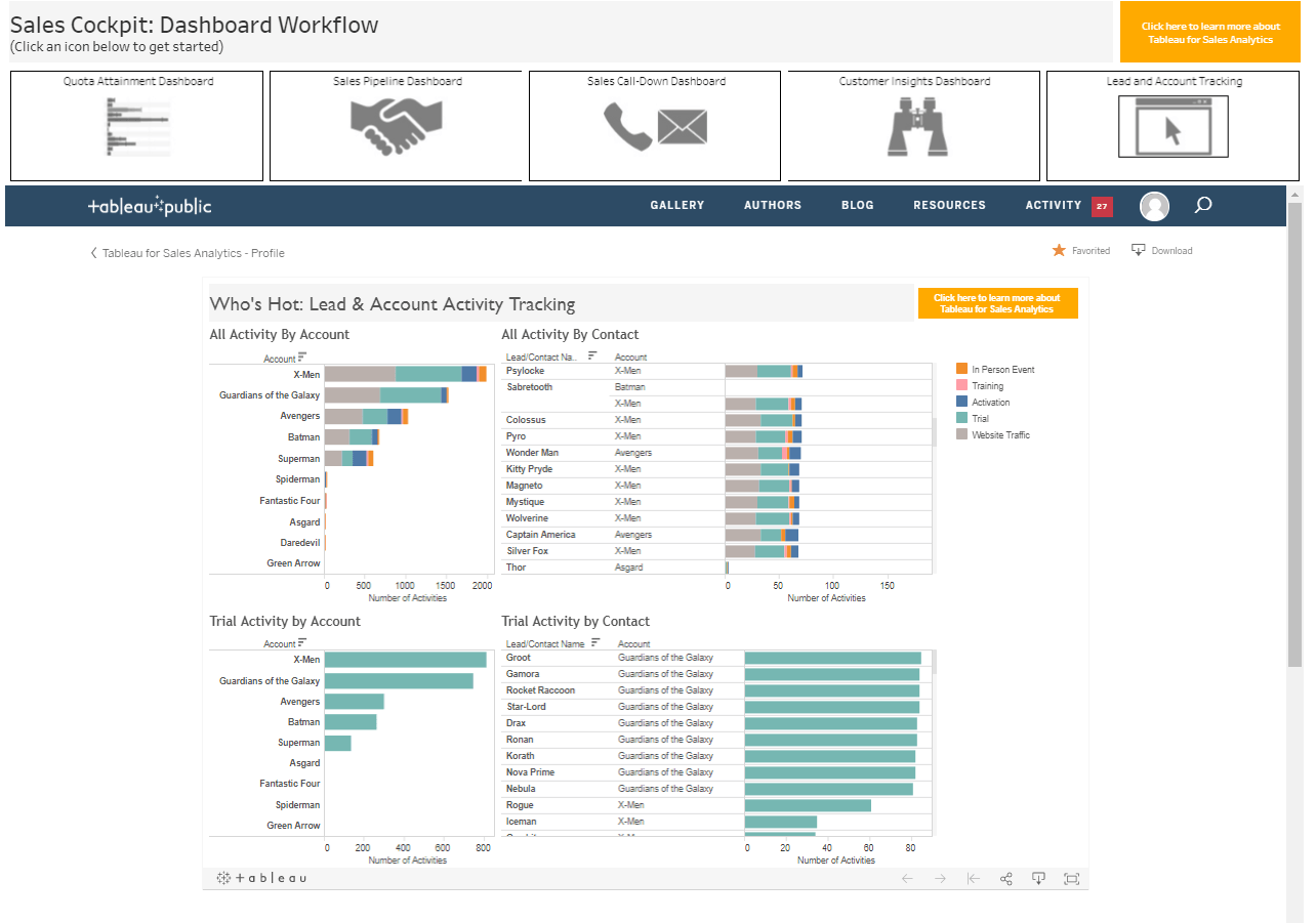
Keep your sellers productive and in the flow with this "cockpit" dashboard. The workflow dashboard presents the data sales reps need without requiring them to jump between tools to find what they're looking for. It brings together data about quota attainment, lead activity filtered by type, call-down lists, and customer insights, connected to your CRM and other existing tools you've already invested in to help sellers take the right action at the right time.
7. Executive Overview: Sales Summary Dashboard
- Intended audience: This sales workflow dashboard is meant for sales representatives to use throughout the day to stay focused.
- Focus metrics: Lead activity by account, customer insights (e.g., major life events, cross-sell and upsell opportunities, at-risk), CRM call-down lists.
- When to use: Use this dashboard to empower sellers to make informed decisions, without having to leave the "cockpit" or hub of sales data.
-
With this report, sales executives can track quarter to date (QTD) sales performance, review numbers in relation to the current quota and previous quarters, filtered by product and opportunity type in this dashboard based on CRM data. In a single dashboard connected directly to a CRM tool, leaders can have confidence that the data is accurate without having to sort through a mountain of spreadsheets with stale and potentially inaccurate data. Presenting an overview allows sales leaders to develop sales strategies and stay focused on the bigger picture—which is where they need to be.
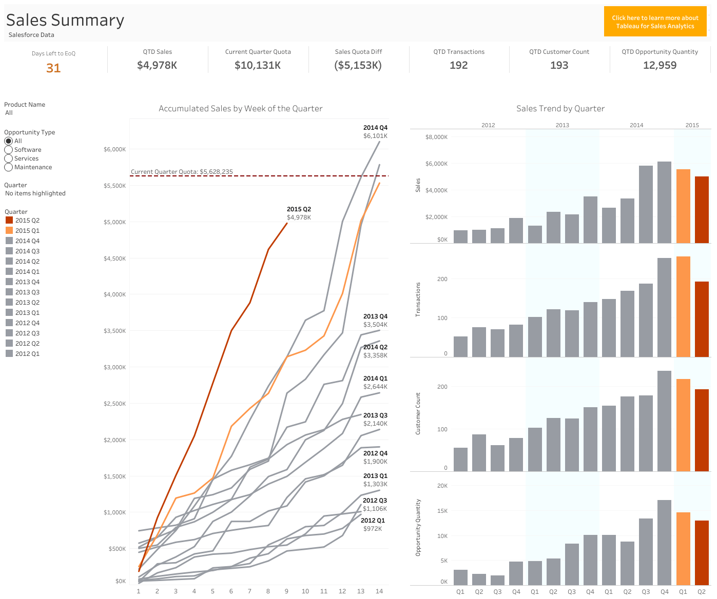
- Intended audience: This executive summary dashboard is designed for senior sales leaders to make decisions quickly based on current, trusted data.
- Focus metrics: QTD sales, current quota, comparison of quota with historical quarters, sales quota difference.
- When to use: Use this dashboard to show leaders the high-level information they need without overwhelming them with unnecessary details.
With these seven example sales dashboards, you'll save time, reducing ad hoc requests with self-service reports. Your organization gets time back previously spent on administrative tasks or digging through CRM data and spreadsheets with outdated information. You'll give your sales organization insights they can use, helping everyone to make critical decisions based on data—and not gut feeling. To access additional resources and stories to make your sales team more data-driven, visit the Tableau Sales Analytics solutions page.
