Measuring Customer Satisfaction
Many businesses have survey data somewhere, waiting for better analysis. Using a survey containing ratings from 1 to 10, this analytical view correlates ratings of overall satisfaction, firm expertise and likelihood to recommend for several customer segments. Each circle represents a segment defined by the combination of industry, job function, gender and product. Size corresponds to the number of customers in that segment.
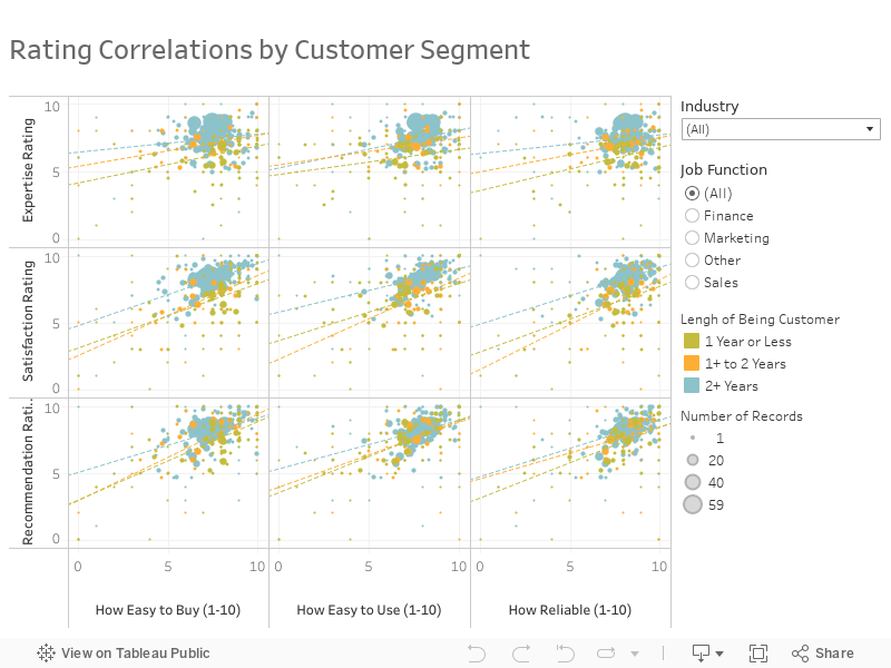
Tableau your mind. Daily.
Get the Viz of the Day delivered right to your inbox from Tableau Public, the world’s largest repository of data stories.
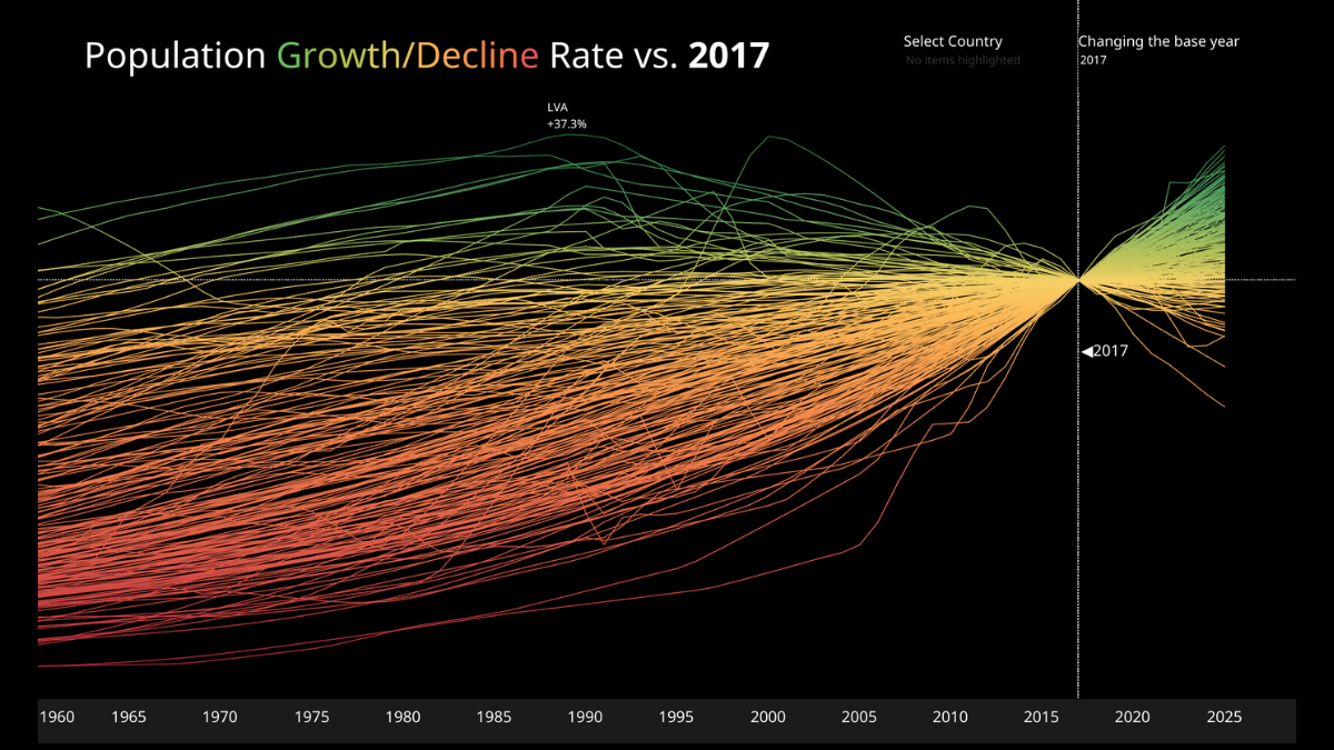
Population Growth/Decline Rate
Today's #VizOfTheDay by Akane Okamoto brings demographic data to life with a high-contrast line chart tracking worldwide population growth and decline. Explore the viz.
Interact with the viz