Tableau Text Table Navigation for Assistive Technology


As a part of the 2024.1 release, Tableau has enabled keyboard navigation for text tables—Viz Navigation for Text Tables—a new capability that will make it possible to use assistive technologies to navigate the marks of a visualization. This is our first step in bringing the marks to all customers through visualization navigation. Our goal is to enable everyone to explore data visualizations.
What is Visualization Navigation?
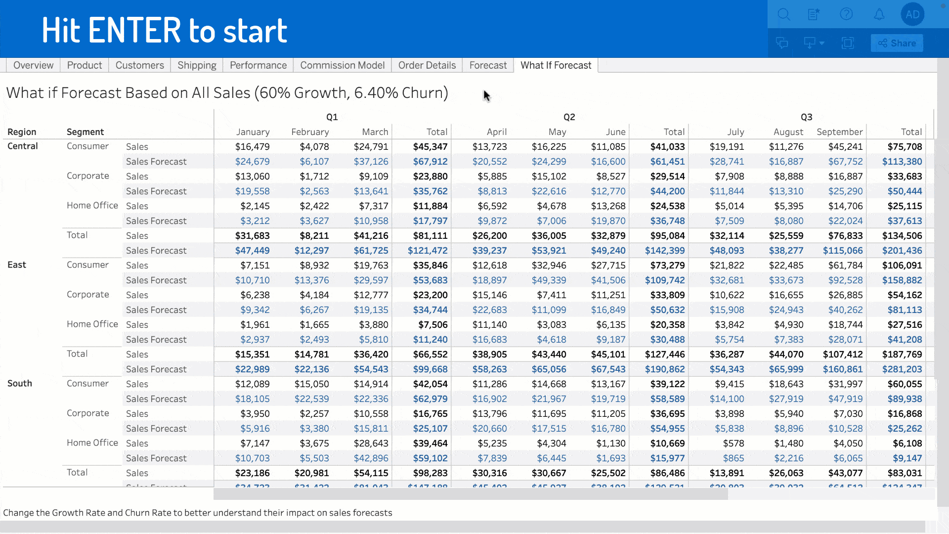
Visualization Navigation, or Viz Navigation for Text Tables, introduces a new mode of data exploration that doesn’t rely on mouse interactivity. To activate the experience, use the tab key to navigate to an online text table. After hitting Enter to access the visualization, hit Enter again in order to navigate the marks. From there, you can use the arrow keys to navigate between the columns, rows, and headers. We’ve updated the View Data experience to be launched using Shift + Enter. All screen reader announcements and help content will be updated to reflect the change in activation.
How did we create Viz Navigation for Text Tables?
When we think about all the types of data visualizations Tableau supports, there are many ways that they could be bucketed: complexity, size, etc. For this project, we grouped them by how they are read. Some visualizations have a logical reading order, such as text tables or bar charts. Other visualizations can be read in any order and still have meaning, like maps or scatter plots. We decided to start with keyboard navigation for text tables because the expectations for up, down, left, or right movements using arrow keys were the most clear.
One major design decision we made was to enable fluid movement through different regions of the visualization. While marks, headers, and axes might all work differently under the hood, that is a complexity of our implementation that we wanted to shield users from having to think about.
We’re now leveraging the learnings and logic we’ve developed for text tables as we enable keyboard navigation for more and more viz types. We aim to add navigation that behaves as consistently and intuitively as possible between viz types while accounting for nuances in each viz type’s capabilities.
Why is this important?
Our goal is to empower authors to create visualizations that enable everyone to see and understand data. This improvement gives authors a way to increase the accessibility of dashboards. For example, you could create a dashboard that has text tables as supplementary visualizations to more complex visualizations, enabling exploration of the data without needing to go to the View Data experience. What’s next for accessibility at Tableau?
Trust is at the center of everything we do, and accessibility is part of that. Over the course of 2024, we will expand the ability to navigate without a mouse to more types of visualizations. In 24.2, we will expand this feature to highlight tables, heat maps, and simple bar charts.
5 tips for creating accessible visualizations
Accessibility is a result of choices, not a single action. Here are five tips to creating accessible visualizations:
- Keep it simple. Wherever possible, aggregate your data to reduce the number of marks. Limiting the number of marks can emphasize the most important data points, making it easier for everyone to understand the insight.
- Provide sufficient contrast. Select colors that have a 3.1:1 color contrast ratio for all non-text items. For text, be sure to select colors that result in 4.5:1 color contrast ratio.Use a color contrast checker to check your contrast.
- Don’t rely on color alone. Use labels, position, size, and shapes in addition to color to reinforce differences between marks.
- Provide meaningful titles and captions. By using simple language that avoids jargon, you can create quality titles that provide context for your data.
- Add alternative text (alt text) to visualizations. In 23.1, Tableau began applying alternative text automatically to all online visualizations. In Tableau 23.2 and later, you can edit this auto-generated content to capture your data insights.
This work is rooted in research through a co-design study conducted by Senior Researcher Arjun Srinivasan, Jennifer Mankoff, Tim Harshbarger, and Darrell Hilliker.
Related stories

The Tableau+ Bundle with Premium AI, Enterprise Capabilities, and Premier Success
 24 June, 2026
What is Tableau Prep?
 30 April, 2026
Insights Wherever You Work: Meet the Tableau App for Microsoft 365
 16 March, 2026