6 Tips on Building a Thriving Data Visualization Community
There’s a verse in Proverbs of the Tanakh that goes like this:
As iron sharpens iron, so one person sharpens another. – Proverbs 27:17
Leveling Up
What does this verse mean? It means that when you have a good friend, that friend will push you and make you better and stronger. If you make a mistake, they’ll point it out to you in the right way so that you don’t make it again. If you do something well, they’ll pat you on the back, but they’ll also help you figure out how to do it even better next time. And vice versa.
It’s about leveling up.
That’s the value of the data visualization community, and why I believe the more voices that join, the better off we’ll all be. There’s a big qualifier to that statement, though. In order to reap the benefits from our interactions with each other, we must avoid two diametrically-opposed cultural paradigms which are the antithesis of iron sharpening iron:
1. Avoid the Love Fest
A “love fest” may feel great at first ("Oh my gosh, they think I’m great!"), but it soon gets old, and the growth curve for those involved is severely hampered. This is where everyone just congratulates, retweets, likes, etc. everything everyone ever does. But because everything is so GREAT all the time, no one gets any better. So go ahead and join the love fest if you want. You may get a gig or two out of it, but you’ll never be any better than the day you join. It’s not for me.
2. Stay Out of The Shark Tank
The “shark tank” is the opposite of the love fest, and is characterized by snarky attacks, arrogant snubs, and all-around competition and condescension. Success is a zero-sum game in the shark tank. In order to rise up in the hierarchy, you have to pull someone else down. And to stay at the top, you have to step on any newcomer and reestablish your dominance. This is a culture of fear in which sharing your work is akin to putting raw meat into the water. Sorry, it’s also not for me.
So where are we now?
Here’s a tough statement that you may or may not agree with: The data viz community has been both a love fest and a shark tank over the past few years. I’ll turn the spotlight on myself and admit that I’ve contributed to each dysfunction at different times in my involvement.
There’s a pendulum effect at play—the culture can swing from one dysfunction to the other—but it’s up to us to strike the balance. Here are some tips:
6 Tips to Building Community
1. It starts with caring. Does it matter to you whether other people get better over time, or do you just care about your own reputation? If you don’t get this one right, don’t bother with the other five on the list. Just please also exit stage left.
2. Always create. The best way to have a useful opinion is to always be visualizing data. You’ll have fresh understanding of the inherent tradeoffs and dilemmas, and you’ll have much better suggestions and ideas to deal with them.
3. Try different tools and techniques. What we’re doing by building this community goes beyond any one company’s quarterly growth objectives. It’s about increasing the data literacy of our species on this planet. Yes, you’ll likely interact more with people who use the same tools as you. Make an effort to connect outside of those subgroups so that they don’t become silos.
4. Seek feedback. After you create something, ask people to look at it and give you their thoughts. What was confusing? How could you increase the impact of the message? Listen to what they say and resist the urge to intervene and explain. And don’t make it an exercise in fishing for compliments.
5. Give honest feedback, with tact. Tell people what you think. Don’t hold back. Just be tactful. Organize your feedback in terms of plusses and deltas—what did you like and what could have been even better? And ask them what they think about your suggestion: “Do you think that would work?" and so on. A little humility goes a long way.
6. Never fall into the trap of the expert. People who think of themselves as experts tend to stop listening. They become close-minded. But there’s always so much to learn. I’m not advocating fake humility here. Sure, you have knowledge and skills that someone new can benefit from. But I guarantee you that every newbie has a few things to teach you, too.
An Example of Iron Sharpening Iron
A couple weeks ago, I got caught up in the whole soccer craze fueled by the Euro 2016 and Copa America tournaments. I wanted to know who had scored the most goals in international play ever, so I created this simple scatter plot:
Unsolicited Feedback Done Well
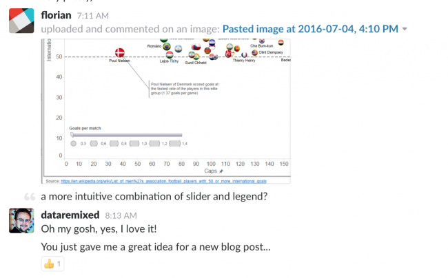
Shortly after I published this viz, my colleague Florian Ramseger pinged me on Slack with a great suggestion:

I totally agree with Florian. This is a much better way to combine the slider and the size legend so that they actually work together in harmony instead of just being located close to one another. Try it out to see why it’s so much better:
Solicited Feedback on Demand
I also reached out to Alexander Mou via Twitter to ask him if he had any suggestions to make it better. Alexander regularly posts suggested improvements via Twitter on what he calls #TweakThursday. I’ve seen him do that for a few months now, and I often like his ideas. So I thought I’d request his input proactively. He not only created a souped-up version, he wrote about it here.
I was quite happy with both exchanges, and felt that I had some new ideas to improve my work. This is a good example of why I appreciate being part of a data visualization community. People out there are looking at what I’m doing and giving me their thoughts, and I have a whole army of advisors to weigh in when I ask for help.
That’s the kind of community I want to be a part of. It’s pretty simple.
Thanks for reading.


