2023 Iron Viz finalists made earth their viz-ness at Tableau Conference


It wouldn’t be Tableau Conference without the world’s ultimate data showdown—Iron Viz. Three fierce data whizzes raced the clock and battled dashboard-to-dashboard to create mind-blowing visualizations that would inspire and in-viz-orate our panel of judges and a massive live audience of data enthusiasts from across the globe. Who rose to the top to win the coveted Iron Viz trophy and bragging rights? Read on to find out.
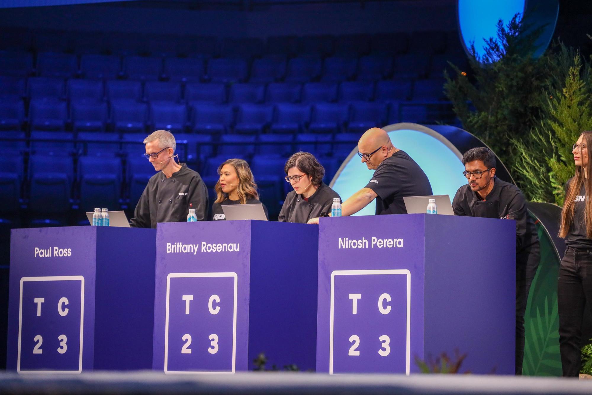
Finalists during their 20-minute build times, on-stage, during the Iron Viz Championship.
Andy Cotgreave—Senior Data Evangelist at Salesforce—returned to the keynote stage to host his sixth Iron Viz competition. He was joined by Solution Engineering Program Manager Archana Ganeshalingam. Their excitement was contagious as they introduced this year's best and brightest in the viz-biz, Brittany Rosenau, Nirosh Perera, and Paul Ross, who earned their place by rising to the top from hundreds of amazing global qualifier entries. The stakes were high as they prepared to click, drag, and drop their data-loving hearts out to be named the champion and win thousands of dollars in prize money for themselves and the charity of their choice.
This year’s data set came from Net Zero Tracker, Carbon Data Project (CDP), and NASA Power to shed light on the global impact of environmental sustainability. Working alongside each contestant was their mentor, trusted advisor, and fiercest cheerleader, their Sous Vizzer. Each Sous Vizzer—Nina Nguyen, Mark Bradbourne, and Alison Whitaker—is a Salesforce employee and long-standing member of the Tableau Community who brought much-needed product expertise and moral support to our finalists throughout the competition.

Iron Viz 2023 Championship judges (left to right): Will Sutton, Taha Ebrahimi, and Dr. Jock Mackinlay.
The formidable contenders needed to impress a world-class panel of data experts, composed of Iron Viz 2022 Champion, Tableau Visionary, and Tableau Public Ambassador Will Sutton, newly retired Tableau VP of Research and Design Dr. Jock Mackinlay, and Tableau Public Director Taha Ebrahimi. The judges evaluated the vizzes based on three criteria: design, analysis, and storytelling.
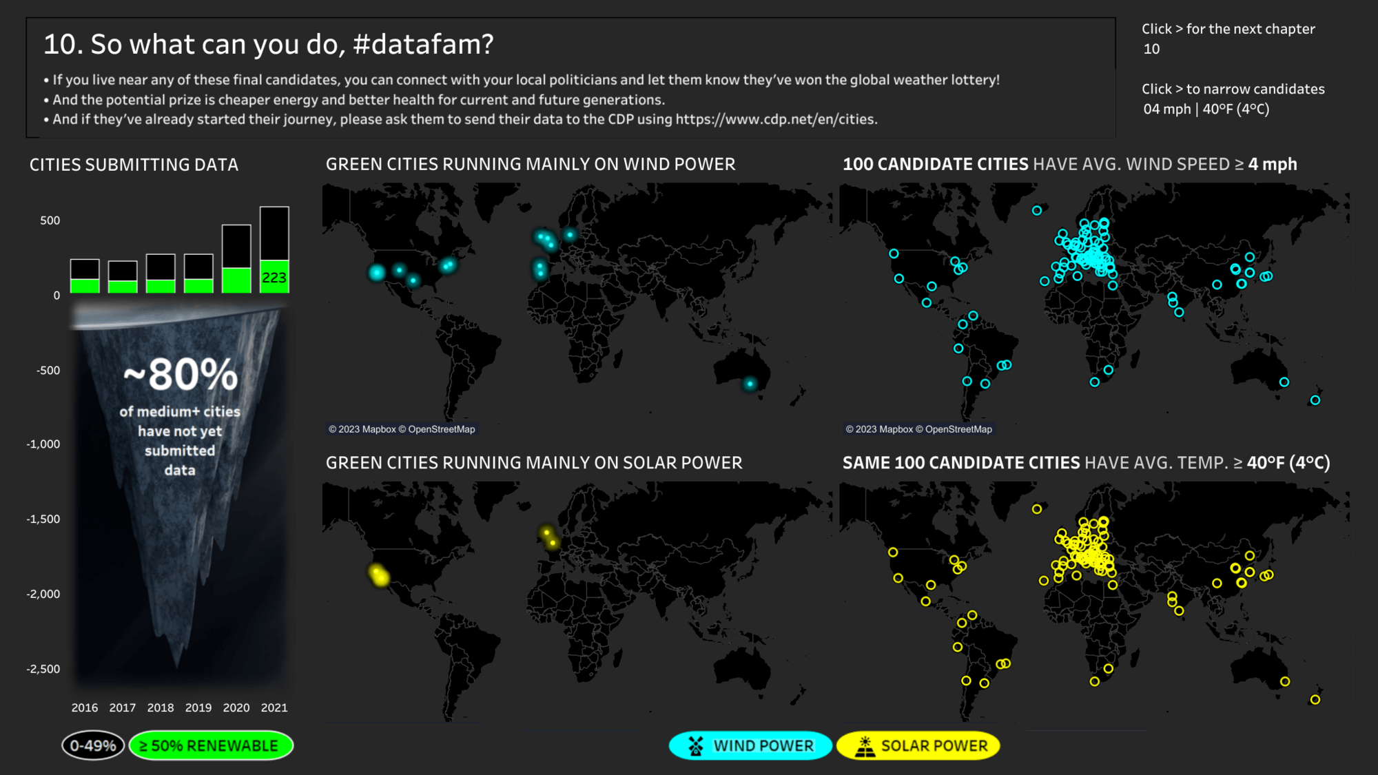
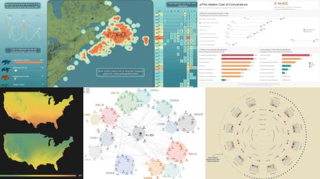
Tableau Public visualization, Iron Viz 2023 Championship Entry: Can We Close the Climate Gap? A Tale of Two Renewables. by Paul Ross
Can We Close the Climate Gap? A Tale of Two Renewables.
Paul Ross began his data story with a quote from a recent climate report where the UN Secretary-General Antonio Guterres said, “Humanity is on thin ice, and that ice is melting fast.” There is a growing climate gap between what we are doing and what is needed to prevent harm to future generations—aggressive measures are needed before it is too late. Those measures should include a shift to renewable energy—wind or solar power.
Drawing on the theme of energy generation, Paul chose to illuminate his visualization using a neon color palette against a black backdrop. Using his favorite feature, Dynamic Zone Visibility, he took great advantage of being able to show and hide his maps at the right moment in his storytelling. Paul noted how many cities are already running on more than 50% renewable energy. Then he showed how many aren’t reporting, who is leading the way, and which cities had tremendous opportunities to close the gap. Paul drilled down further to determine which would be the best wind and solar candidates bringing cheaper energy and better health for future generations.
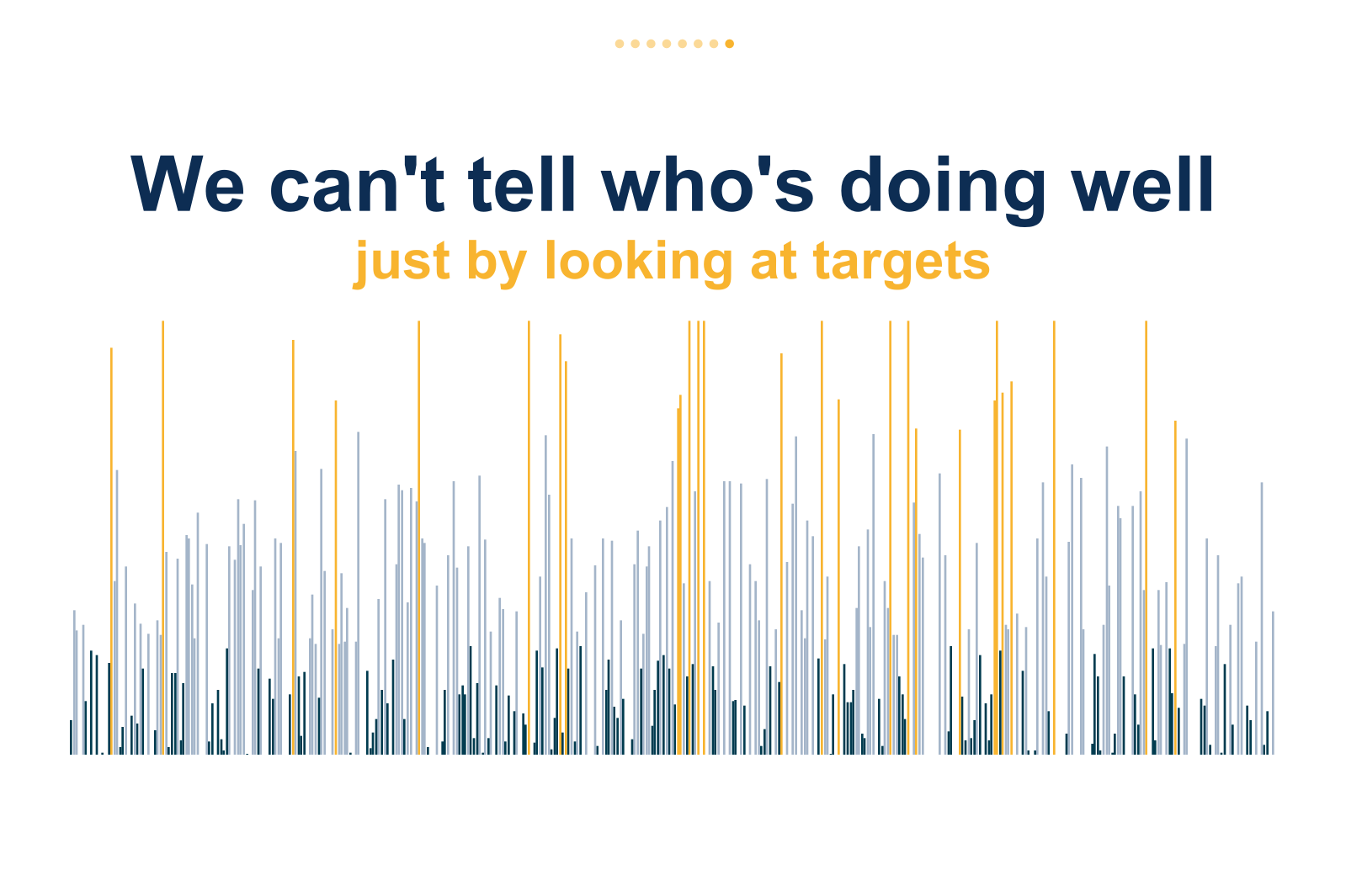
Tableau Public visualization, Iron Viz 2023 Championship Entry: Targeting Net Zero Emissions. Can We Tell Who’s Doing Well? by Brittany Rosenau
Targeting Net Zero Emissions. Can We Tell Who’s Doing Well?
Brittany Rosenau focused her analysis on Net Zero data. She began her story with some facts. “Net Zero doesn’t mean no emissions, but that emissions are offset through different strategies. How do we get there? The biggest gains can be achieved by switching to cleaner energy sources, reducing emissions from the start, and offsetting through planting new trees.”
Brittany started with a waterfall chart to frame the story. She used a classic element—Story Points—to tell her narrative and look deep into three cities with unique challenges—Vancouver, London, and Mexico City—all reporting various notes of Net Zero progress and their approaches. She showed that we can’t really tell who is doing well just by looking at targets. Brittany determined that “shifting targets makes it easier to report good progress but hides the fact that they mostly rely on fossil fuels. In other words, we can shape the data to make it look like progress, but it doesn’t tell the whole story.” Her recommendations to the audience were to “ask questions, stay informed, and share your voice.”
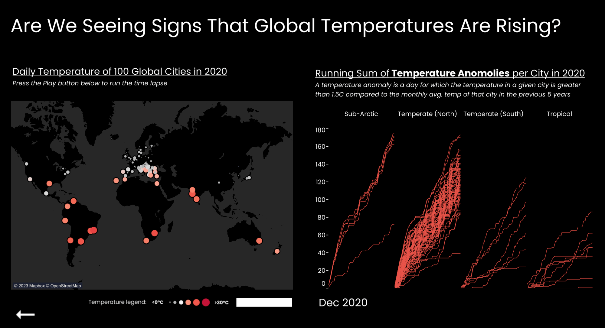
Tableau Public visualization, Iron Viz 2023 Championship Entry: Are We Doing Enough? by Nirosh Perera
Nirosh Perera's analysis focused on the question, “Are we doing enough to create a sustainable future?” He created a play on the scatter plot for “illusion and mystery” by building a ternary chart—each point in the triangle represented a key point in the story.
First, Nirosh looked at global temperatures to determine if there were signs of them rising. The warmer the temperature, the deeper the red color of the mark. Through animation and time-lapse, he showed a steep rise in the number of these anomalies, particularly in the northern hemisphere. Our planet is getting warmer. What can we do? Reducing the use of fossil fuels is a great place to start. Nirosh used the weather data to guide renewable energy strategies. He demonstrated how each city has a unique weather profile visualized by four data points. He then used that profile in his ternary chart to tell us which three renewable energy sources best suit the selected city—wind, solar, or hydropower. Nirosh concluded that “our world may be getting warmer, but by focusing on generating renewable energy that compliments our own weather and climates, there is still time to make a difference. We can do enough.”
And the winner is…It was an outstanding performance and a dazzling display of data storytelling from all three contestants. The work they produced was mind-blowing. Each Iron Viz finalist had a very different approach, but all three wowed the crowd. One viz simply out-edged the competition—and the audience agreed with the judges by also voting it the “Fan Favorite.” Congratulations to Paul Ross and his charity, The Nature Conservancy.
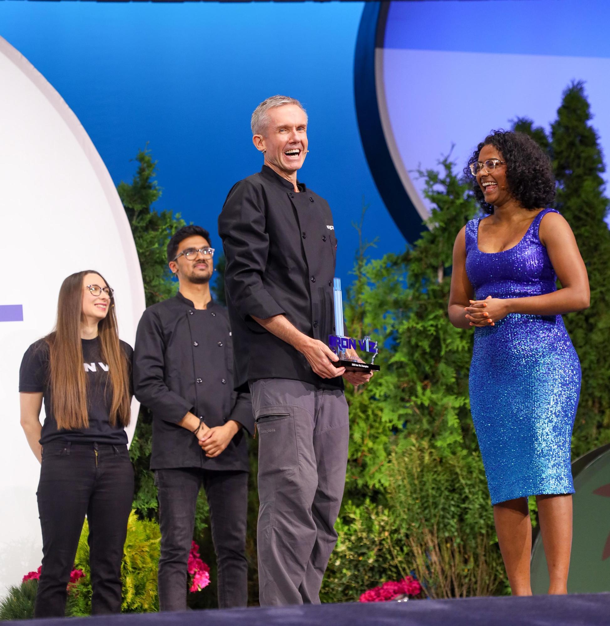
Paul Ross accepting his Iron Viz 2023 Championship trophy.
Don’t want the excitement and mastery to end? Iron Viz is a chance for amazing vizzers who spend their days on Tableau Public to give the world a behind-the-scenes look at their magic. With over 3 million global profiles and 7 million vizzes available, there's a viz to explore for almost any topic. And a new storytelling masterpiece is featured daily on Viz of the Day. Sign up to have a healthy dose of 'viz-spiration' delivered to your inbox.
This officially ends Iron Viz 2023. It proved to be another memorable competition. If you missed it, you can watch it now on Salesforce+. Congratulations to all who participated, and again, well done Paul. What an incredible performance.
Related stories
DataFam Roundup June 2026
DataFam Roundup May 2026

Iron Viz 2026: Read Between the Data
 28 May, 2026