Marketing Dashboards: The Do’s and Don’ts
Data is marketing’s lifeline. But all the data in the world is useless if it can’t be analyzed. That’s where marketing dashboards come in. They can bring together all of your data and make it easy for people to make better decisions, faster.
Are your marketing dashboards providing the insights you need to understand the big picture? Read the whitepaper to learn what you need to know to create effective marketing dashboards, what to avoid, and how powerful visual analytics can drive results.
Why do marketing dashboards fail?
Dashboards are a natural outcome of any workflow with analytics technologies—they’re also an essential
way to extend the value of your data analysis and provide answers to marketing teams and the full
organization. Still, there are reasons why 70 percent of digital transformation initiatives fail, including
analytics projects. Some of these reasons include:
- They use old data and by the time a dashboard reaches viewers, it’s dated and too late to be actionable. Analytics in the form of good dashboards should have fresh data that allows immediate action.
- When audiences can’t see where data comes from or struggle to explore it on their own, they have lower
trust in the analysis. - Many pre-built dashboards aren’t flexible enough to provide the views that audiences need for deeper
understanding. (For example, they don’t filter to give a detailed view relevant to a job.) - Marketers move fast; they constantly innovate and experiment, trying new channels, technologies,
and marketing strategies. When some analytics projects take months to deploy, their dashboards
become obsolete. The business moved on because they didn’t have an agile method for deploying and
developing the solution. - When advanced coding knowledge is needed, many marketers turn away. They’re not developers by nature
and grow frustrated waiting for answers or the availability of busy analysts. - Access is limited. If marketing teams or other business teams with interest can’t access the same data,
dashboards fail to have an impact. A governance model that provides access to the right information, on
a secure platform, will make marketing analytics initiatives successful.
To overcome these and other challenges, follow the list of do’s and don’ts outlined in this whitepaper as you create and use effective dashboards and deploy your analytics platform. These recommended strategies will provide marketing teams and the business with a deeper understanding of the marketing funnel and clarity on areas to change or improve.
What to do: Successful practices with marketing dashboards
1. Focus on KPIs that matter
A KPI Dashboard that reports on marketing department performance versus key metrics has powerful, organizational impact. It signals to everyone—campaign managers, creative directors, and analysts—what matters most, especially when leadership weighs in and approves KPIs. A KPI dashboard that also reflects multi-touch attribution from marketing to down-funnel opportunities or sales, allows marketing to claim ownership over its business impact with skeptics who question the return on spend. And when it’s easier for marketing leaders to take action on a dashboard, others will follow to help grow an enterprise data culture. 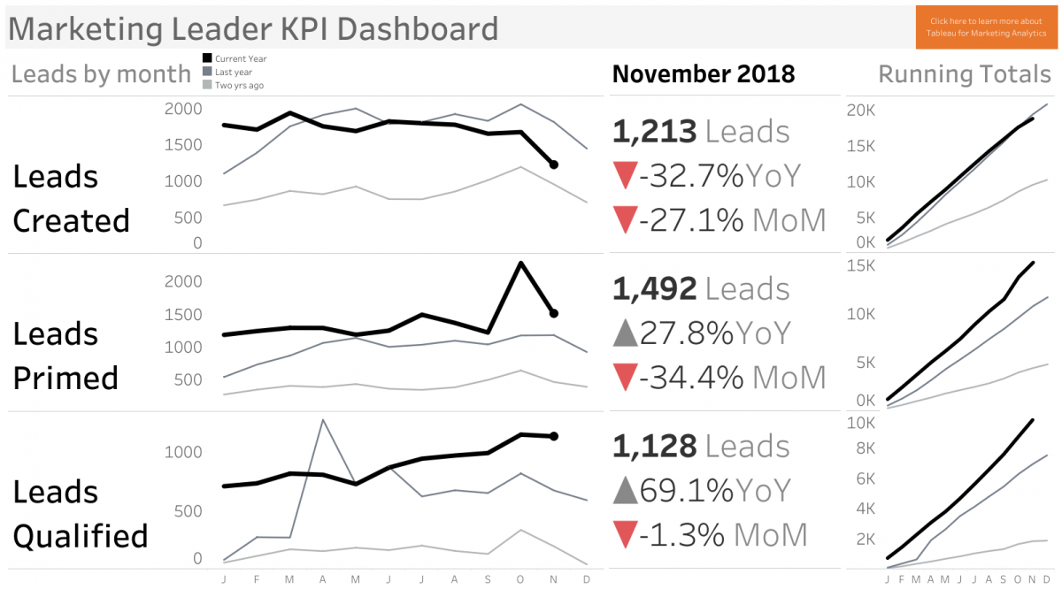
This dashboard is shared in monthly marketing department meetings. Tableau’s marketing leaders use it to communicate critical KPIs, own their impact on go-to-market execution, and inspire team members to use data in campaign execution or to evolve their work so it grabs customer attention.
2. Answer recurring, time-consuming questions with self-service analytics
Analytics and data science talent are extremely valuable, but unfortunately a lot of their time is wasted on repetitive, manual data preparation and analytics processes. Some recurring questions that get asked and distract them are: how many page views did our blog receive last month, what topics are most popular in posts, or how is the open rate on emails trending. These and other questions can easily be answered by automated dashboards that become a central source of truth, allowing analysts and data scientists to spend time on more challenging and strategic questions. 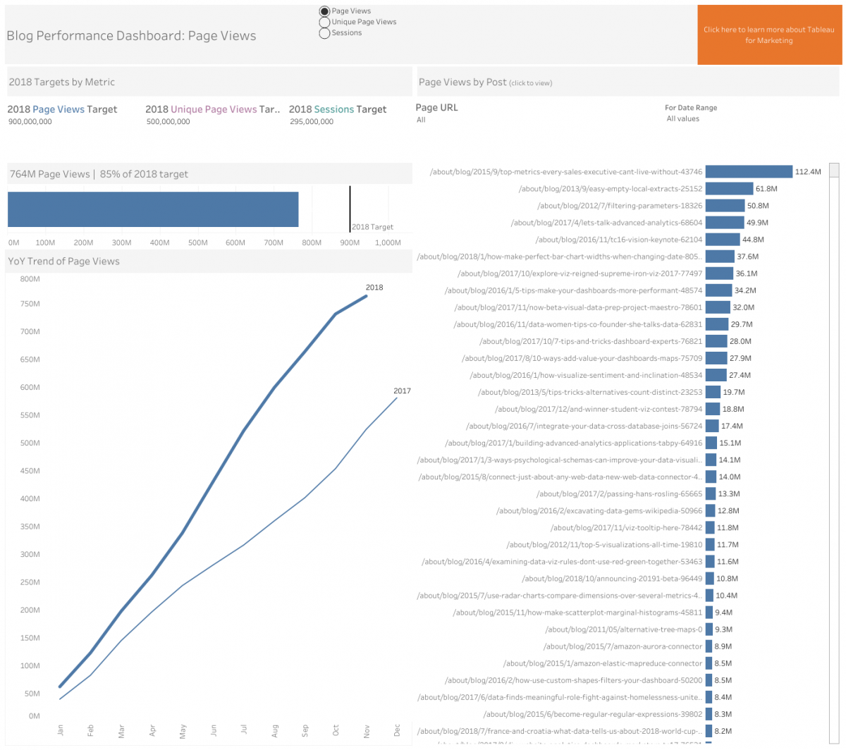
This dashboard shows how many page views, unique page views, and sessions that a company’s blog post received. The interactivity allows for deeper exploration and helps answer follow-up questions.
3. Enable marketers to feed their curiosity
Great marketers are curious. They want to know everything about their customers, product(s), partners, competition, and more, and new insights help them better execute or target their campaigns. That’s why well-designed, interactive dashboards are valuable; they illuminate an insight, answer existing and follow-up questions, and provide ways to change a perspective that makes marketers more effective. Embrace an analytics platform that provides maximum flexibility to interact with different data using filters, natural language features or follow-up dashboards, for instance. In addition to a flexible analytics platform that invites exploration and interactivity, feed marketers’ interests by supporting participation in different trainings, analytics education, and online communities to nurture growth. This will enable marketers to answer their own “what-if” questions that you never anticipated.
4. Apply design thinking and use data creatively
The five-stage Design Thinking model—empathize, define, ideate, prototype, and test—as outlined by Hasso-Plattner Institute of Design at Stanford, is ideal for creating new dashboards. Initially, marketers should get a deep understanding of the business problem and why it’s important to stakeholders as they develop a dashboard. At the same time, it’s important to move quickly and “fail fast.” Analytics platforms like Tableau empower dashboard creators to build quickly, collect feedback, and create a new version in minutes so impact can be assessed and the quest for perfection doesn’t slow down the process to discovery and experiencing results. When data and creativity are mixed, the outcomes are also amazing. The possibilities of using data may seem infinite, but here are some effective places to start.
5. Use dashboards to spur enterprise collaboration
- Explore unusual data sources to discover business insights. At Tableau, we look at trends on our community forum, are inspired by data sources for vizzes on Tableau Public, and we explore use of sales enablement content, which reveals hidden super users, customers having problems online, or opportunities for new, targeted marketing.
- Embrace third-party sources. There are so many sources available now that provide extra context to a company’s data or give an edge with marketing executions. Some to explore and prioritize are: - Free government data sources like the U.S. Census - Ad partner data from companies such as Google, LinkedIn, and Facebook - Web-scraping technologies like R, Python, or Import.IO - Statistics provided by industry authorities (e.g., the Digital Marketing Association, eMarketer, Statista, and Nielsen)
- Think about how to use company data in content marketing. This technique is successfully used by global organizations such as KPMG, Spotify, Boeing, Zillow, and more. Their dashboards will inspire others on how to take content marketing campaigns to the next level.

- Dashboards can break down barriers between people, process, and technology to spur cross-team collaboration. The eye-opening discoveries and insights that they uncover spark important discussions and reveal opportunities for teams like sales and marketing to come together and act on data. In these presentations, Jazz Pharmaceuticals, Windstream, and Cloudera demonstrate how their sales and marketing teams drive collaboration with Tableau and live the “better together” motto.
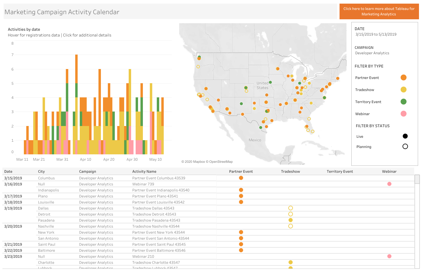
This Tableau Public dashboard shows marketing activities that will occur during the next 60 days. A comprehensive view like this reduces barriers and aligns teams such as sales and marketing around strategy, activity, and results.
What not to do: Pitfalls to avoid with marketing dashboards
1. Start from scratch
While no two marketing organizations are the same, they share similar data challenges: for instance, understanding the customer journey, optimizing digital marketing spend, and tracking leads through the funnel. It’s not necessary to start from scratch with analytics. Begin with the end goal and work your way back to the beginning asking how, what, and if-type questions, and collecting inspiration—as Austin Kleon suggests all artists can and should do in his “Steal Like an Artist” TEDx Talk. Tableau Public has sample, downloadable dashboards that marketers can dissect and recreate with their data. There are thousands of other searchable dashboards that also offer inspiration from global marketers.
2. Have different definitions of metrics
Siloed, disconnected data sources result in marketing mayhem. In that environment, the most simple decisions are difficult to make. Without a definitive system of record for metrics, two marketing teams in the same department can easily operate with different definitions and report on the same data differently. This creates analytics anarchy. Dashboards with certified data and aligned metrics create a source of truth and increase trust so everyone understands marketing’s impact and feels confident that the right decisions are being made.
Tinuiti, North America’s largest independent digital marketing agency, suffered from a complicated landscape of technologies and data sources, which made it difficult to quickly analyze client information and optimize their media mix.

They adopted Tableau, helping their staff make sense of all channel-level data and reducing time spent on data reporting, collection, and preparation by 60 percent. Data was centralized from more than 100 sources with the help of ChannelMix by Alight Analytics and Tableau delivered scalable, cost-effective, automated reporting to improve the agency’s analytics effectiveness and client relationships.
3. Assume that if you build it, they will come
Marketers are busy and face competing priorities that consume their daily attention. The different technology platforms that add value can also distract and make it difficult to decide where to start. There are internal wiki pages, chat applications, emails, project management, CRM or budget solutions, and more. Instead of requiring dashboard consumers to go out of their way, put dashboard insights into their workflows.
Here are steps to ensure a dashboard gets the appropriate attention:
- Create email subscriptions that remind employees it’s time to review a dashboard.
- Set data-driven alerts that notify dashboard viewers of anomalies.
- Dashboards or links should be placed where work occurs. Whether it’s shared on the factory floor, in a CRM, or on your internal documentation site, make sure a dashboard meets viewers where they are to increase adoption and usage.
- Establish an analytics Center of Excellence (CoE). This group is made up of your analytics champions and they usually assesses the current infrastructure or determine the value of investment. Brown-Forman created a CoE, explaining, “Somewhere there has to be a driver for the strategy and there has to be a home for your data scientists. This center of excellence was a block in our pyramid that always needed to be there.”
It’s helpful to analyze dashboard viewership, too. In fact, that should happen consistently as you ask questions: are there usage trends that stick out, how does viewership compare with other marketing dashboards, and who regularly, occasionally, or never consumes it? By diving into dashboard use, marketing can uncover areas for improvement, barriers to adoption, or competing priorities.
4. Silo advanced analytics and data science projects from dashboards
Advanced analytics techniques bring significant value to dashboards. Brands such as Merkle, zulily, and Worthington Industries use them to great benefit. By connecting to R and Python—you can access state-of-the-art algorithms and use open-source programming languages, which elevate dashboards with predictive models and sentiment analysis. They also help teams interact with powerful data science techniques to ask “what if” questions—an important aspect of any marketing plans. And as data science models evolve, these benefits will happen without changes to a dashboard experience; they’ll seamlessly integrate and give marketers confidence that their advanced analytics projects are making an impact.
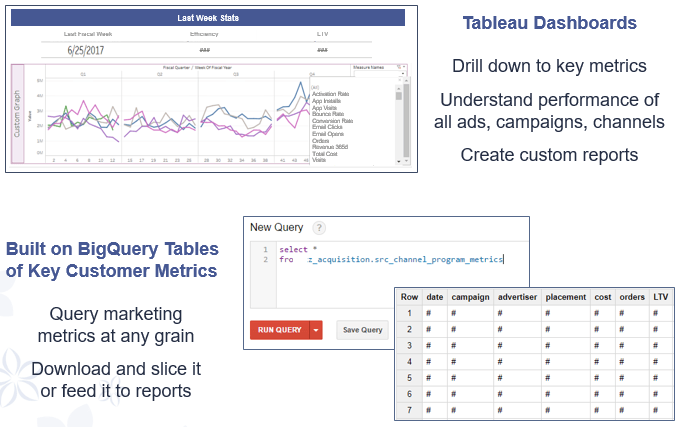
Summary of dashboards built by the zulily marketing analytics team using Tableau and Google BigQuery to create a data model based on all aspects of customer behavior, which feeds back into the marketing campaigns that drive customer actions.
5. Forget to use a checklist
When it’s time to publish a dashboard, always maintain a checklist to verify best practices were followed with dashboards and elements like tooltips, fonts, colors, interactivity, security, performance, and brand standards. In fact, this Tableau Performance Checklist is an easy place to start with tips to keep complex marketing dashboards functioning optimally. By following through on these recommendations, they will effectively serve the team, organization, and stakeholders like customers and partners, providing a clear view of engagement to support maximum results.
Marketing analytics: A key to success
With the growing sophistication of business intelligence solutions like Tableau, dashboards are quickly becoming one of the greatest assets for marketing teams and professionals—regardless of type, size, experience, and industry. And to maximize marketing investments and results, seeing and understanding each win and loss of your cross-channel marketing efforts has become priority for marketing teams and leaders—from Walt Disney to The Ad Council, Humana, and other brands.
If you’re still new to dashboards, prioritize the do’s and evaluate how your data insights measure up while activating marketing strategies and tactics to engage audiences. You can start by using Tableau Dashboard Starters or different connectors to easily gain stunning, data-rich dashboards populated with Salesforce, Eloqua, Marketo, ServiceNow, Google Analytics, or Google AdWords information that enable quick wins.
Finally, our Tableau partners enable organizations and marketers around the world to achieve better insights from their data. Discover and connect with a local technology, alliance, or OEM partner that can help scale and maximize your marketing analytics.
Related materials
Tableau Marketing Analytics solutions page
– A one-stop resource to understand how Tableau helps marketers see and understand data
Marketing dashboards
– Explore marketing dashboards on Tableau Public
zulily Marketing Analytics customer story
– Learn how the e-commerce company created a self-service marketing analytics platform optimizing Google BigQuery integration with Tableau